AO Villa I Interior
Location:
Kazakhstan, Astana
Year:
2023
Status:
Designed
Construction technology:
Combined cast-in-place and steel frame
House area:
2 051m2
Work done:
Site plan
Architecture
Interior design
Visualization
The team:
Kirill Skorynin
Vlad Chabai
Anton Dodalev-Kovalchuk
The villa is situated in the very heart of Astana, within the newly developed residential quarter of AKBULAK Riviera, also designed by our company. The property is surrounded by green areas and on one side adjacent to the embankment. Consequently, while enjoying the convenience of locating in the city center, the owners benefit from all the amenities of country living.
The house was designed to be a permanent residence for a large family comprising three generations. Before the design, a thorough analysis of the local environment, the family’s lifestyle, their habits, and values was conducted.
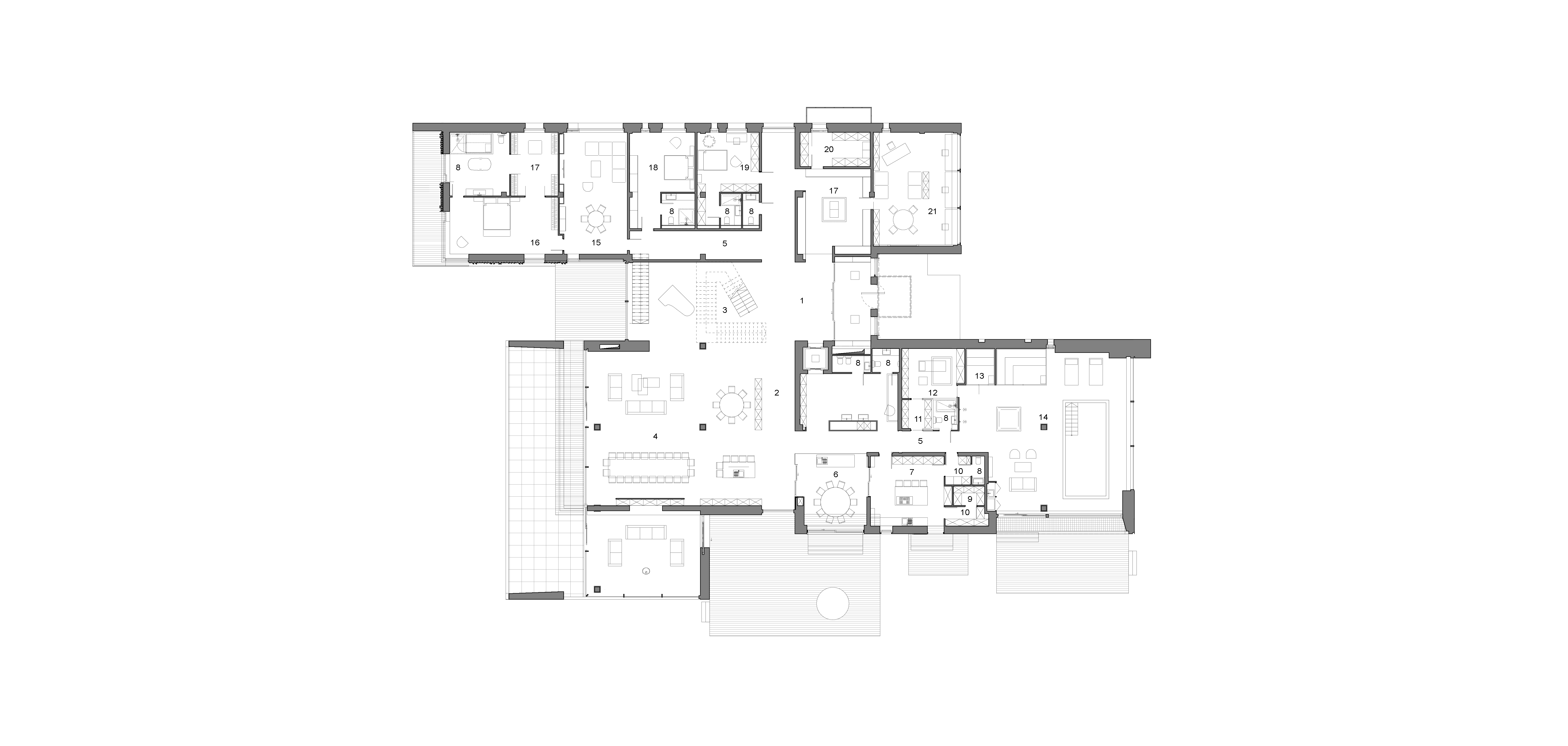
- Hallway
- Gallery
- Hall
- Living room
- Corridor
- Open kitchen
- Working kitchen
- WC
9. Refrigerator compartment
10. Pantry
11. Dressing room
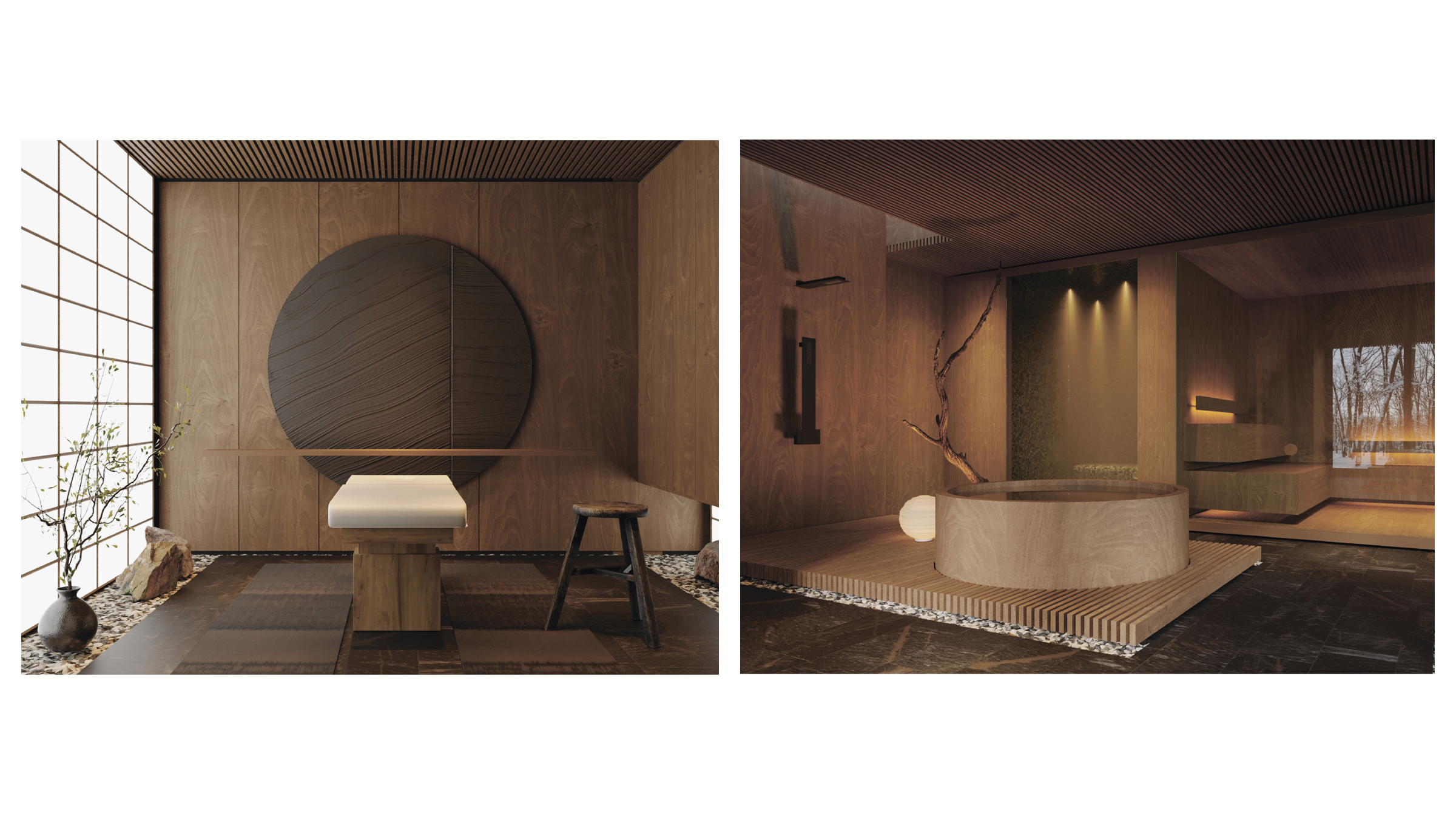
12. Massage
13. SPA area
14. Swimming pool
15. Living room
16. Bedroom
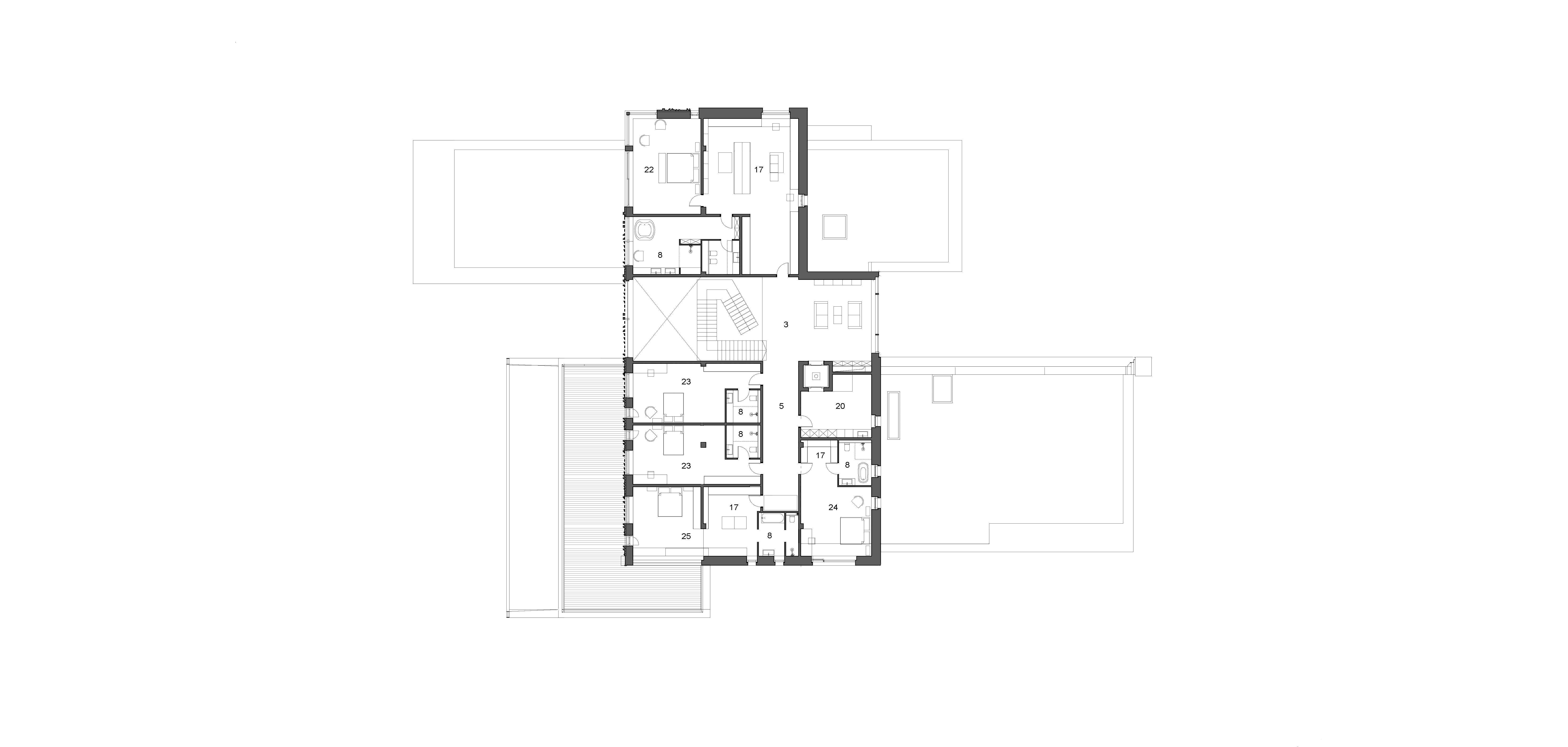
17. Closet
18. Guest bedroom
19. Staff quarters
20. Laundry
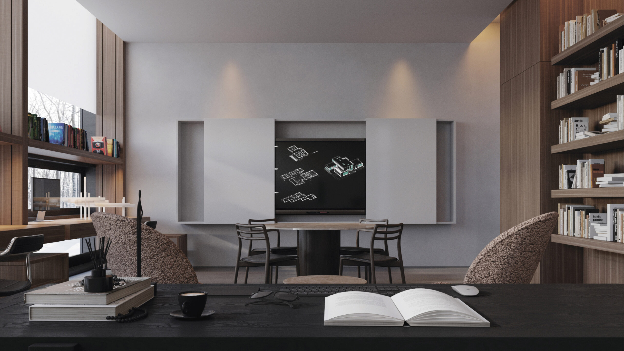
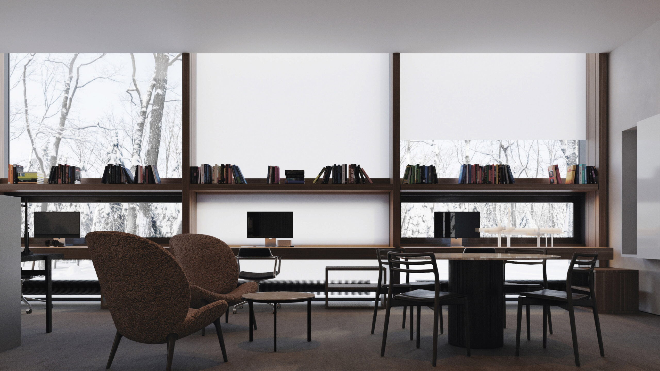
21. Office
22. Primary-bedroom
23. Twins bedroom
24. Teenager’s bedroom
25. Girl’s bedroom
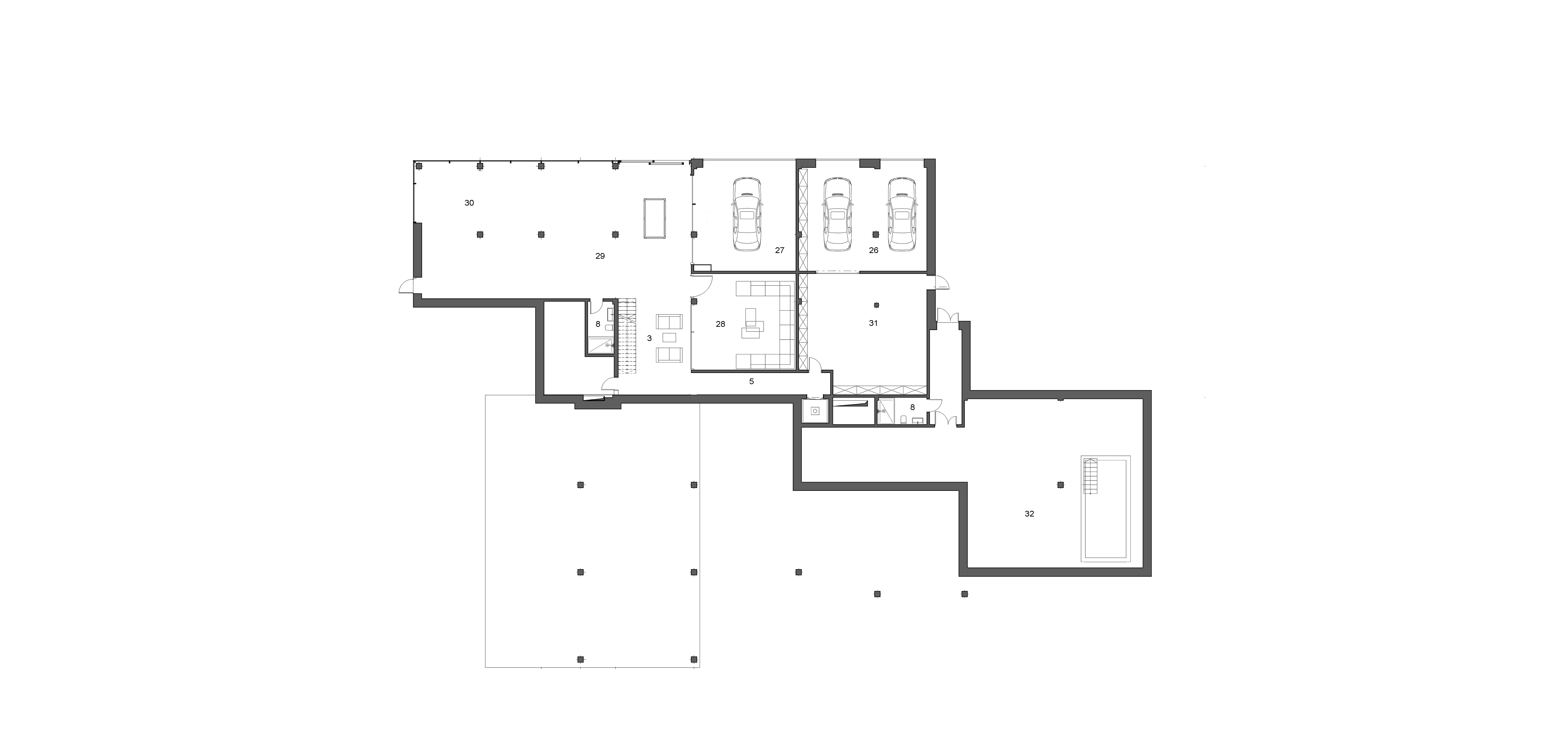
26. Garage
27. Autopodium
28. Cinema hall
29. Игровая
30. Game room
31. Workshop
32. Technical room
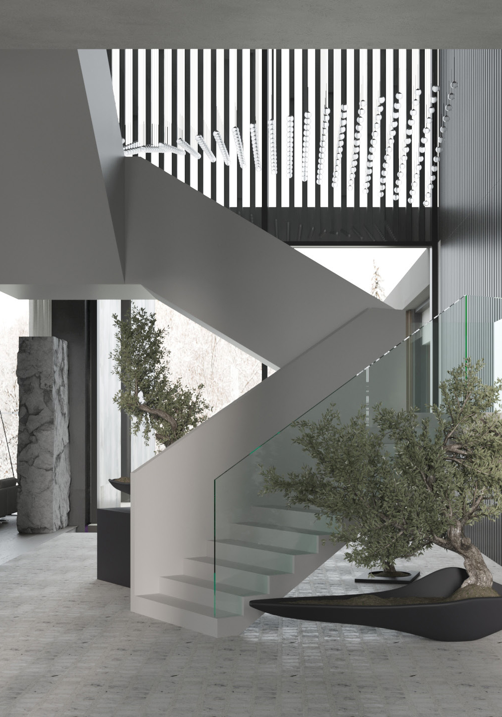
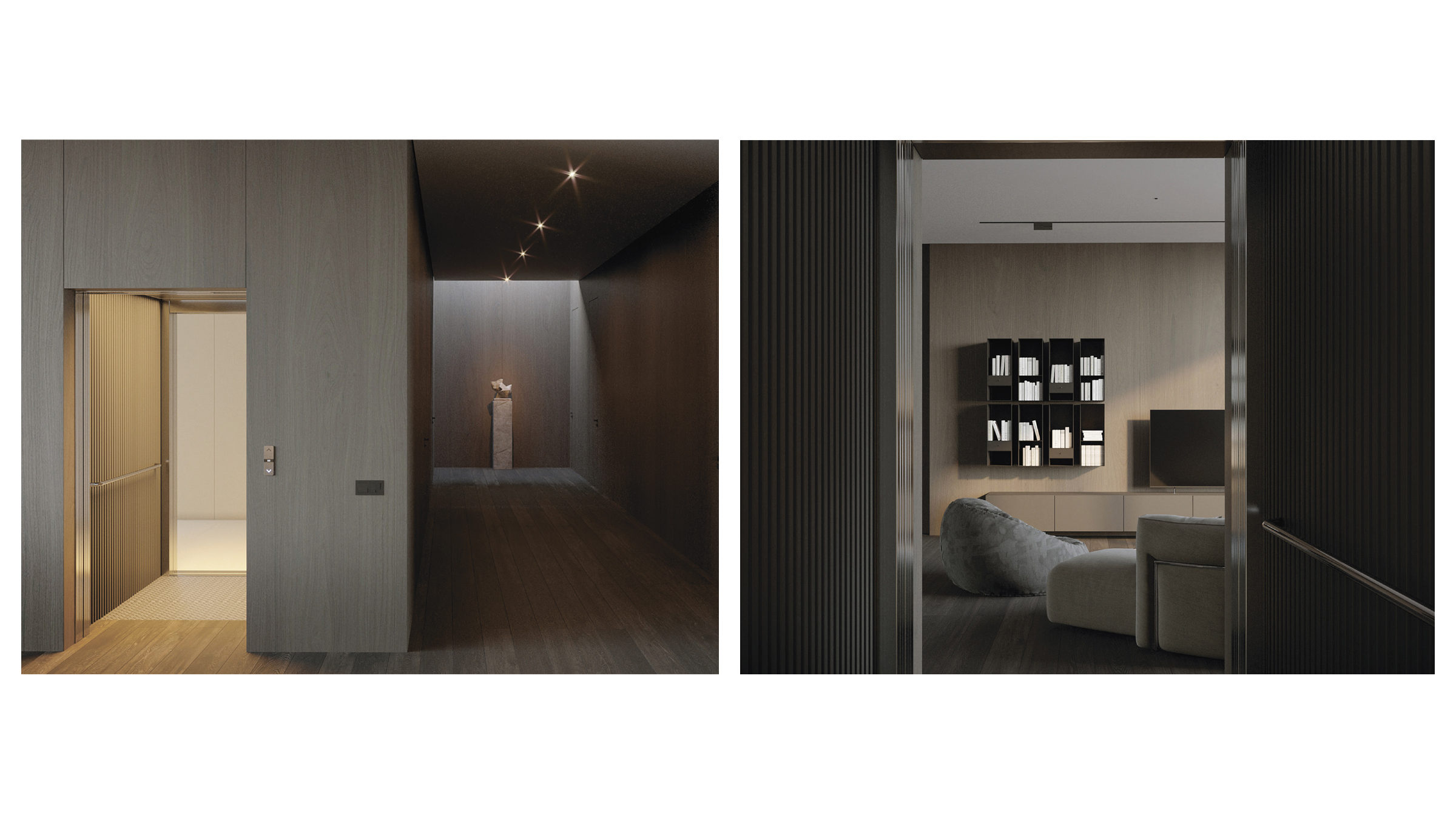
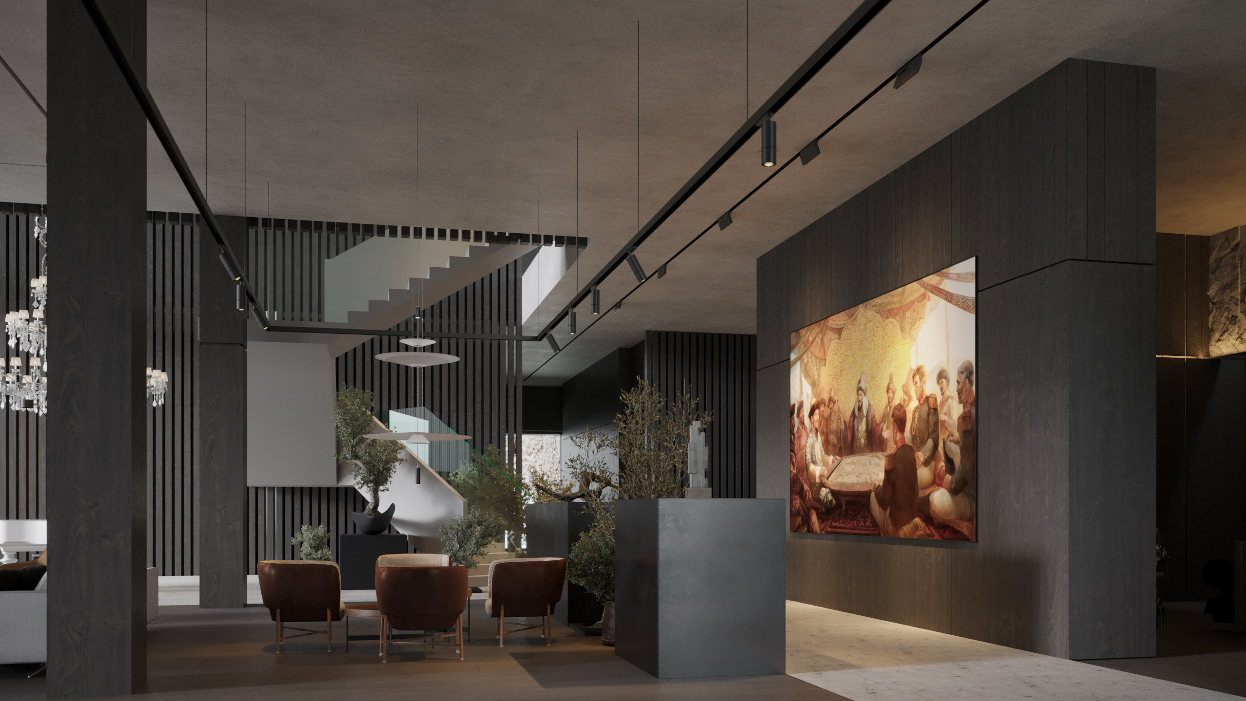
Compositionally, the interior space is designed around the junction of two axes:
The first axis runs from the entrance hall to the staircase, forming a spacious hallway that offers guests the initial impression of the house and its residents;
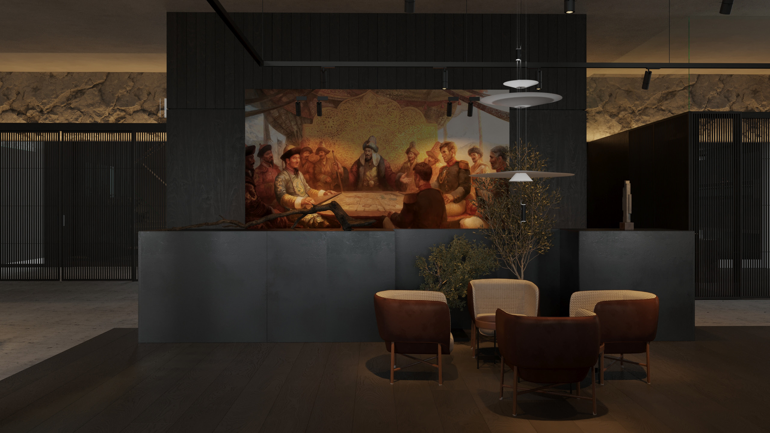
The second axis, which runs perpendicular to the first, extends through the entire house and serves as an art gallery.
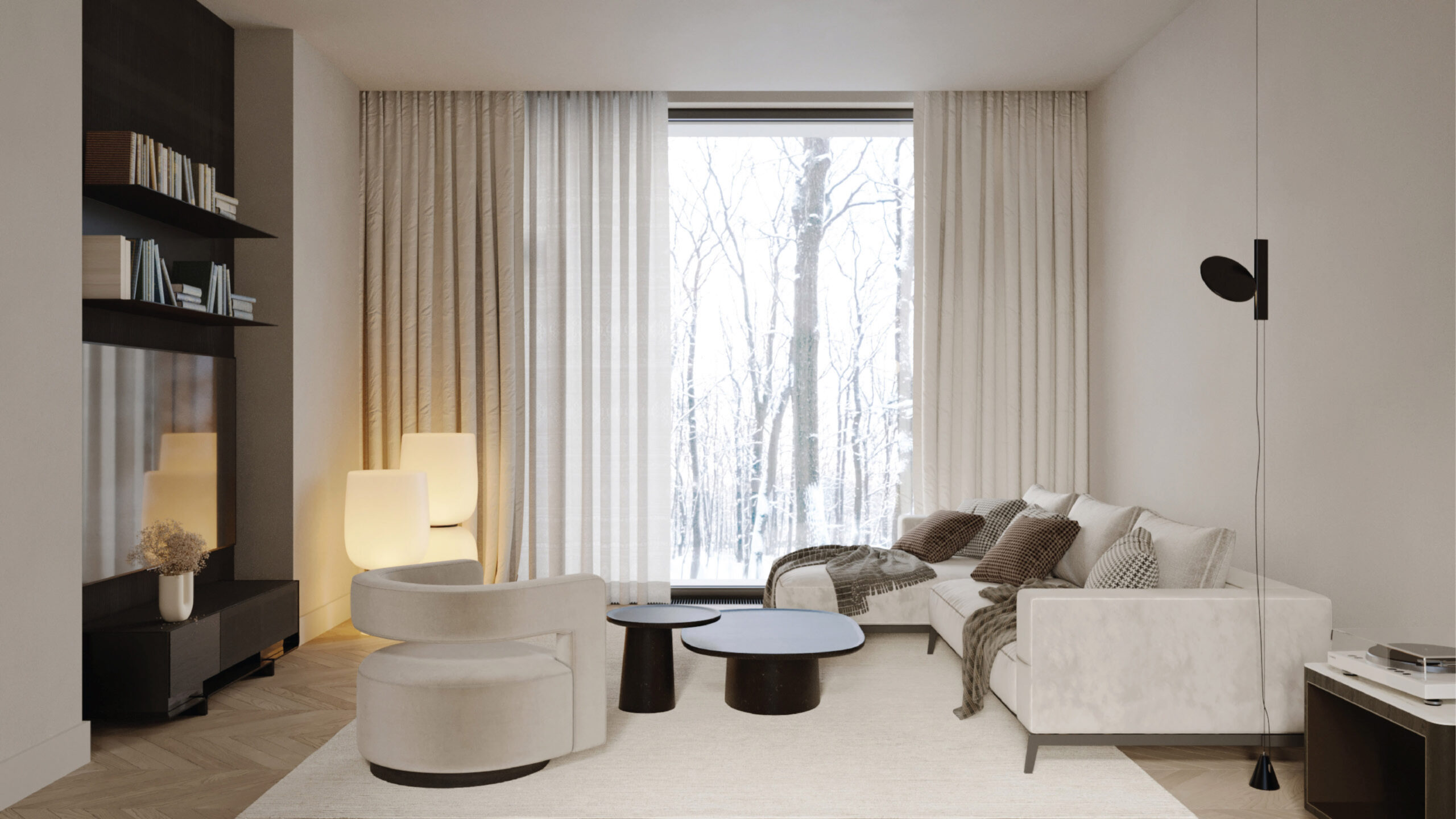
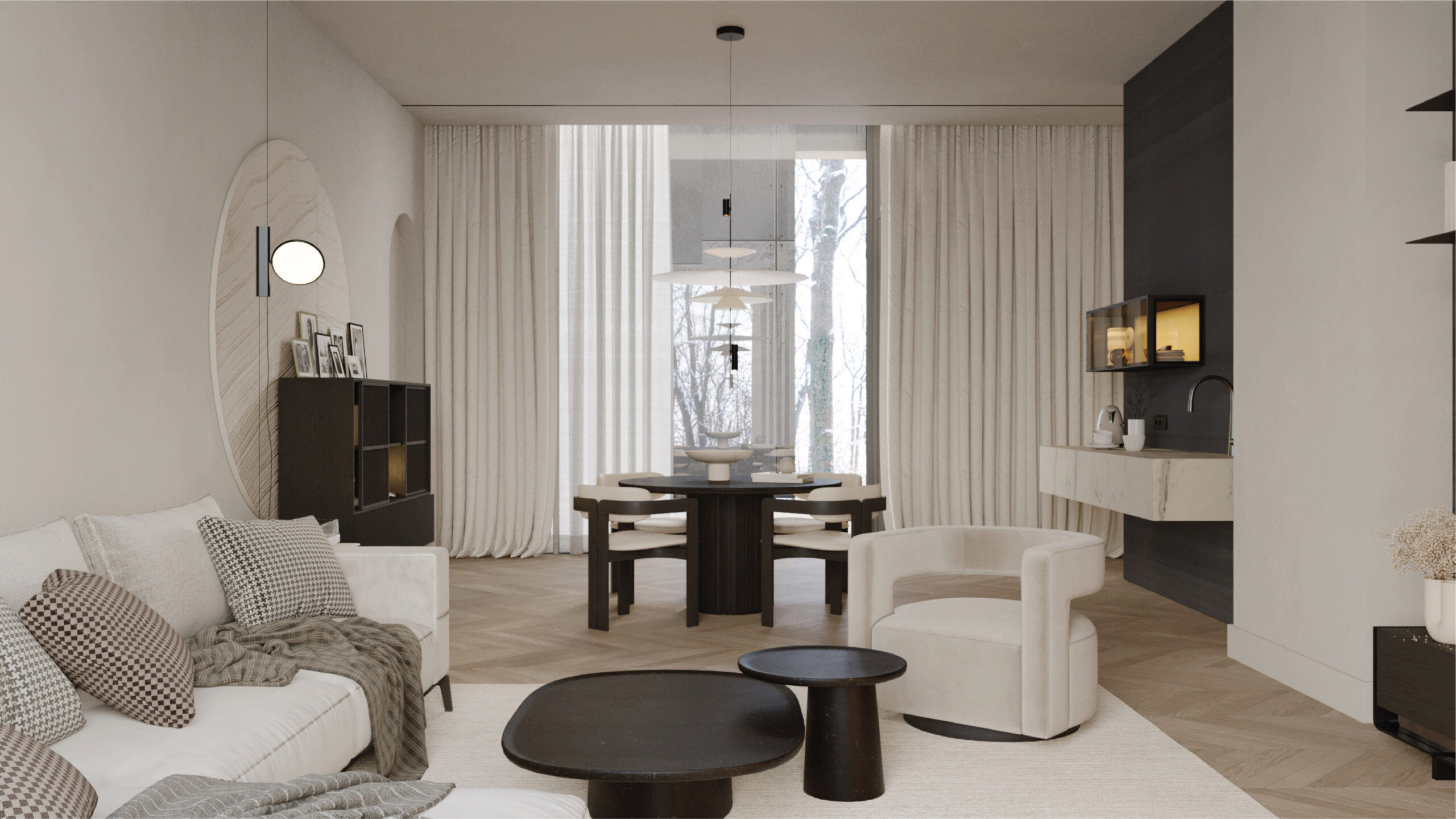
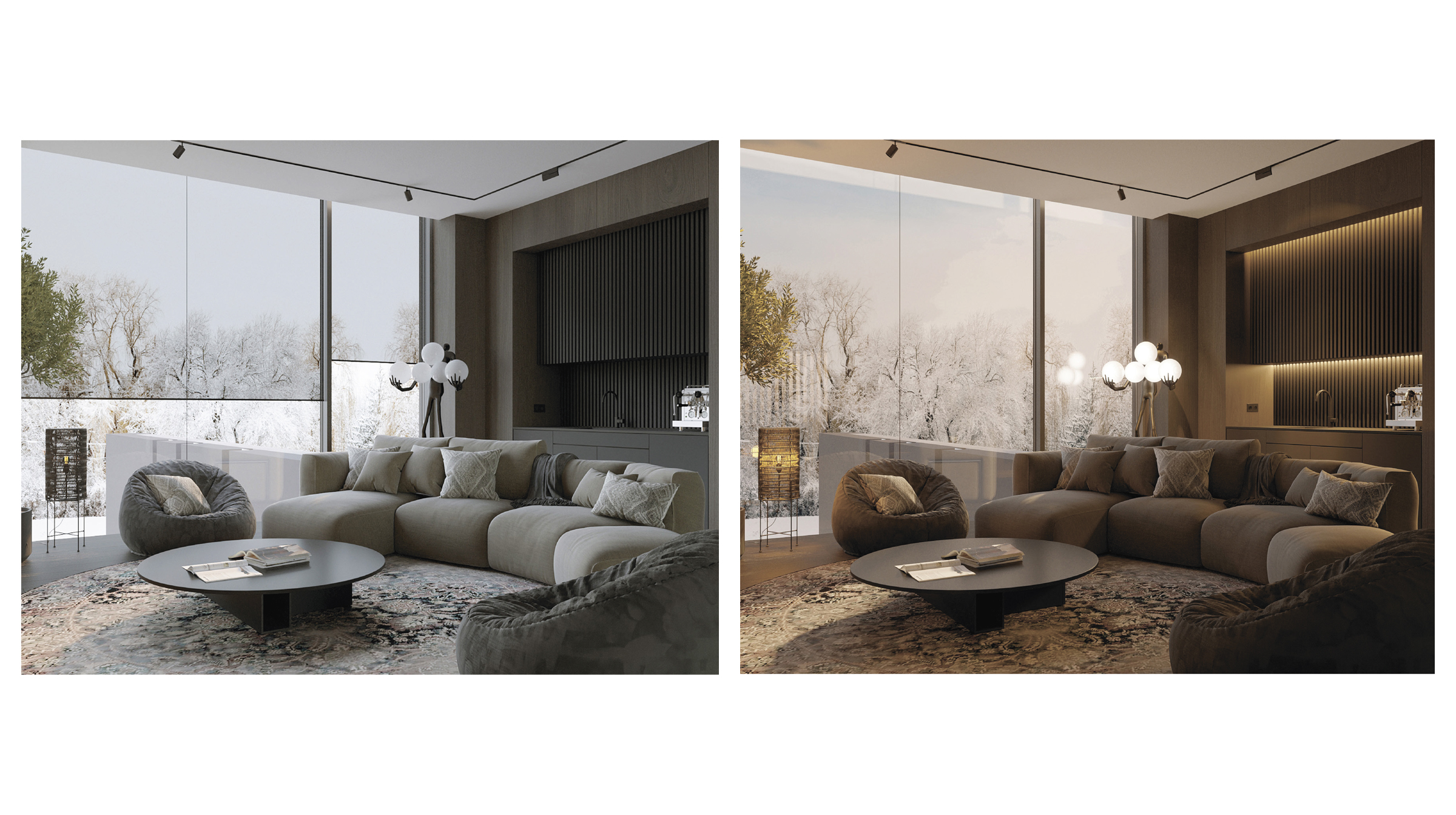
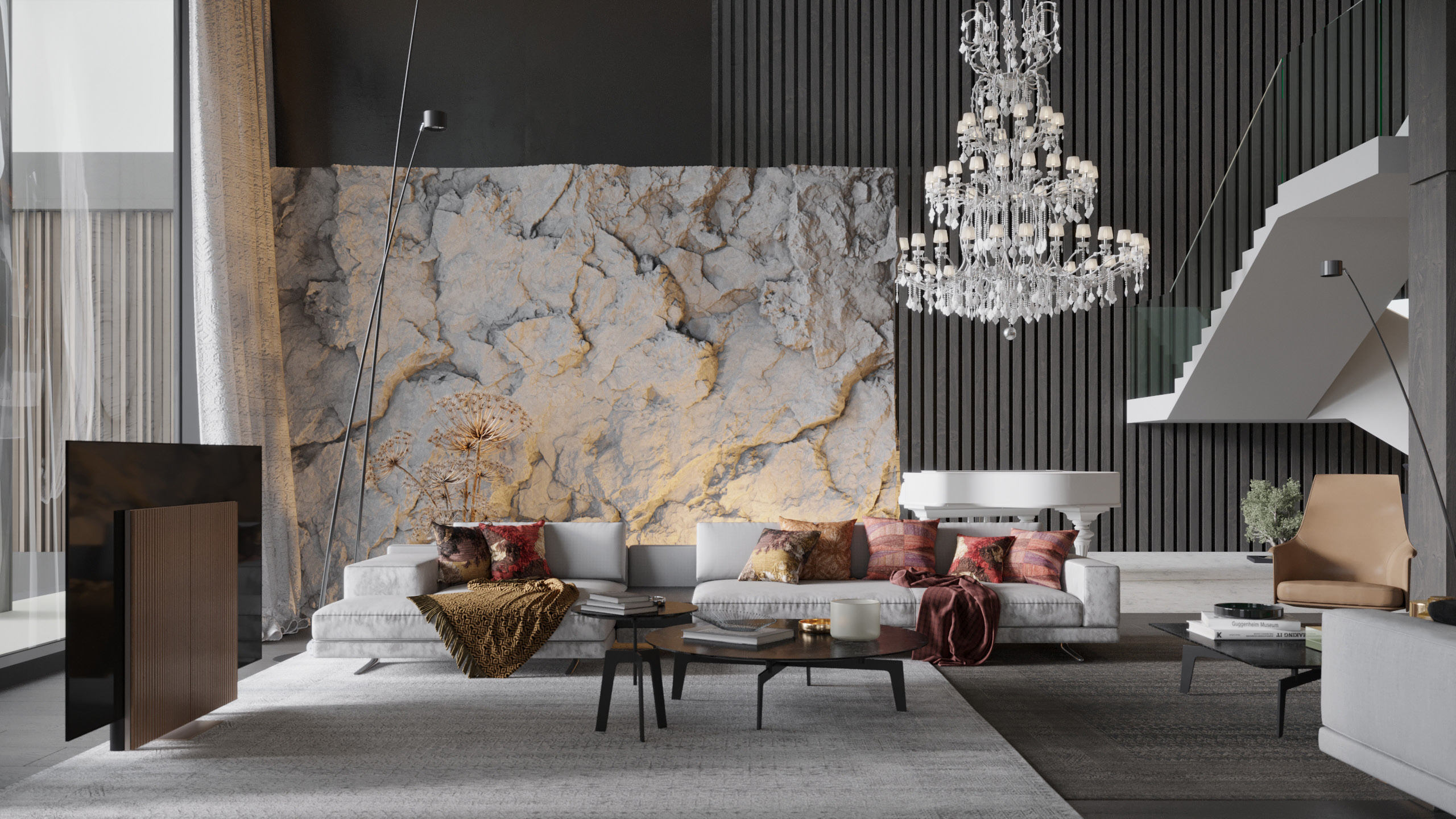
To the left of the entrance, there is a spacious common area, which functions as a hub for various recreational activities, reception events, and parties. Throughout the evening, guests can seamlessly transition between these different areas.
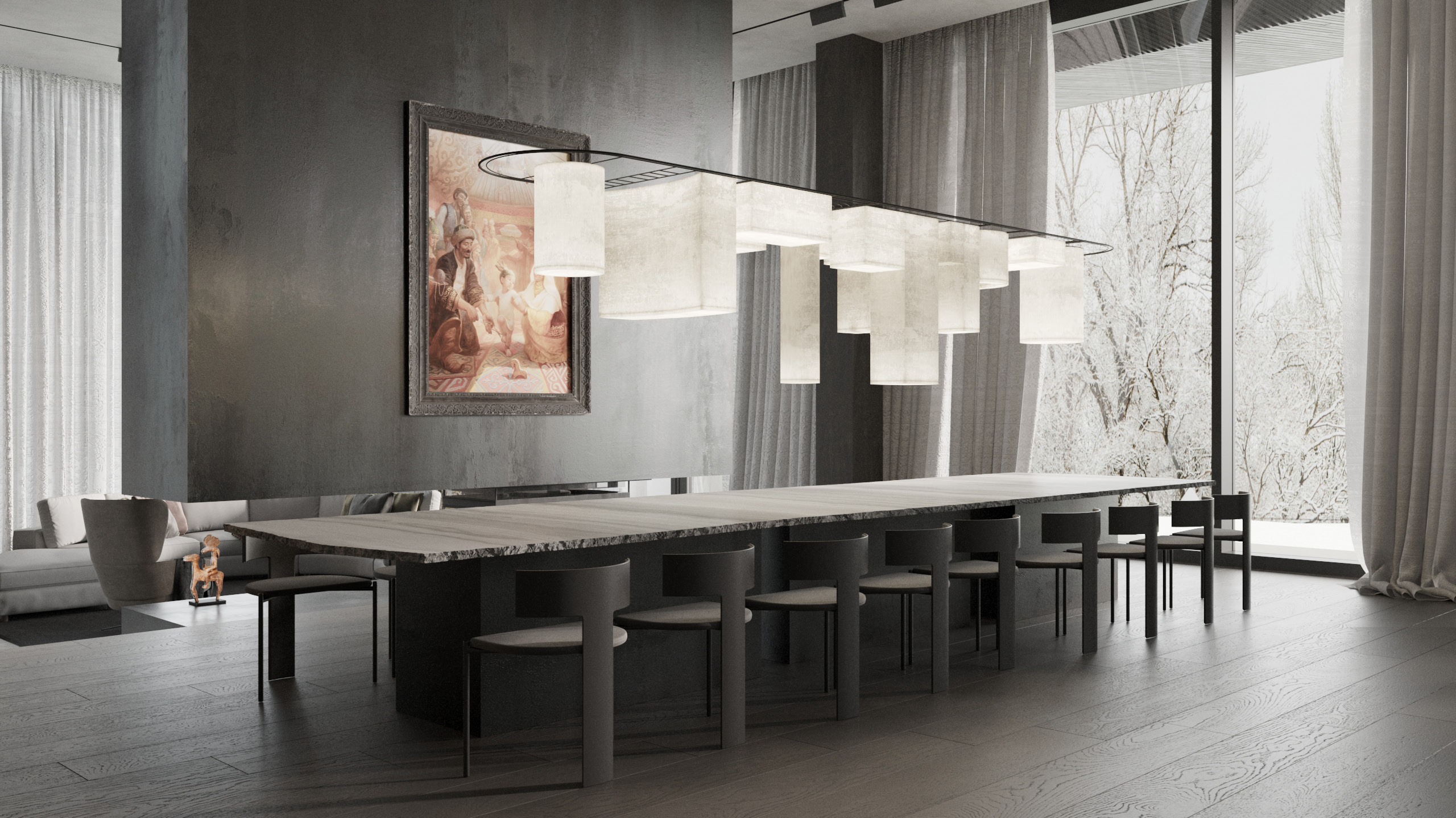
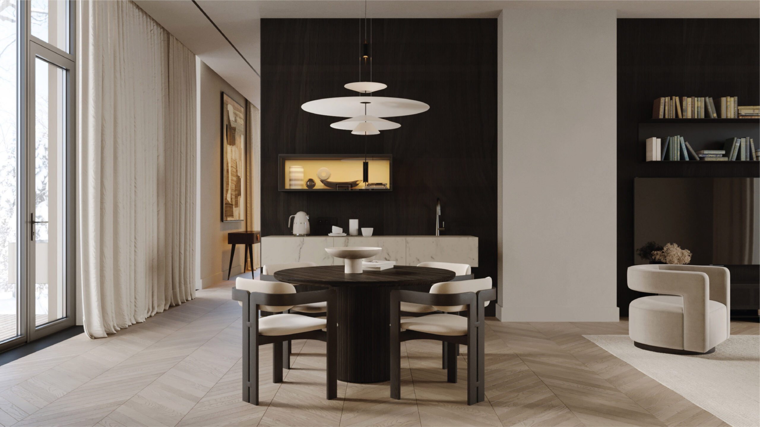
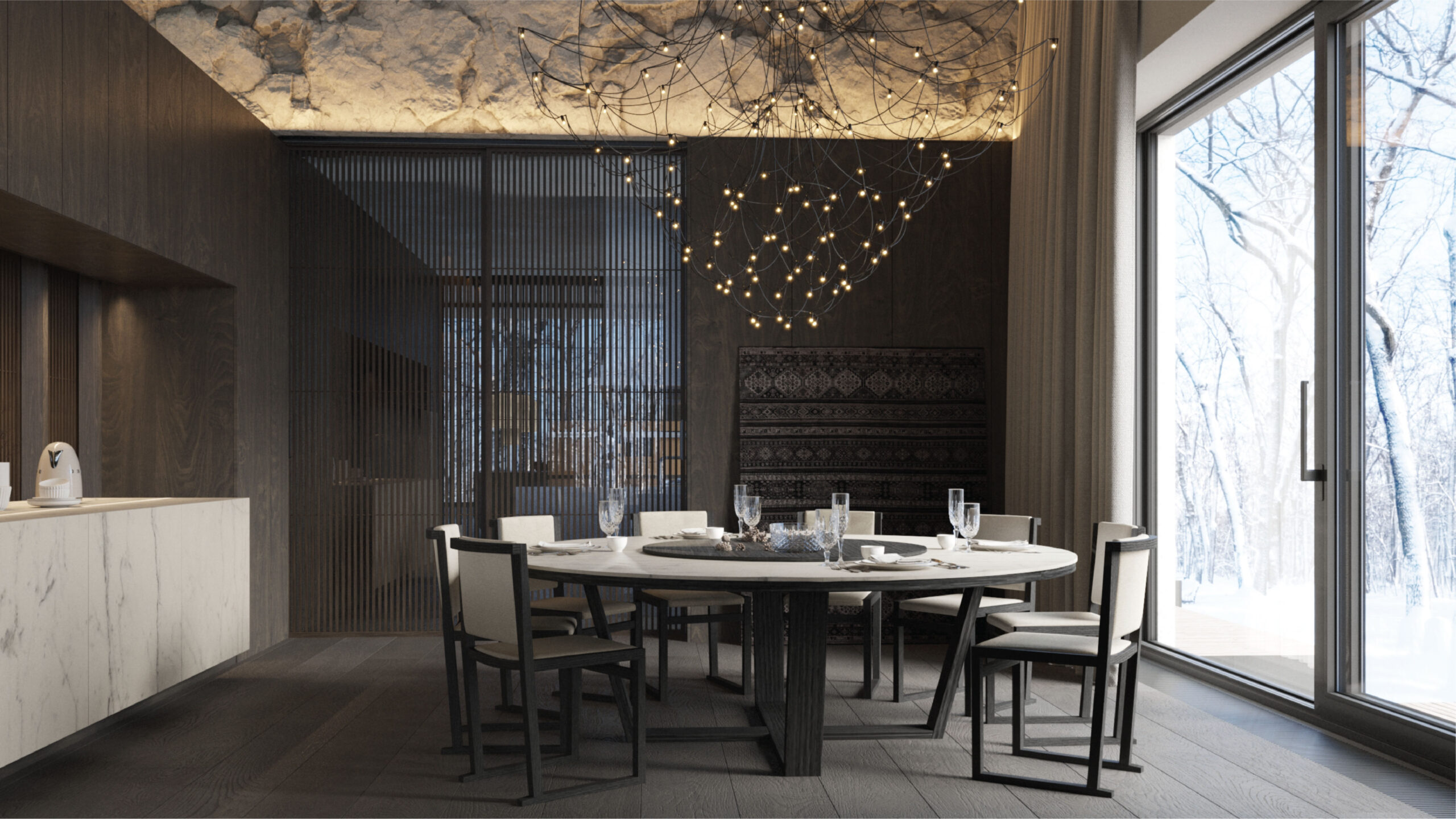
It all starts at the bar area, then the dining table and the lighting above it take over the attention — they are true works of art. At the end of the evening, the lounge zone comes into play.
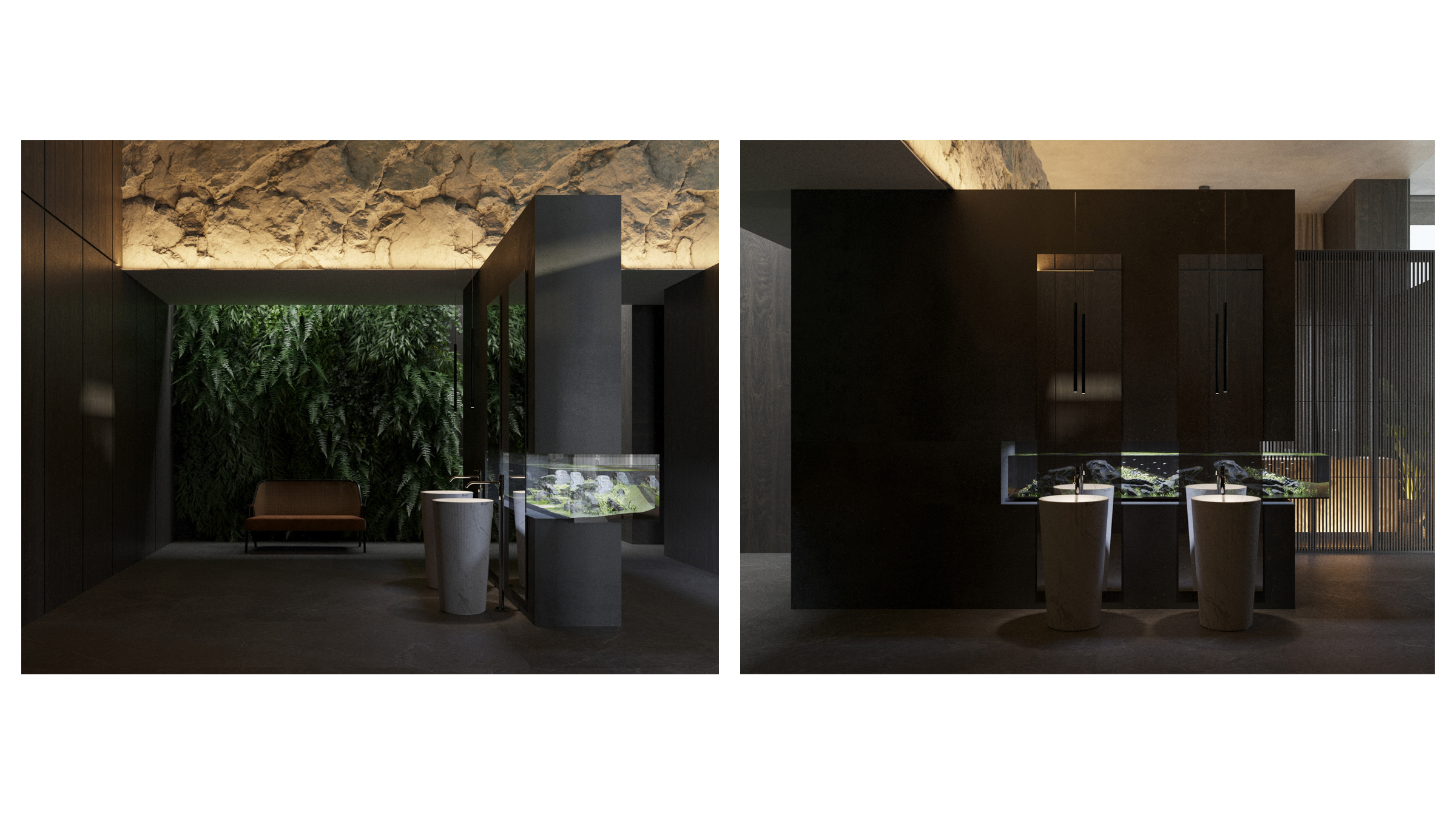
An equally spacious and attractive bathroom is available for the main part.
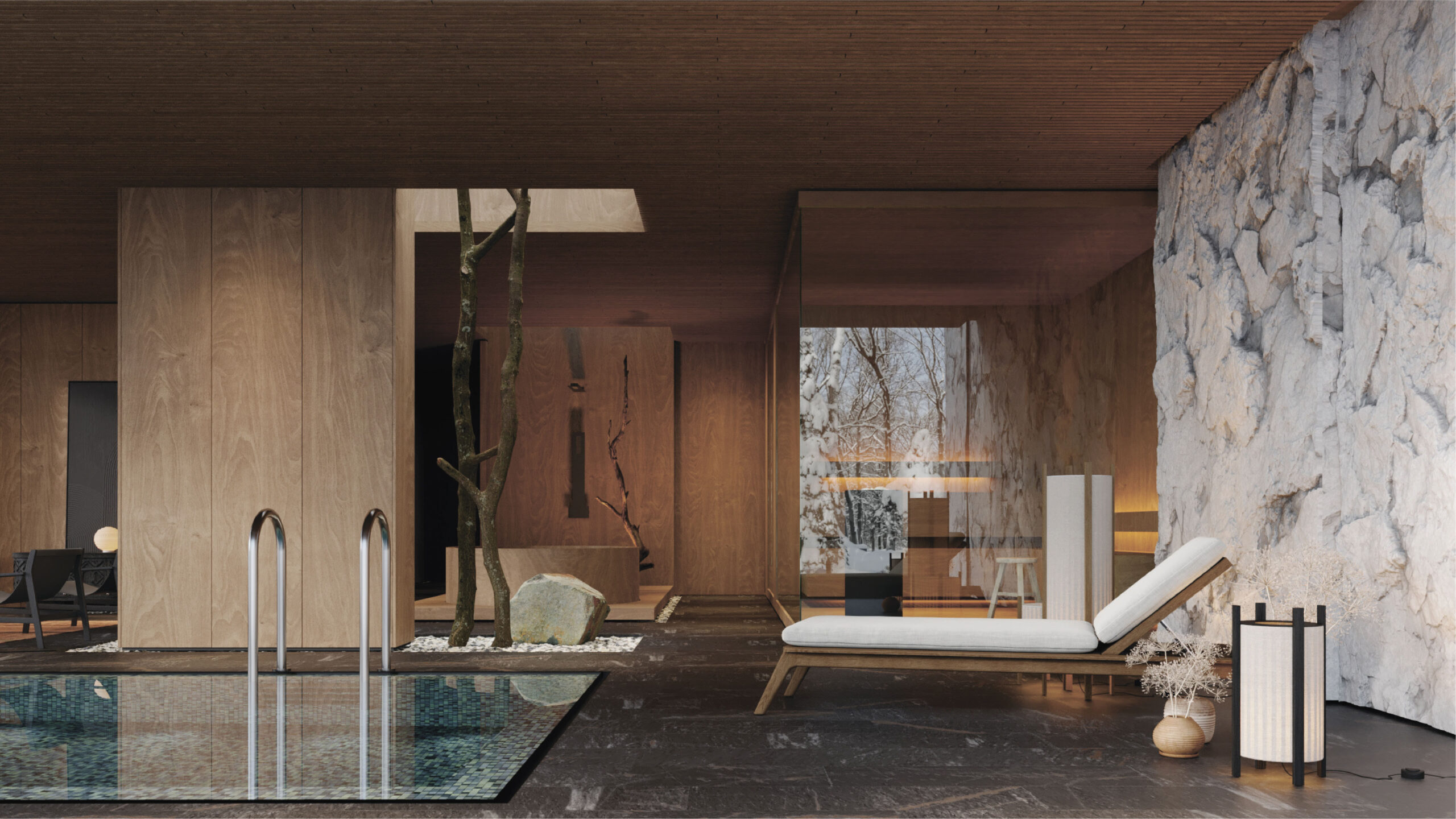
Dim light, natural stone, and exotic plants create the effect of a cave.
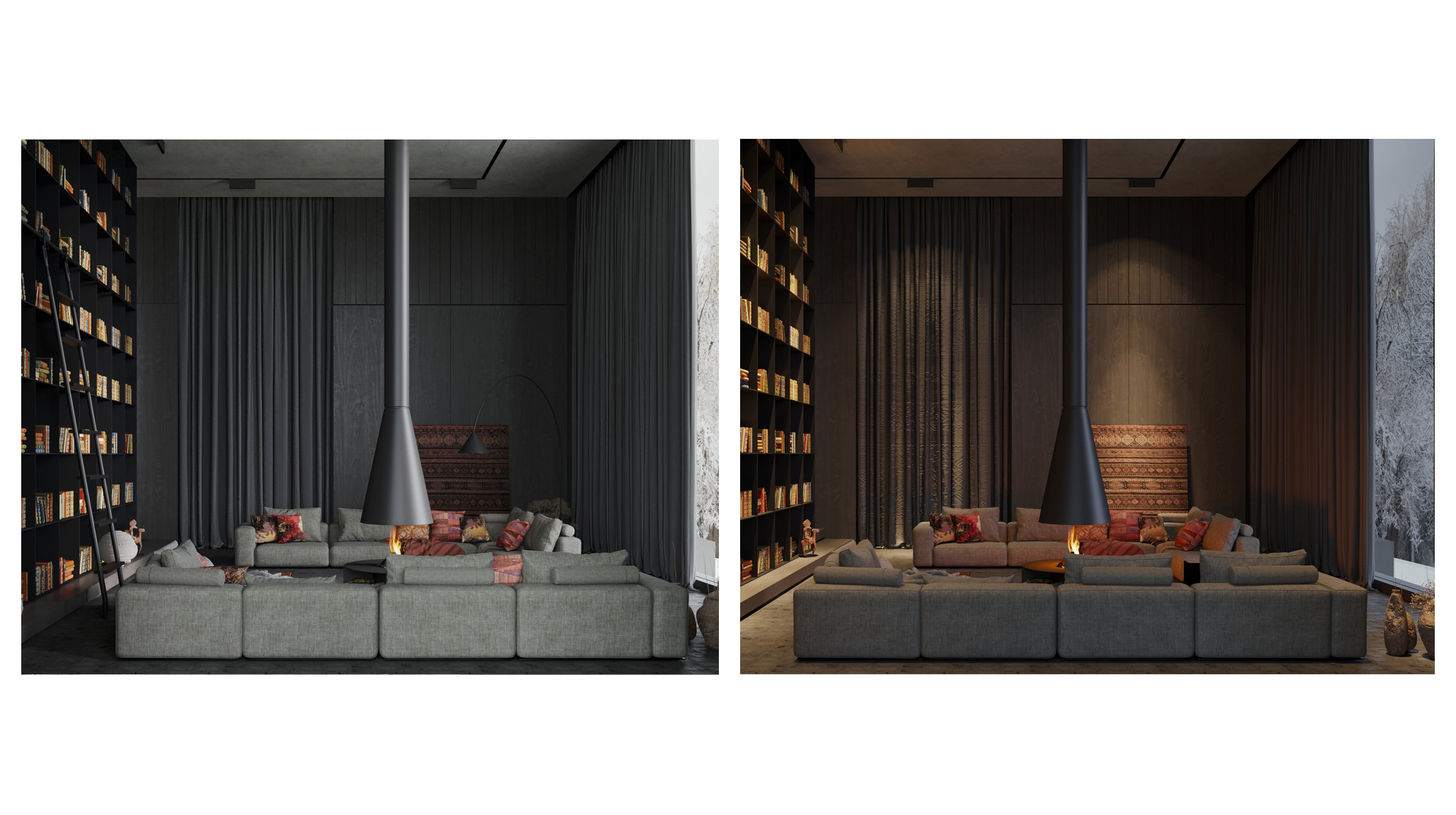
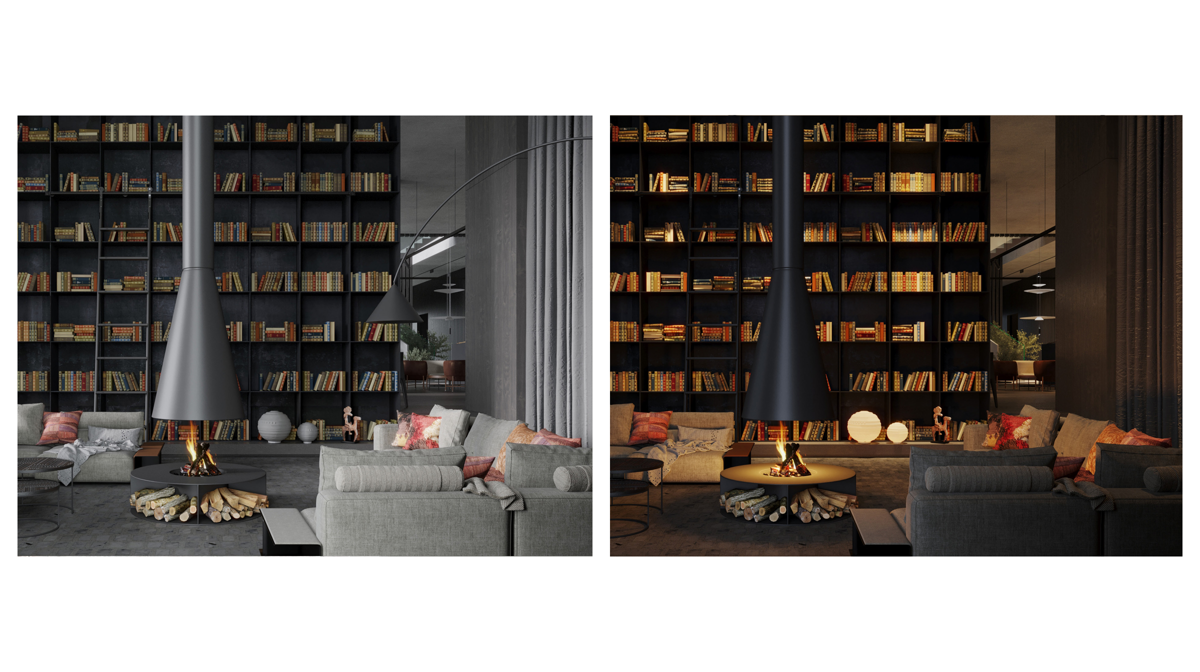
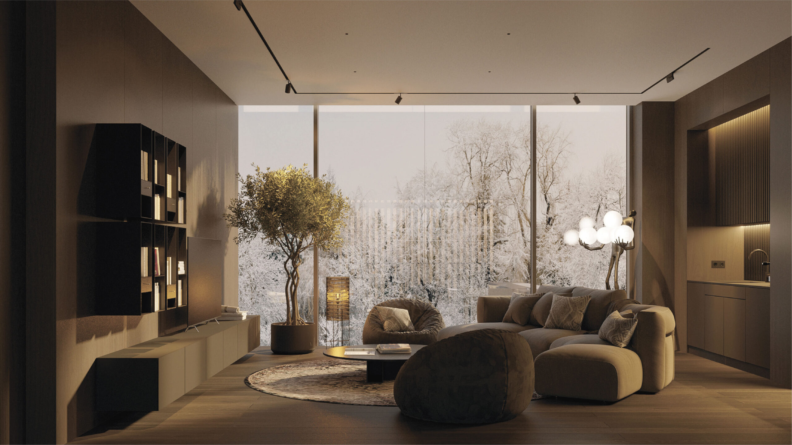
On the first floor, there is an additional seating area by the fireplace, which faces the embankment and offers an impressive view of the cityscape.
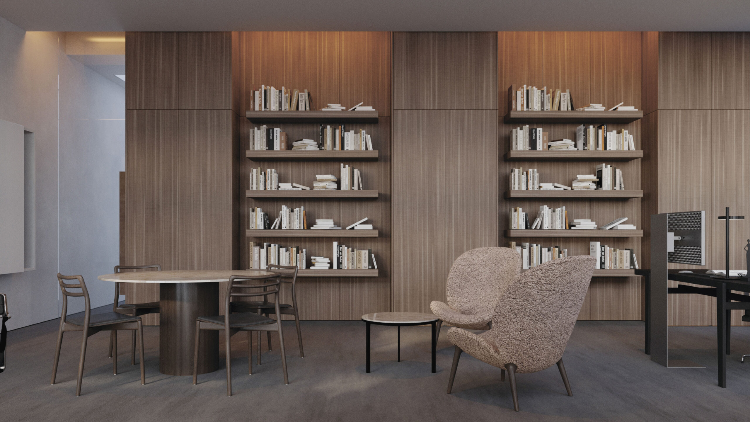
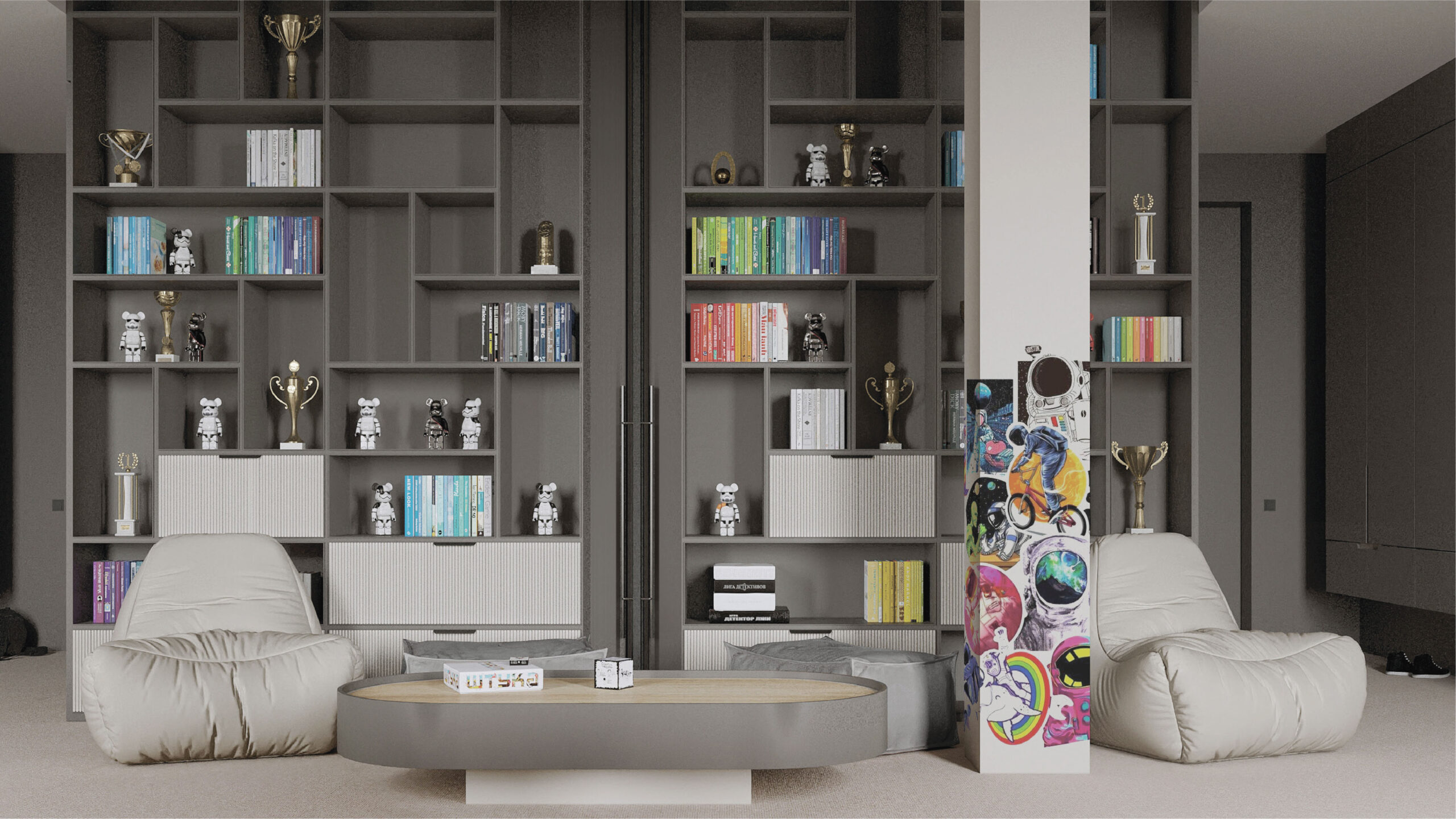
Shelves extend all the way to the ceiling, lining one wall of the room. It appears to be a kind of private library.
There is a small dining room for everyday family lunches, breakfasts and dinners.
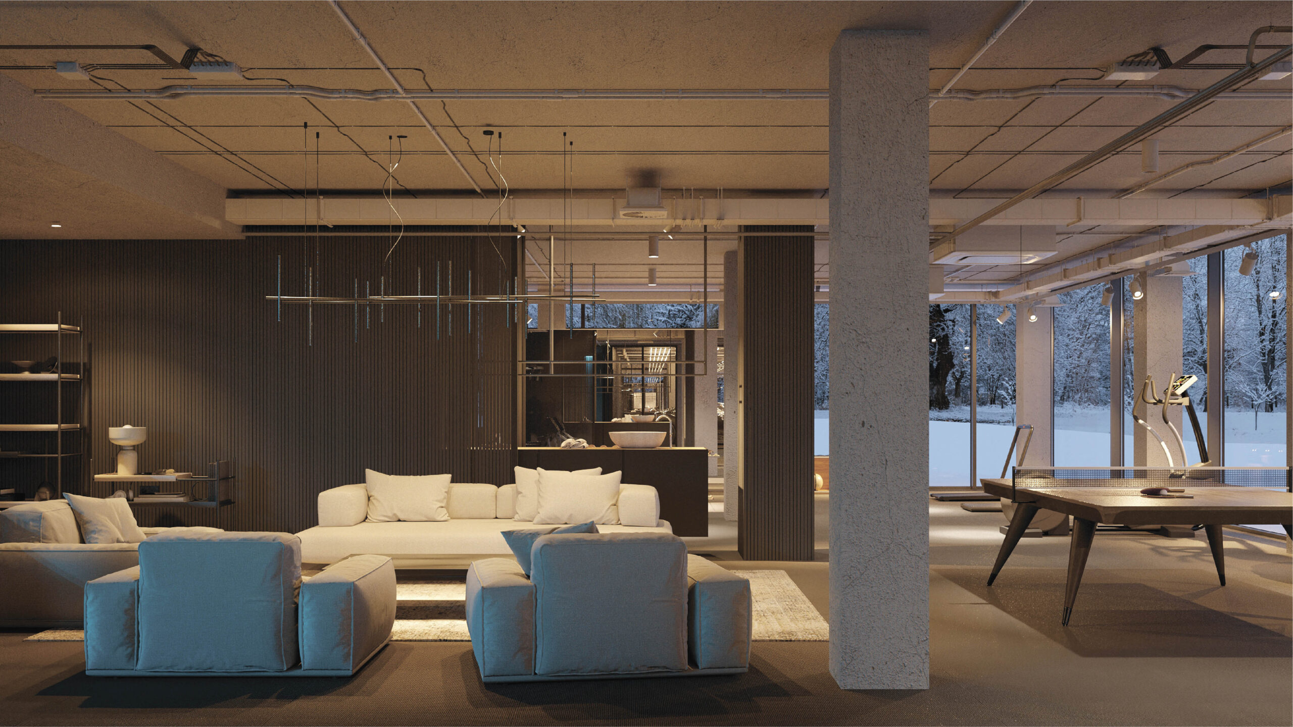
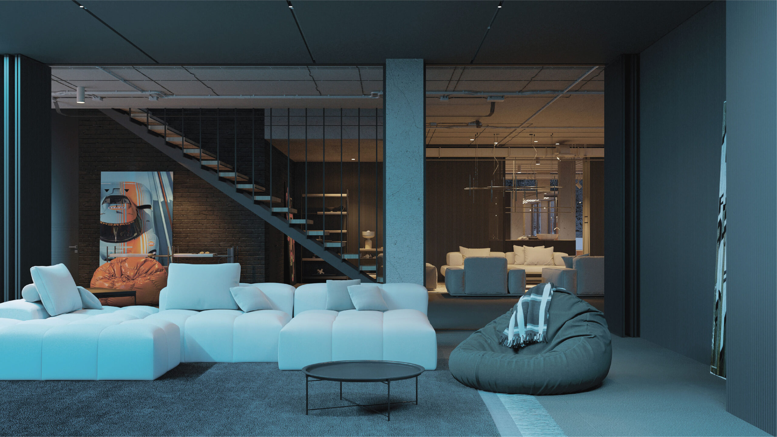
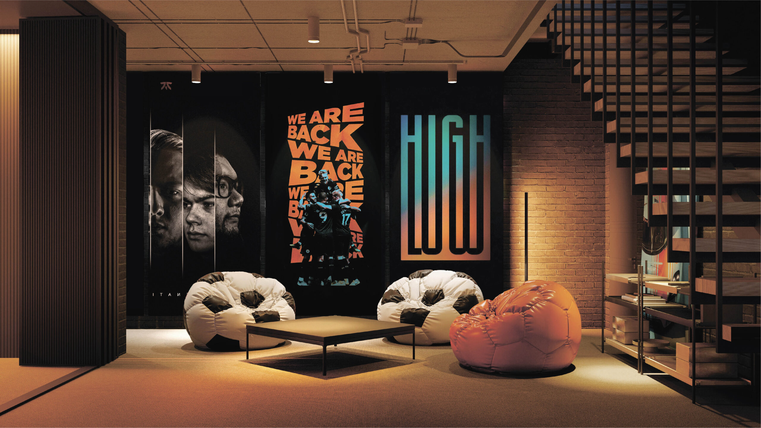
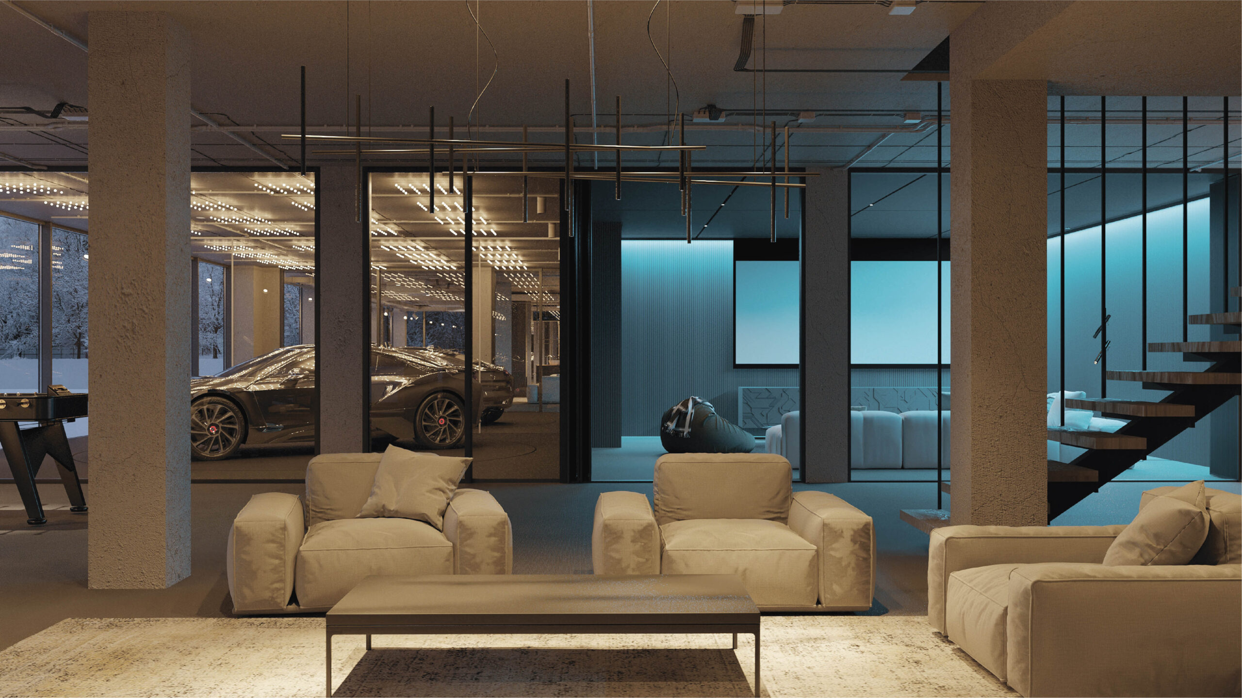
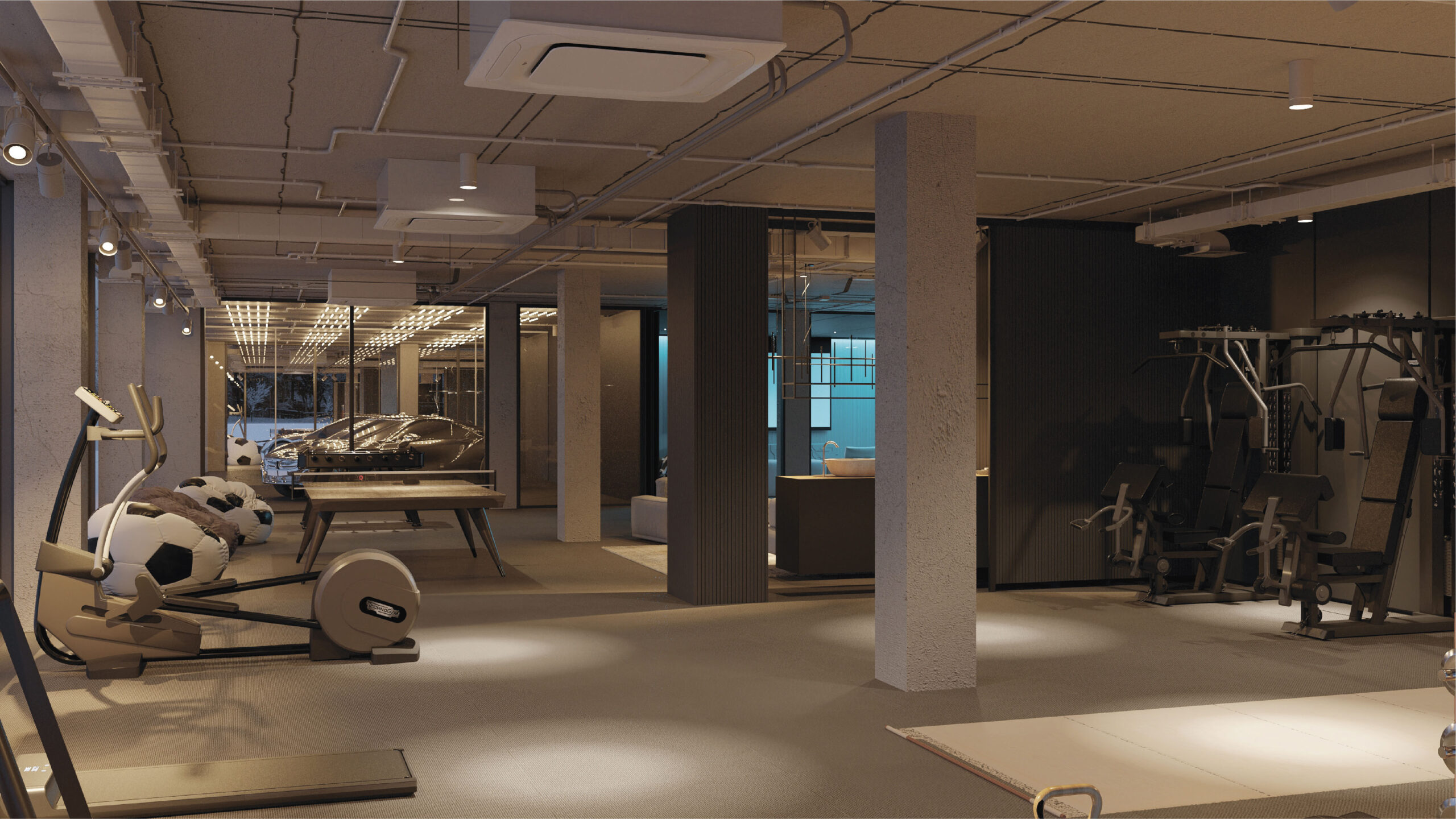
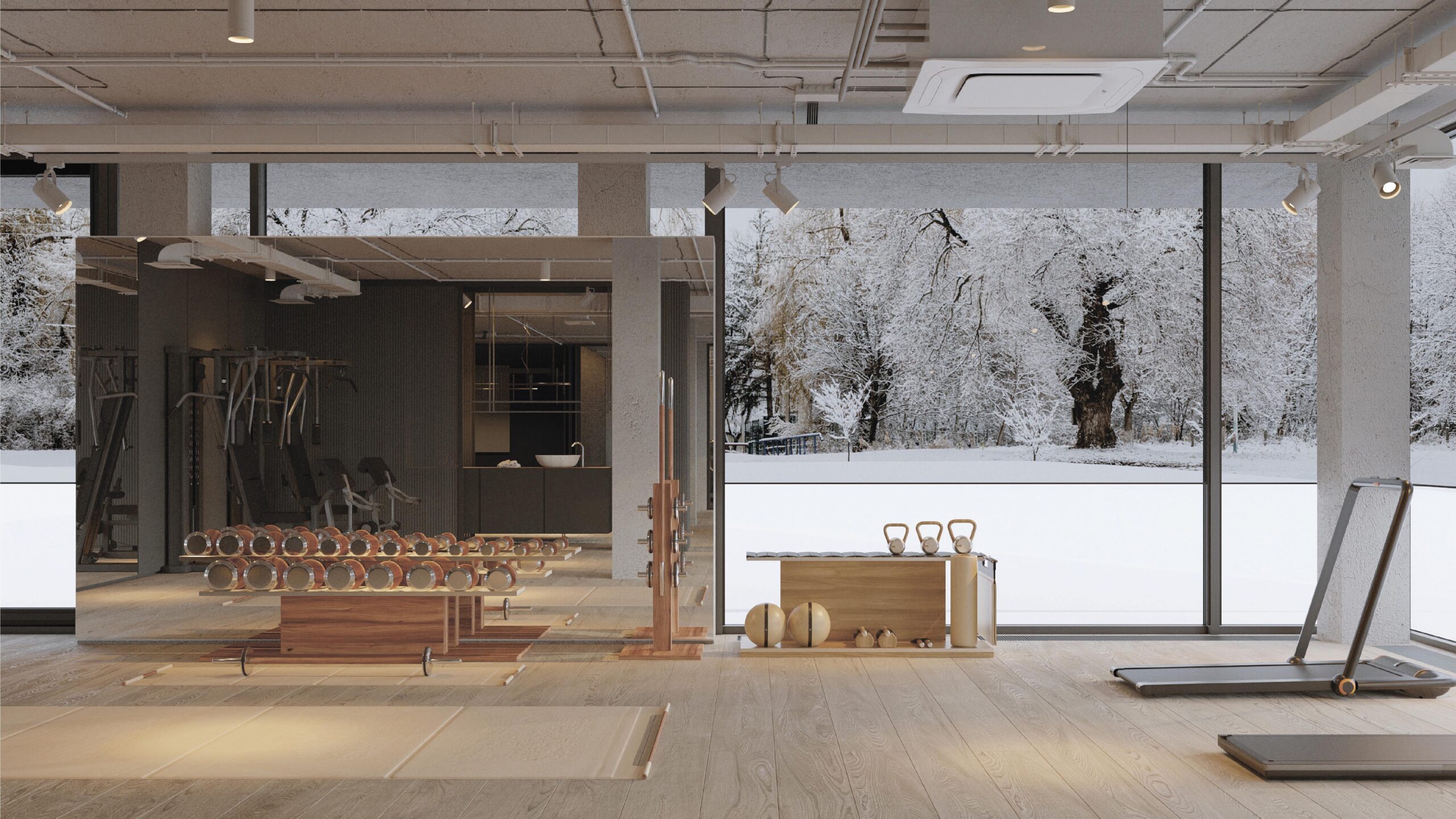
The house has a comprehensive range of facilities. On the first floor, there is a dedicated entertainment area: a home gym, a home cinema, a showroom for cars, and a workshop.
Such spaces often seem dark and dull. In our case, however, the floor is flooded with natural light thanks to panoramic glazing and a skillful use of the terrain.
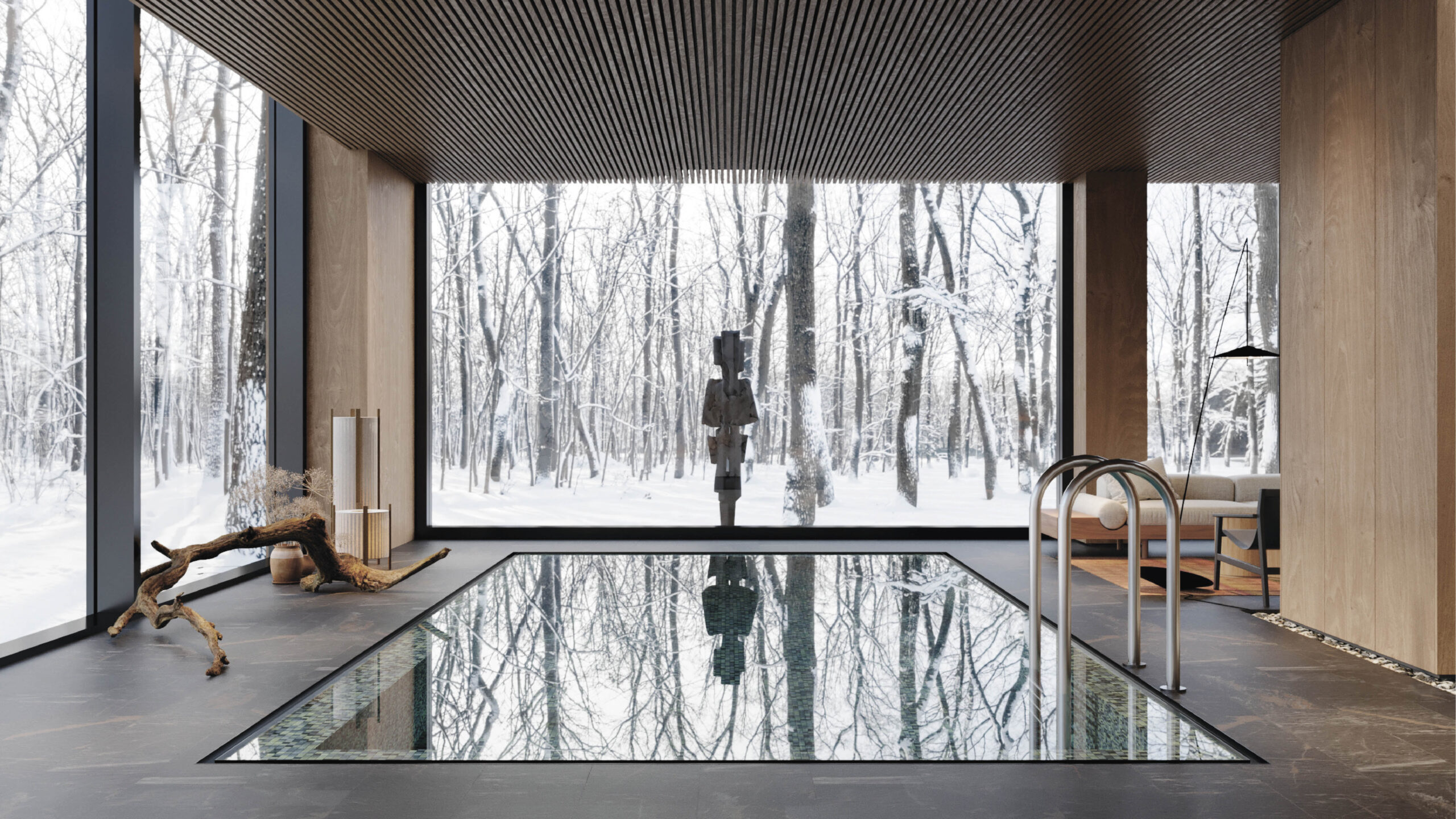
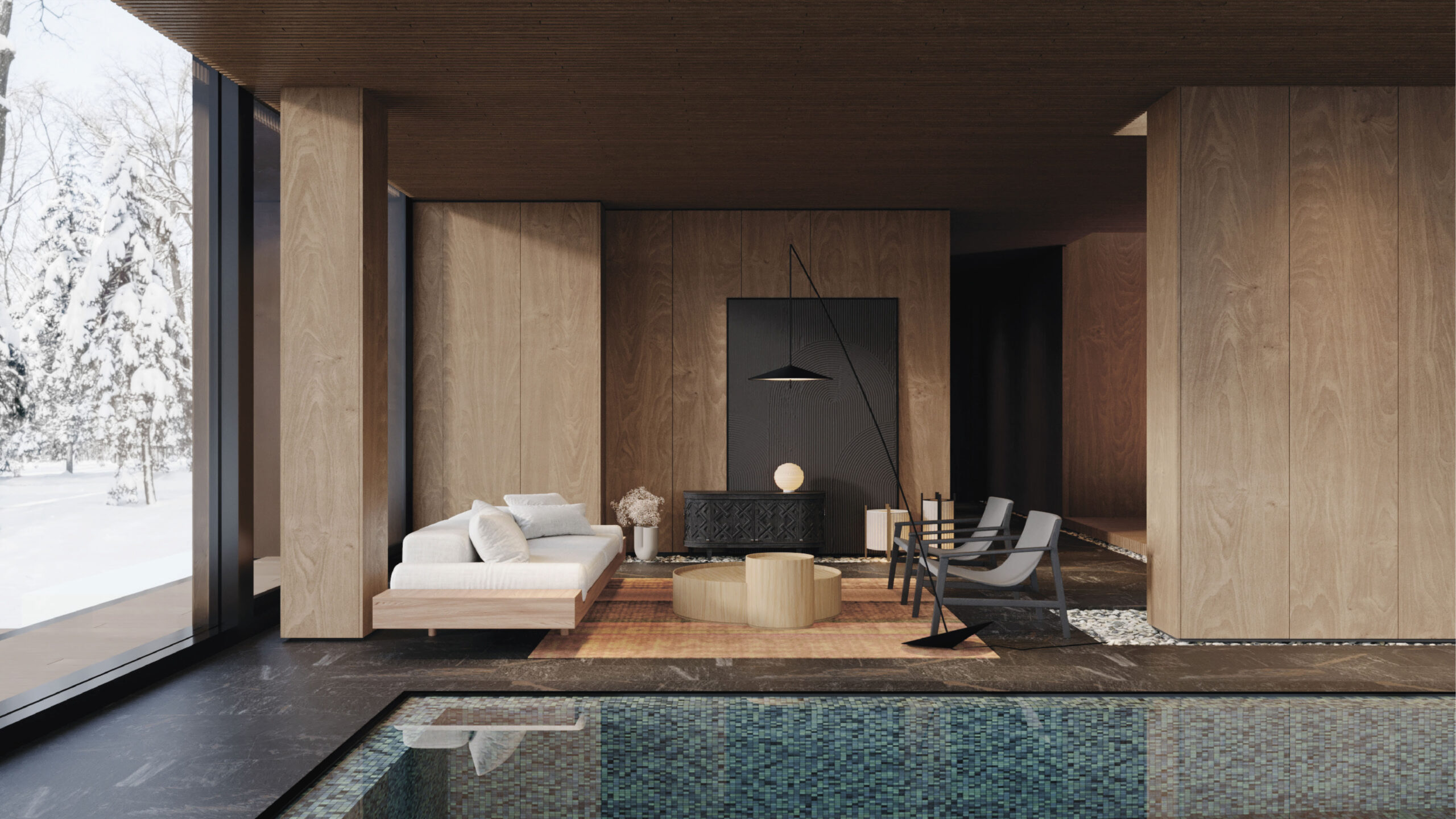
On the first floor, we have a spa area with a pool, sauna, and massage room.
This part of the house is self-contained and separate from the rest of the first-floor common area.
In addition to the formal meeting area and pool, there is also a home office, utility area for staff, guest room, and parents’ quarters. The house has 8 bedrooms en-suite.
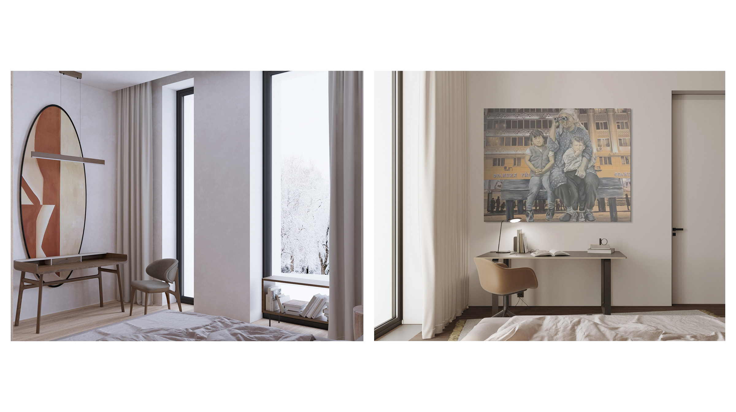
The home office combines several functions, serving as both an office space and a study area for children, allowing them to study and complete homework without distractions.
The guest room has a restrained design with subtle references to oriental culture throughout, like the other spaces in the house.
Equivalent in comfort and quality to the guest room, the staff room provides amenities for staff members.
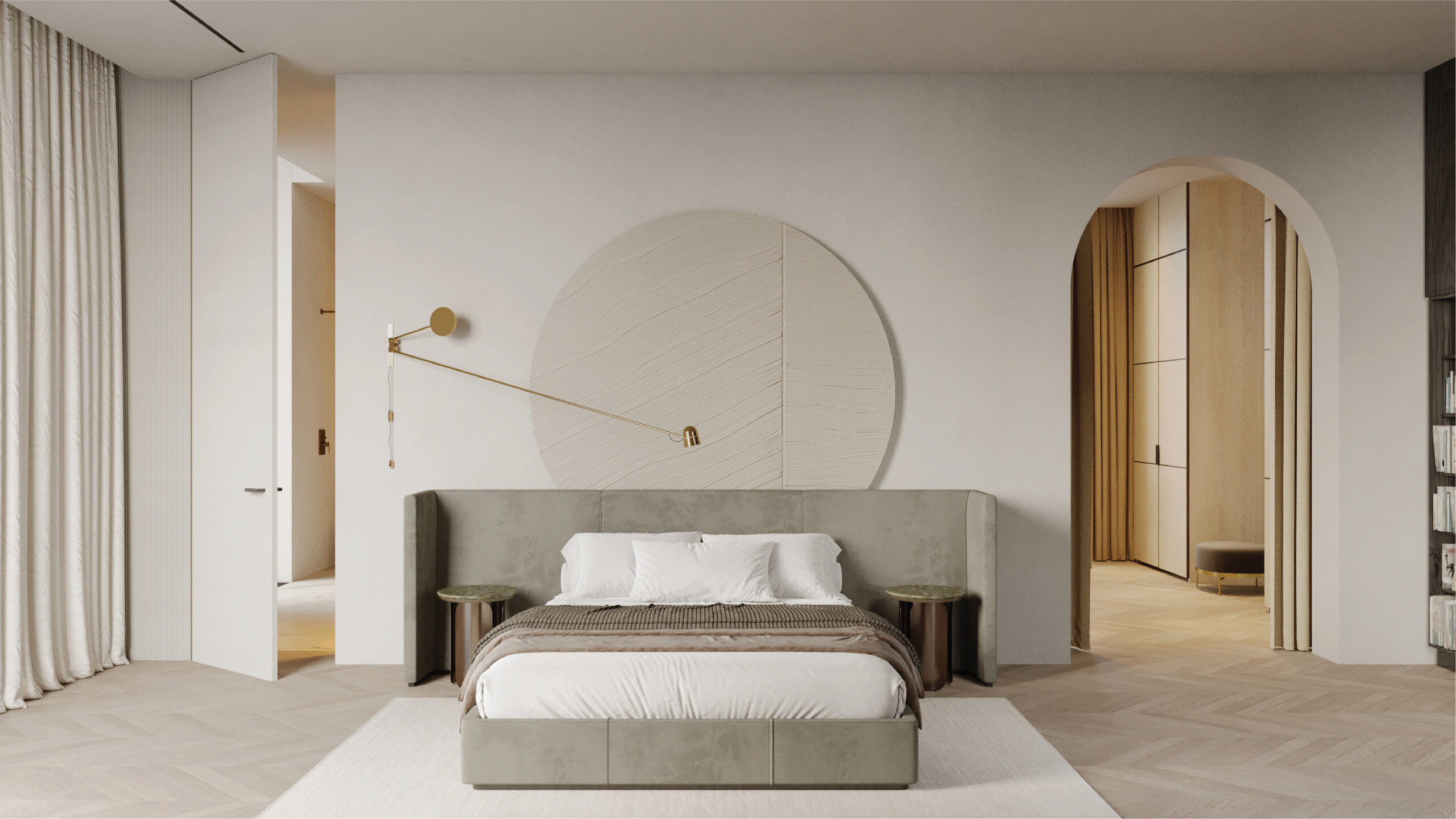
The parents’ quarters are a fully-fledged separate residence within the house. This part of the house is filled with comfort, a sense of warmth, and softness, something dear and pleasant.
The quarters consist of a combined living and dining area, a bedroom, a spacious closet, and a bathroom.
The bedroom and living room do not have a door separating them, instead flowing together through an open doorway.
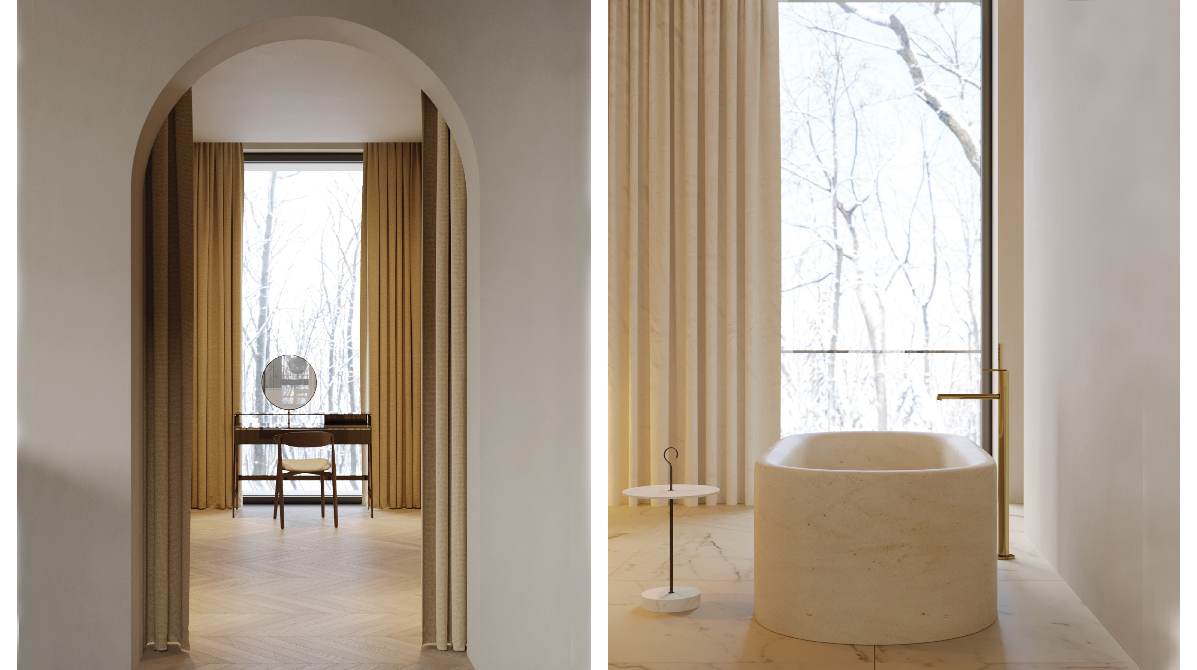
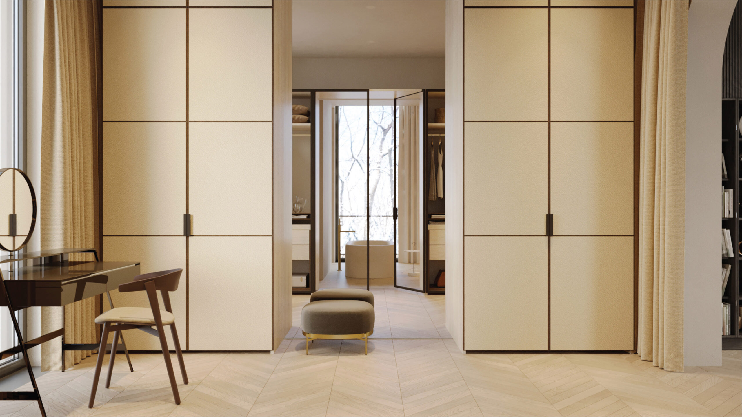
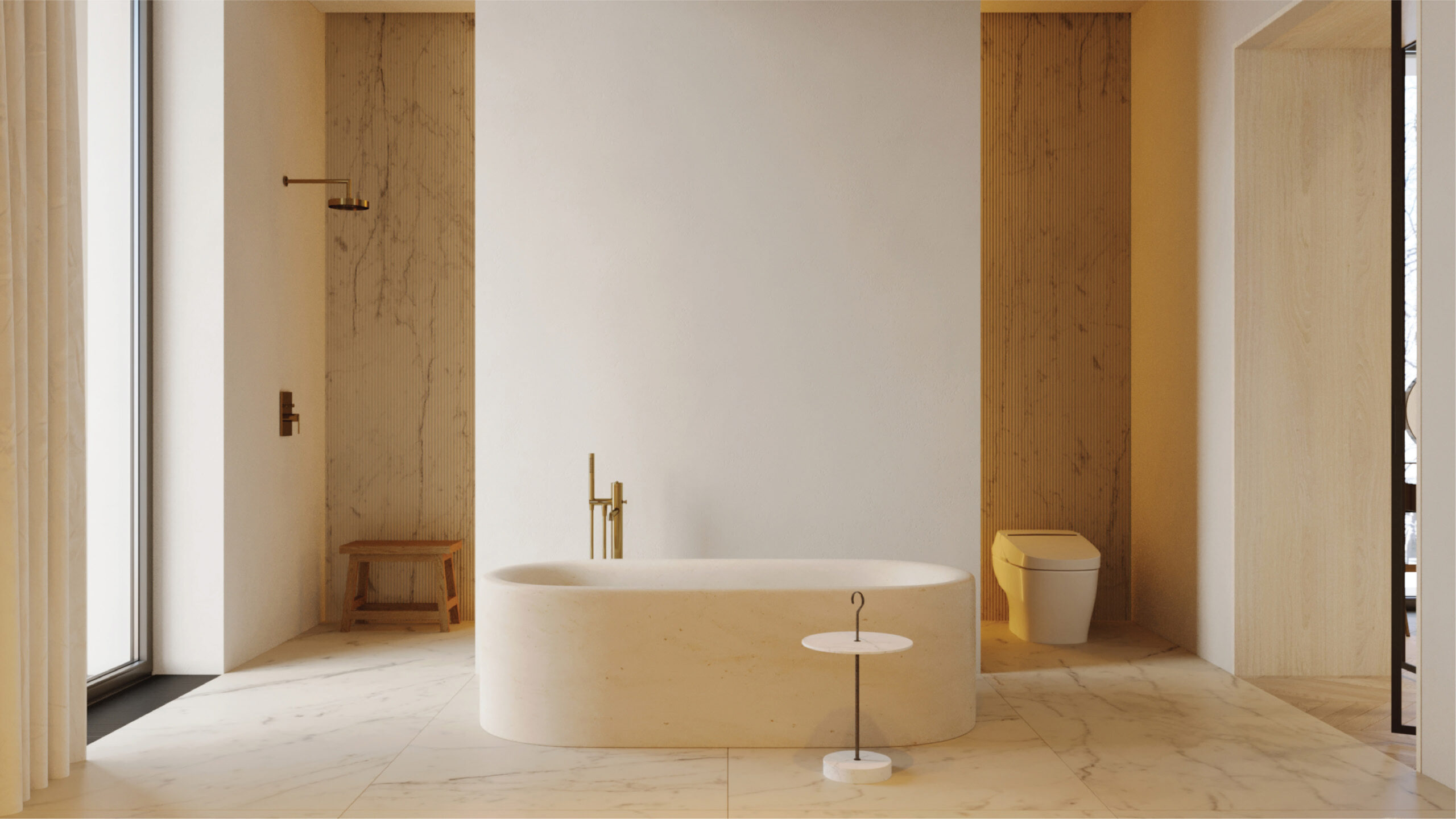
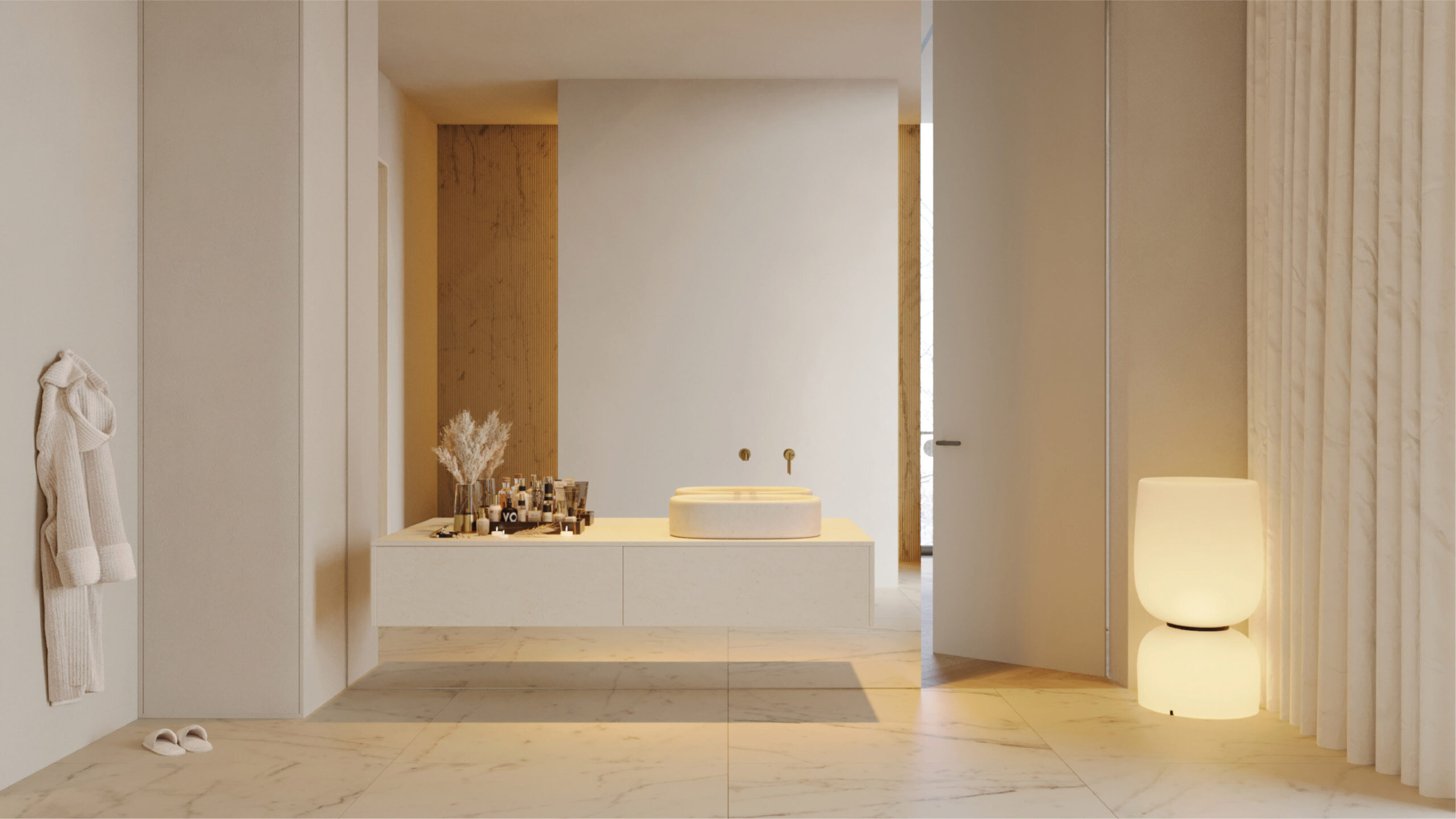
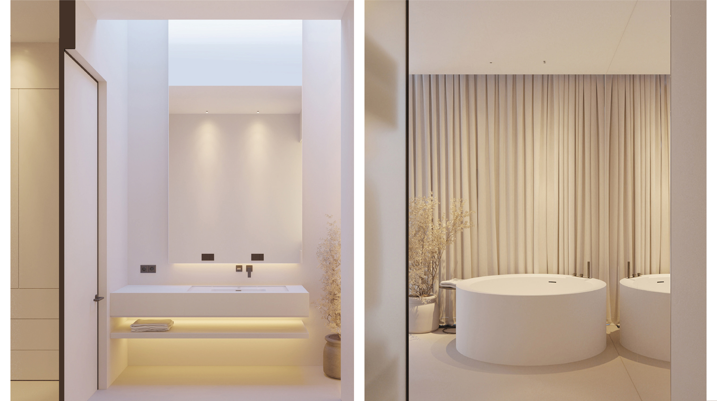
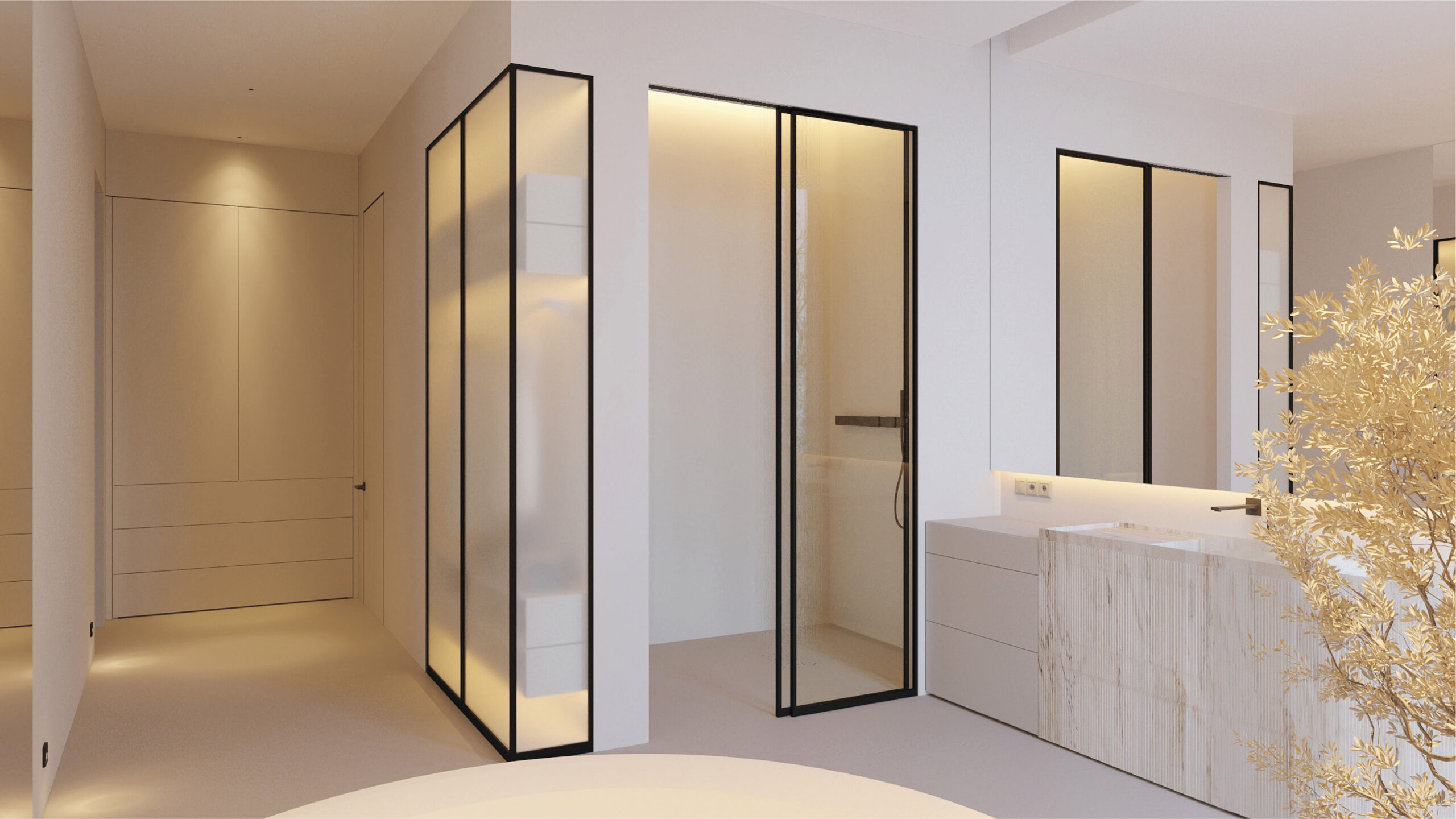
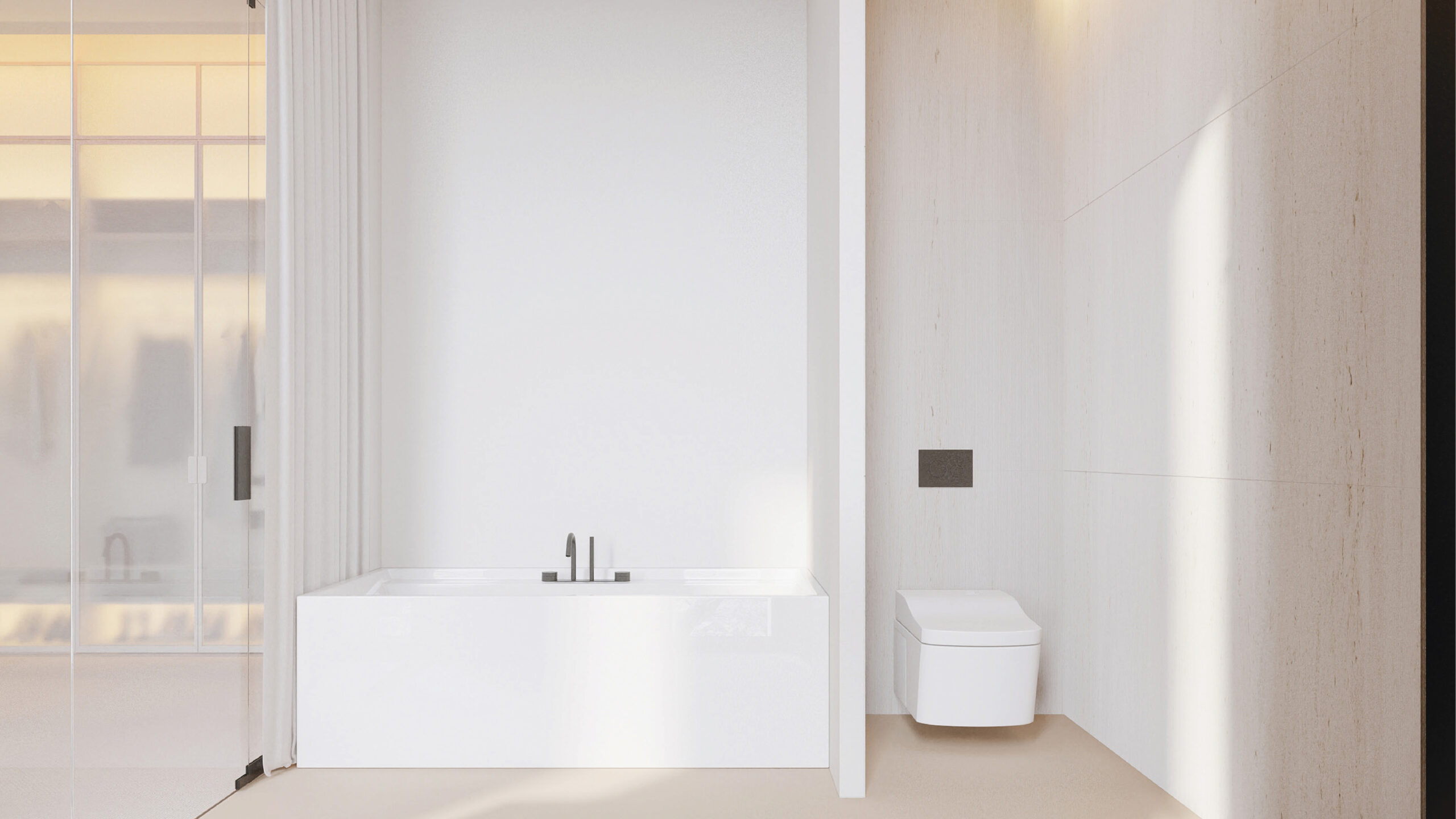
The bathroom and dressing room form a practical yet expressive part of the apartment.
Each element is in its appropriate place and draws the eye, especially the freestanding tub.
If the first floor serves as a presentation area that helps keep one in good spirits, then the second floor serves as a private family area. The entire life of this level revolves around a comfortable lounge area.
This is a space where one can gather the entire family in a semi-circular sitting zone, bringing them even closer together. From here, like from the captain’s bridge, one has a clear view of the spaces on the first floor, while rest and quality time with the family are top priorities.
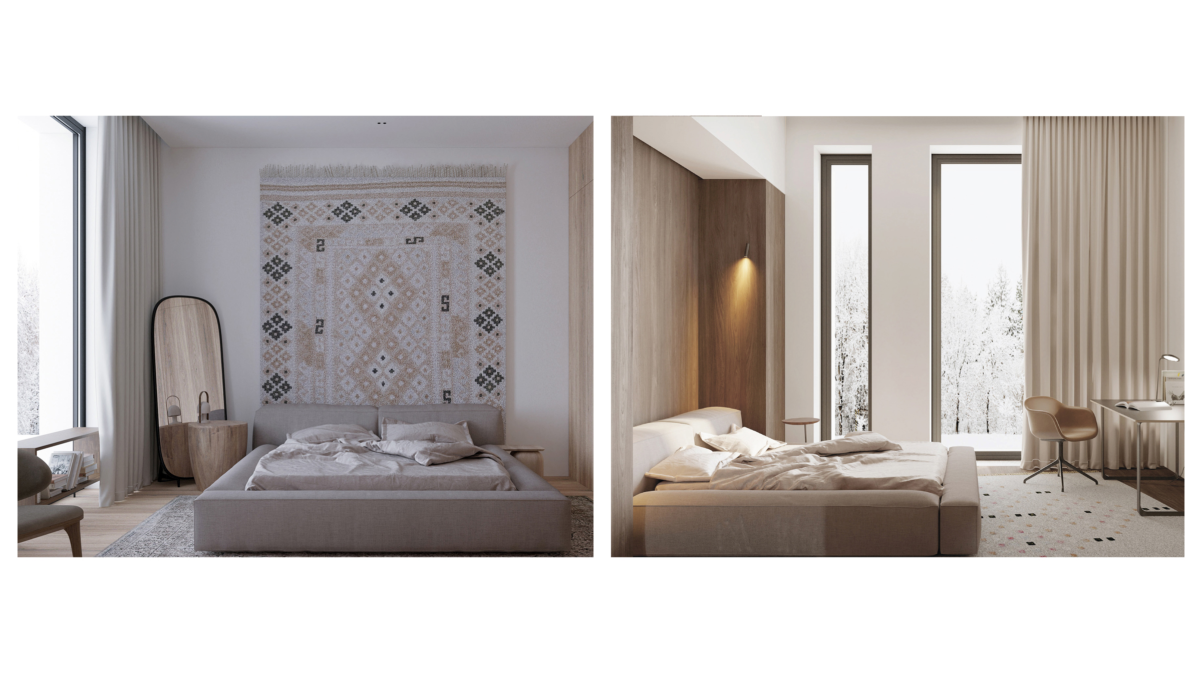
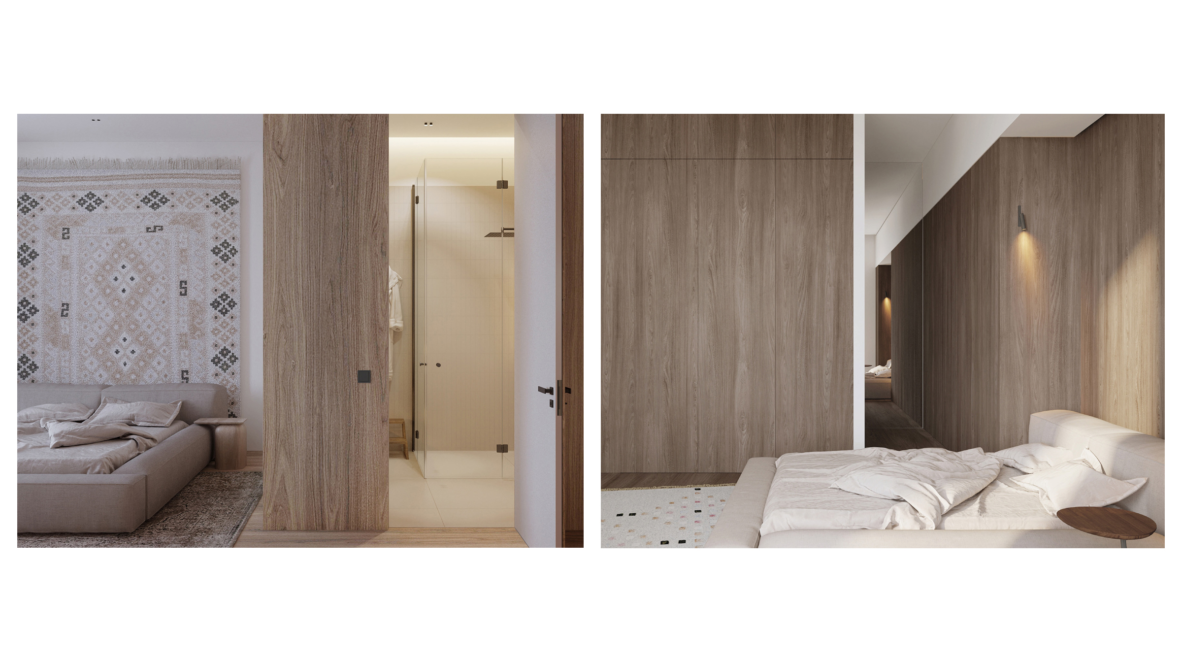
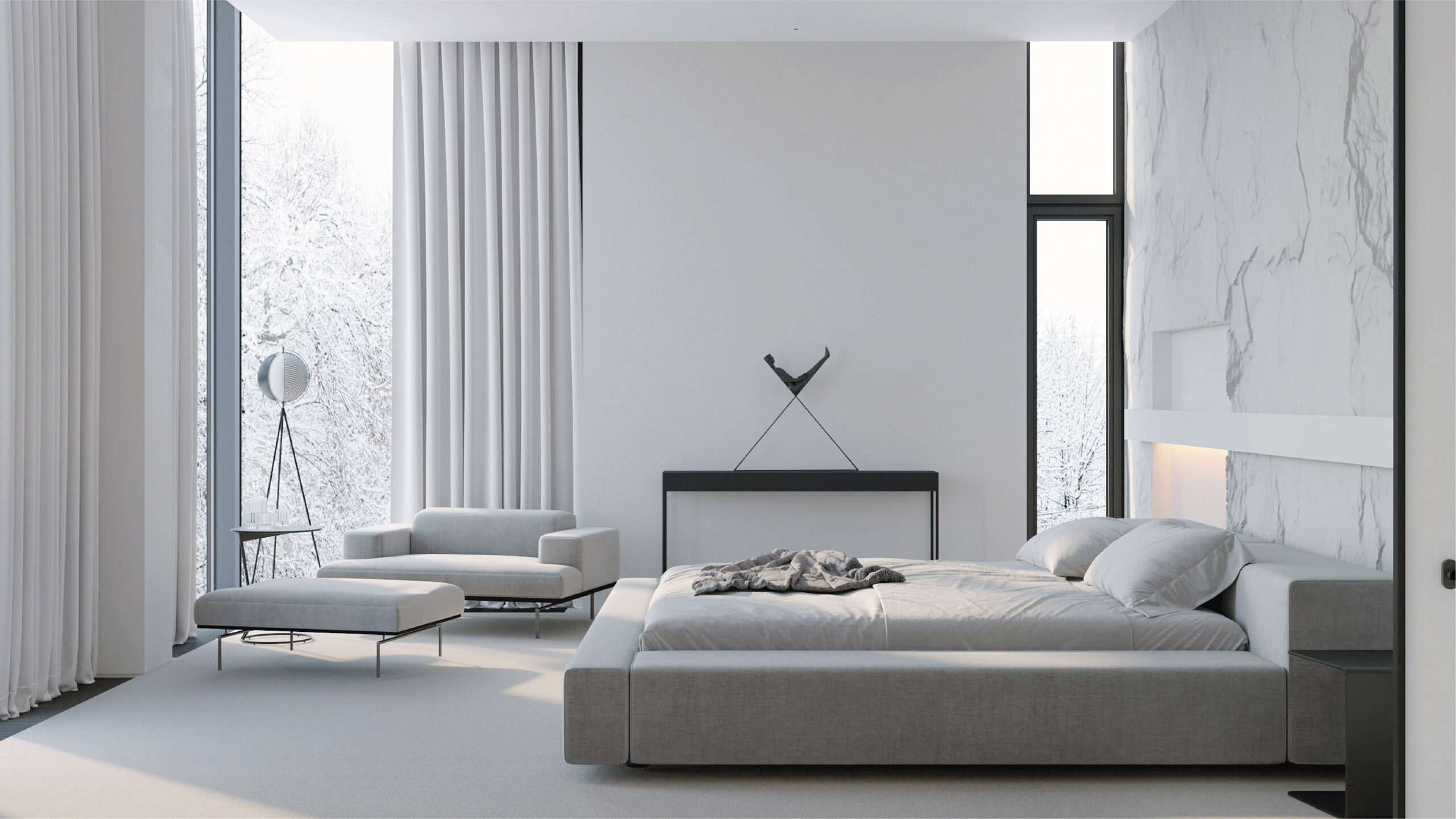
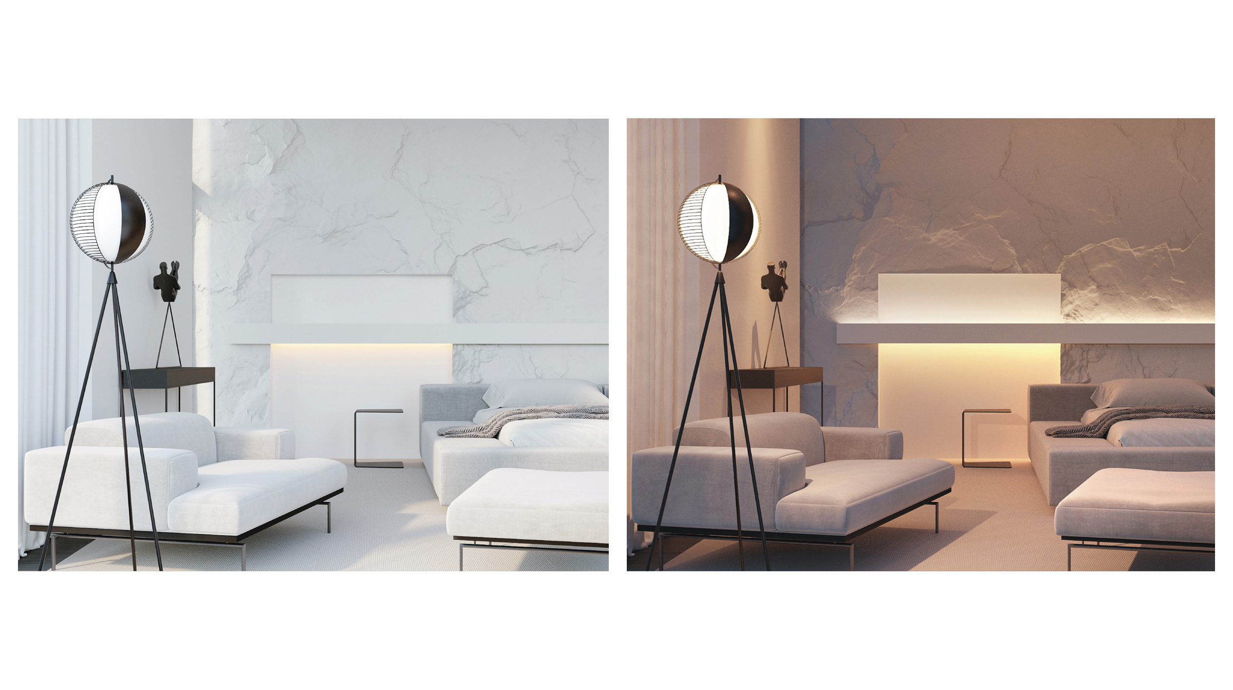
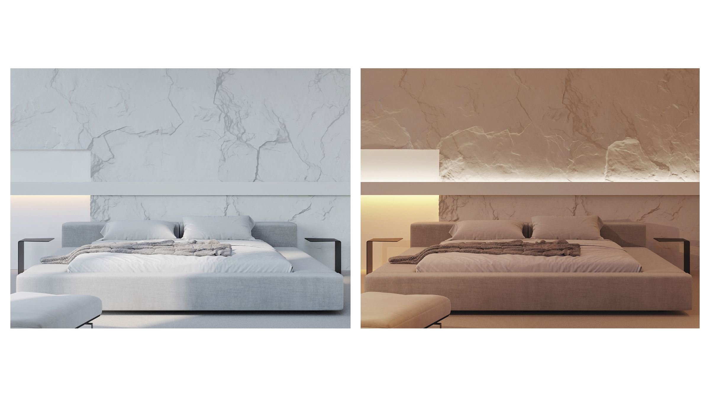
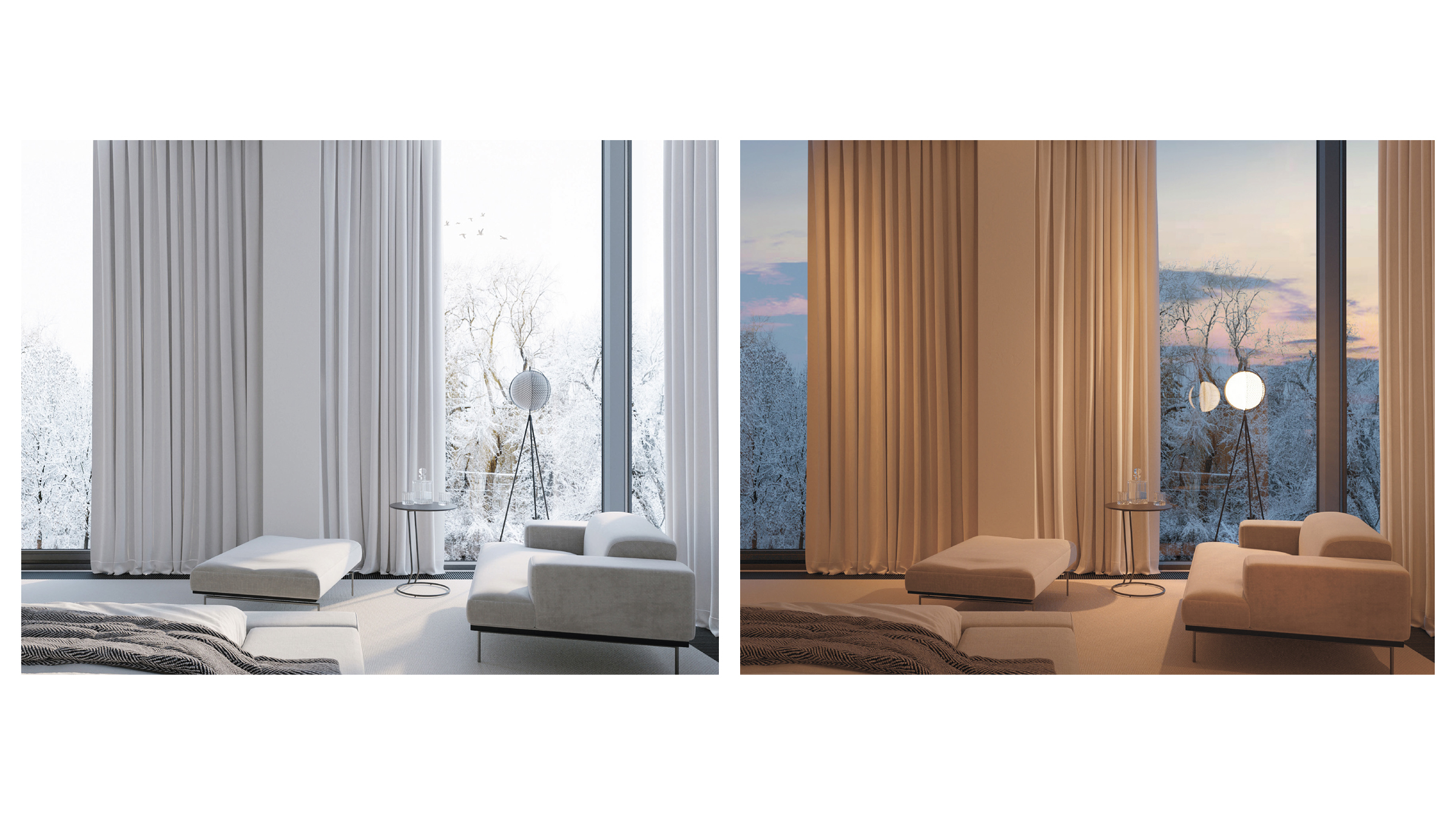
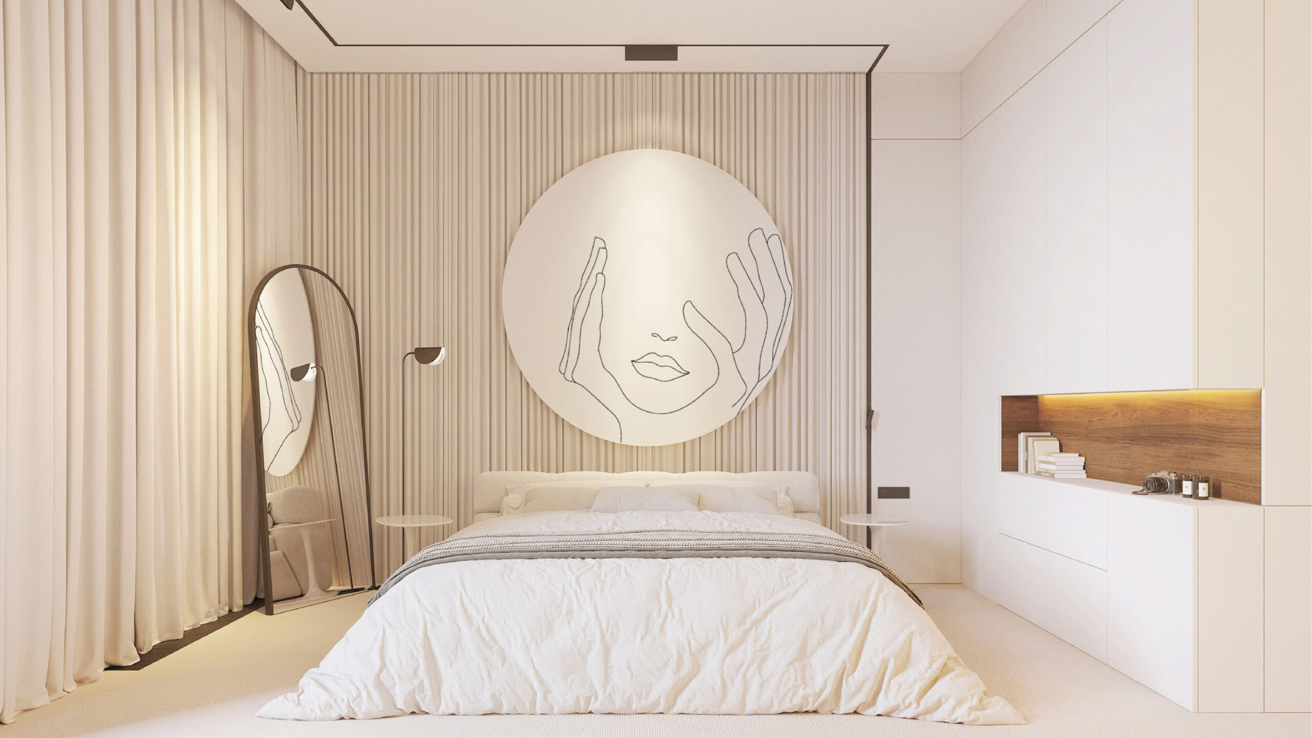
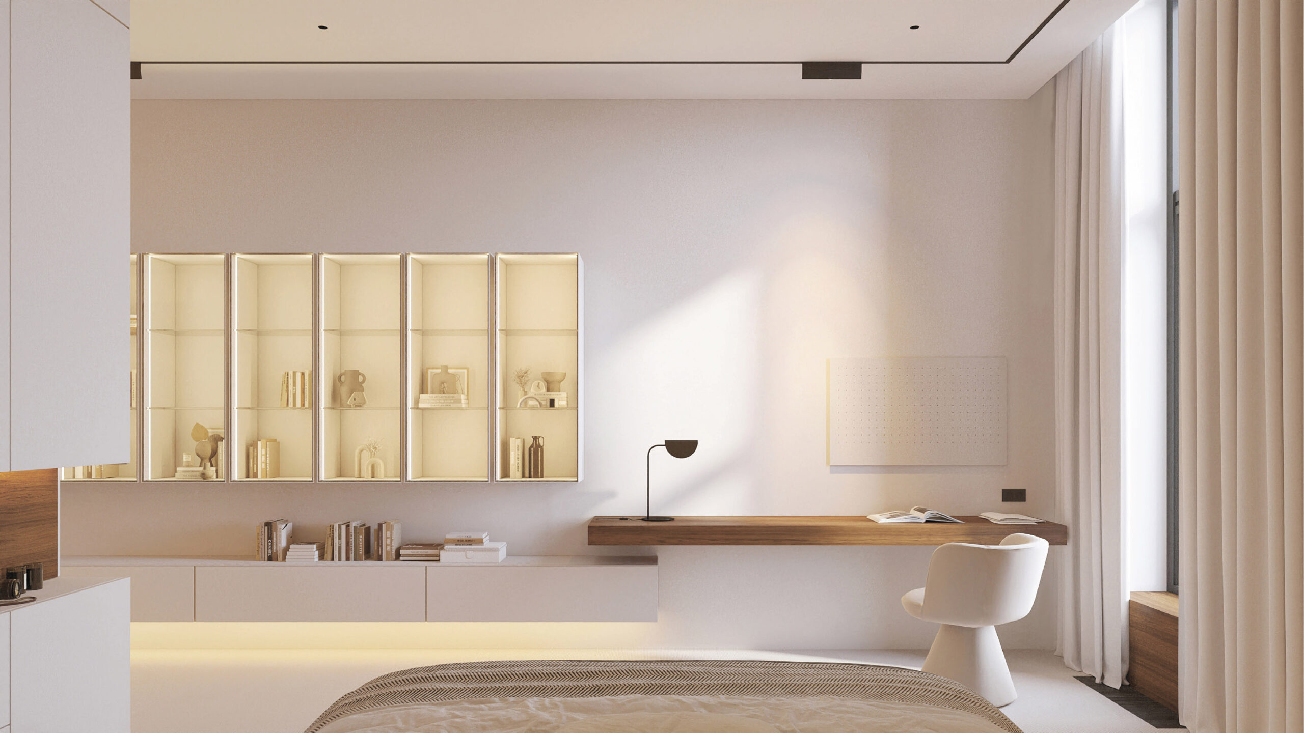
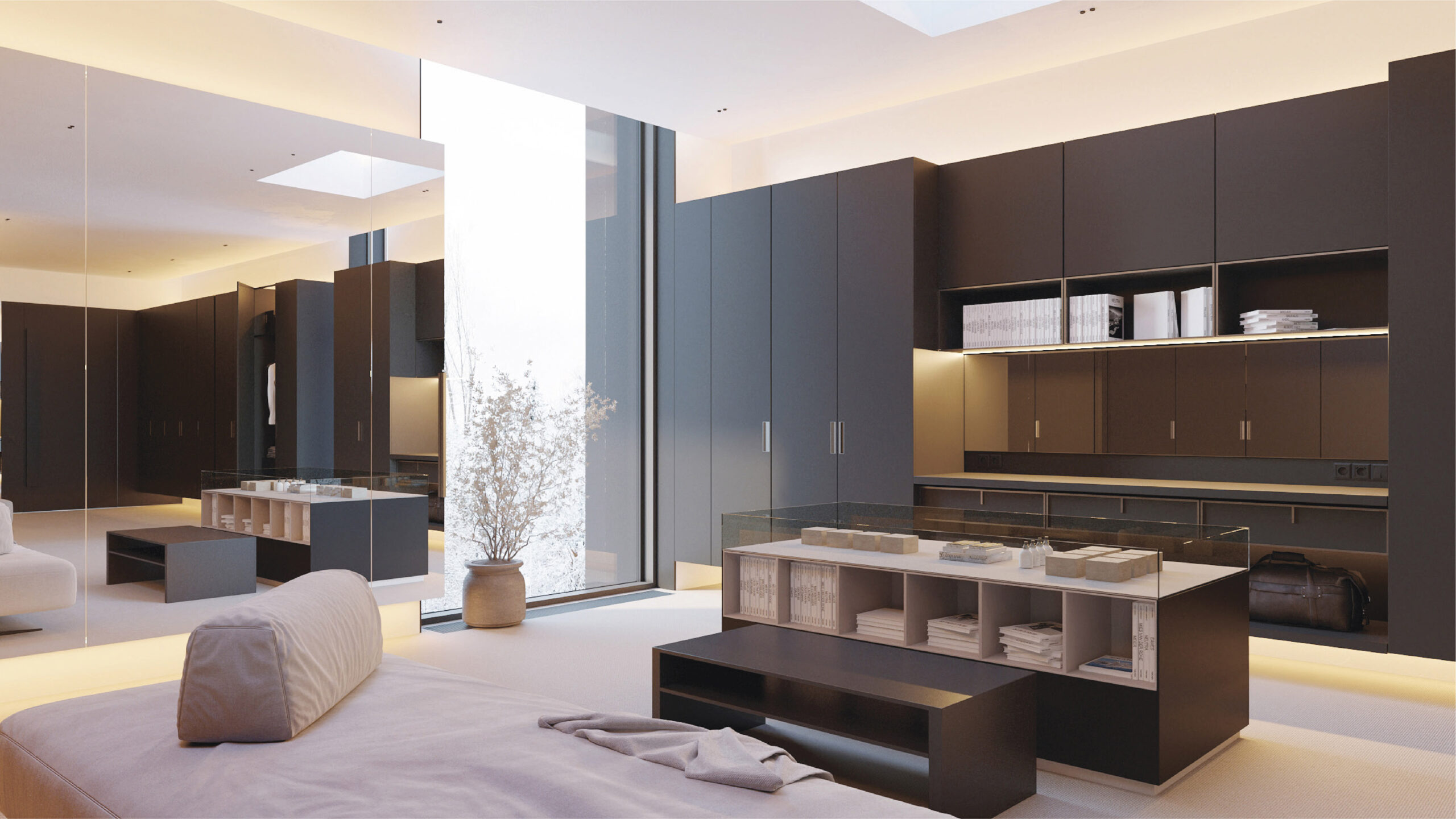
The primary bedroom suite includes three distinct spaces: a bedroom itself, a bathroom, and a dressing area. These spaces complement each other, and they are based on a shared philosophy.As a whole, this part of the house is perceived as a naturally, cleanly, and brightly designed space. Eco-minimalist principles can be found in every detail.
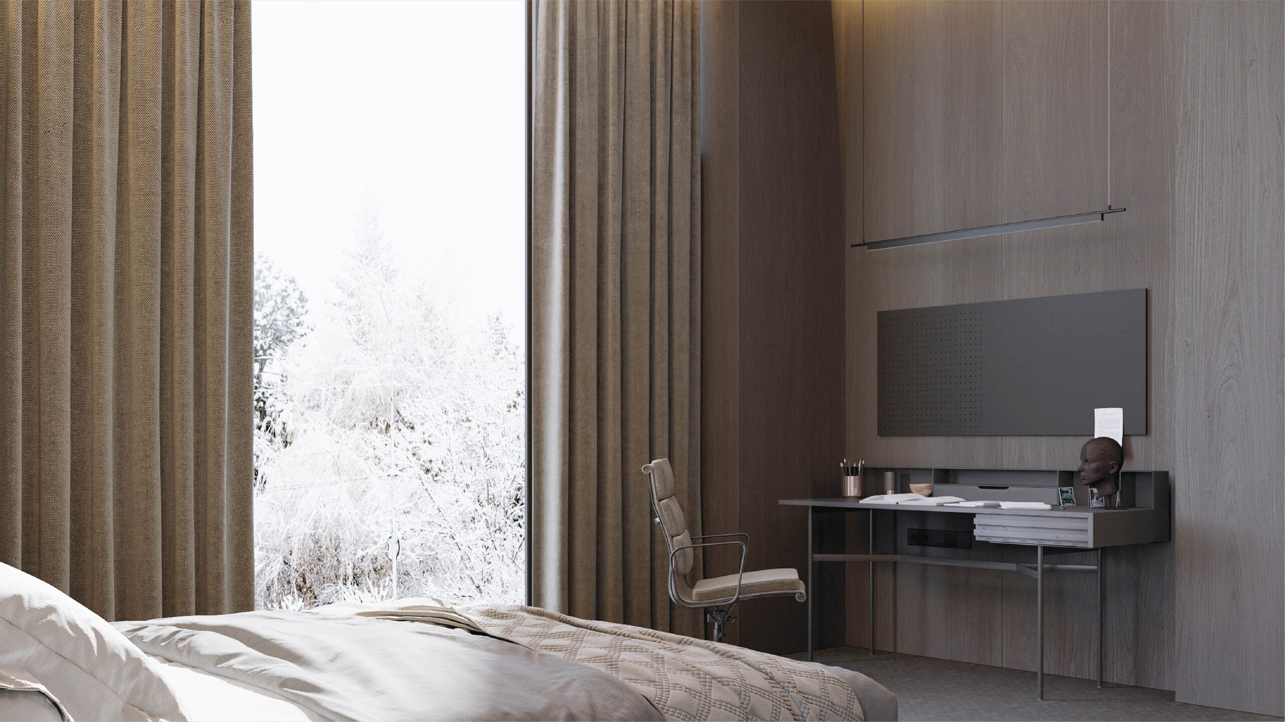
The bedroom itself is a tranquil place for sleeping and relaxing, so all unnecessary items remain outside the room. There are no electrical outlets in the room, and the temperature is kept at a comfortable level. Natural, tactile materials are used throughout the room.
The closet combines three functional spaces:
— storage for clothesl;
— a work space where one can organize their things upon arrival;
— a seating area for resolving unexpected work-related issues.
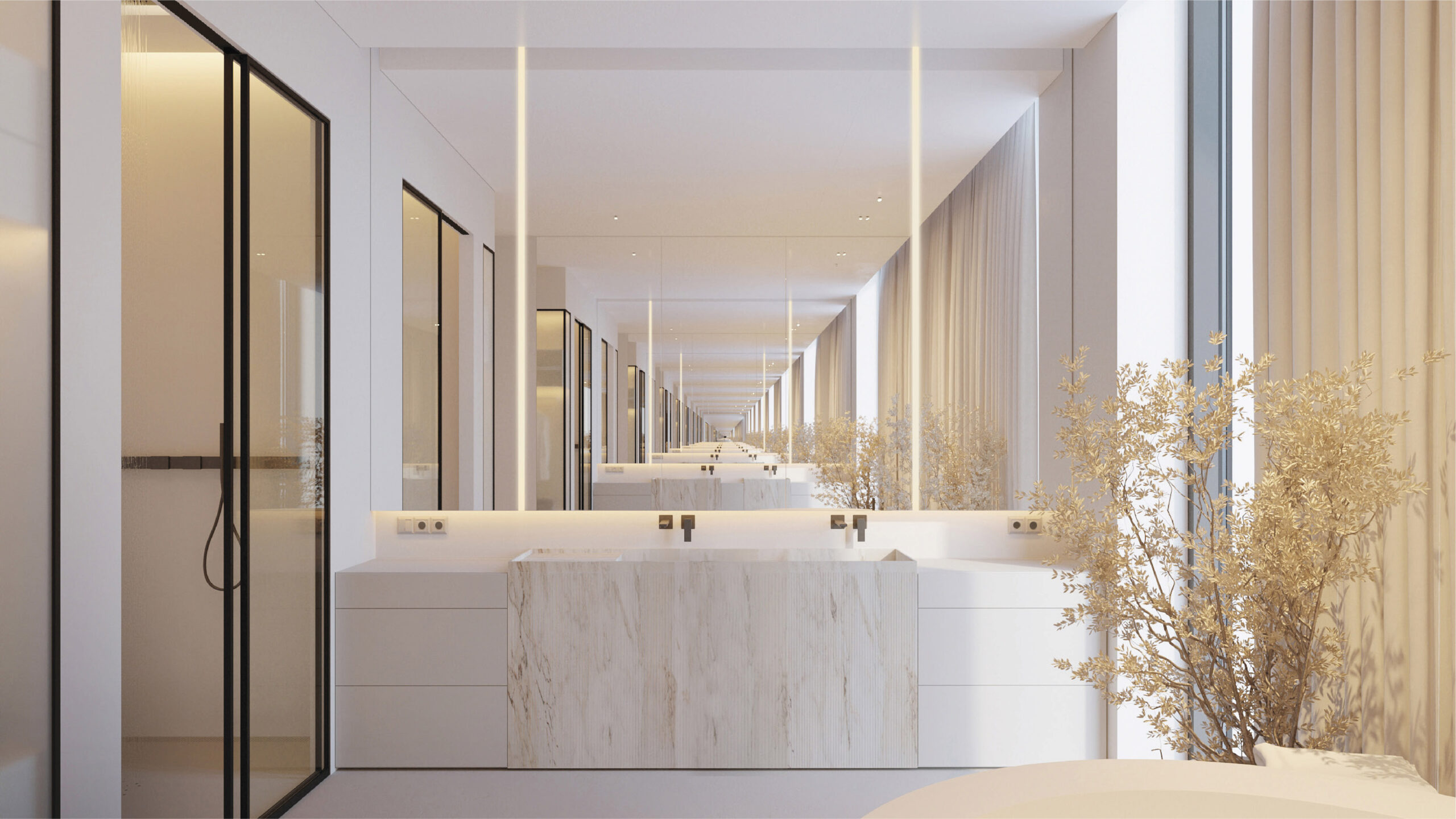
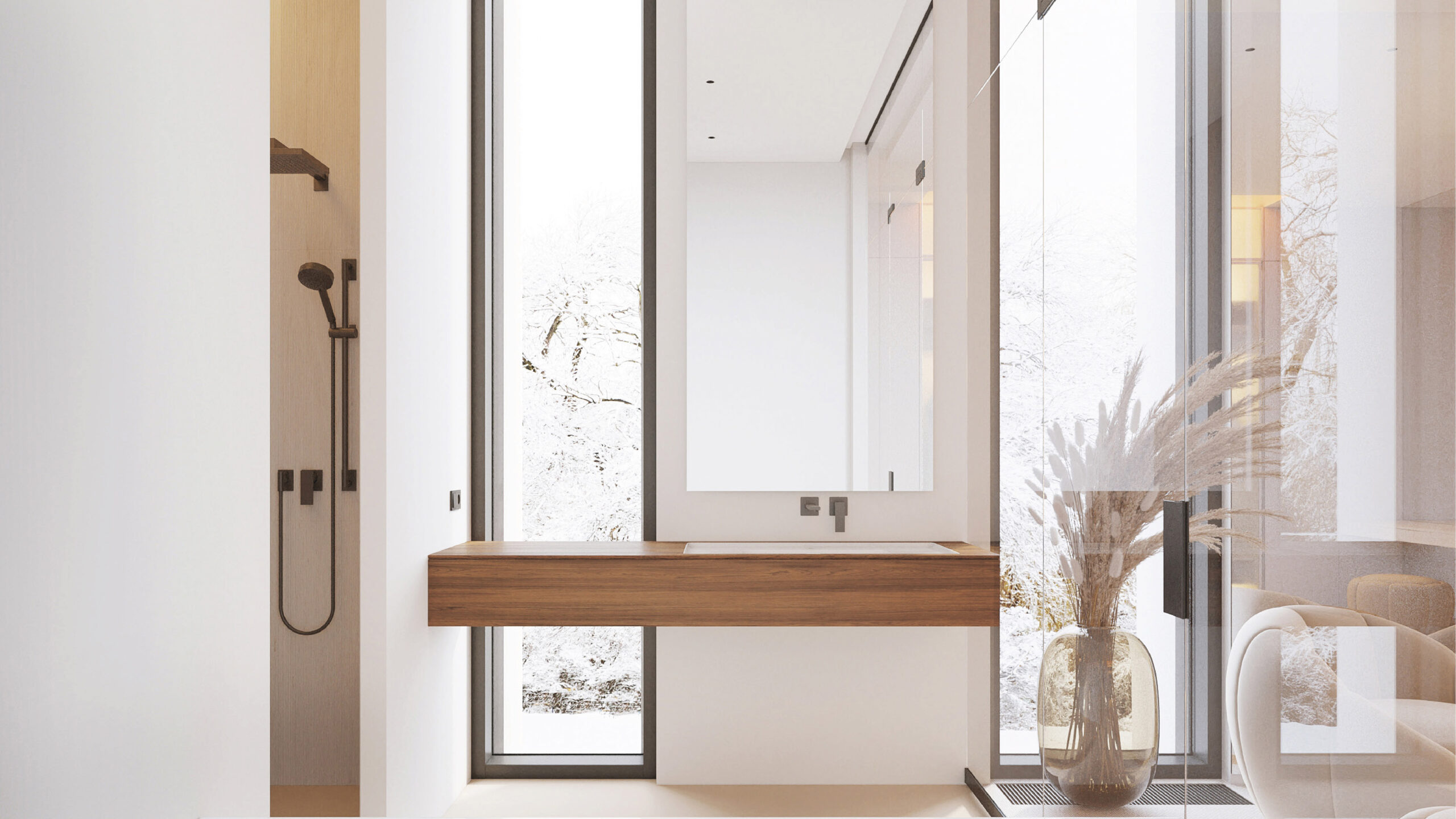
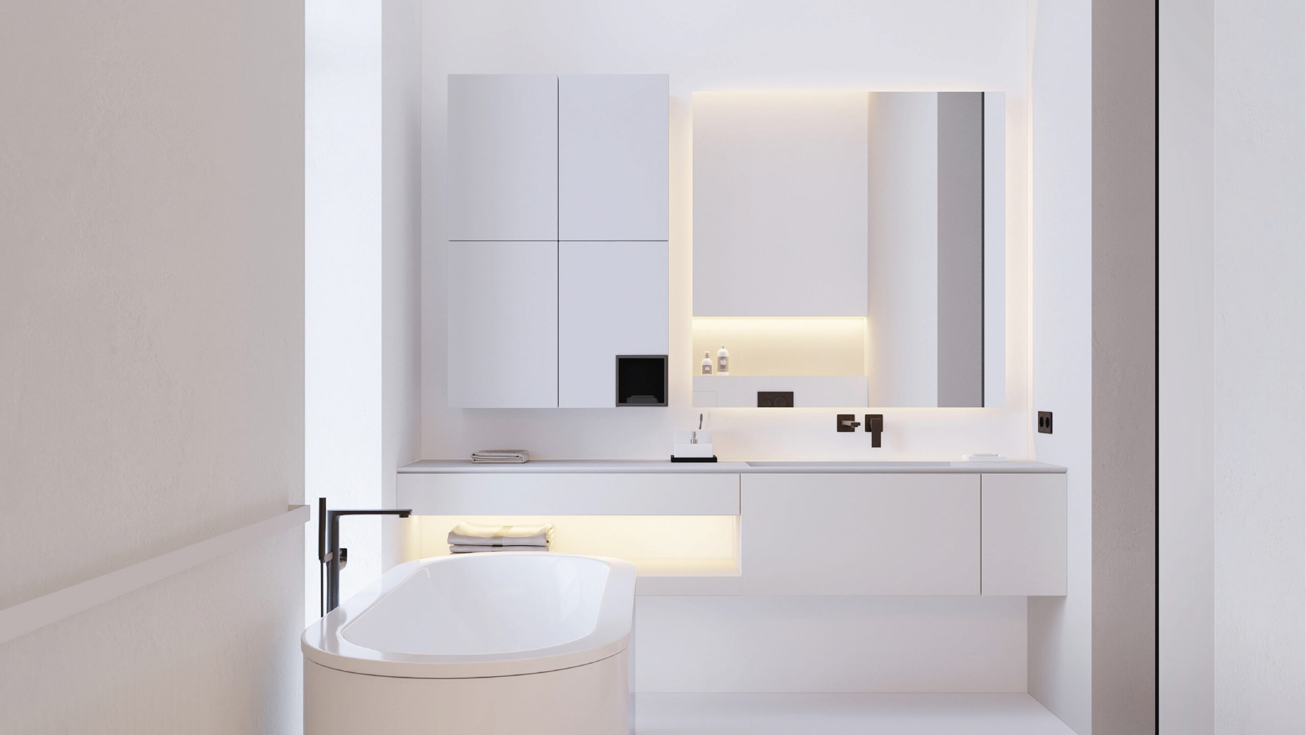
The bathroom design is quite traditional and straightforward. This space is separated from the bedroom in order to create a comfortable environment suitable for people with different daily routines.
It has all the essentials: a shower, bathtub, long sink, and large glazed windows. Freedom and light as much as possible.
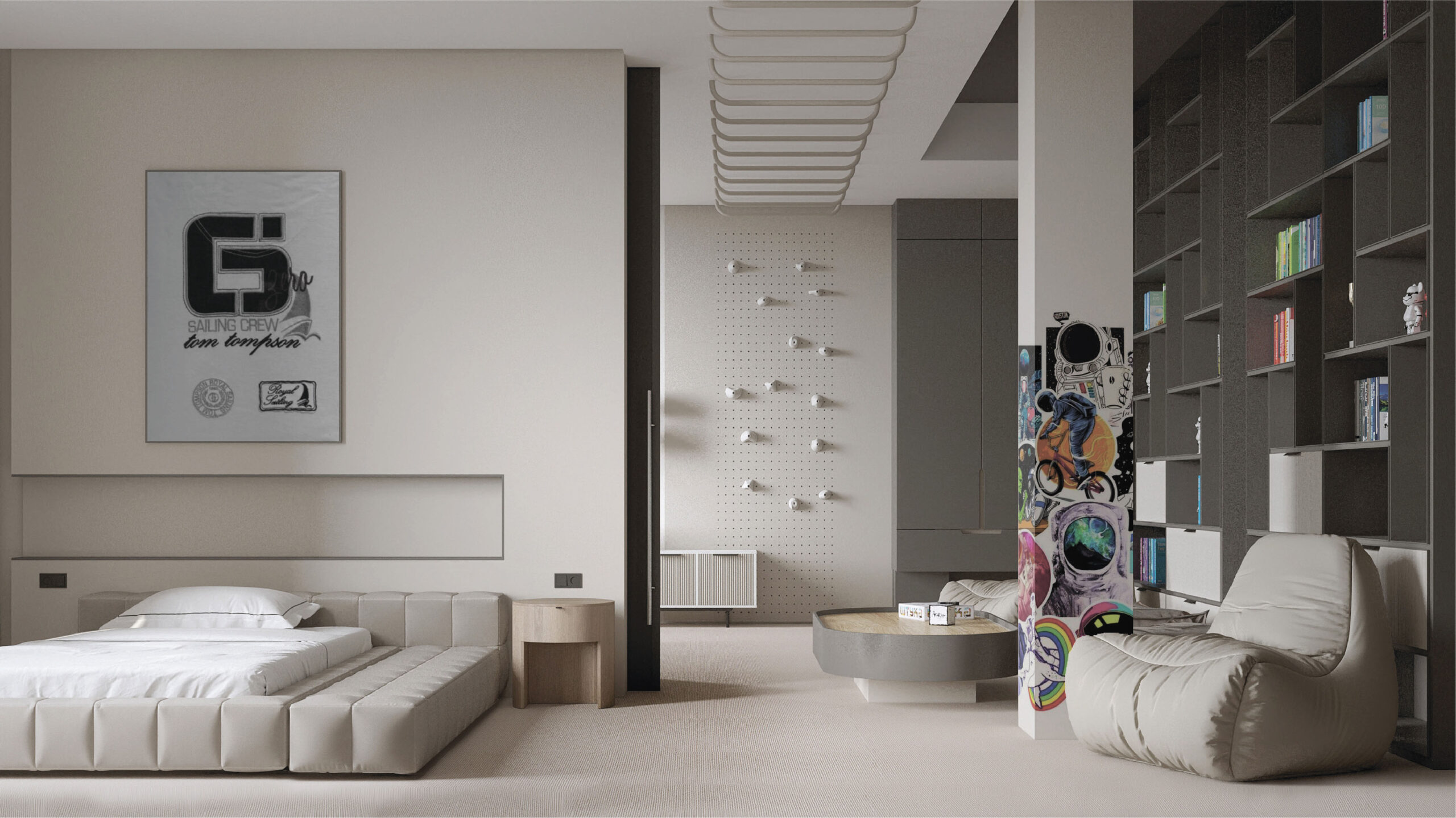
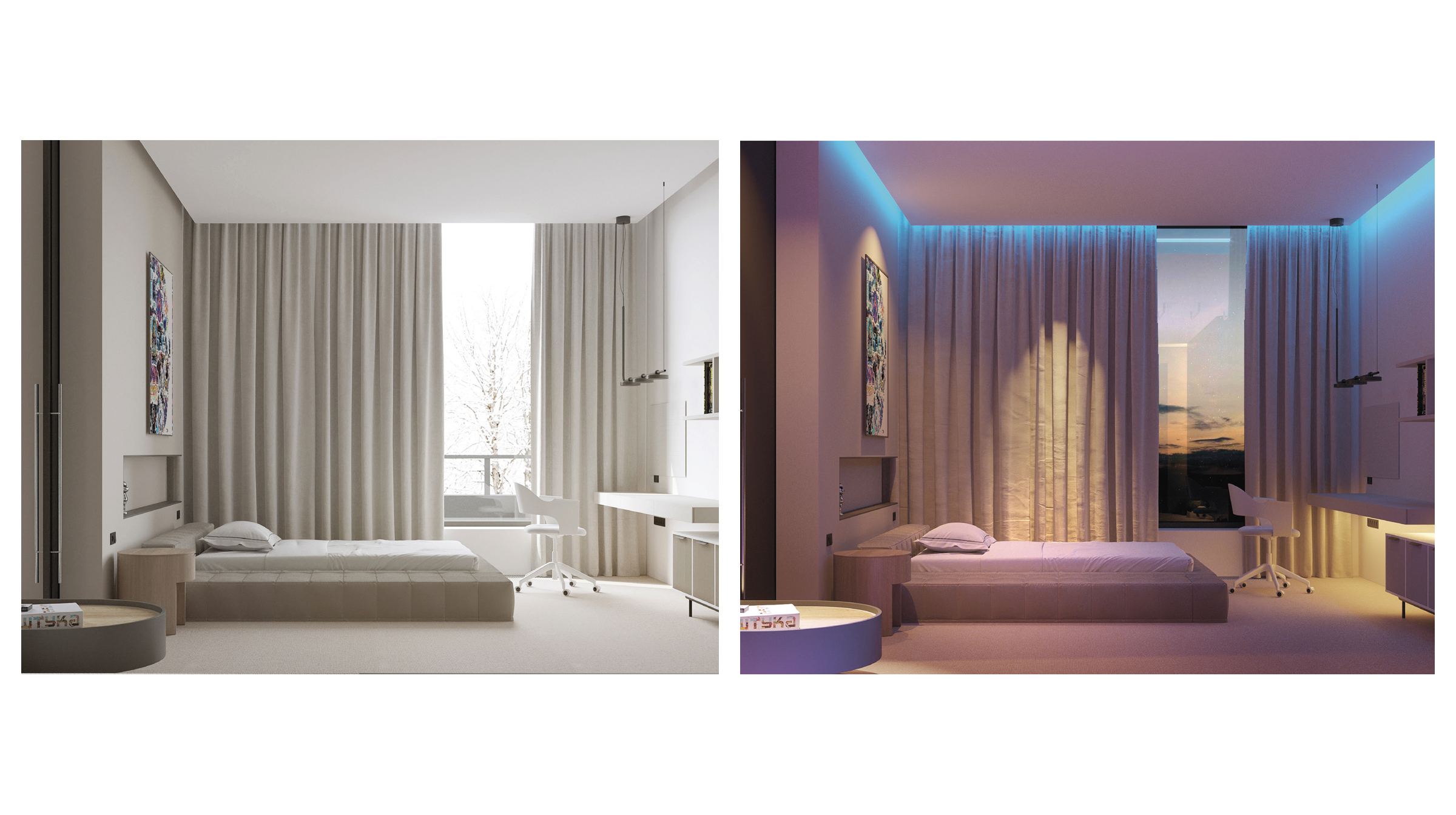
The twin’s bedrooms are among the most interesting parts of the house. During the design process, a thorough analysis of the character and interests of each child was conducted. The rooms are identical — this design choice is driven by the situation. Originally, the rooms were divided by a wall, but it became clear that it was not possible to completely separate the children.
We wanted to create an environment where the twins could not only separate, but also easily interact and support each other. Therefore, a sliding partition was incorporated into the design, and several possibilities were explored: each child has their own private space, while a shared central play area is available, which may be made visible or invisible at times. The background for this concept is an open shelving unit with a variety of fillers.
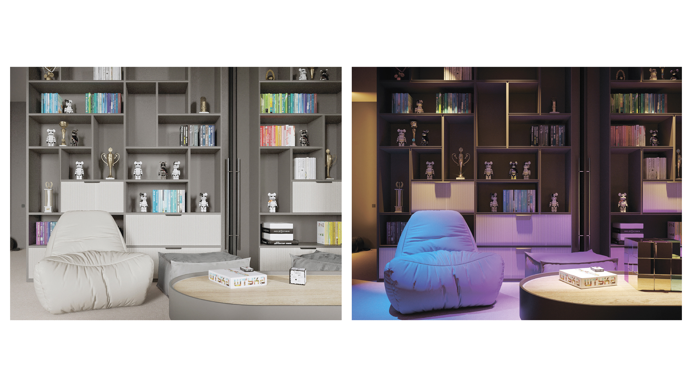
An outstanding feature here is the backlight. The children wished to see some illuminated elements in their bedrooms. To make sure the illumination is adaptive to the children growing, we provided several lighting options.
To add a touch of magic, the system allows users to select the color of lighting. Additionally, each room’s lighting is independent. It means rooms can be lit in different colors or a single color, depending on the individual preference of each twin.
An unexpected feature of the space is the column, which has got into one of the bedrooms. To make the most of it, we suggested a function that allowed the child to personalize it according to their interests. With this option, they can attach any item to the column. This reinforces the concept of experimentation and maximal self-expression.
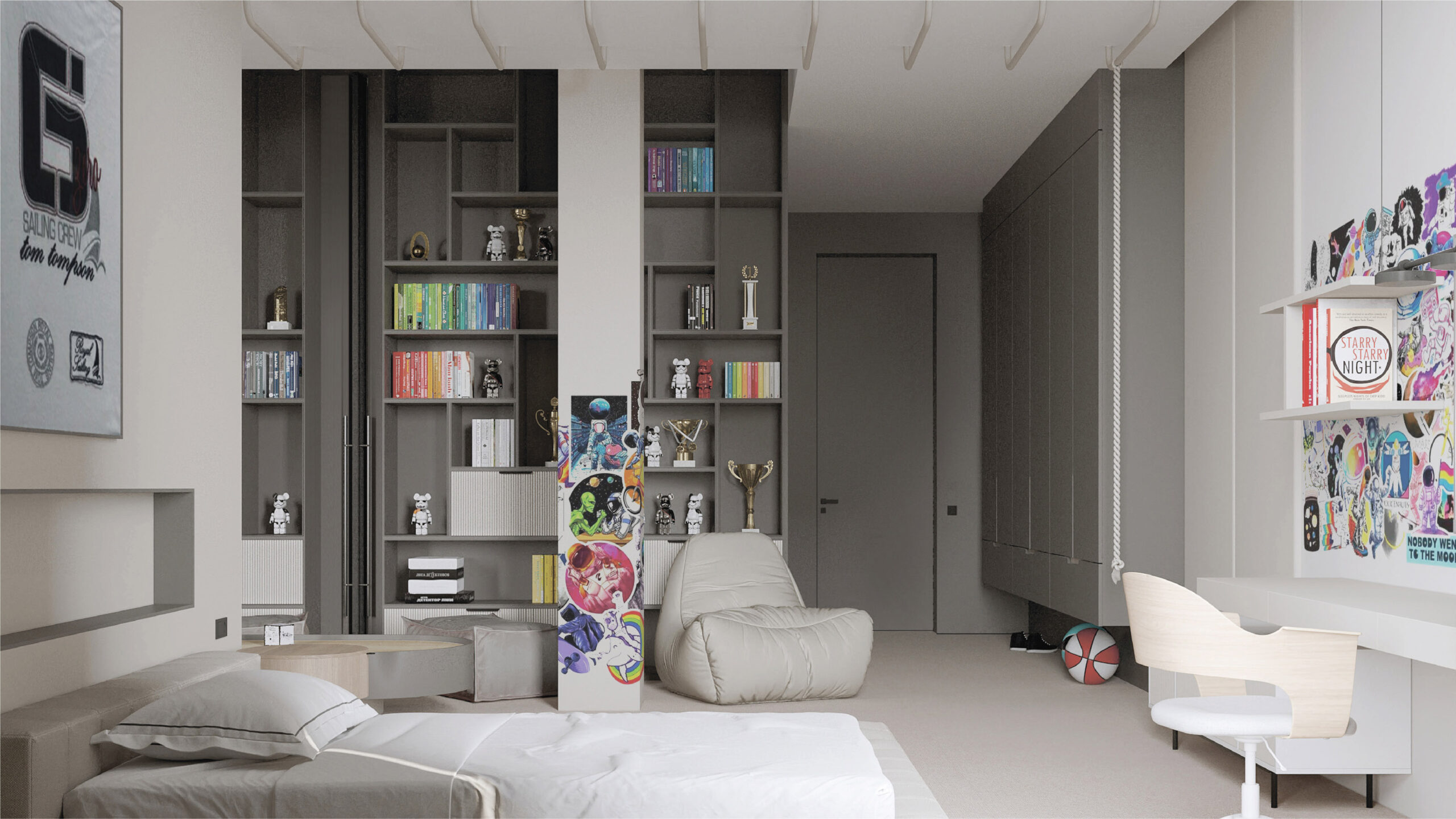
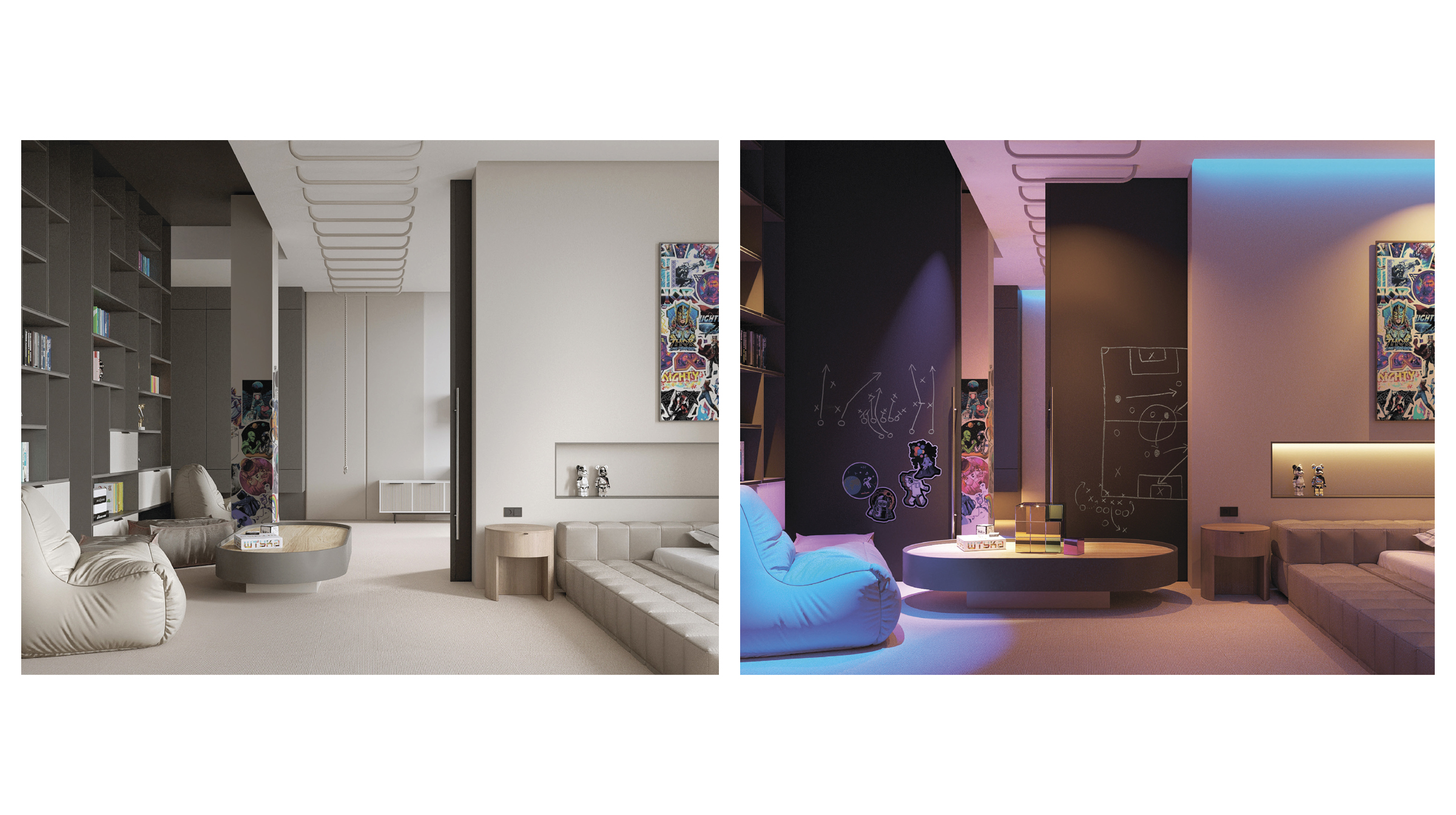
The sliding wall, in addition to delineating and integrating the bedrooms, also provides a space for creativity thanks to its chalky finish on each side.
The twins will only need to share a table that moves into one of the sections when the partition is closed. At this point, children should learn how to negotiate with each other.
For the rest, these are typical bedrooms with beds, bathrooms, and work areas.
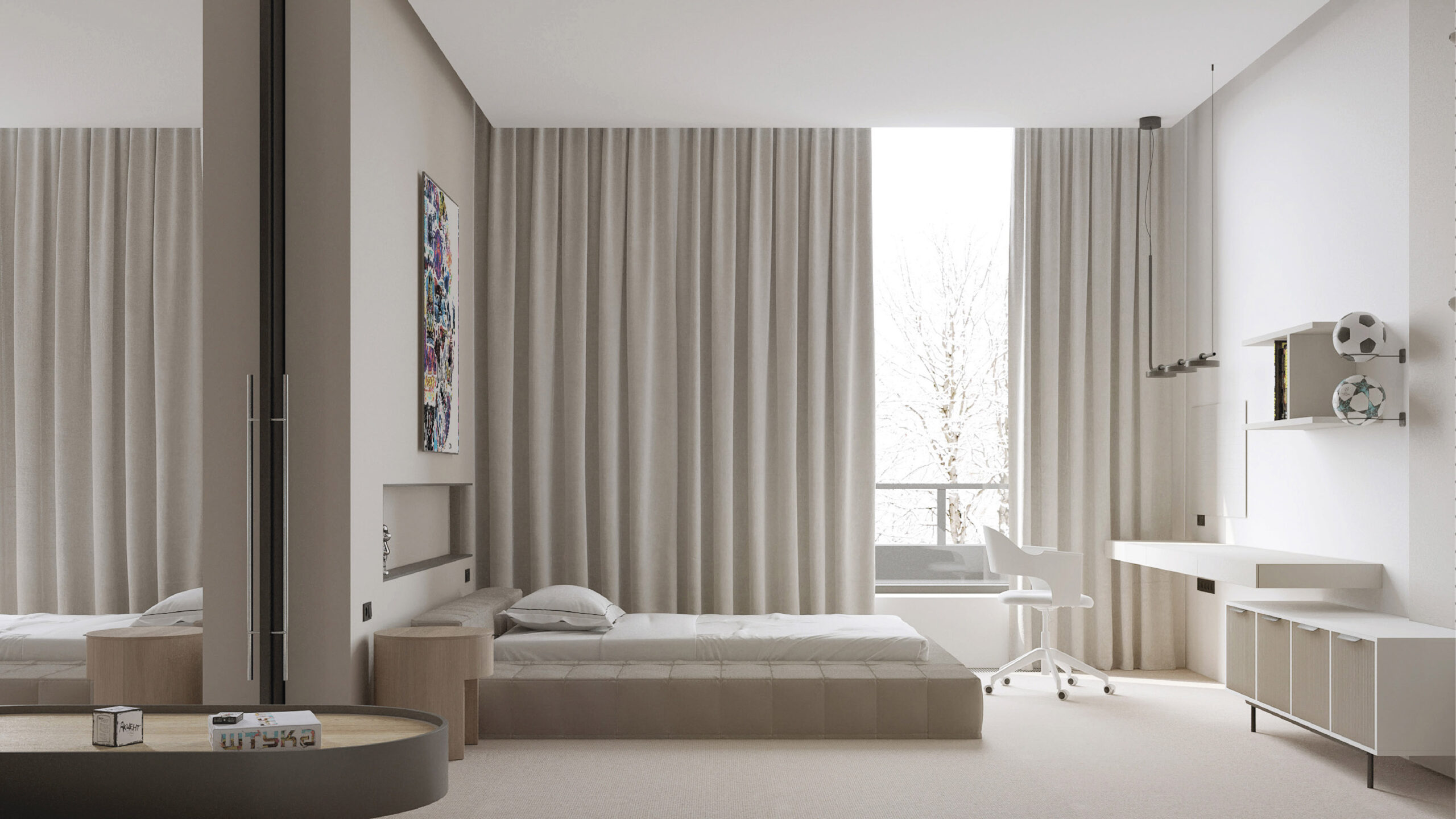
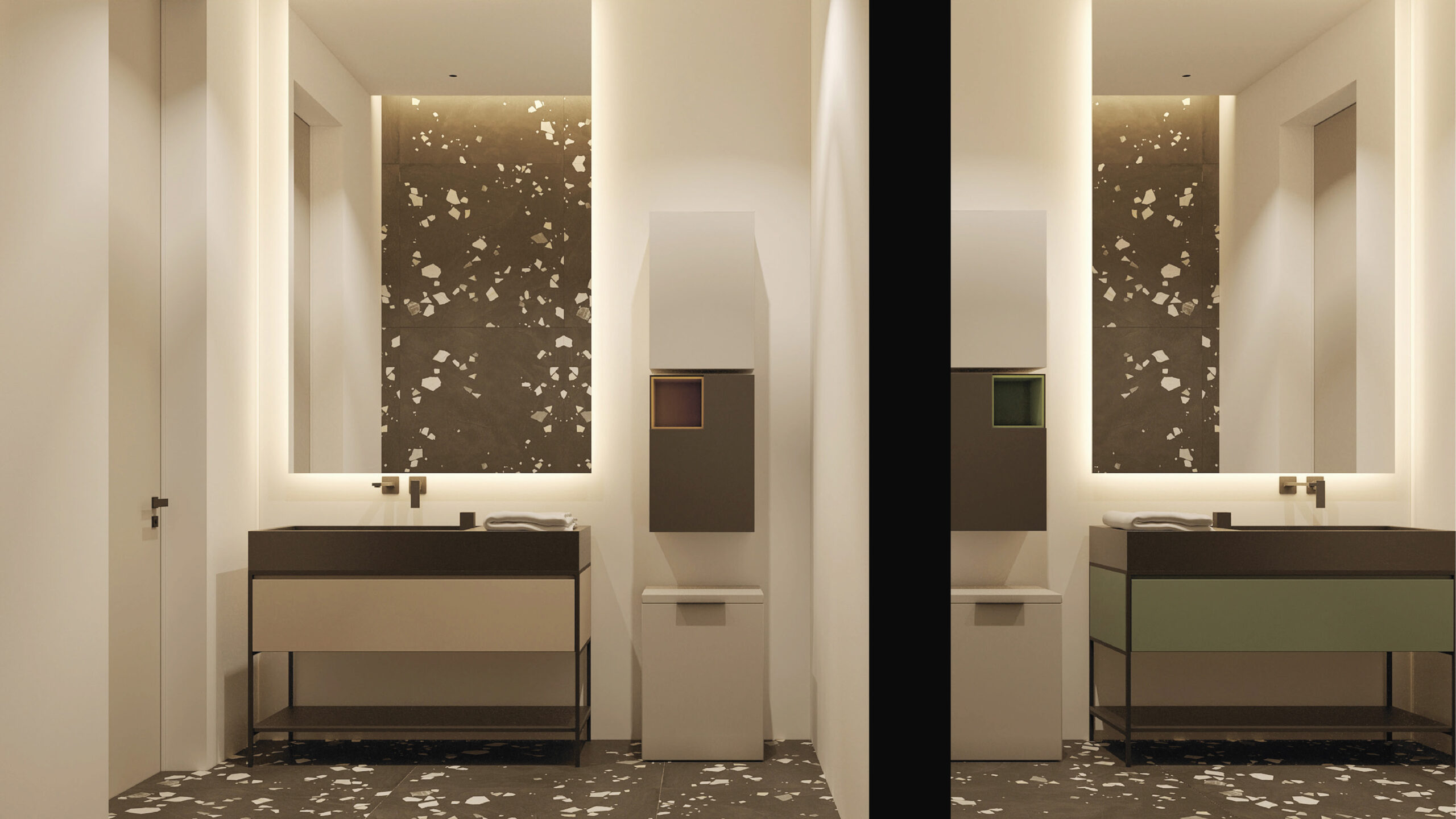
The symmetry of the spaces continues in the bathrooms. They are differentiated only by a subtle splash of color that was chosen by the children.
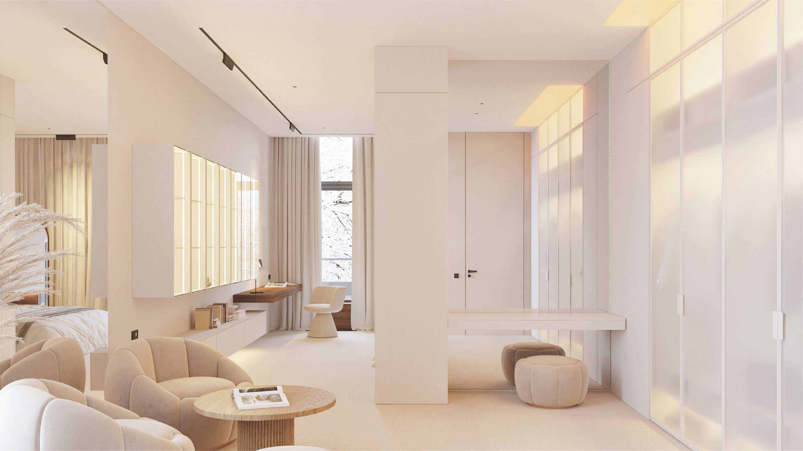
The girl’s bedroom is divided into three zones:
—a lounge-boutique that serves as a dressing room and living room;
—a bedroom with a work area;
—a bathroom with a vanity.
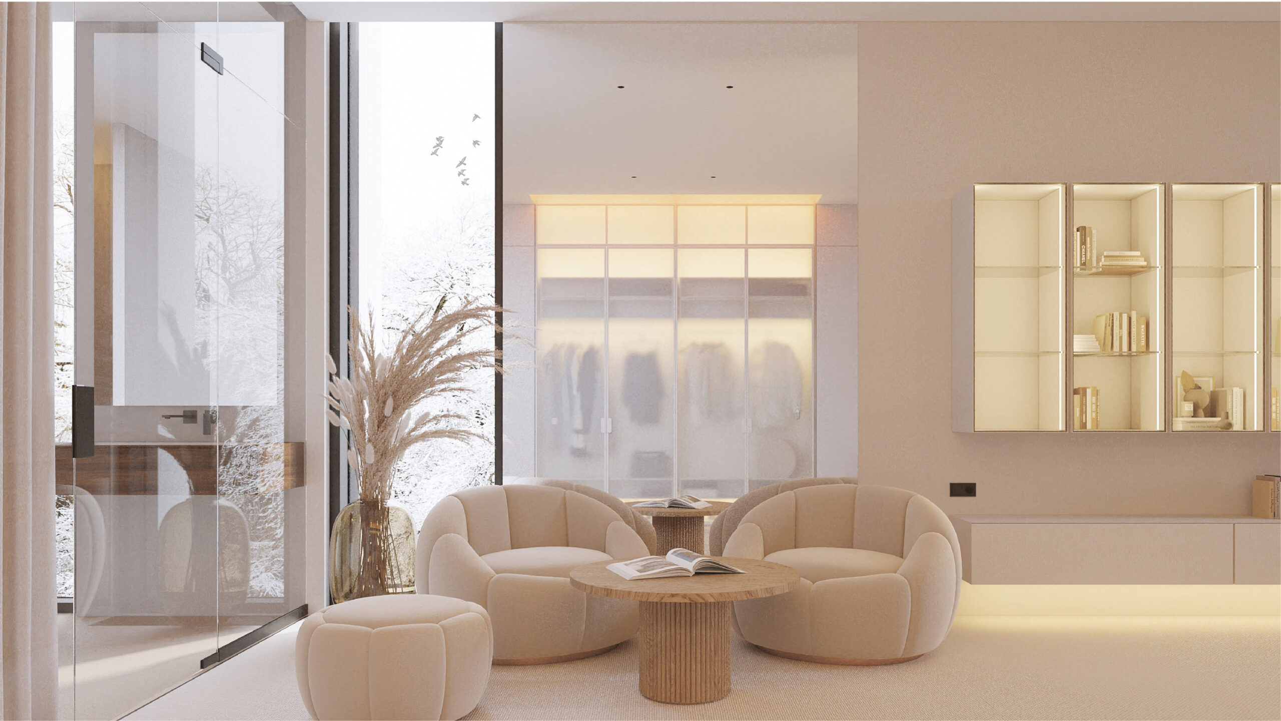
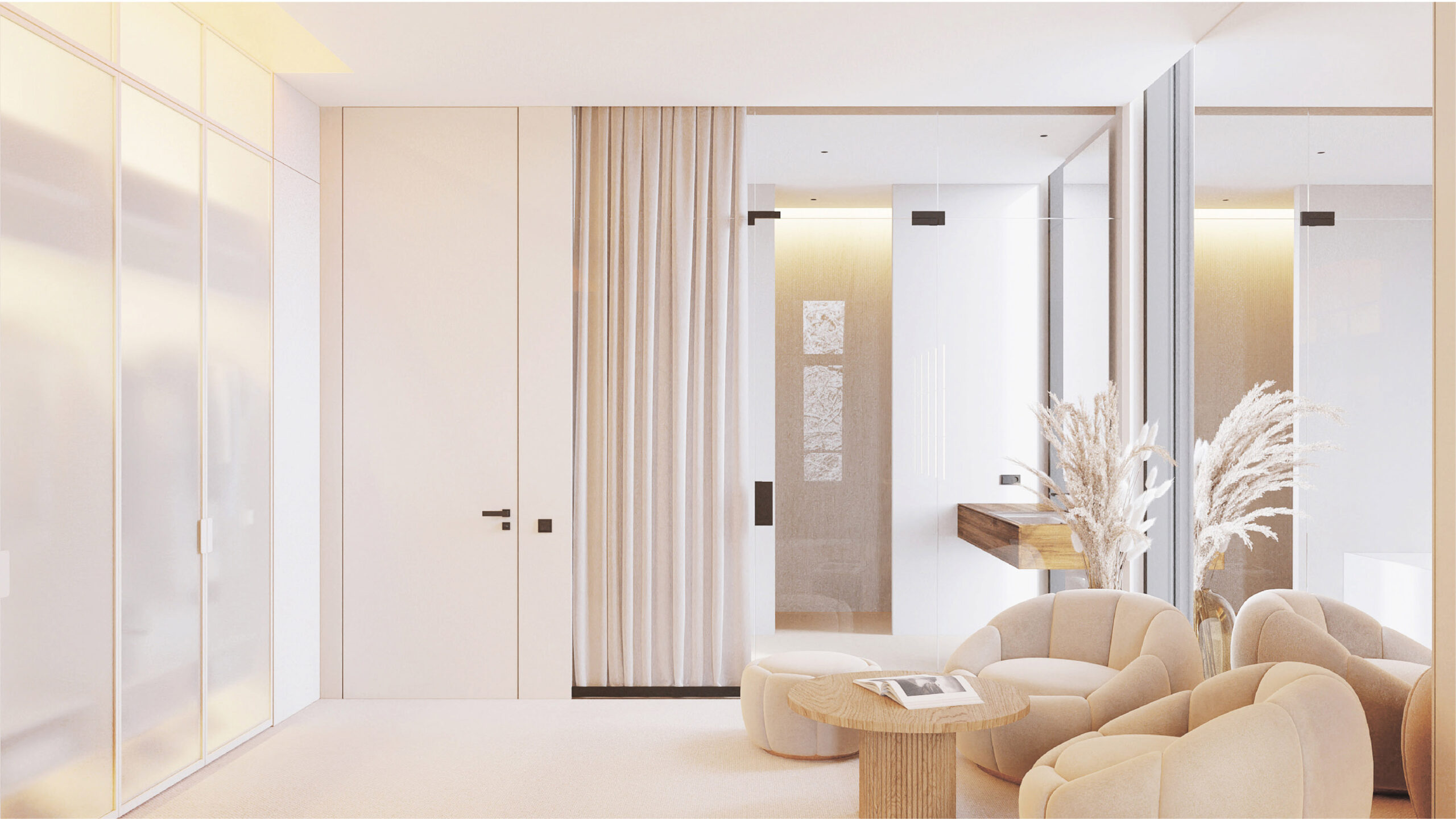
The boutique zone is light and matte, with translucent surfaces. For relaxing, meeting with friends, and exchanging gossip, a cozy area of accent plush chairs has been set up, attracting all eyes. The glass wall between the bathroom and the lounge does not affect the lightness of the space.
The two parts of the space are visually unified by the rhythmic arrangement of the shelves, which run through both zones.
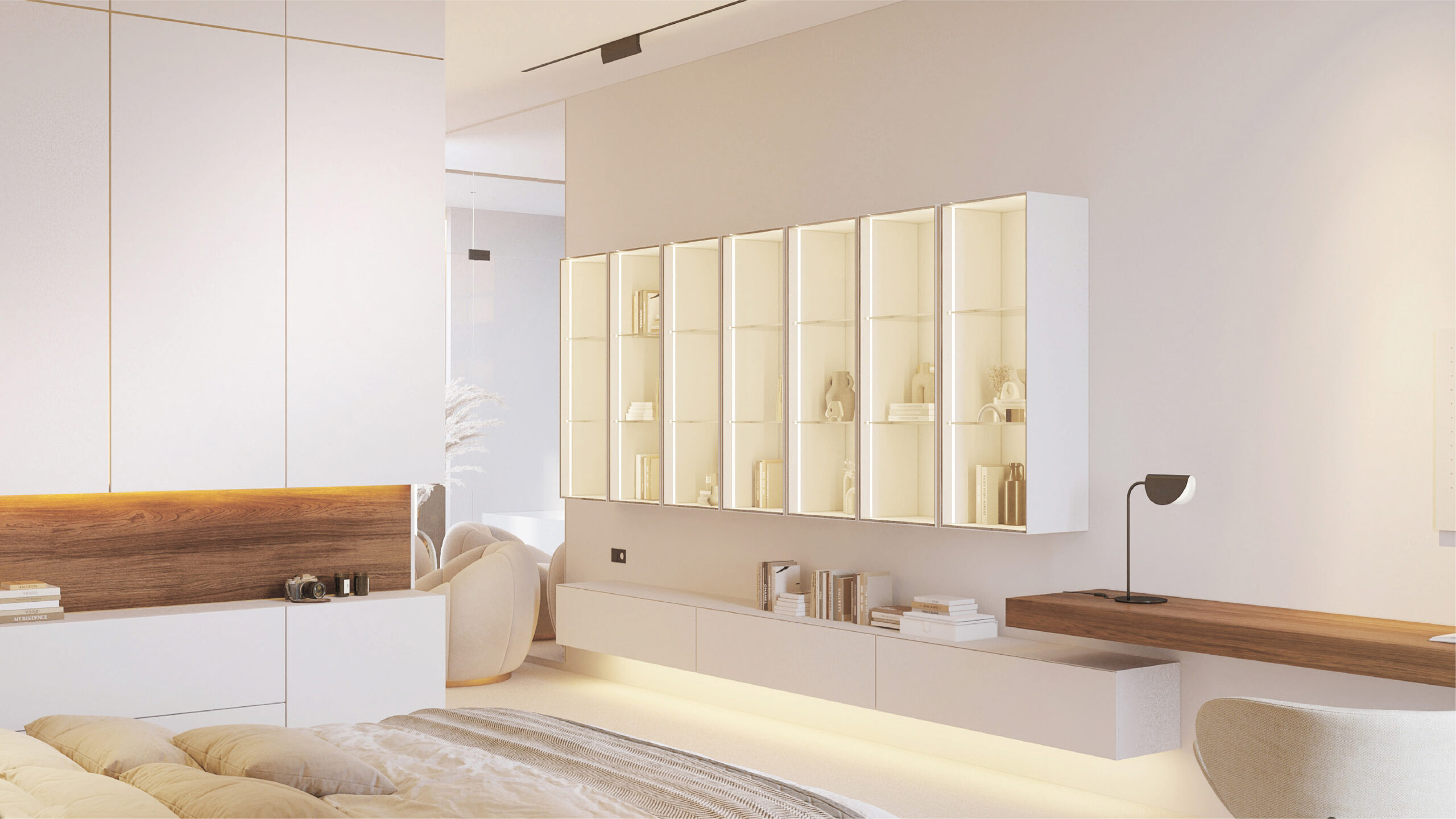
We wanted to convey conciseness and subtlety in the interior. Initially, quite accentuated lounge chairs and work area furniture are the wishes of the girl. We took them into account and tried to gently weave them into the overall interior of the room.
In order not to overdo it and not to create a too naive, soft and figured interior, we decided to make the entire space quite rectangular and strict, without unnecessary background details. Another reason for minimalism is to create a canvas in which new details can be added in the future and those elements that are no longer relevant can be removed.
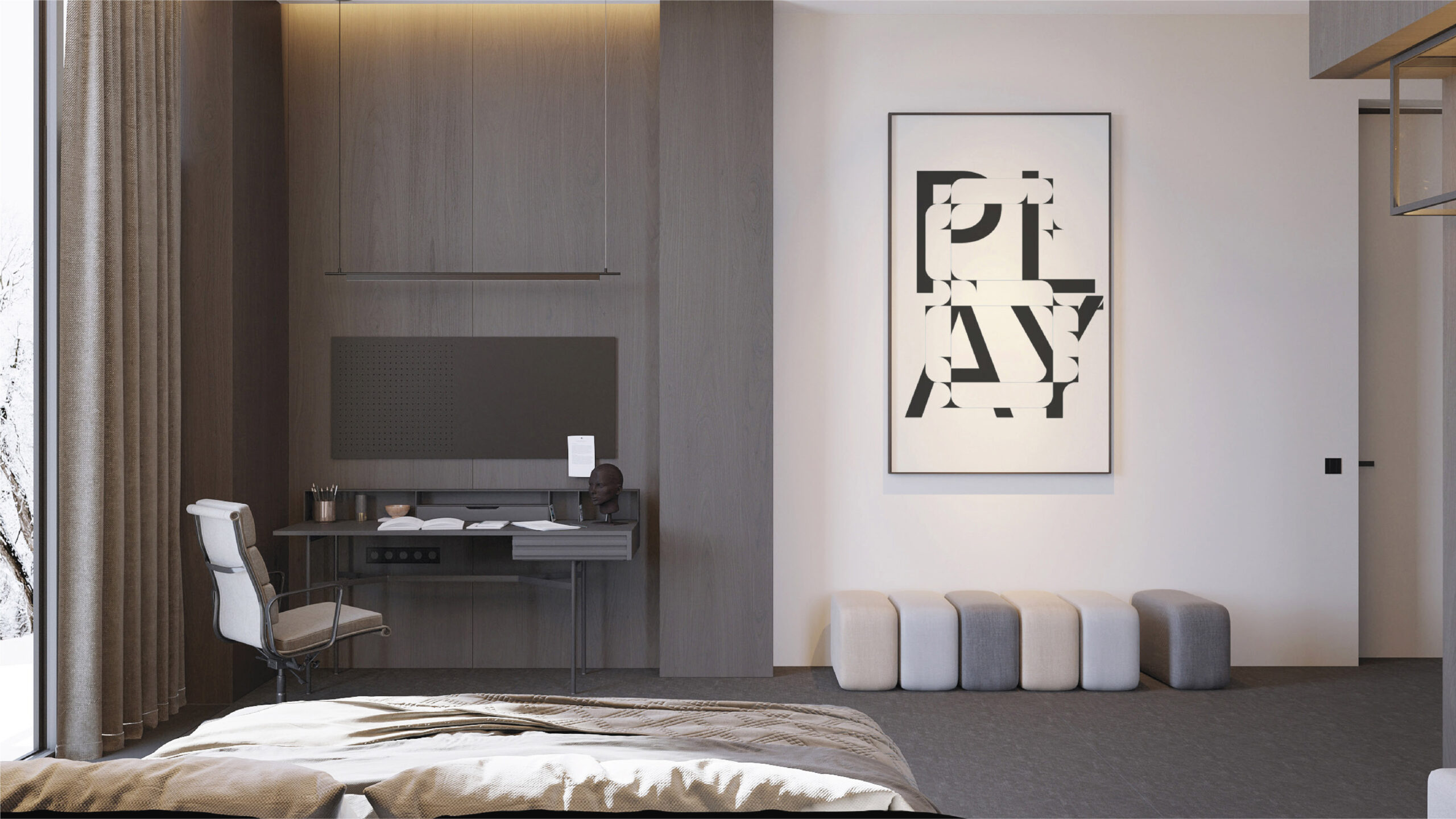
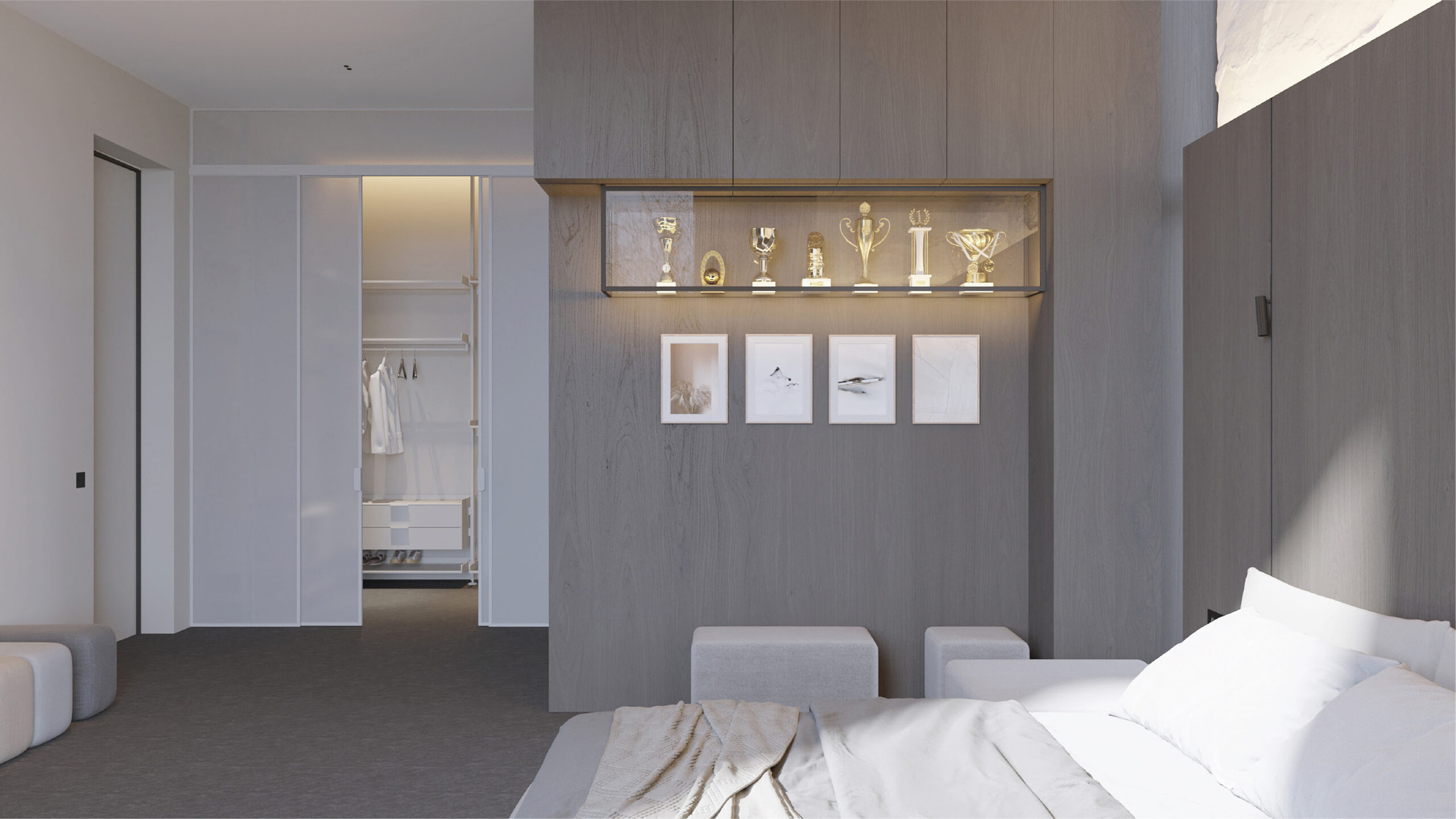
There is less identification in this room than in other children’s rooms, since this is already the space of a student son who comes home periodically. The interior here is more strict and concise. The only thing that somehow personalizes the space is a niche for awards and cups.
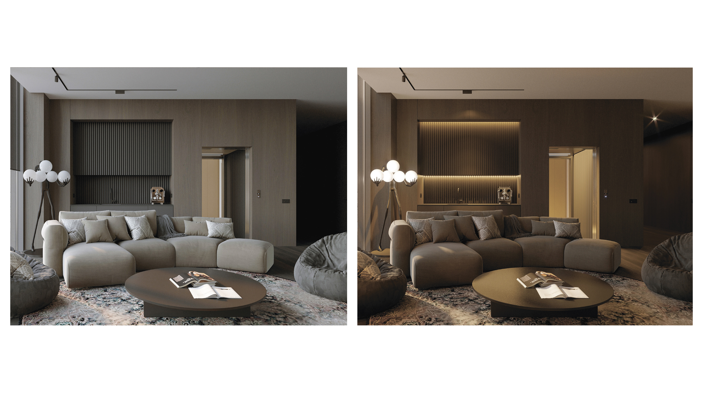
Throughout the interior space, we tried to create a connection with the exterior of the house. We took a modern, restrained interior as a basis, putting ergonomics and logistics first. This base, devoid of decoration and detail, continues the concept of fluidity of space. At the same time, there are noticeable elements in each zone that reflect the character and values of the residents of the house. To psychologically protect the residents from the harsh climate outside, we worked carefully at the level of small details, natural materials, textiles, tactile sensations and local warm light.
More information about this project you can find here: https://level80.pro/projects/ao-villa/
