ATRIUM

Location:
Belarus, Mogilev
Year:
2018
Status:
Build
Work done:
Architecture
Visualization
The team:
Kirill Skorynin
Katerina Kovaliova
Dmitry Sergienya
Dmitry Bernovik
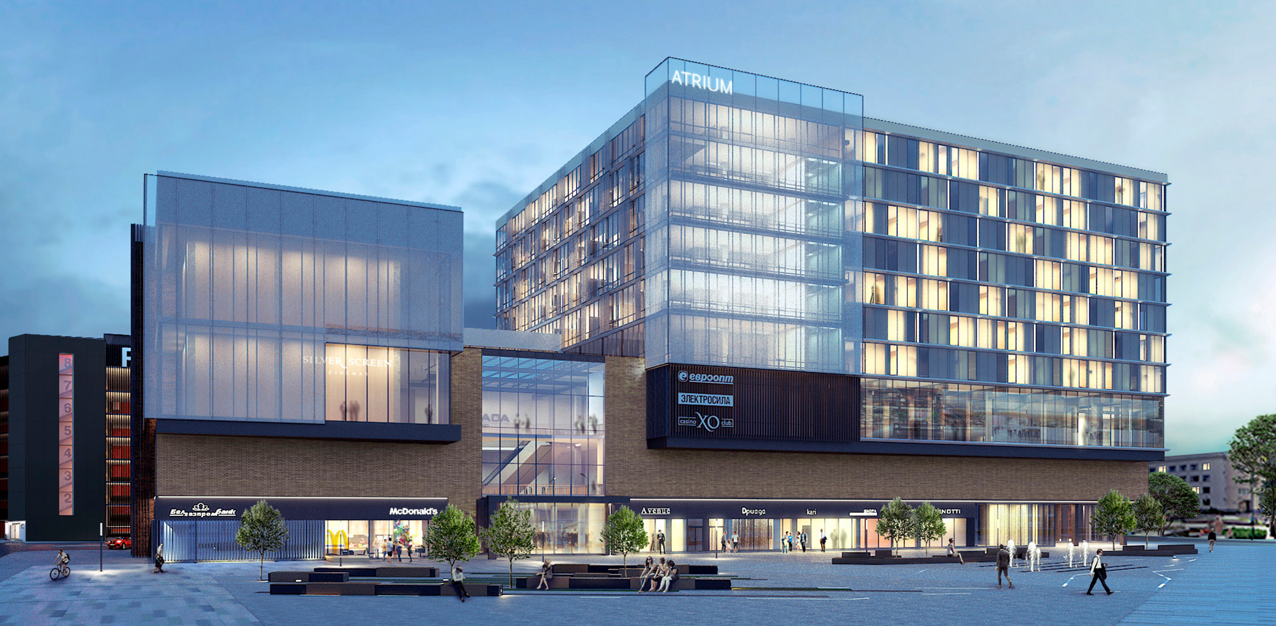
Construction of the Atrium administrative and business complex building commenced in the heart of Mogilev in 2015. Shortly after construction began, the building owners decided to alter the appearance of the building.
They asked LEVEL80 to propose a vision for the facade with a new, more up-to-date, look.
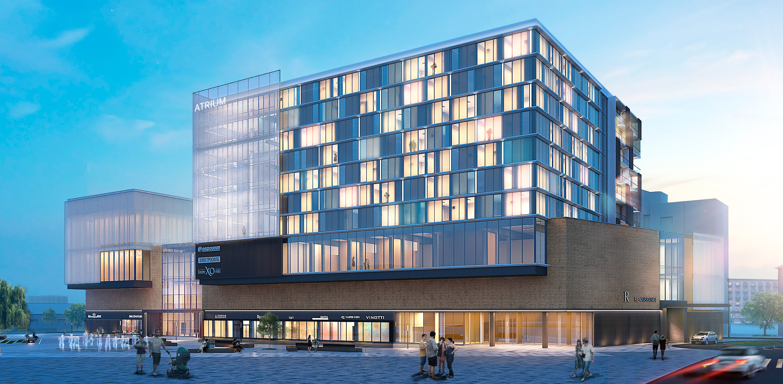
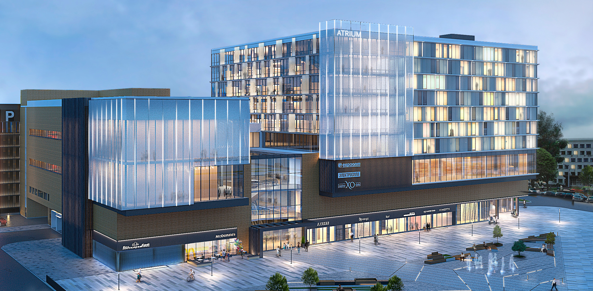
We aimed for a harmonious combination of various elements, shapes, and materials. Within the concept, we visually divided the building into several interconnected volumes. Each volume serves a specific purpose and adds to the overall appearance of the building.
Each of the volumes has its primary cladding material. Thus, structural glazing prevails in the office and hotel block; the part with the cinema is lined with a facade grid on top, the shopping center area — with clinker brick, and the parking lot — with wooden slats.
Glazing in the office and hotel part gives the building lightness and airiness. Thanks to the transparent glass surfaces, the facade perfectly interacts with the environment: it reflects and refracts the sun rays creating interesting chiaroscuro effects. Non-standard window shapes play a particular role here, creating a unique geometric pattern on the facade surface.
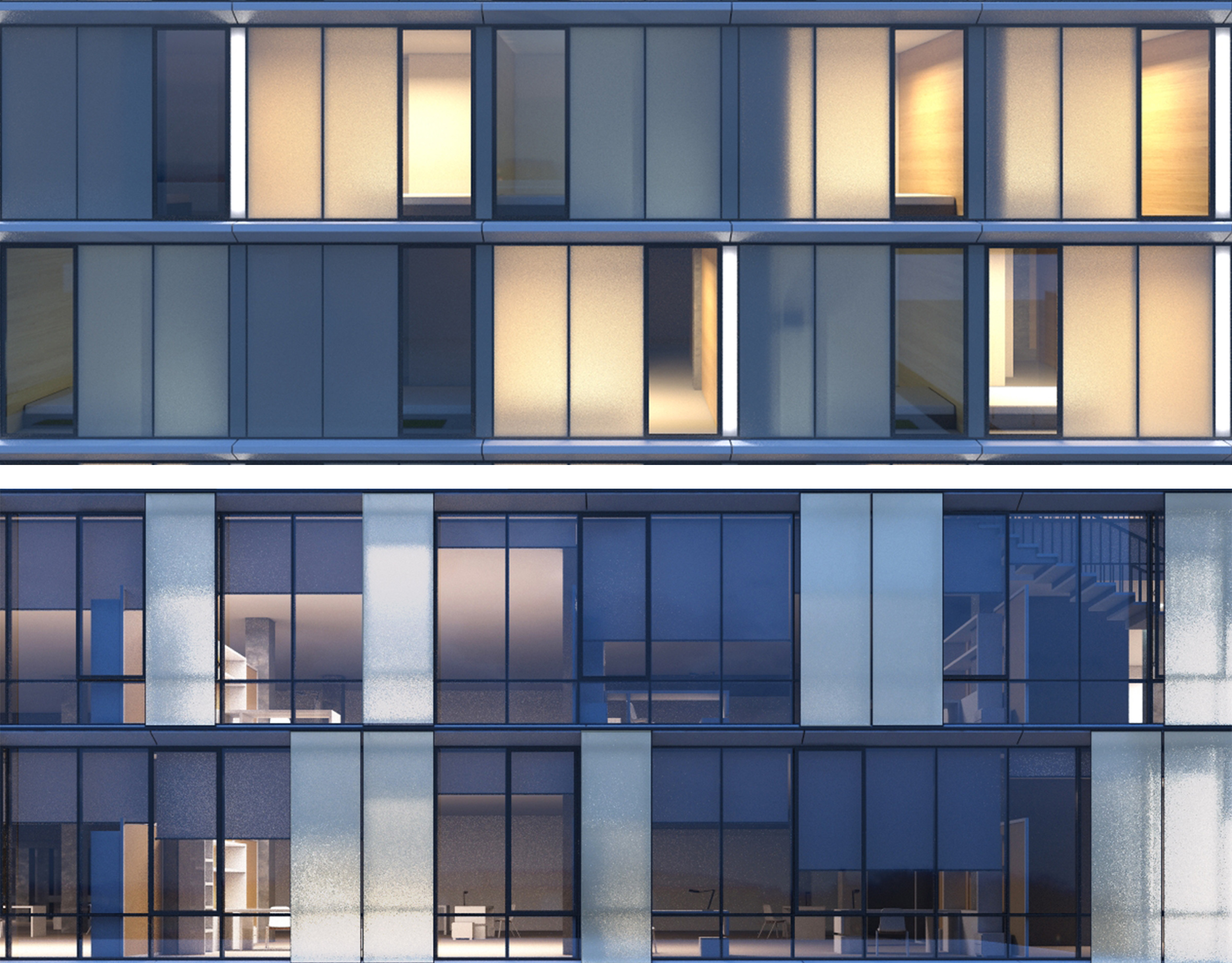
The facade grid makes it possible to set up a media facade. The building will look spectacular day and night, and the media facade will serve as a bright landmark and a center of attraction for citizens.
Depending on the configuration, the building owners can change the façade pattern and turn the entire building volume into an information panel.
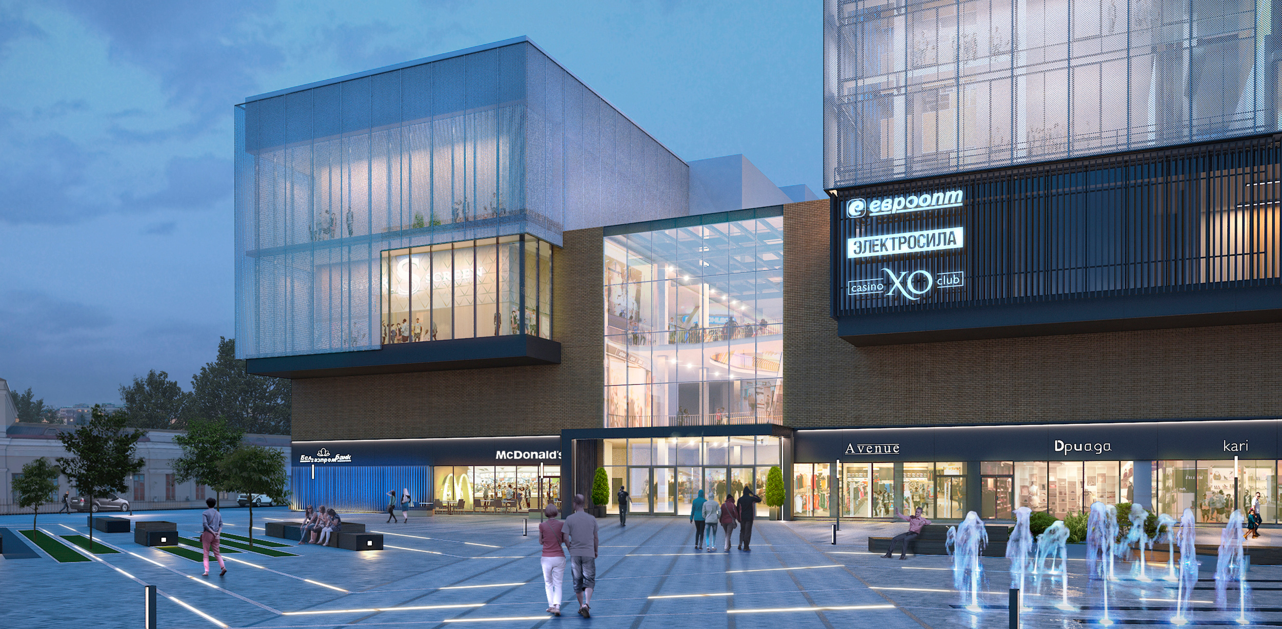
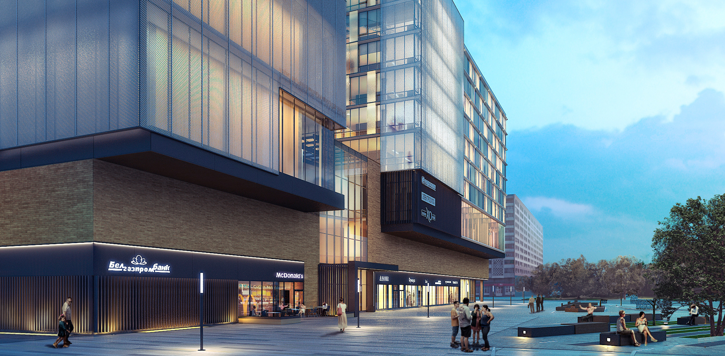
The first floor received a ribbon showcase window. The anthracite strip above the window designates a place for signage and does not allow it to spread out along the facade. By placing the names of stores on the pedestrian level, we made them readable despite a small font size.
Signage should be placed only in specially designated places. It should be white on a dark background. This solution allows one to preserve the integrity of the facade. If desired, additional information can be displayed on the media facade.
The principle cladding of the side and rear facades was finished using clinker bricks. It is an environmentally friendly material of high durability with frost resistance and many color shades. Bricks in the cladding helped us establish the connection between new construction and existing architecture in the city center.
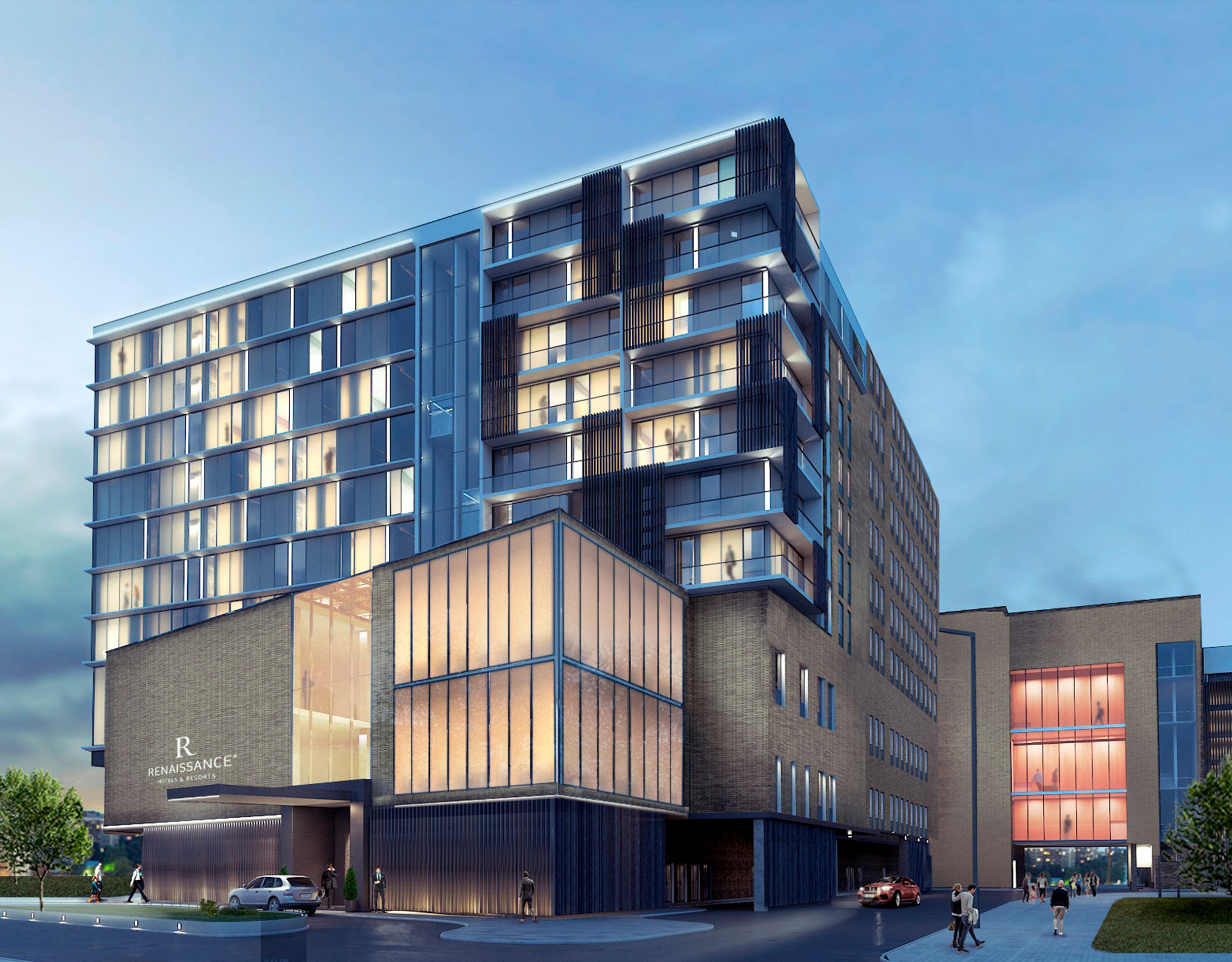
For the lining of the parking lot, we used wooden slats. They helped to reduce the building volume visually, bring it closer to the human scale, and make it more harmonious with the environment. The staircase-elevator unit was allocated with a lining of alucobond — composite panels consisting of two aluminum sheets with a polymer core between them, which makes them light, strong, and durable.
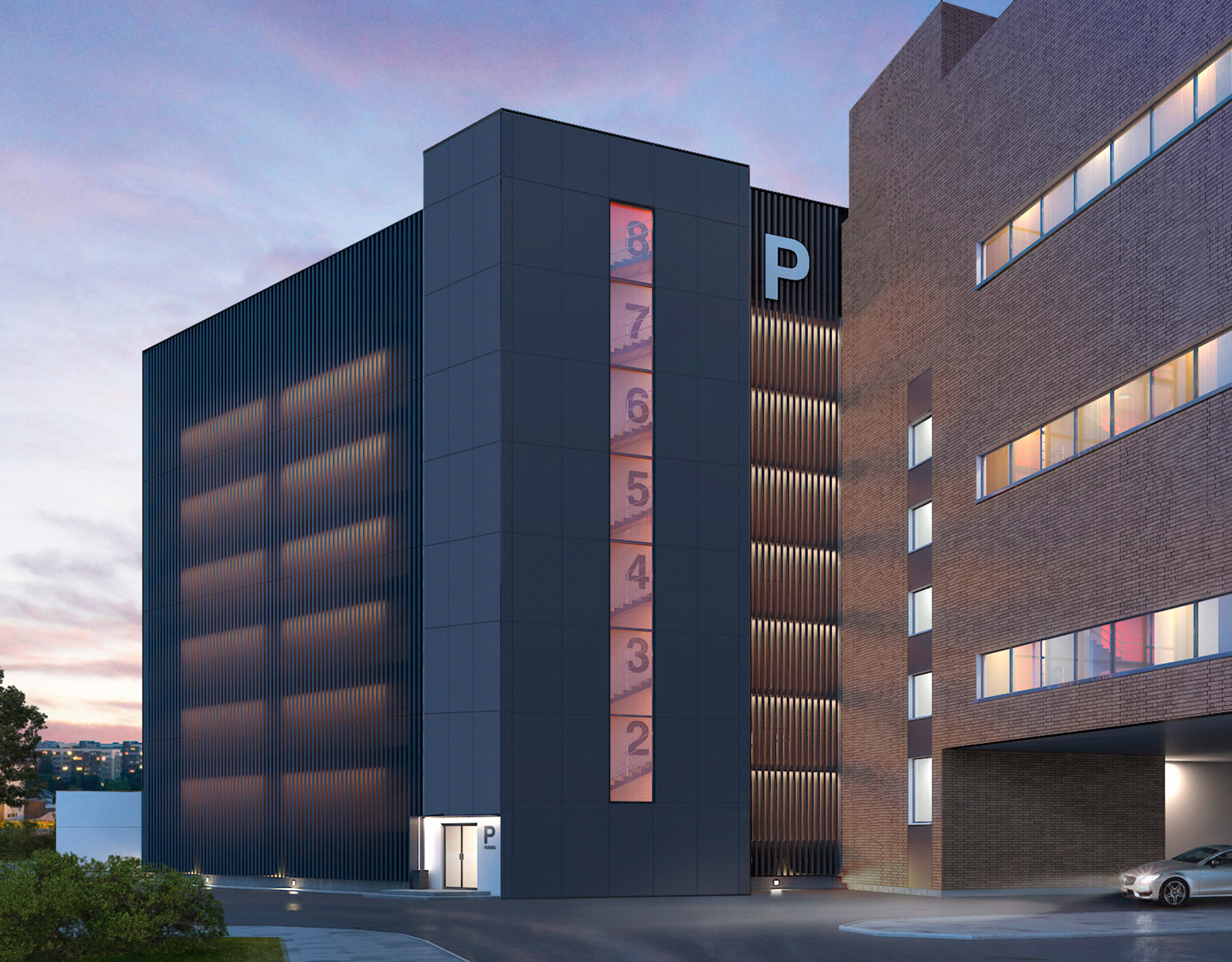
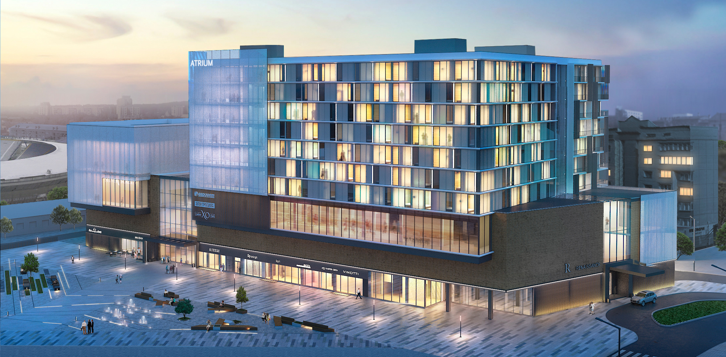
The synthesis of a wide range of architectural principles and materials creates a building that is both functional and visually appealing.
Our team successfully crafted an innovative and contemporary image that seamlessly blends into the urban surroundings.
