F House I Interior
Location:
Lithuania, Vilnius
Year:
2019
Status:
Built in 2022
House area:
570m2
Work done:
Site plan
Architecture
Interior design
Landscape architecture
Construction technology:
Combined frame
Style:
Natalia Lutovich
Photo:
Ilya Polonski
Elizaveta Kulenenok
The team:
Katerina Kovaliova
Kirill Skorynin
Eduard Medvedev
Natalia Lutovich
Valerie Kislyuk
F House is a residence for a young family with two children near a pine forest and a small pond. We tried to create a space that would suit the lifestyle of our clients: dynamic, welcoming, and friendly.
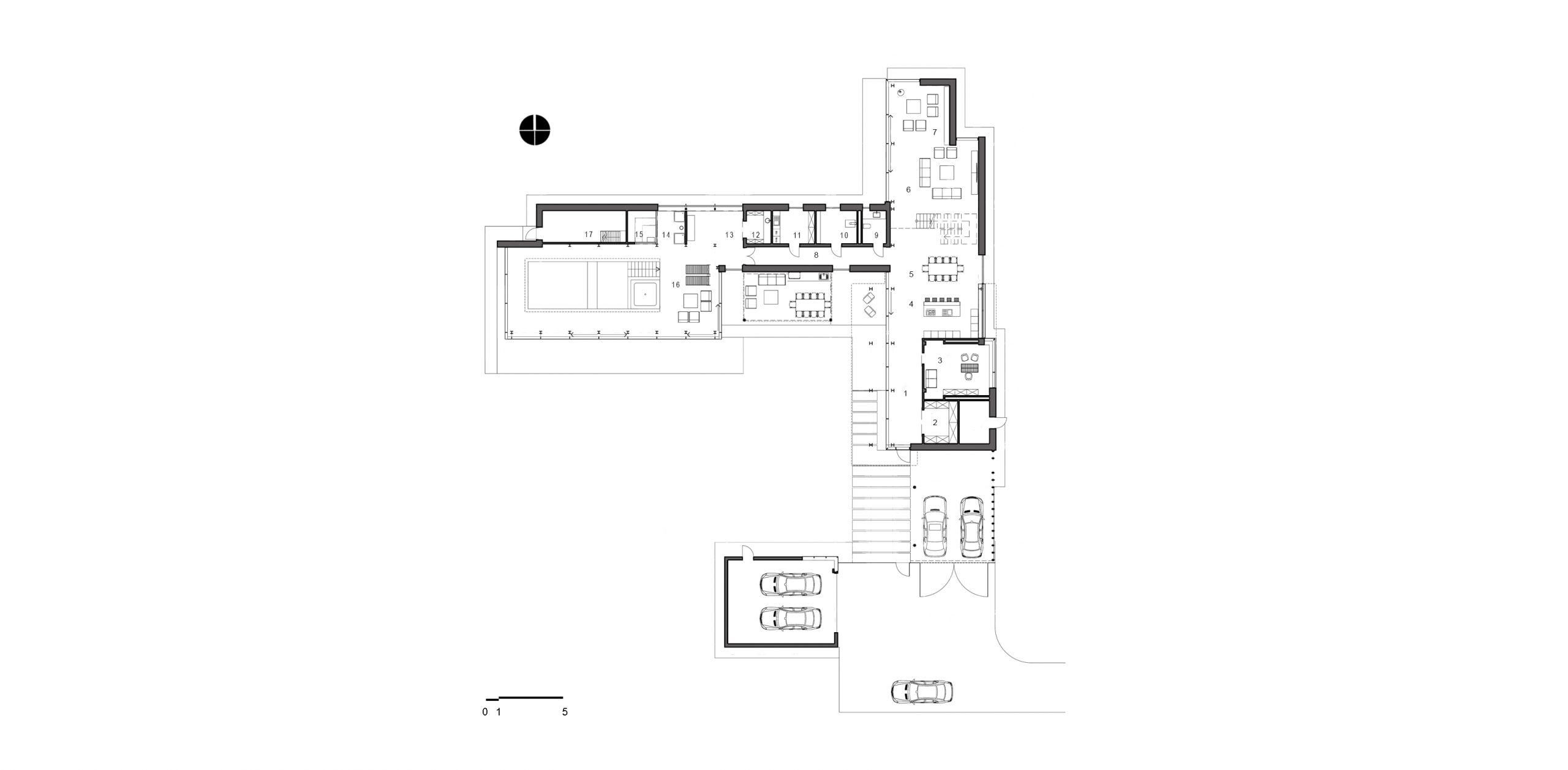
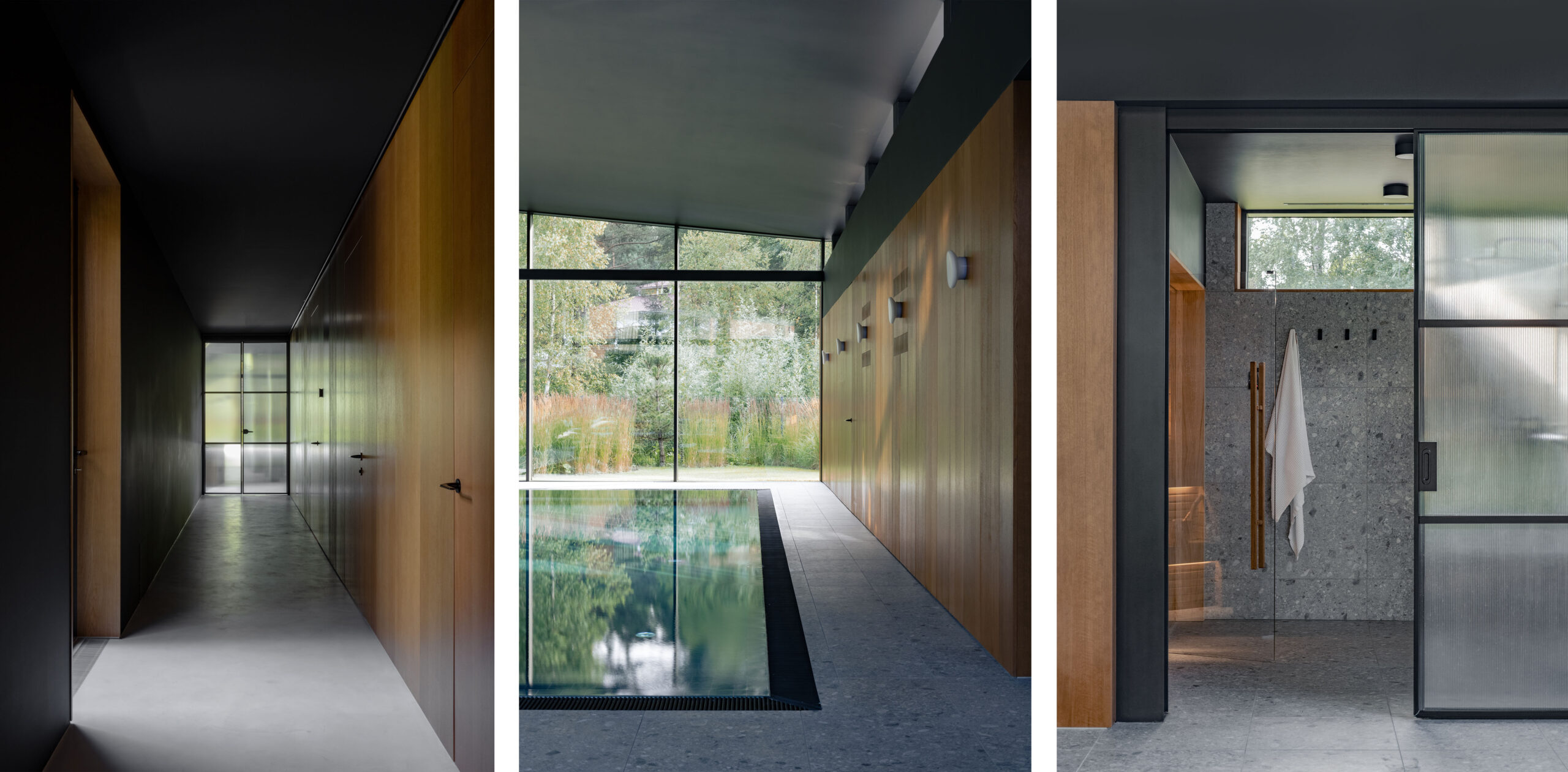
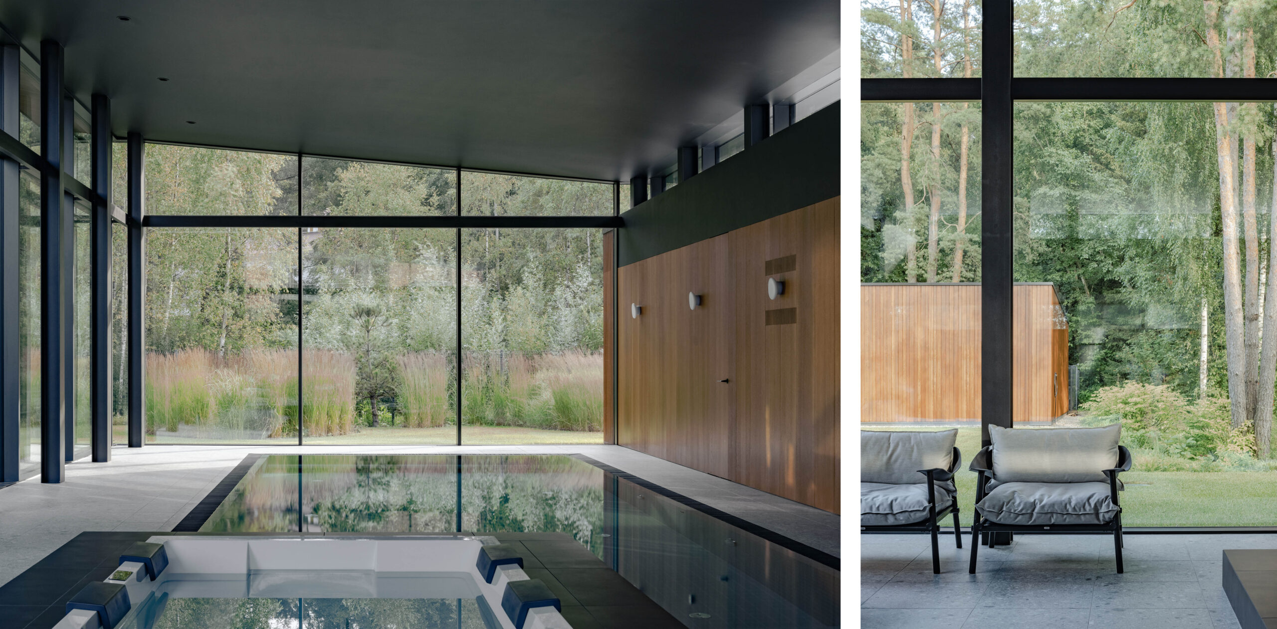
The object consists of three volumes: a two-story one with common spaces and bedrooms, a one-story volume — a swimming pool, and a connecting one-story part with technical rooms. Together they form a single volume where the frame of the house is an expressive architectural element that augments the interior.
1. Hall
2. Closet
3. Study
4. Kitchen
5. Dining room
6. Living room
7. Fireplace zone
8. Hall
9. Bathroom unit
10. Furnace
11. Laundry room
12. Dressing room
13. Hall
14. Shower room
15. SPA area
16. Pool
17. Ventilation chamber
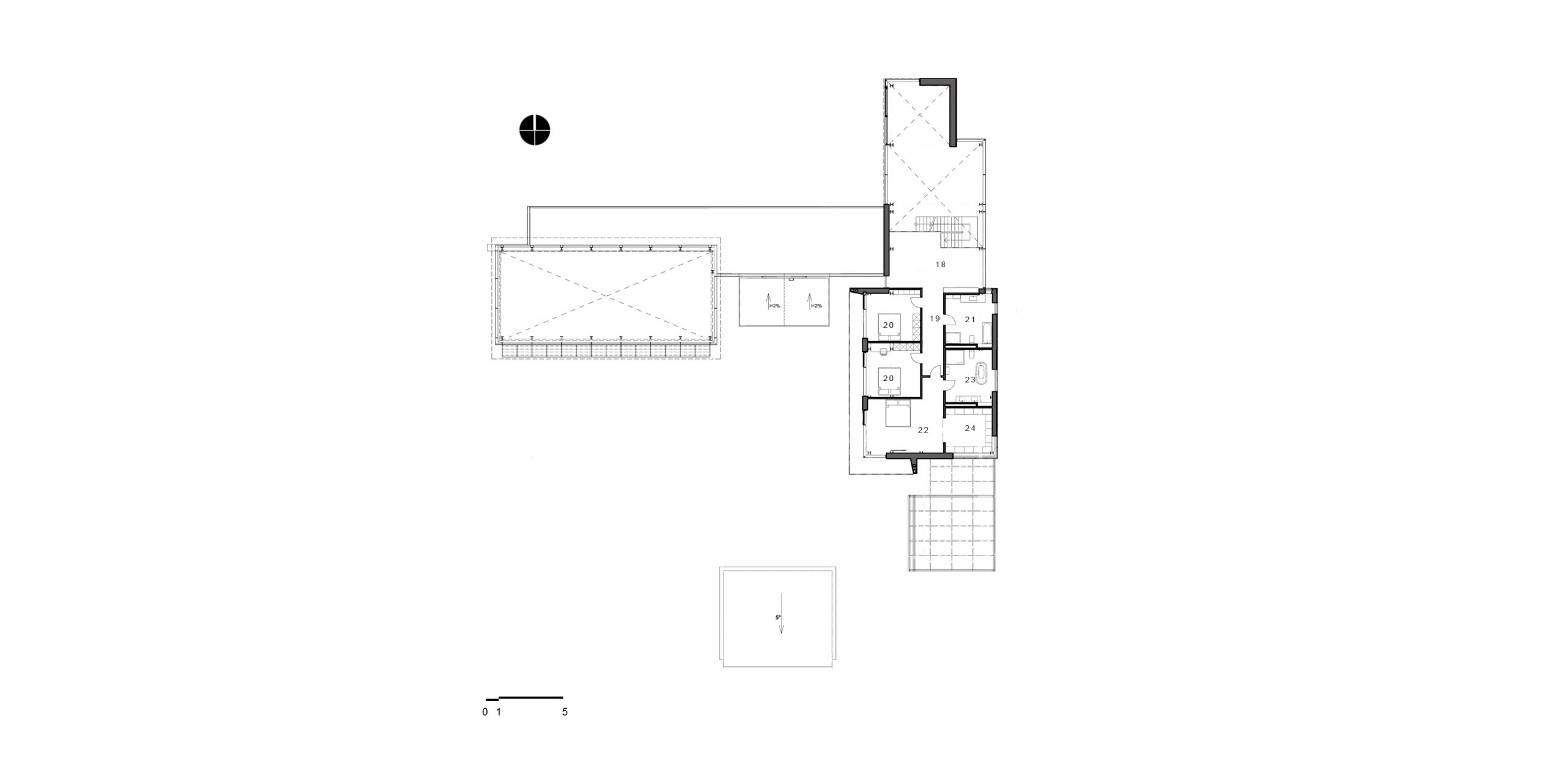
18. Сommon area
19. Hall
20. Child’s room
21. Bathroom unit
22. Primary-bedroom
23. Primary-bathroom
24. Primary-closet
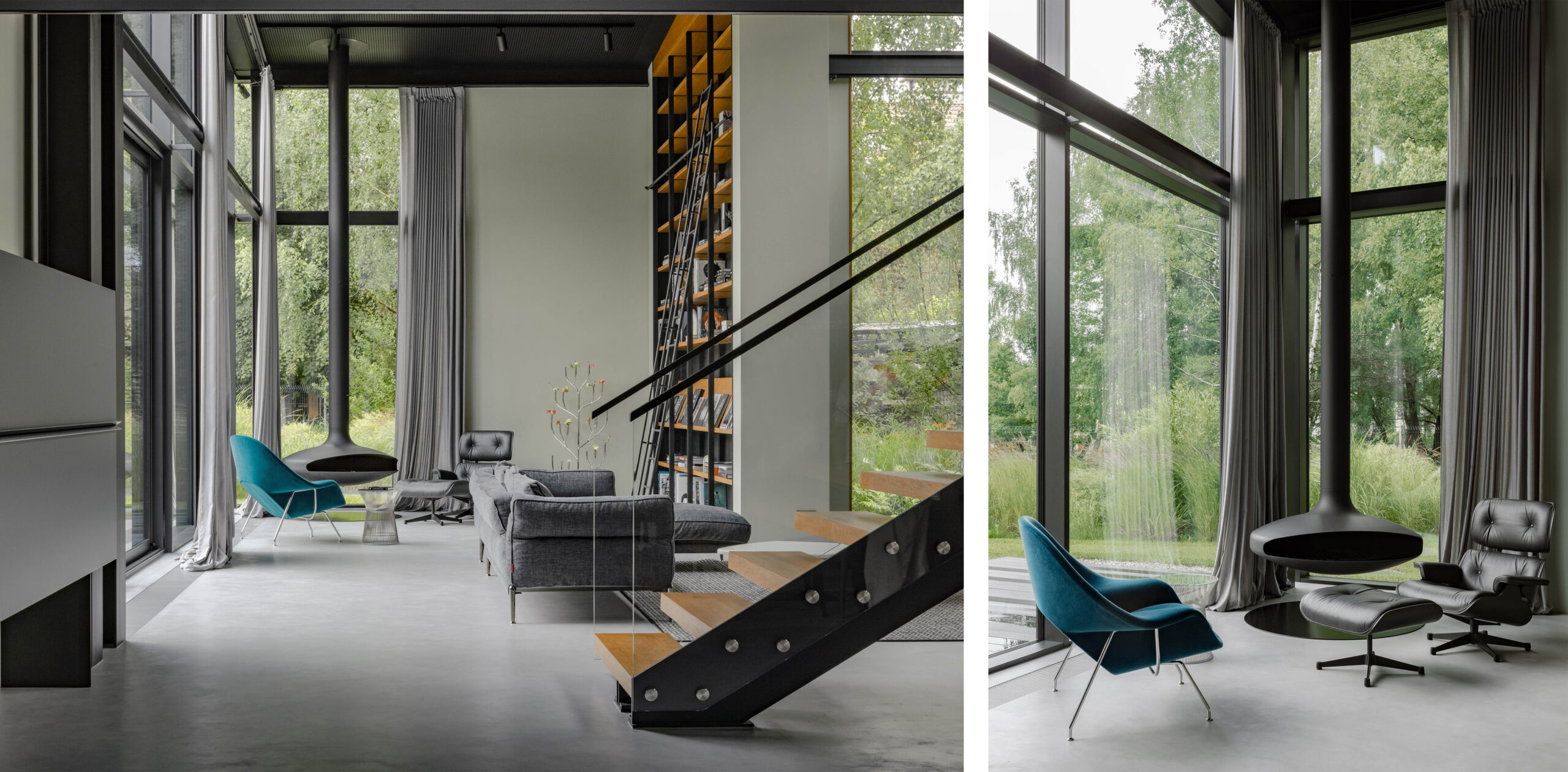
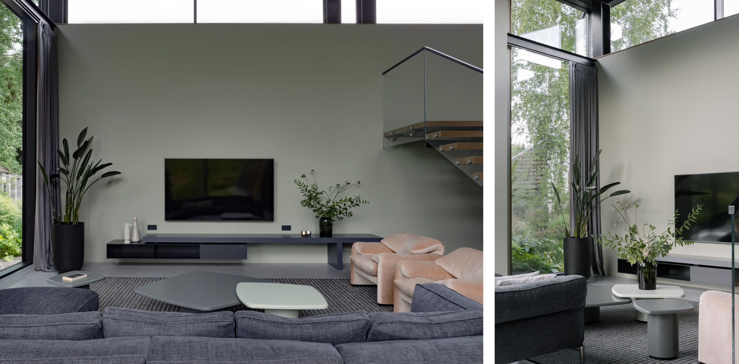
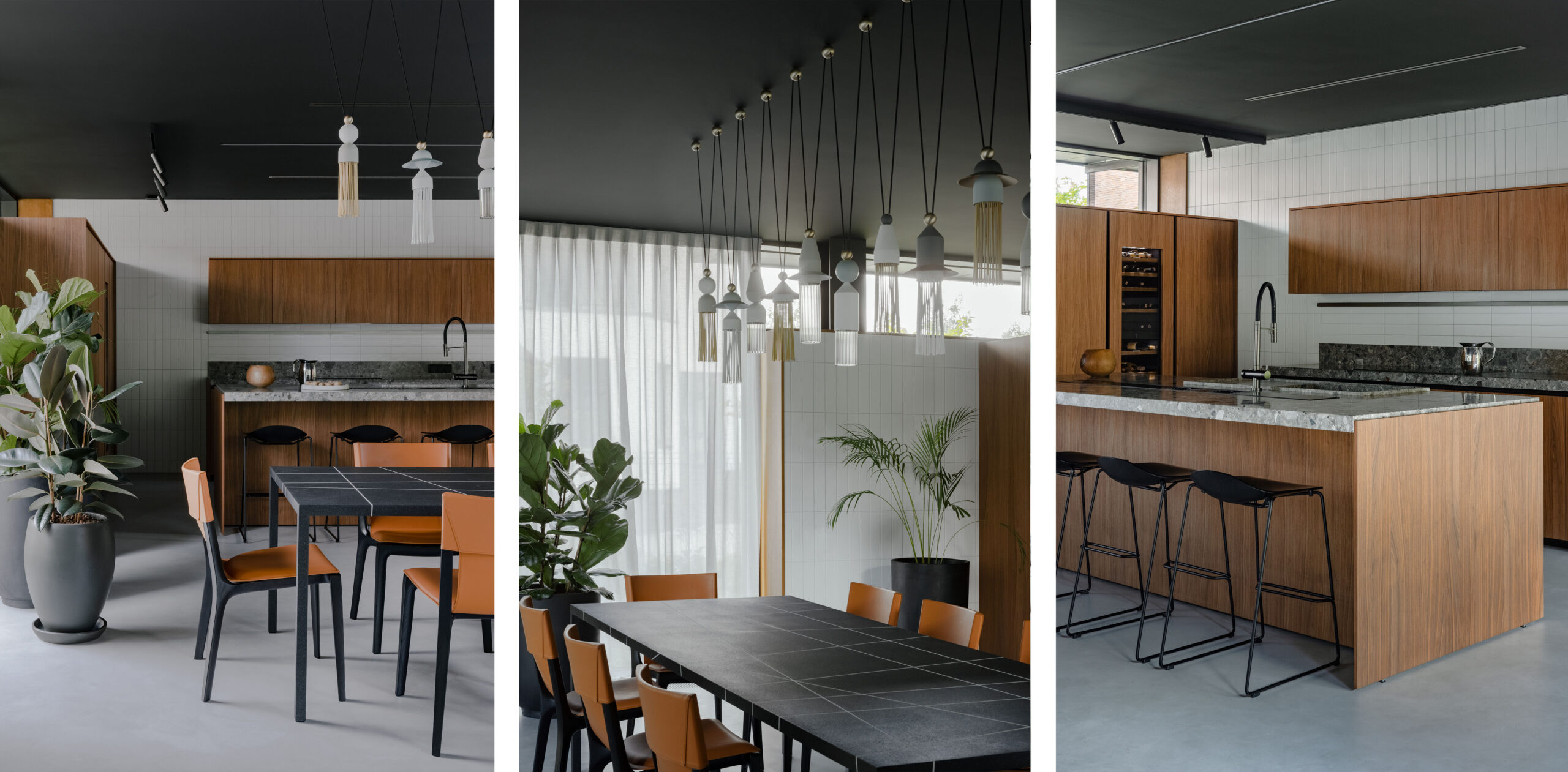
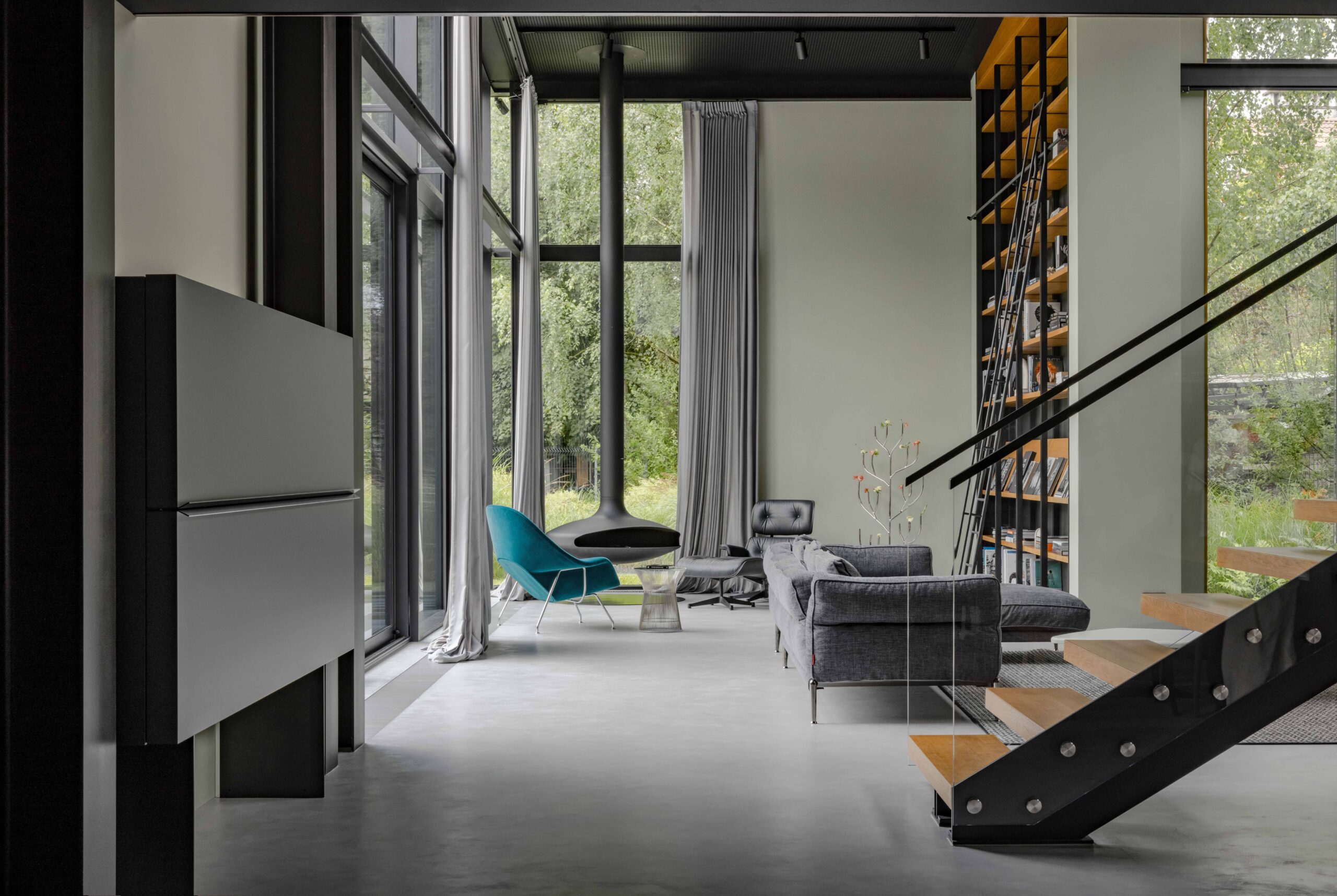
The planning solution and interior design of the house are both centered around visual points of nature outside and the location of accent zones inside. It combines harmony, elegance and functionality. When guests enter the house, the first thing that attracts their attention is the fireplace area. This zone is located at the end of a long hallway — the primary axis of the residential part. All functional zones of the first floor are designed on the axis: a closet, a study, a living room with a library, a dining room, and a kitchen with a kitchen island.
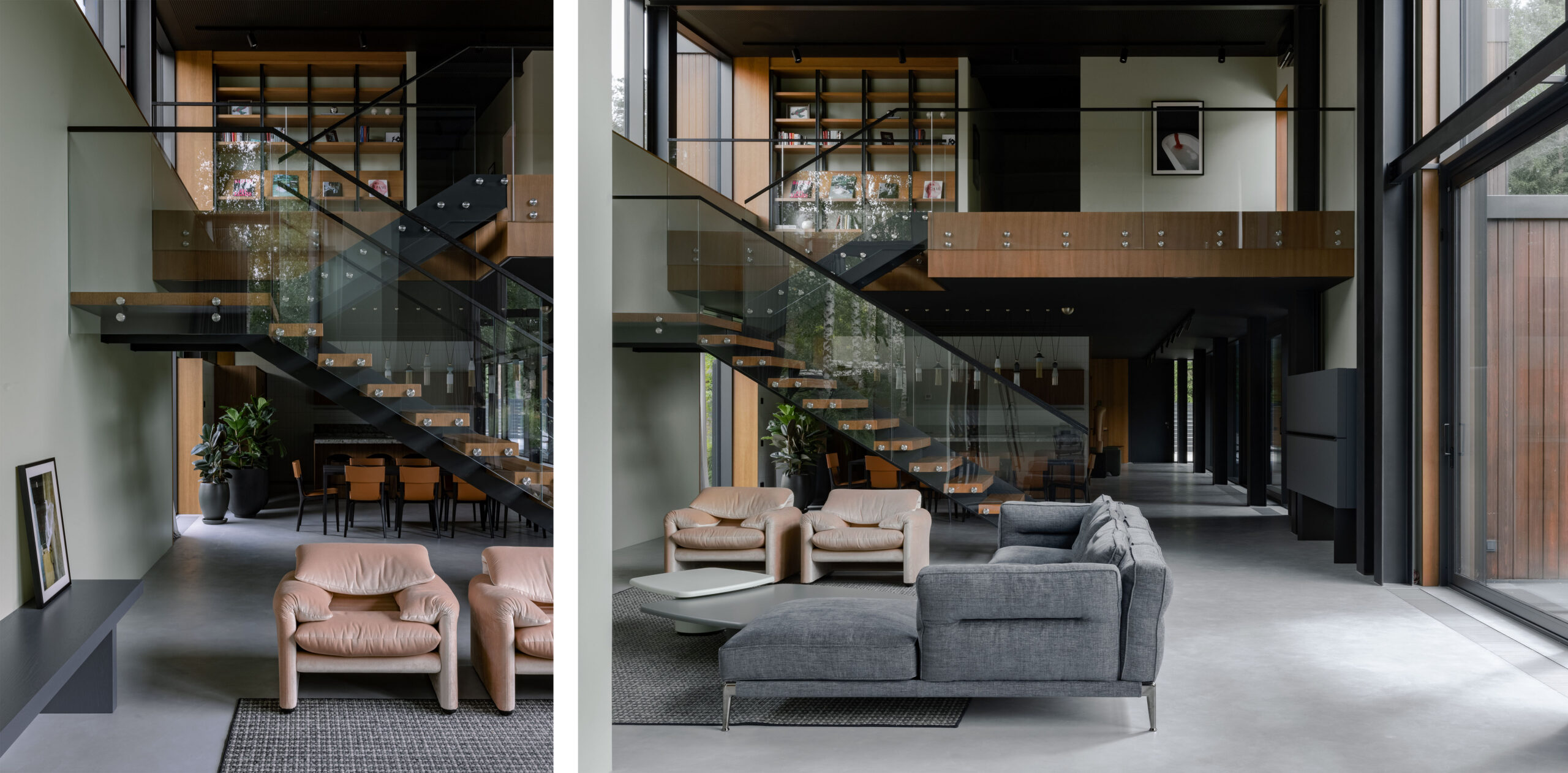
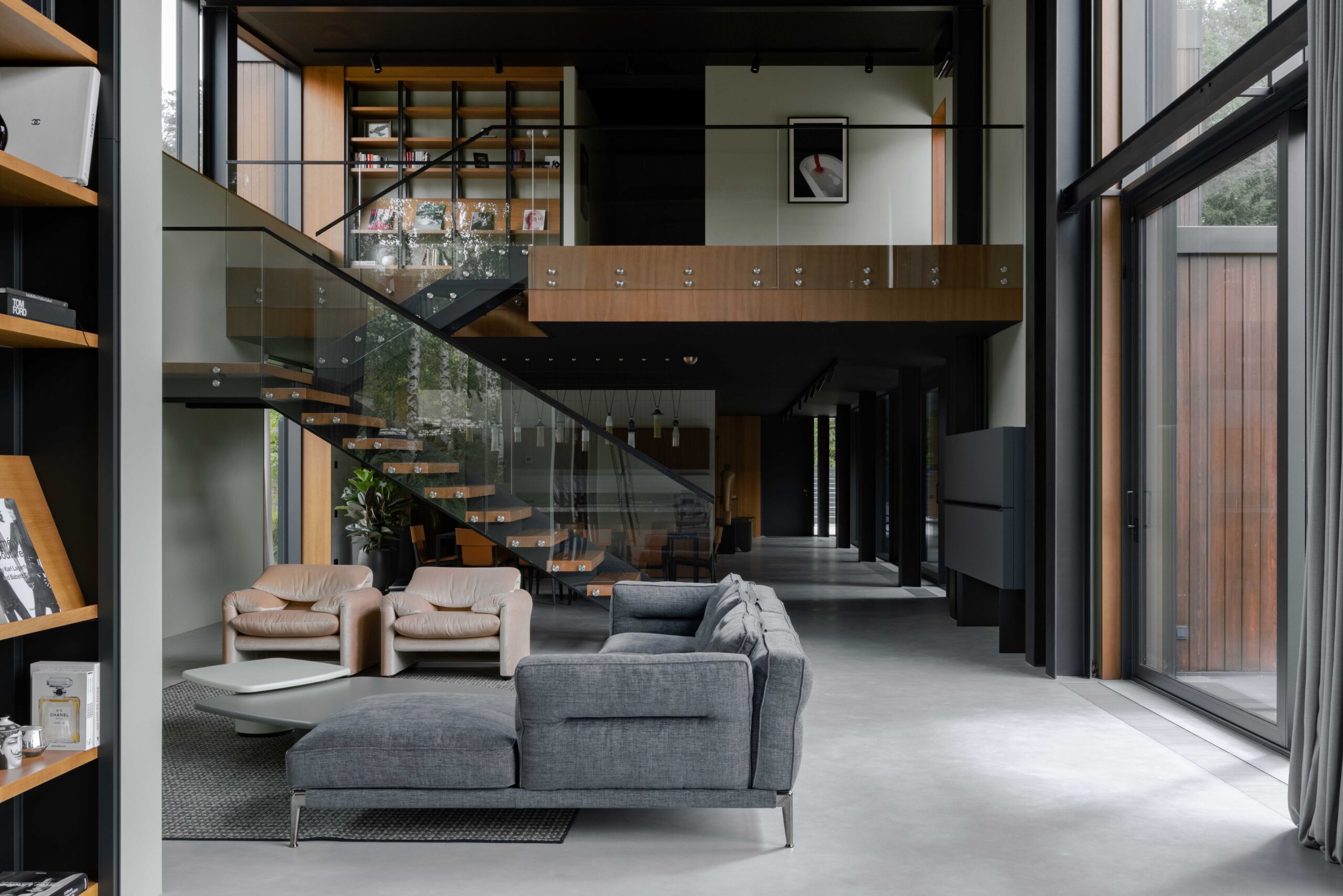
The staircase has multiple functions: it is not only a transit to the second floor but also a visual barrier between the kitchen and the living room. It is not perceived as something massive because of its constructive solution. A transparent fence ensures safety and does not weigh down the structure.
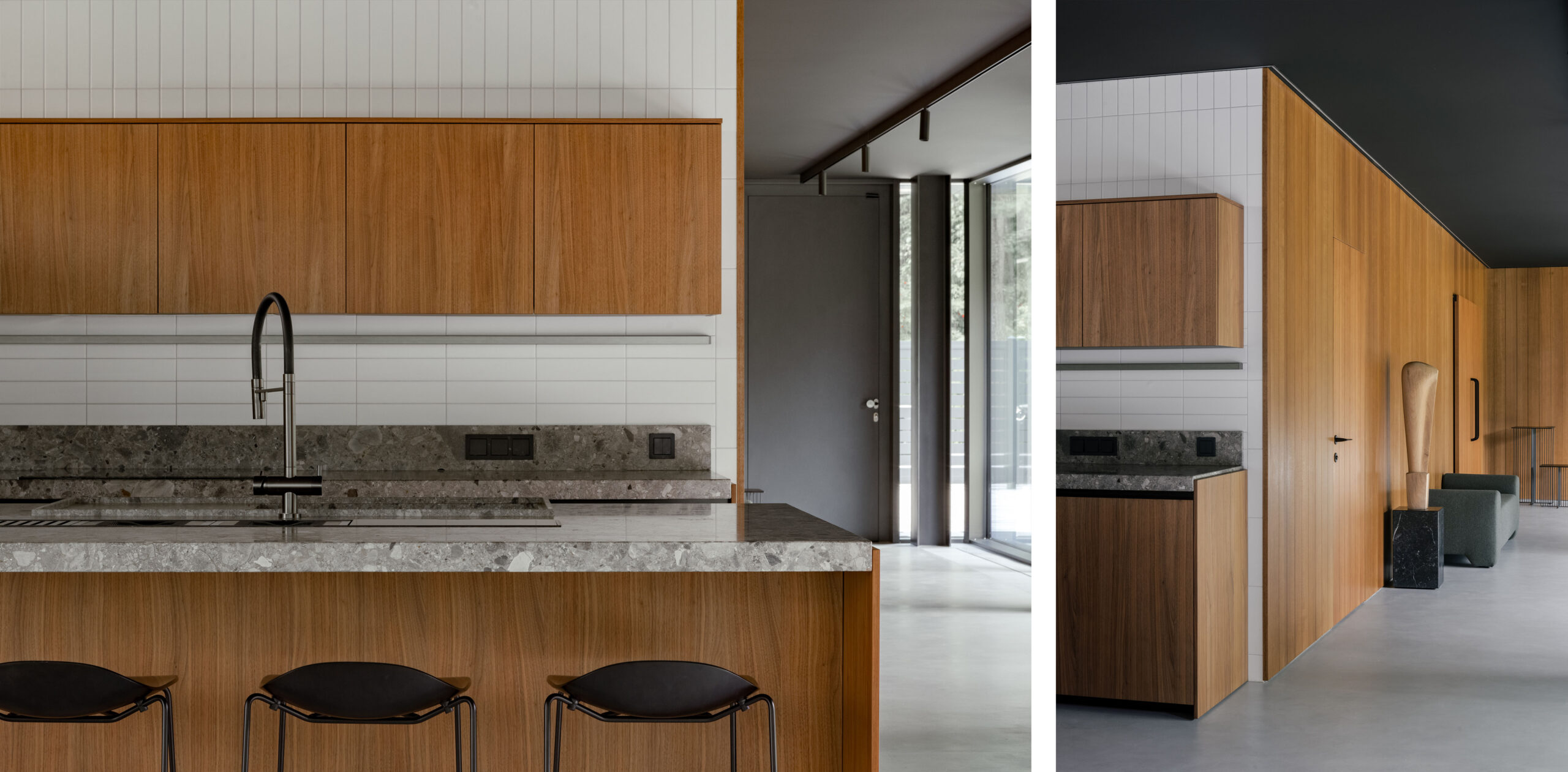
We selected the palette of materials and shades as delicately as possible. The walls of the first floor are painted in a complex olive color borrowed from the palette of the surrounding forest. Oak veneer wooden elements match the façade color and unite the exterior and interior designs.
The floor is designed of heterogeneous micro-cement. It is tactile and delightful, due to the built-in floor convectors. The ceiling is painted black to visually lower the height of the space and enhance intimacy. There are soundproof panels with small perforations on the ceiling. They compensate for the echo that usually happens in big rooms with extensive glazing.
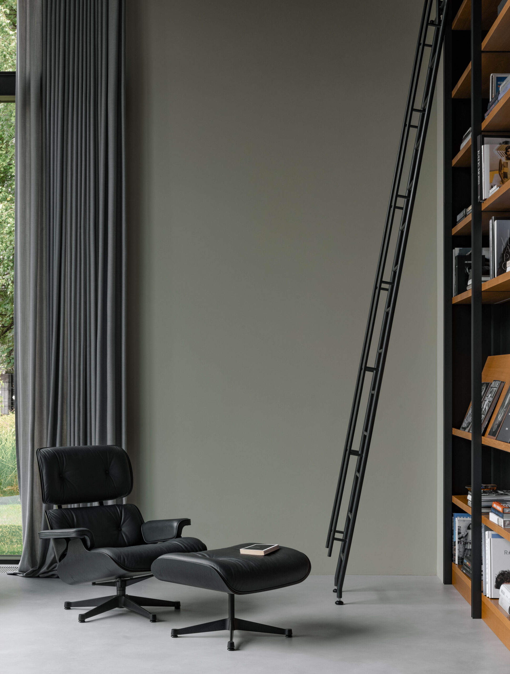
The interior is complemented by bright color accents of furniture, tiles, textiles, paintings, and timeless iconic elements.
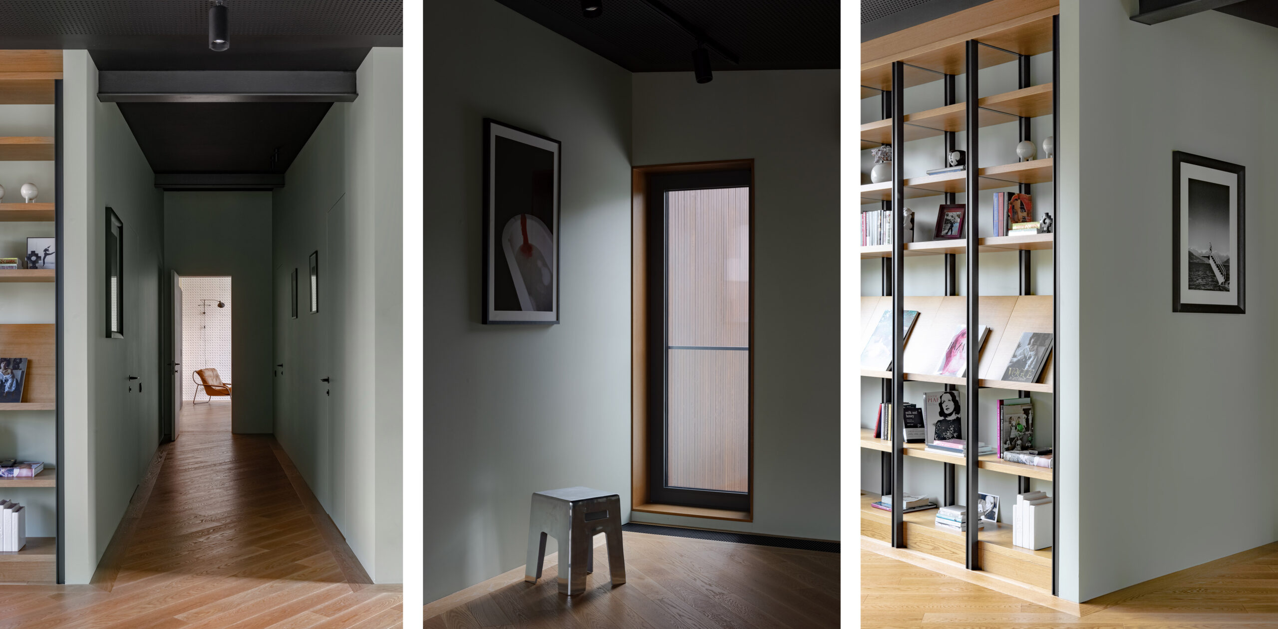
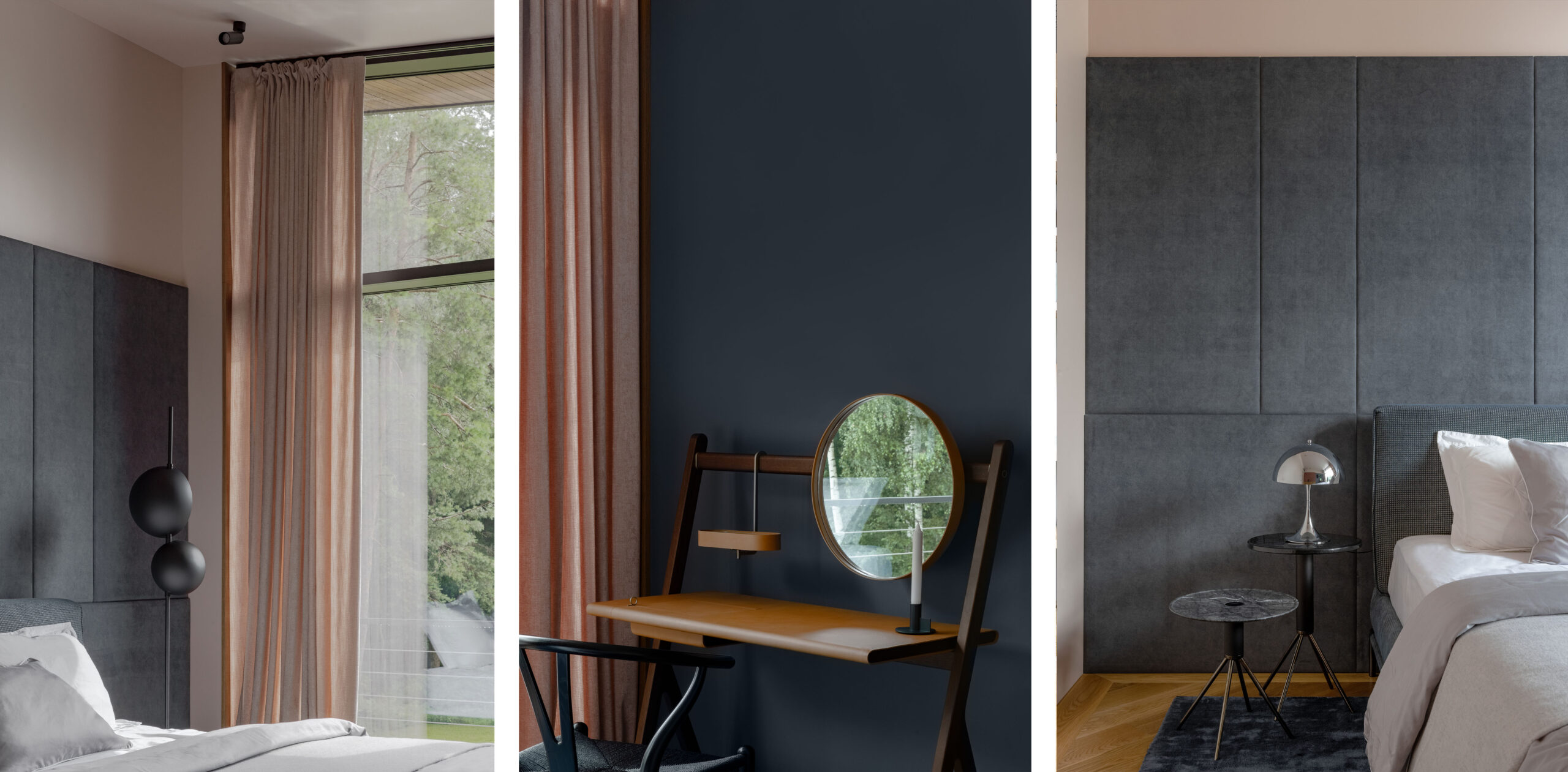
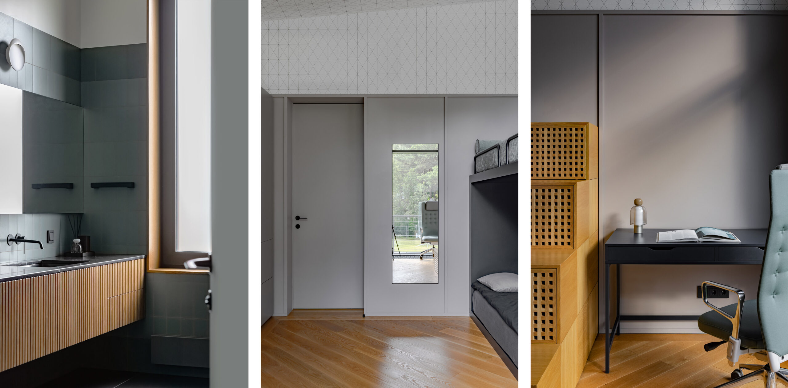
The second floor is the private part of the house with a library, a guest bedroom, a playroom, and a primary suite. It starts with a small mezzanine protruding over the first floor.
The second floor differs from the first with the introduction of new shades such as dusty rose, deep blue, and warm terracotta. This enhances the feeling of coziness and comfort.
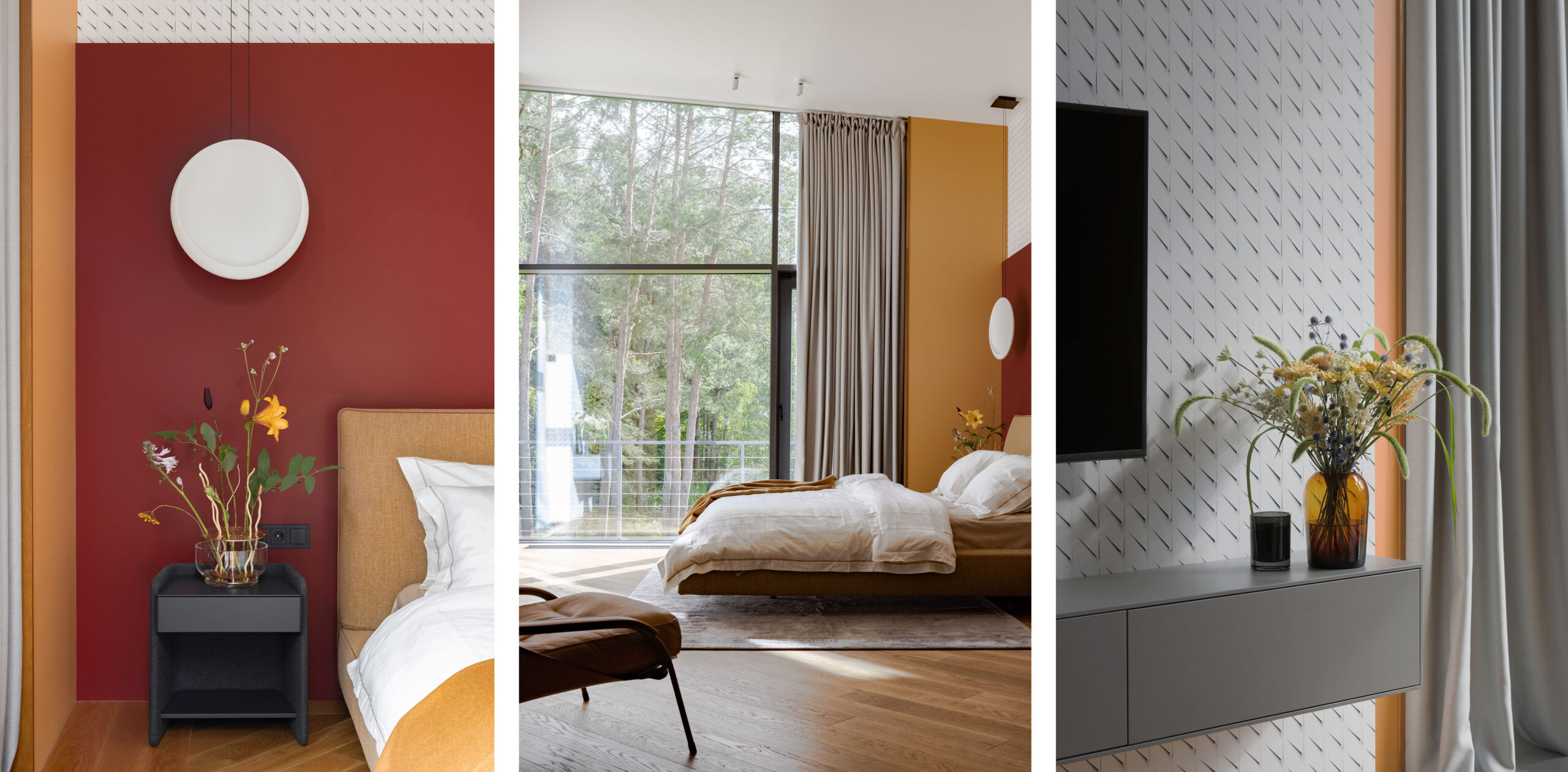
The primary suite is a bright spot in the calm colors palette of the rest of the house. All the shades here are as complex as in the whole project, only their saturation and warmth are on full. Natural light complements the atmosphere.
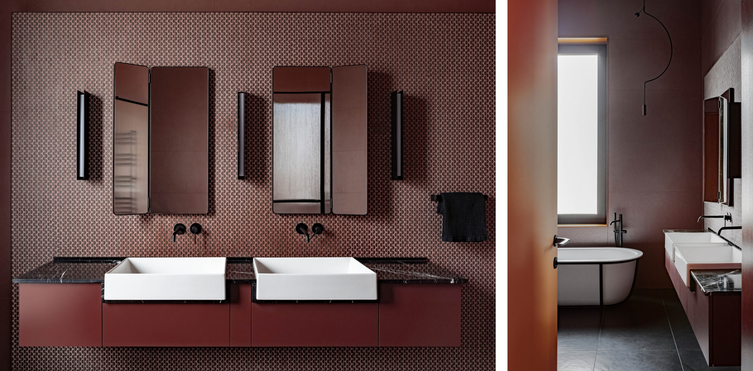
The natural light gets into the house through the panoramic glazing and enhances the cheerful mood of red and terracotta colors. The dark-Bordeaux primary bathroom calms the bedroom energy a bit and adds mystery.
А corrugated glass door separates the SPA zone from the living area and creates a semi-blurred effect. Oak veneer panels on the walls and graphic anthracite color link the SPA zone to the residential block. Panoramic glazing and reflection in the water enhance the effect of getting a natural environment inside the house and creates an effect of immersion into a naturally peaceful environment.
Our customers were enthusiastic about taking part in the project development with us. They wanted that the interior space was practical and not swamped with unnecessary details. We managed to do that: the interior design of the house is a base, which the family will change and enrich with their favorite things.
More information about this project you can find here: https://level80.pro/en/projects/f-house/
