TERRA COTTA

Location:
Belarus, Minsk
Year:
2014
Status:
Built in 2014
Work done:
Reconstruction
Architecture
Interior design
The team:
Katerina Kovaliova
Kirill Skorynin
Igor Yaremchuk
Kristina Hamaneeva
Vera Moiseyeva
Lisa Gnativ
Ksenia Poberezhnaya
Photo:
Ilya Polonski
Nikita Bezrukov
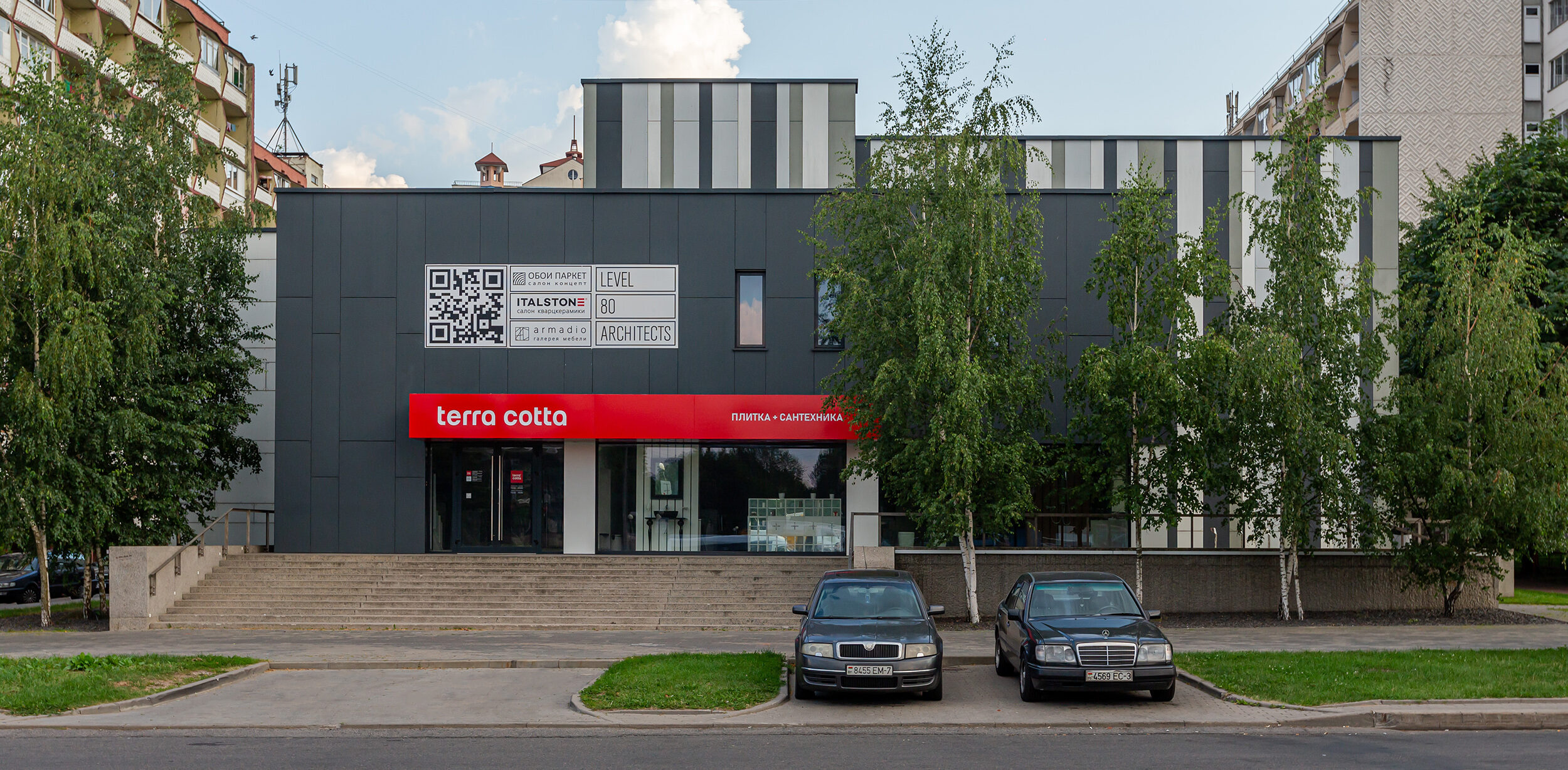
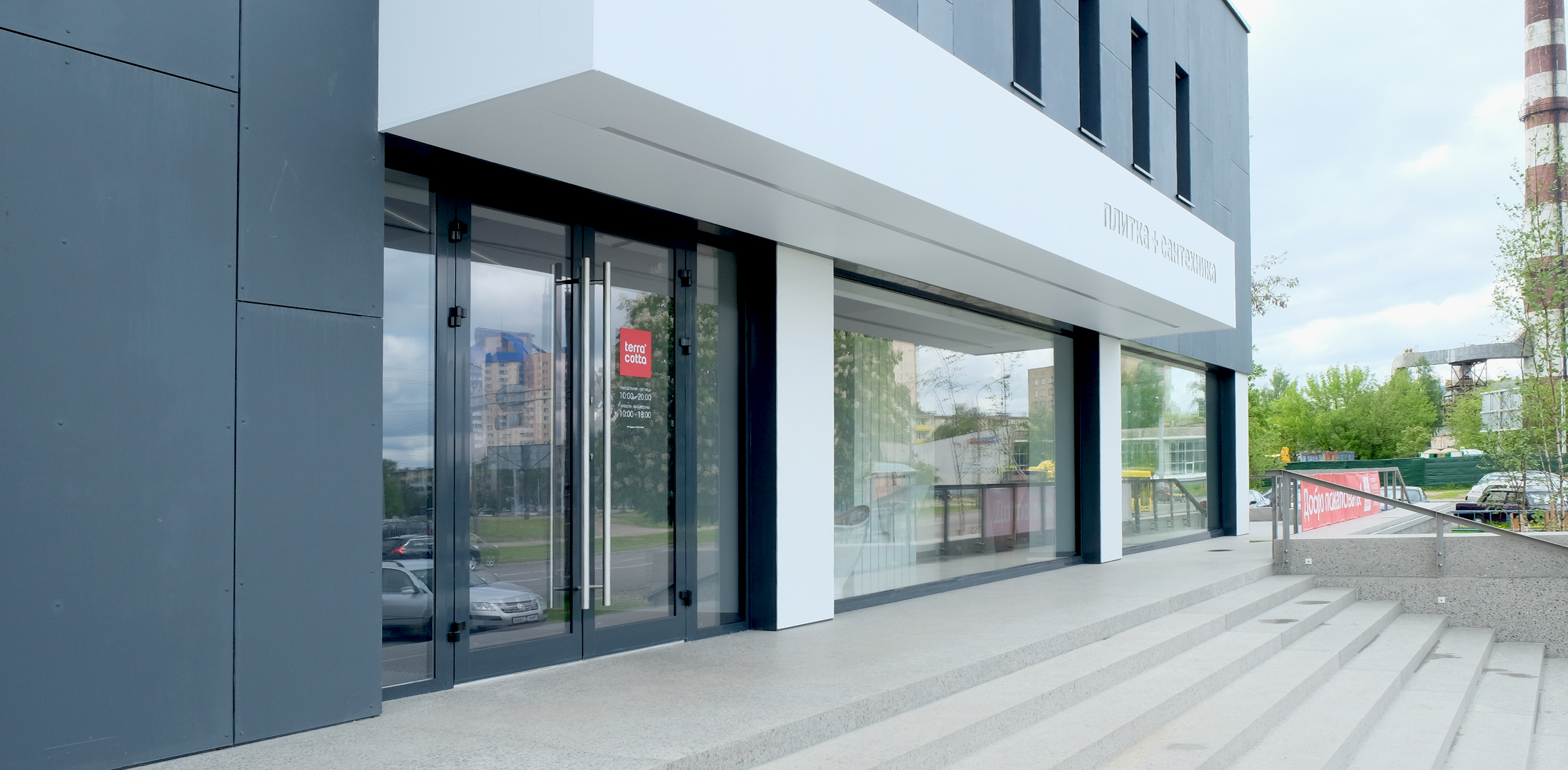
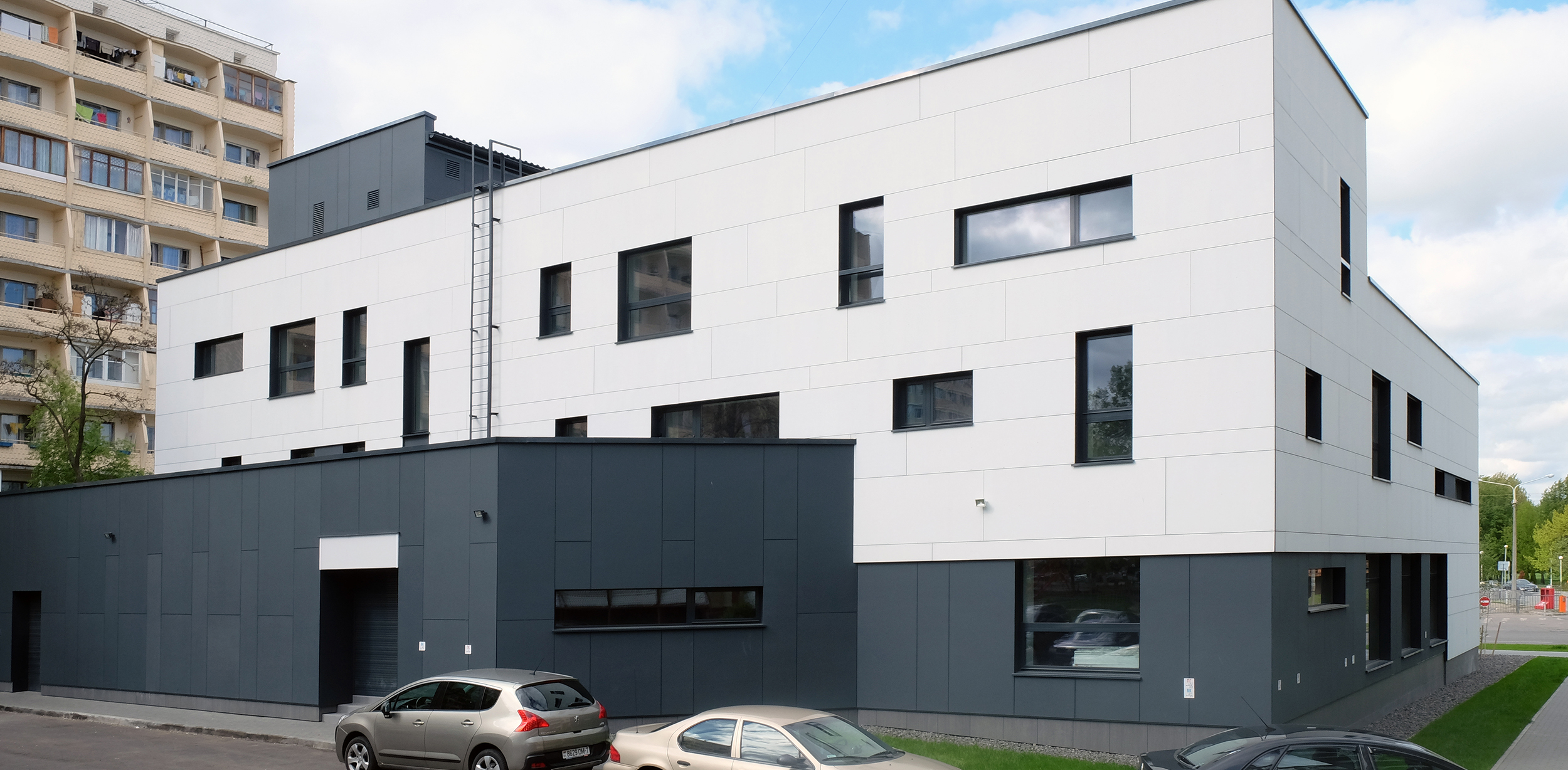
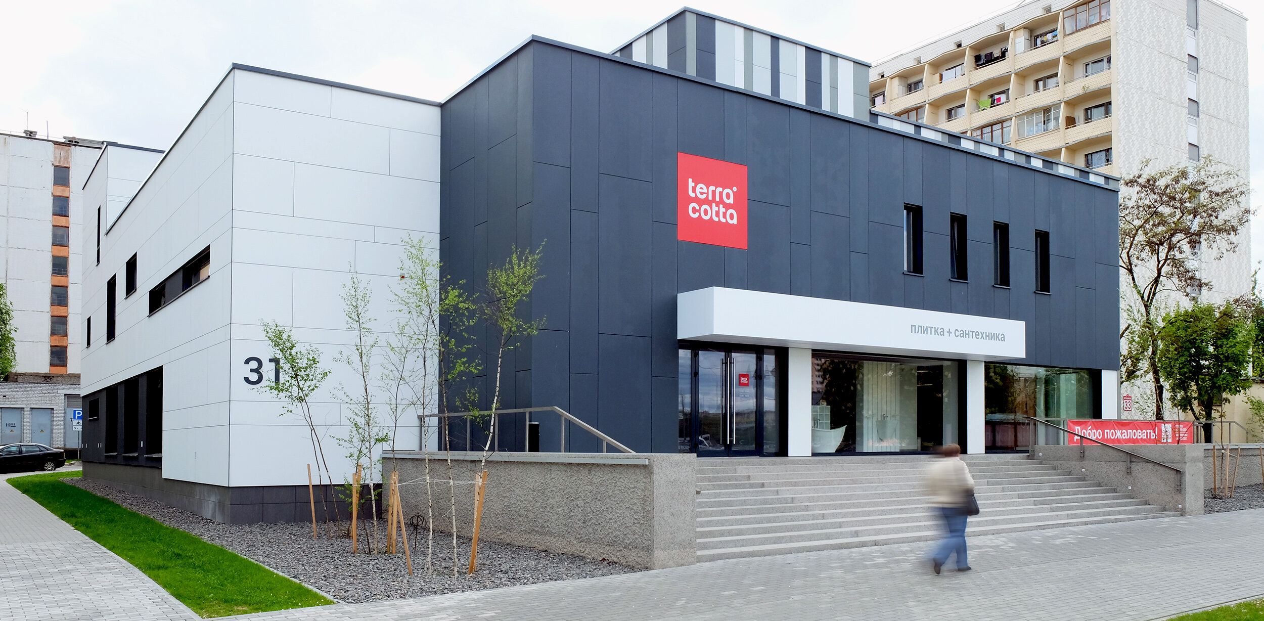
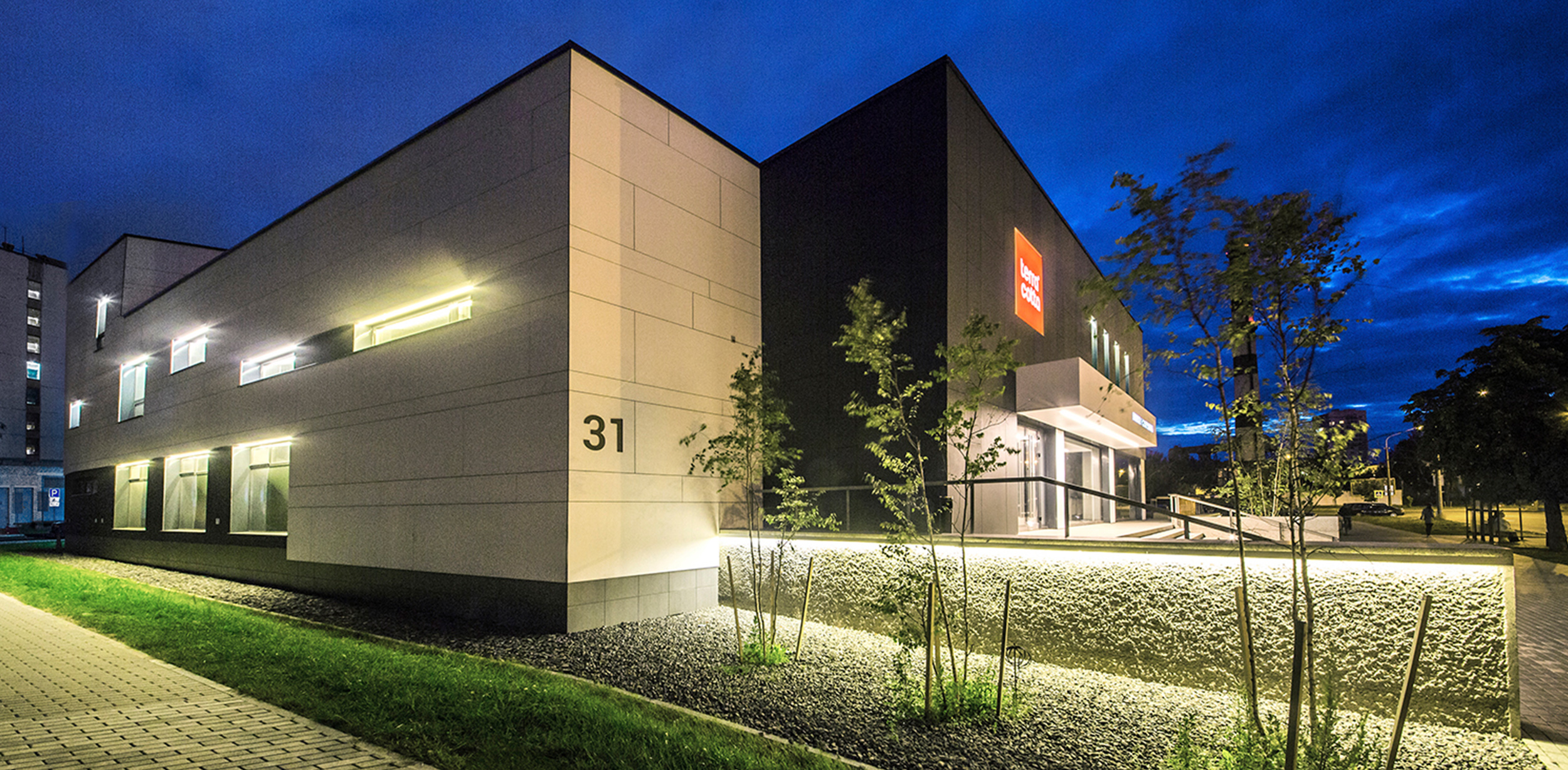
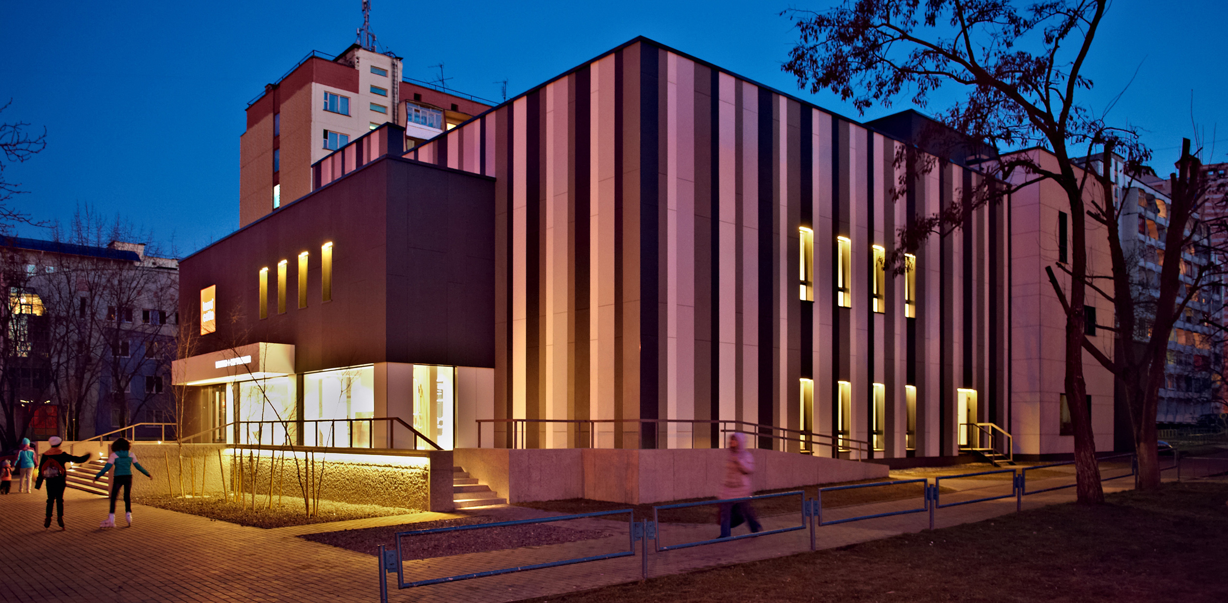
Terra Cotta is a striking example of modern architecture created as a reconstruction result. The primary architectural solution is a combination of volume, decoration materials, and color varieties: white, anthracite, and accent with vertical stripes.
The restrained monochrome color palette allows the building to fit into a complex urban environment harmoniously, and the faсade solution attracts the attention of both city professionals and residents to the present day.

Krosny Trading House was built in the mid-1990s. It housed an Alesya knitting factory outlet. After the store got closed, the building was in desolation for a long time.
At the beginning of the reconstruction, it required a global rethinking. Therefore, during the design process, we changed the visual image of the building, removed the round windows, and simplified and condensed the volume.
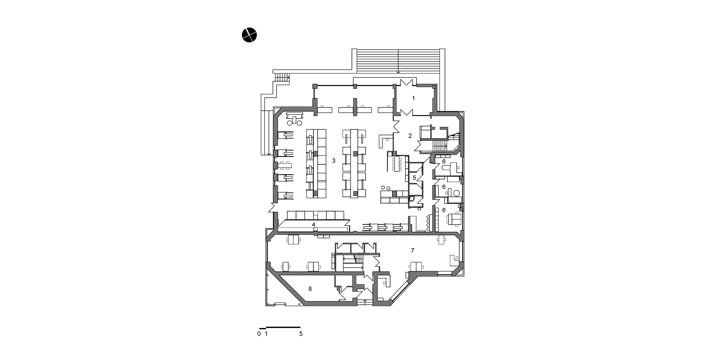
1. Tambour
2. Lobby
3. Exhibition hall
4. Utility room
5. Bathroom unit
6. Study
7. Office
8. Heating unit
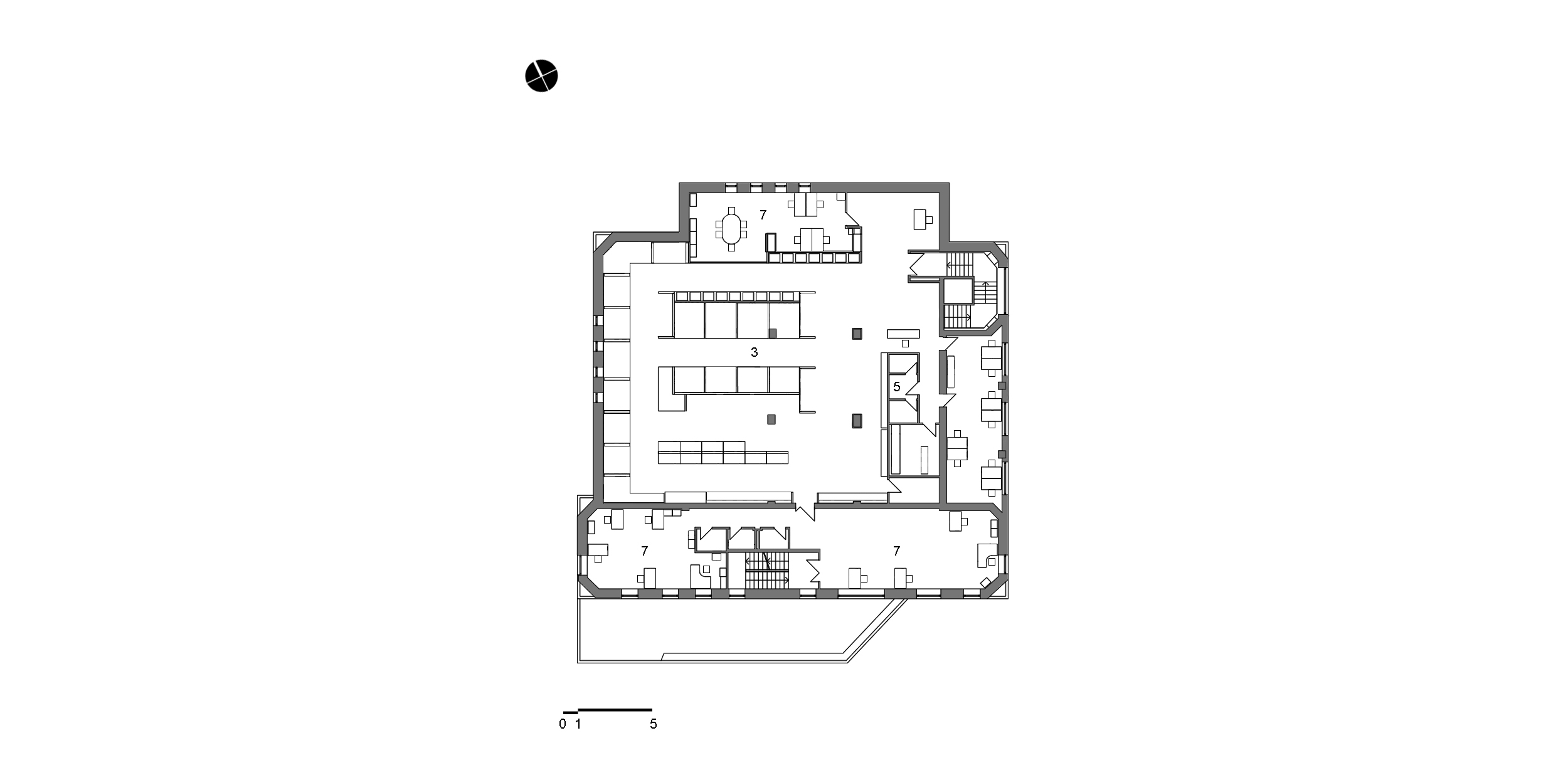
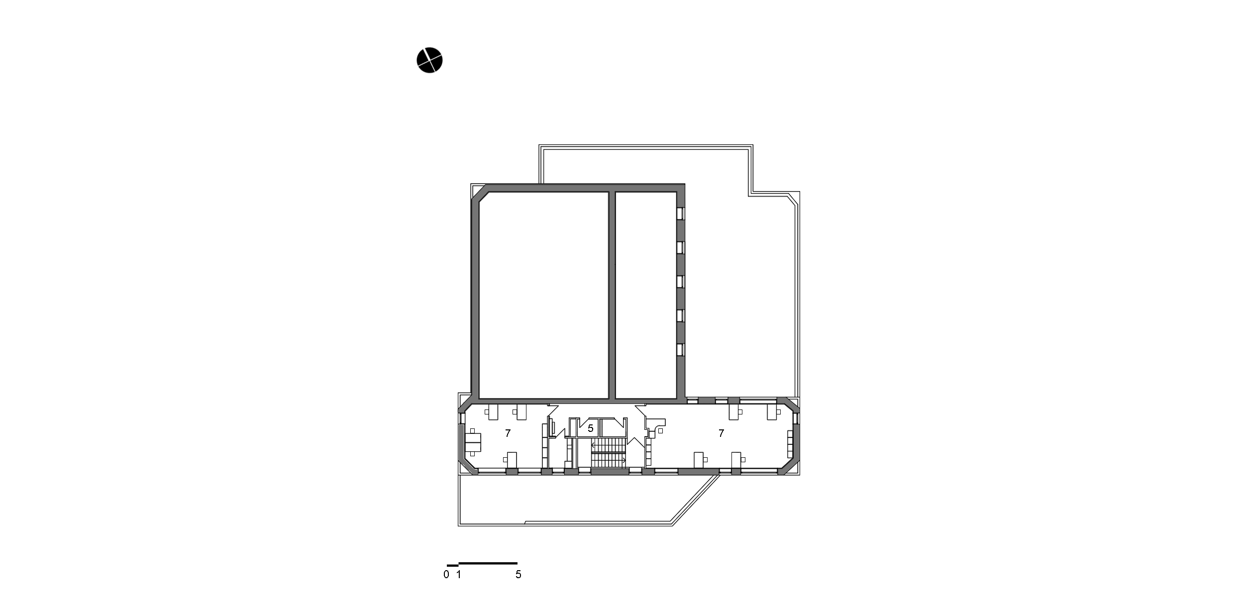
In the layout, we divided the space into two functionally independent parts: Terra Cotta tile and plumbing fixtures store and office space. The store occupies the first floor of the main building, while the second floor houses the offices of architects and designers.
The project proposed the installation of a mezzanine with access to the roof on the second floor along the windows. However, we couldn’t implement it because, after evaluating the structures of the building, it turned out that we needed expensive reinforcement which was unfeasible.
We believe that good architecture should be recognizable from afar due to its silhouette and vivid image, but it should also have details that can be viewed up close.
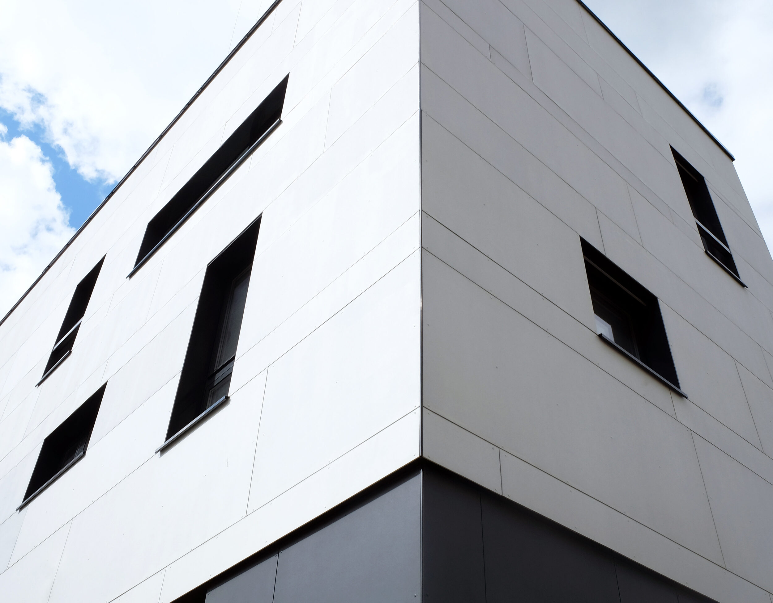
We decided to diversify our faсade solution by using a chaotic arrangement of windows and fiber cement panels. Slabs of different sizes were arranged in horizontal stripes with vertical seams or vice versa.
Also, the different size of the windows corresponds to the function of the premises: large windows are located in the office part, where more natural light is required, and narrower openings are provided in exhibition rooms.
Initially, the porch looked grandiose and non-functional. Since it was a reconstruction, we could not eliminate the high rise to the main entrance, so we tried to find a practical way to modernize it: we beat off the old granite and dismantled individual parts of the porch. For employees and visitors of the building, we provided bike racks with a convenient ramp on the porch.
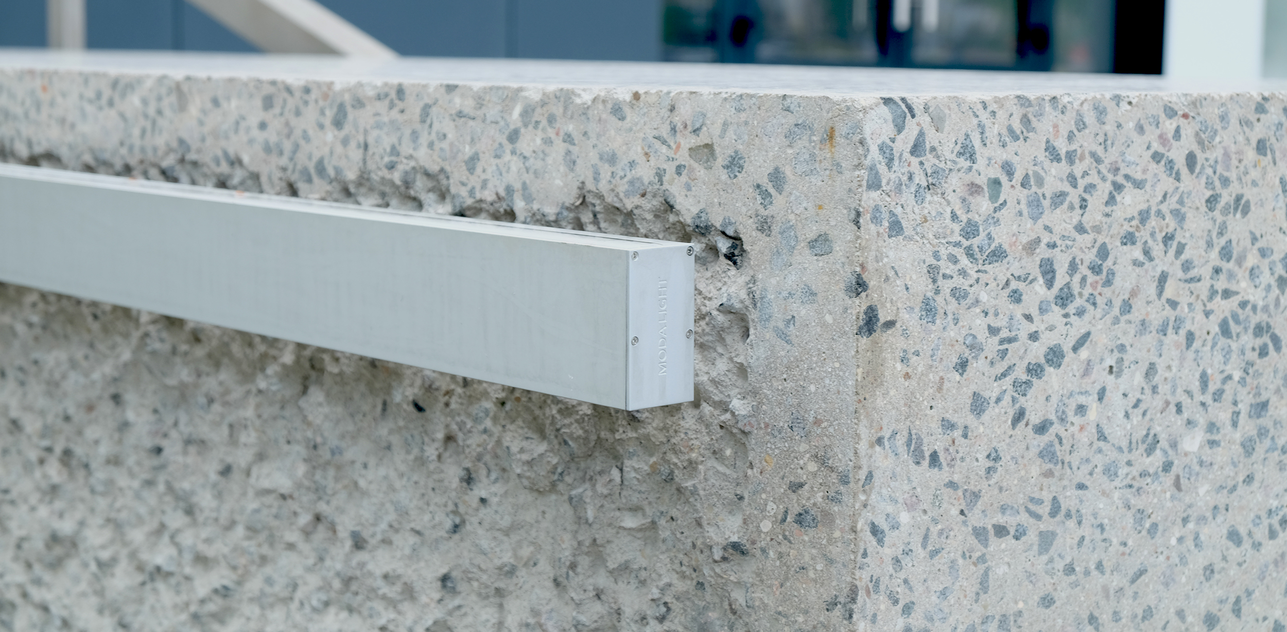
Our team redesigned a part of the porch using concrete in the color of the previous one so that there would be no differences. In contrast, some faces were ground, and the others were beaten off with a rock drill to create roughness. Our idea was to put a fresh and bright volume on a brutal fundamental porch.
Landscaping is an essential part of architecture, which consists of creating a pleasant, comfortable, and welcoming environment around the building. Even having a small adjacent territory, we paid much attention to it. In front of the main entrance, we designed birch trees with a sprinkling of crushed stone. This option perfectly harmonizes in color with the faсade solution.
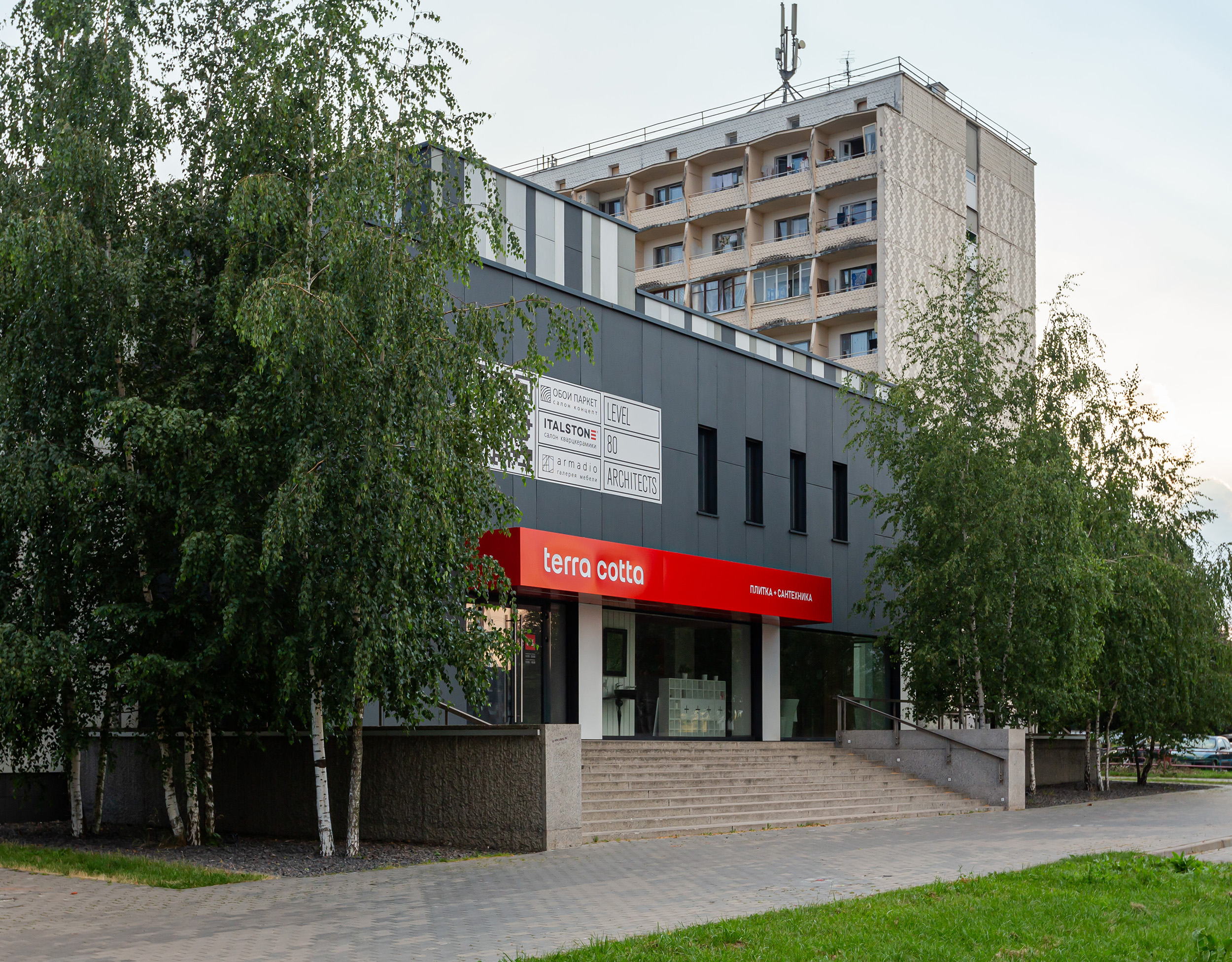
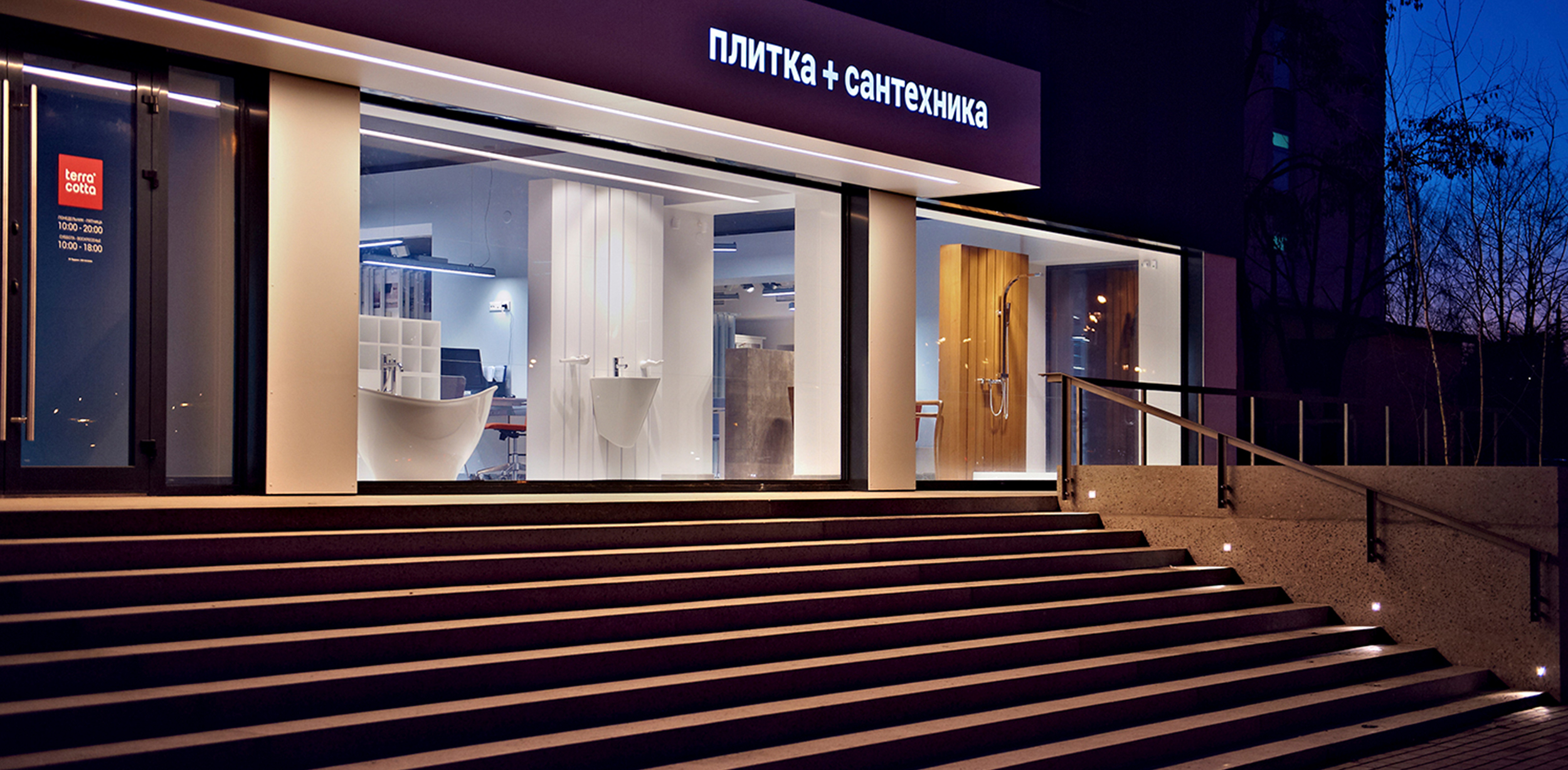
An important point is the appropriate placement of advertising on the faсade. It should be unobtrusive and follow the faсade solution. We allocated a significant area of the faсade for signage, arranging it above the entrance group, and thereby focused on the primary function of the building – the Terra Cotta store.
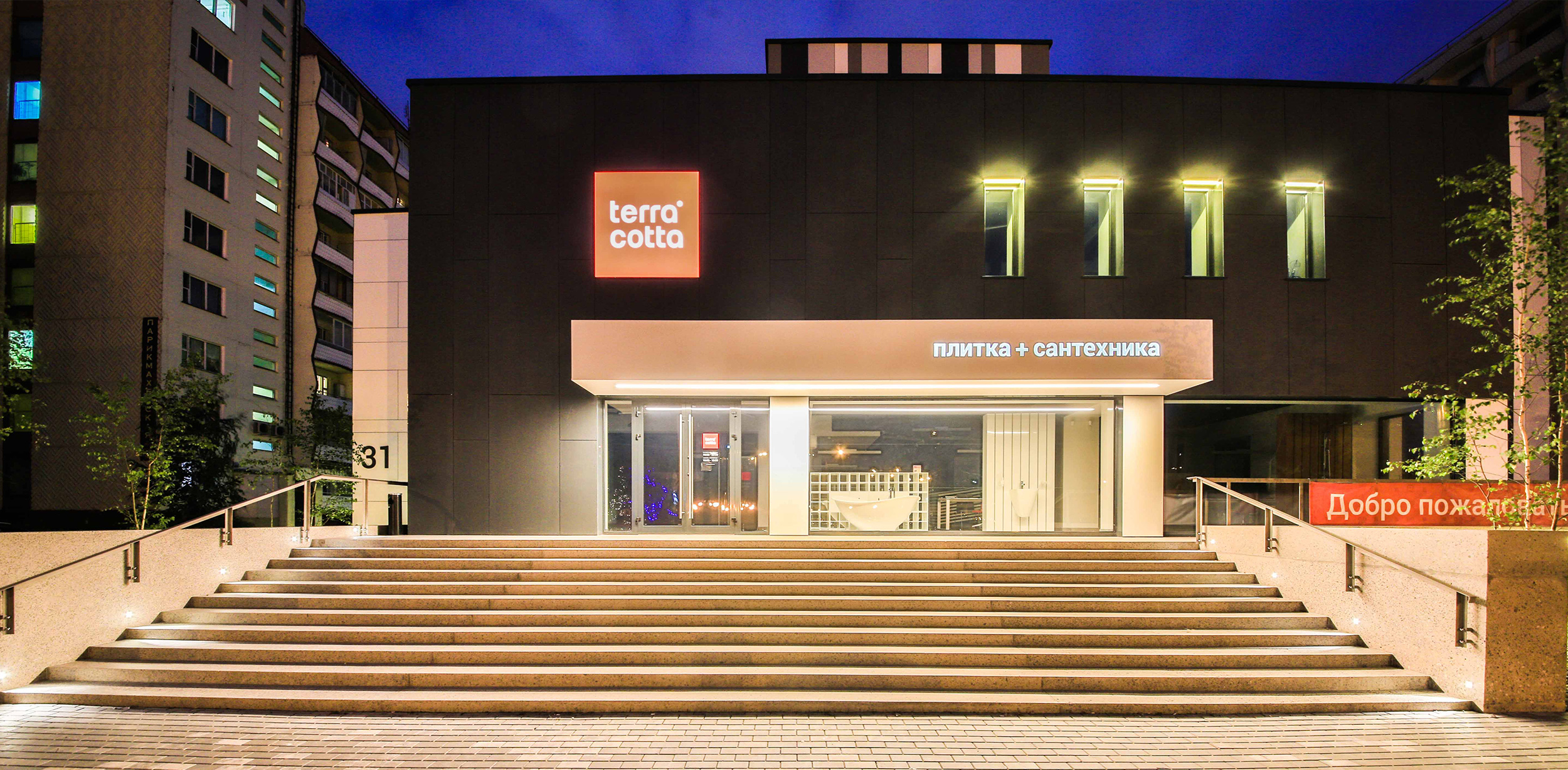
Also, so that the appearance of the building could be seen in the evening, we installed soft illumination of the windows and porch. The sign illumination with the store logo does not create an excessive glow and does not interfere with others, but at the same time, it is a bright accent.
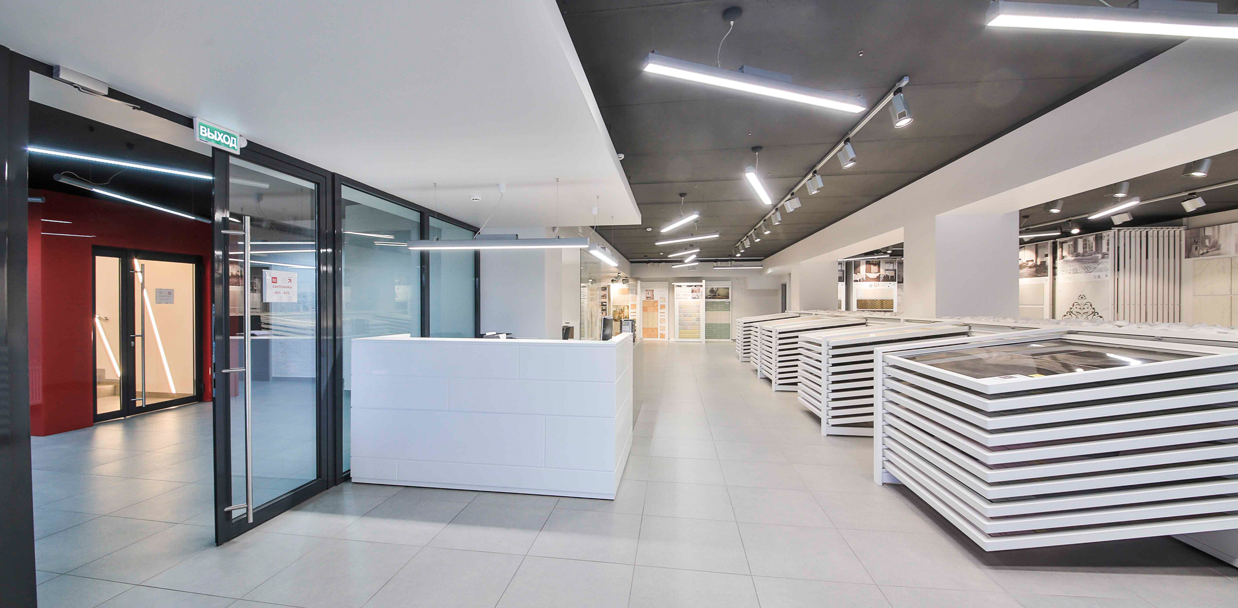
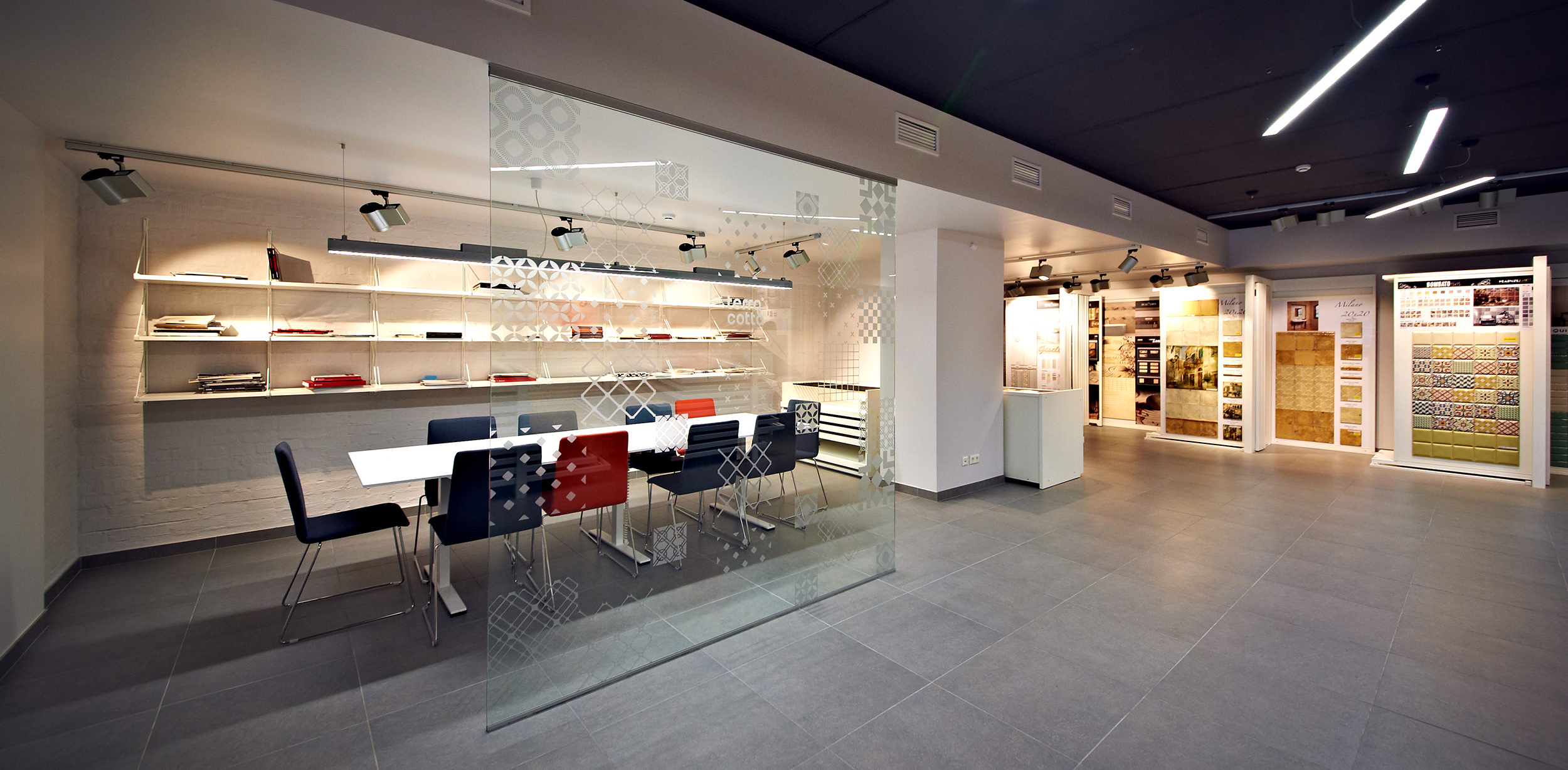
The interior of the two-story showroom is designed in monochrome colors and serves as a background for the
tiles and plumbing fixtures exhibition. The interior design of the first floor corresponds to the concept and Terra Cotta corporate style.
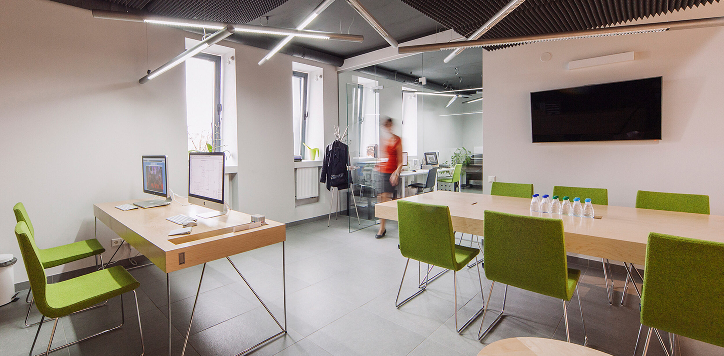
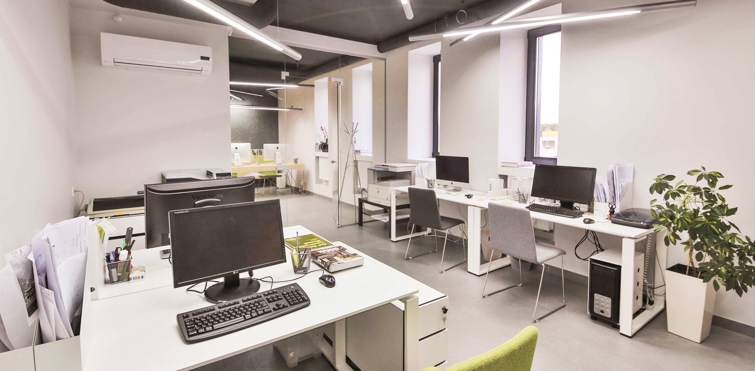
The part with office spaces was designed in light colors, using furniture of bright colors as an accent. A glass partition was installed between the exhibition hall and the office, which lets natural light in and expands the space.
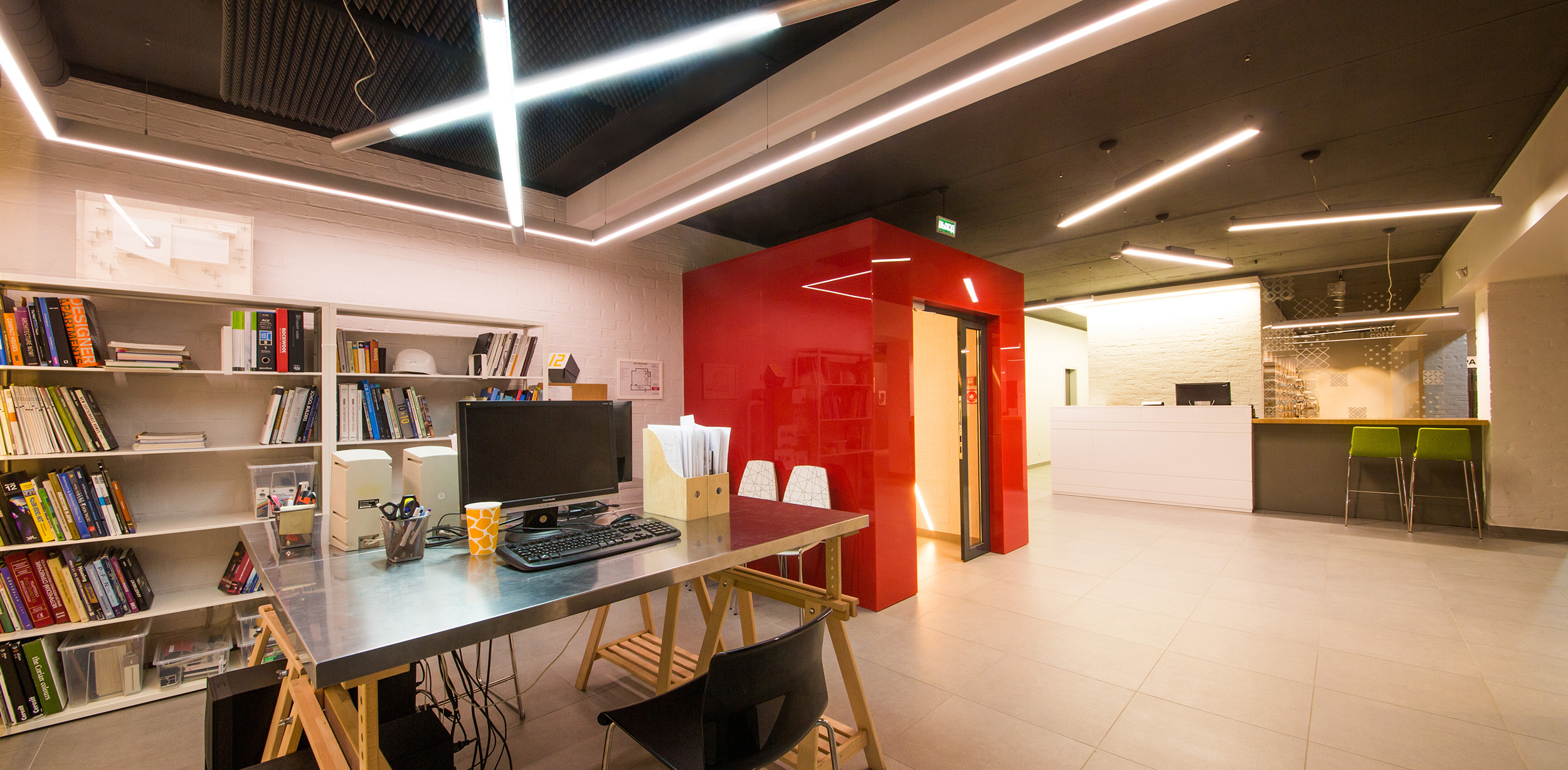
The connecting element of the two exhibition spaces is the stairwell, which is a separate volume in the interior of the halls. It was accentuated by finishing with glossy red glass.
In contrast to the smooth glass surfaces, we preserved brick columns, walls, and cast-in-place floor slabs. To make the space airy and spacious in the exhibition halls, we decided not to coverthe existing ceilings but to leave the structures in plain sight.
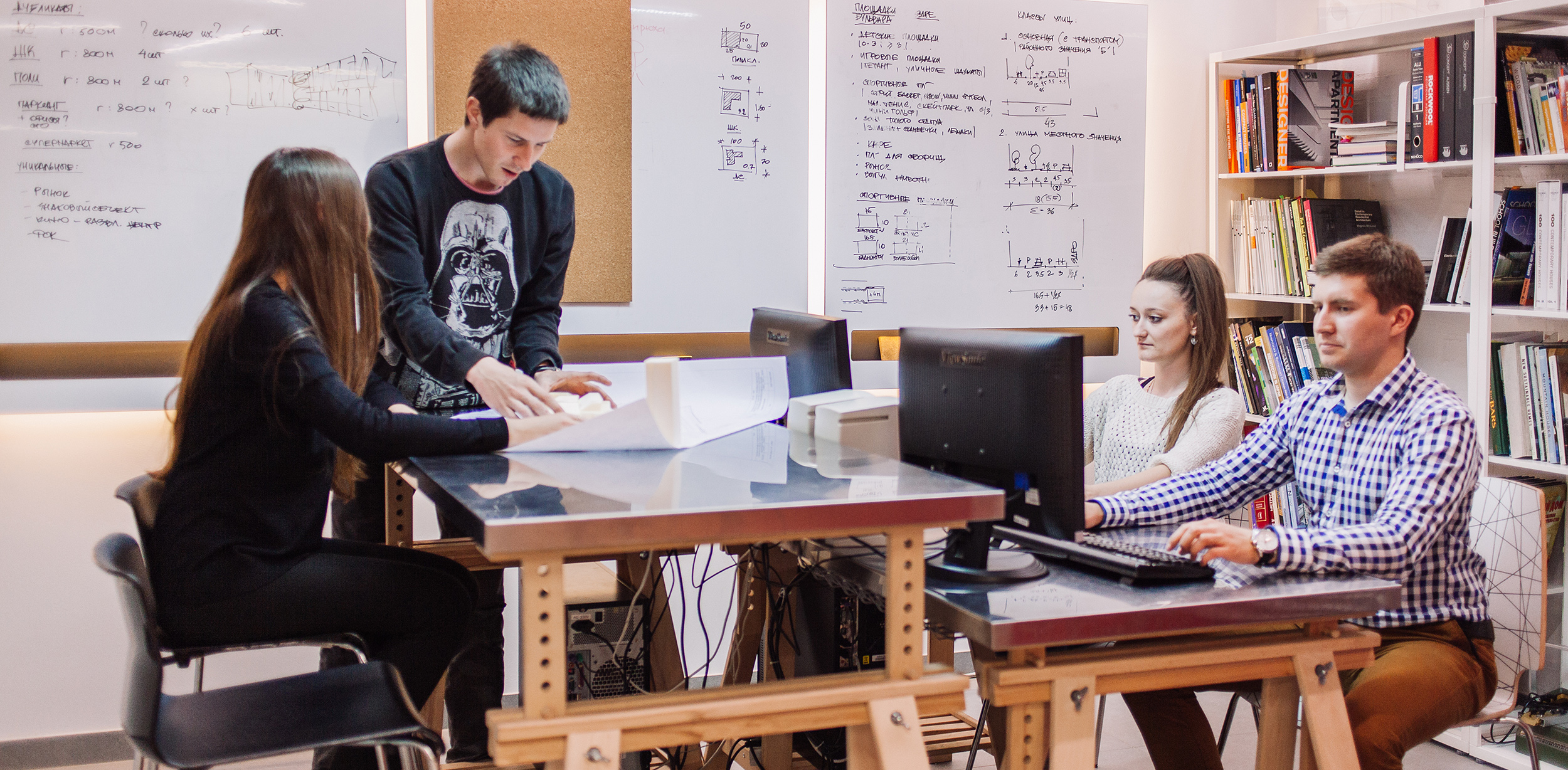
We believe the reconstruction allowed the building to get a new life. Today the Terra Cotta building is a creative cluster for imaginative people. On the first floor, we designed a coworking space with a meeting room and a seating area.
New products are displayed in the exhibition halls, while architects and furniture designers work in informal offices. The architecture and interior create a favorable atmosphere for creativity.
