BOOK Towers

Location:
Belarus, Minsk region, New Borovaya
Year:
2016-2018
Work done:
Architecture
Landscape architecture
Status:
Built in 2018
The team:
Katerina Kovaliova
Kirill Skorynin
Kristina Hamaneeva
Ilya Polonski
Dmitry Tarasevich
Photo:
Ilya Polonski
Anastasia Sascheka
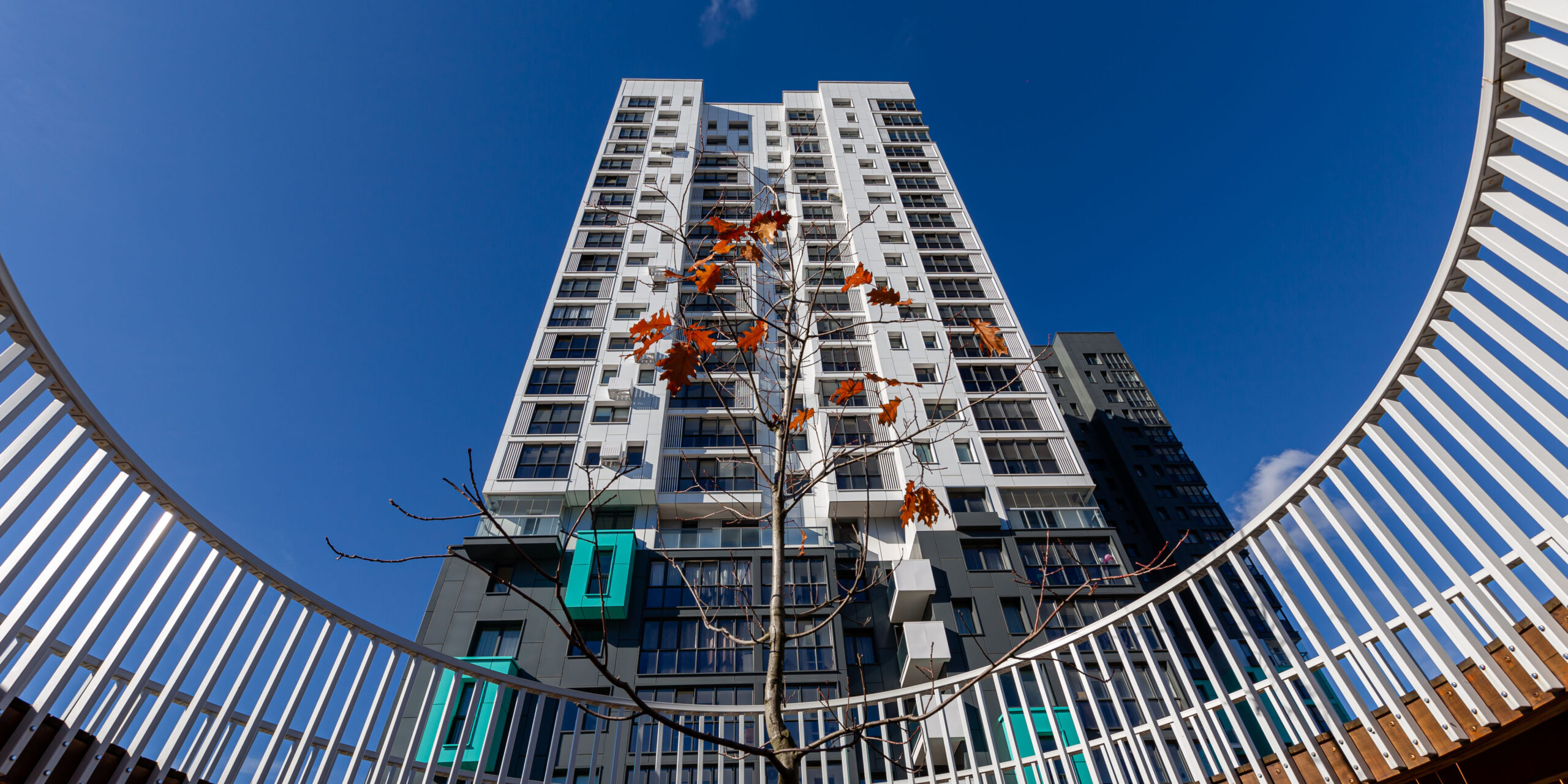
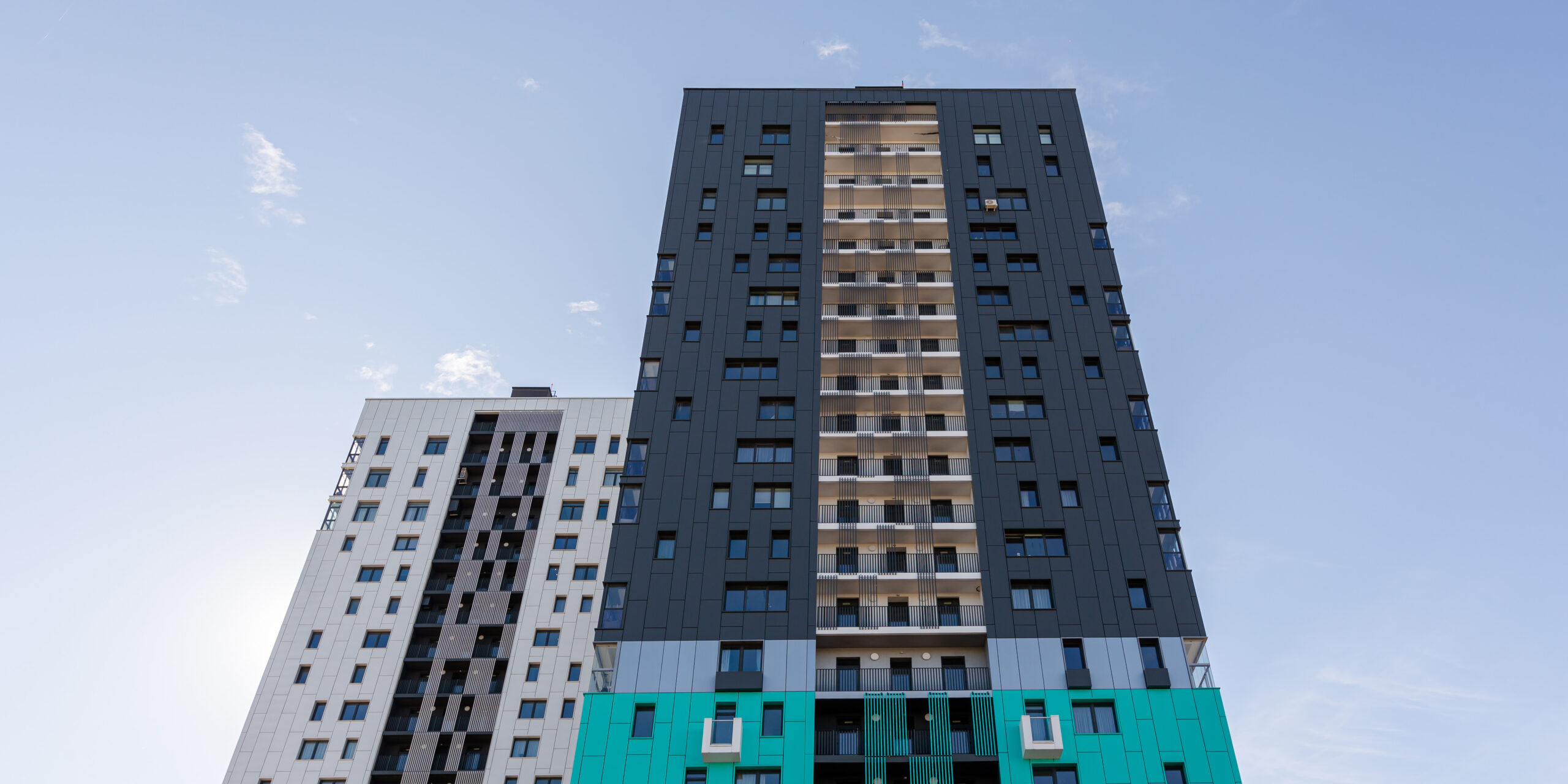
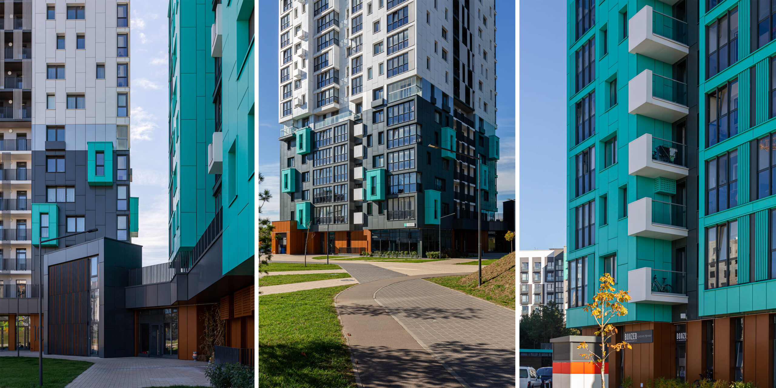
BOOK Towers are two 23-story towers in the Sosnovy Quarter in the developing residential area of Novaya Borovaya. The two buildings are turned at right angles to each other and located on a common stylobate with additional public functions.
For this complex, we designed façade solutions that we strived to make cohesive and recognizable while using many original details.
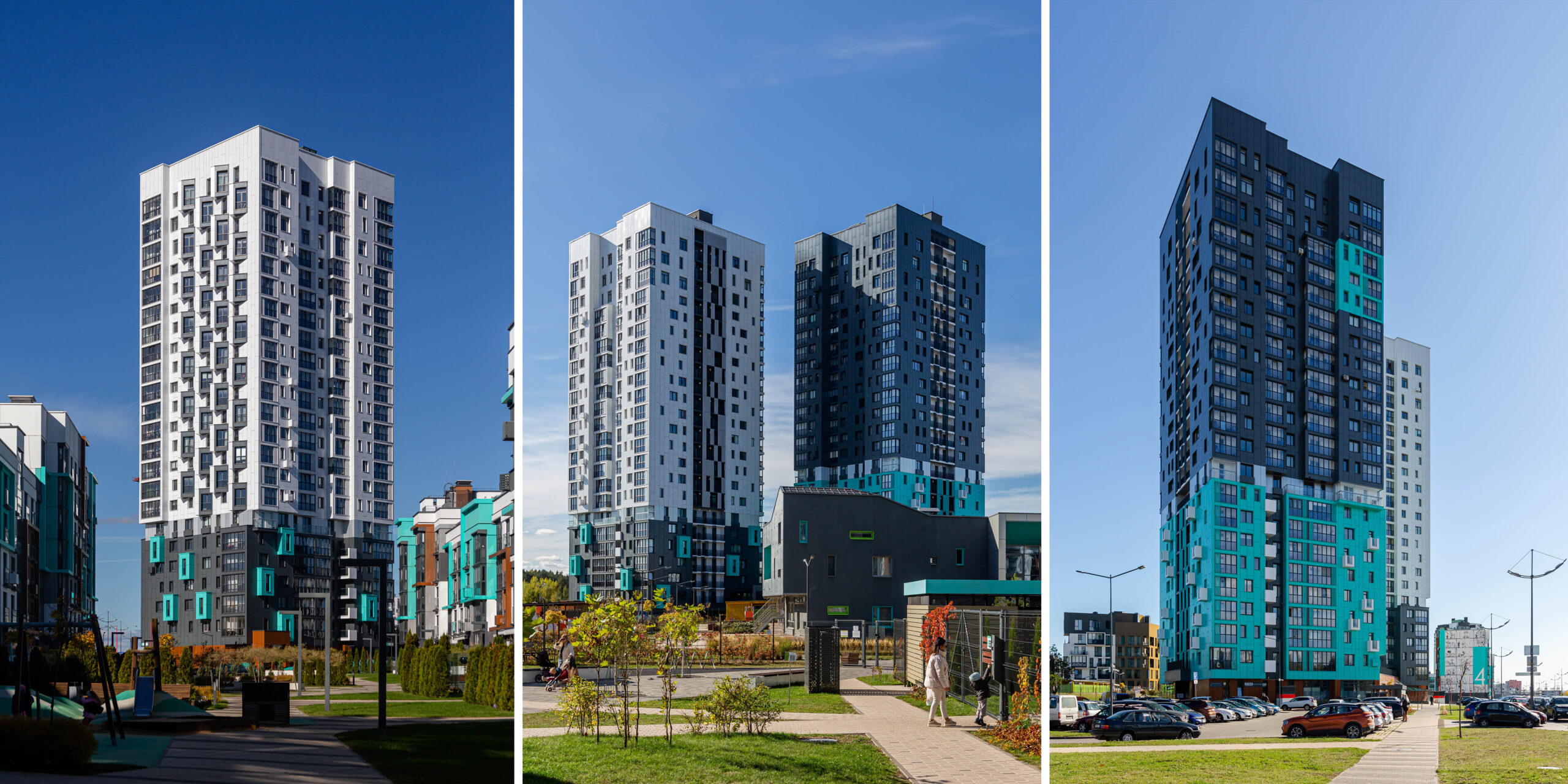
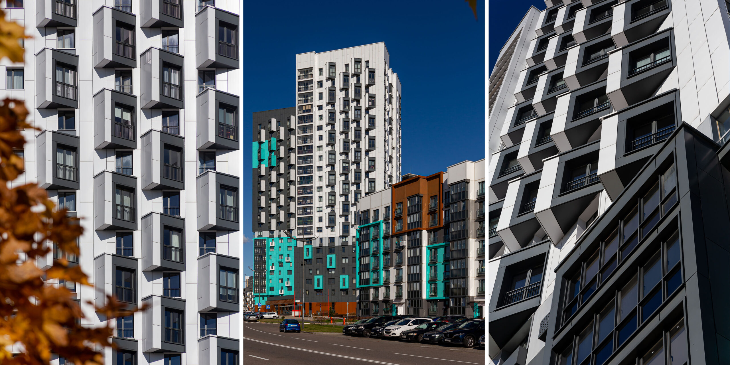
Every time one wanders around the houses, they notice that the two towers seem to replace each other, but at least two faсades of each of them stay visible. To play with these moments, we developed similar solutions that, at the same time, have individual features.
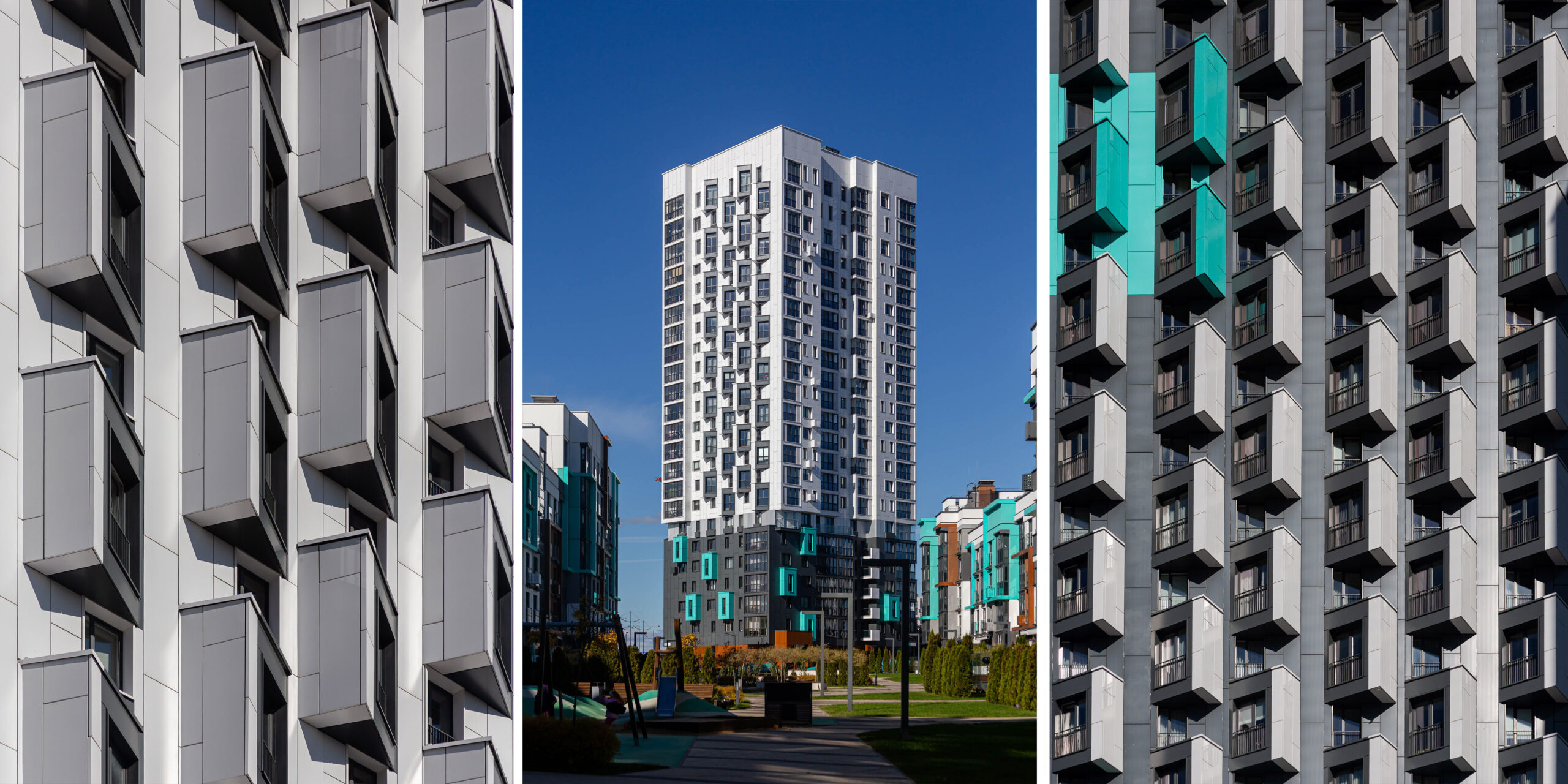
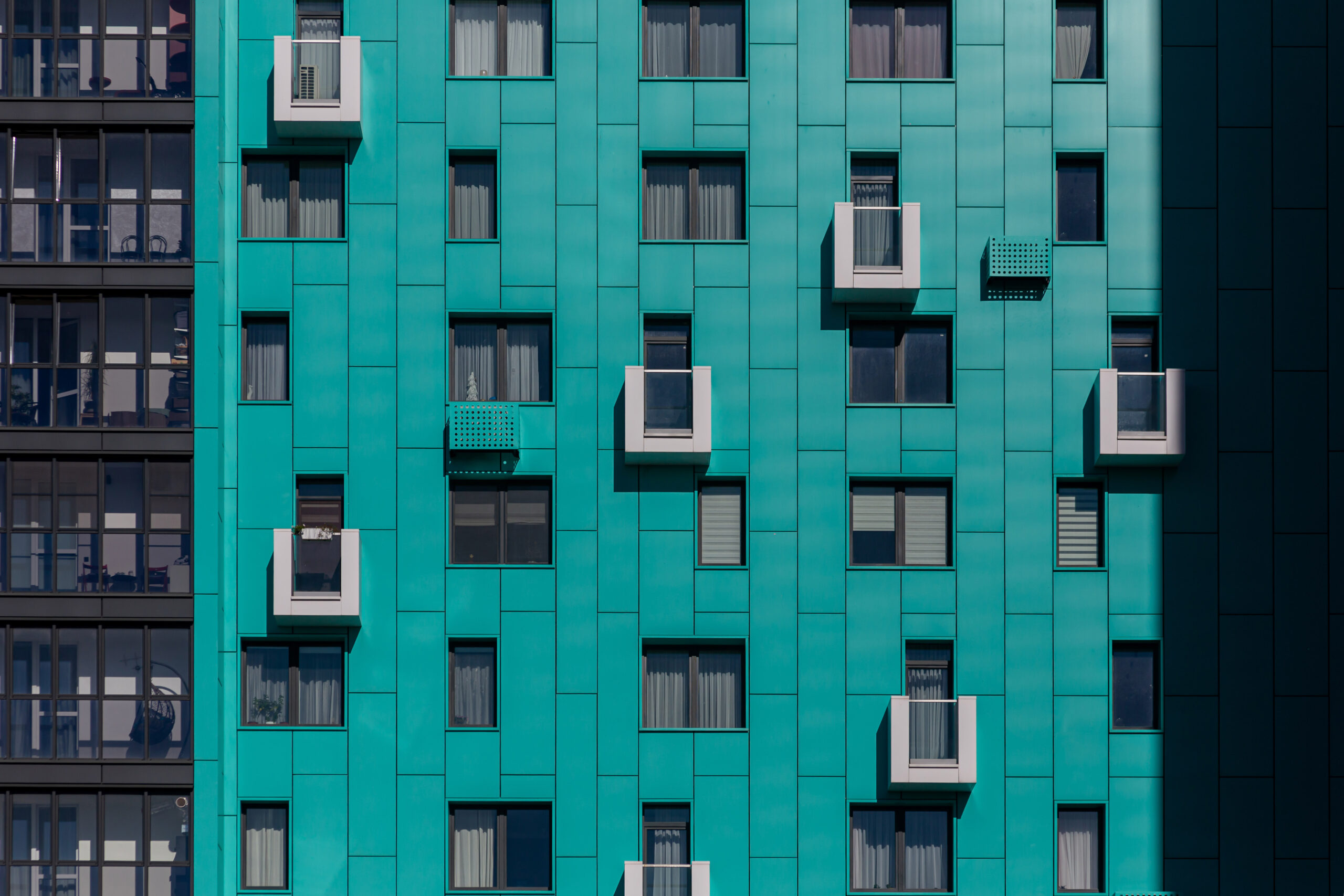
In each tower, we redesigned the layout of the balconies at the corners, distributed them randomly, and even moved them to the opposite facades. We did that to get rid of monotony and create a complex volume.
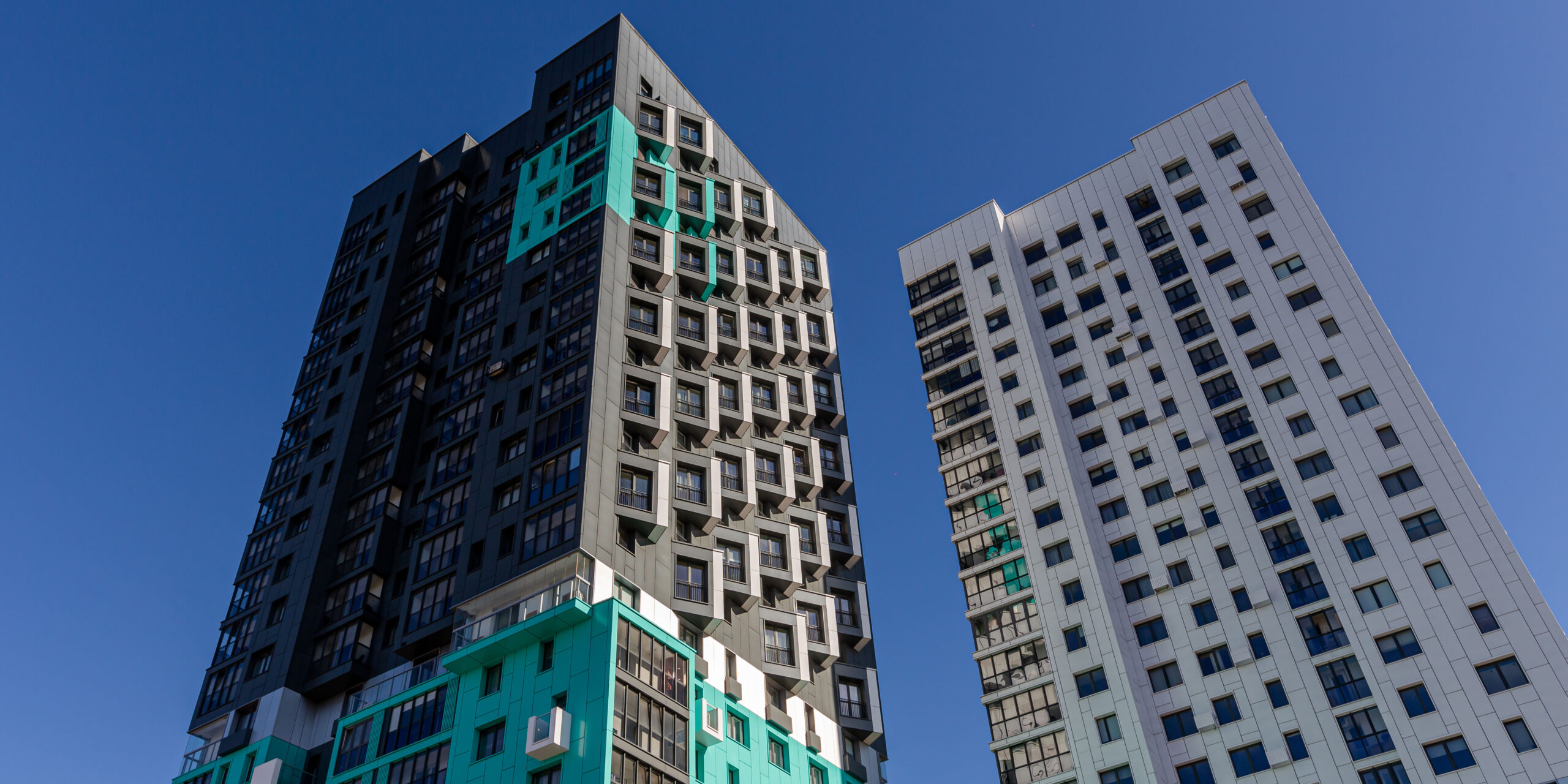
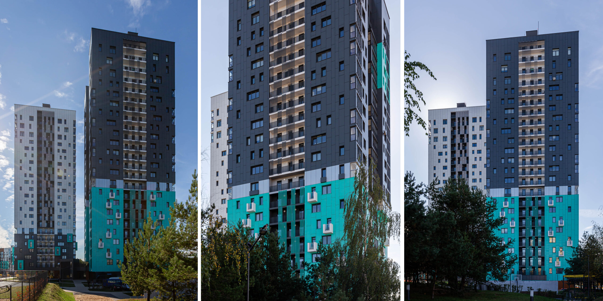
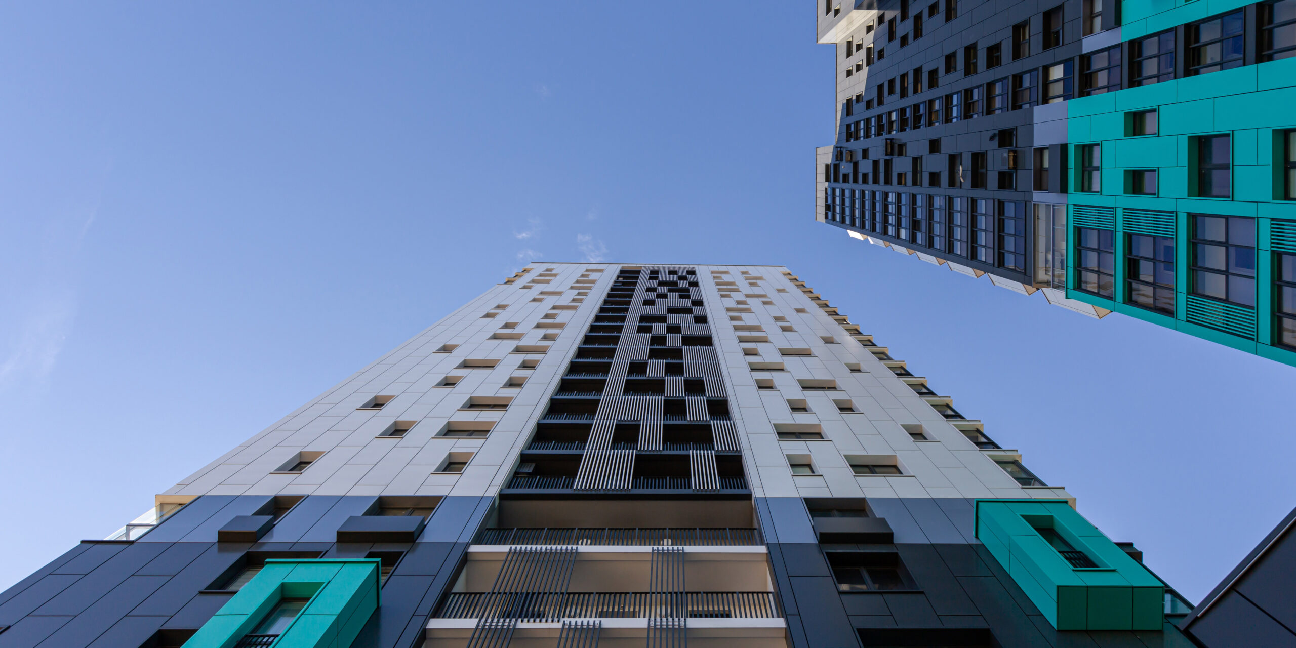
The main material is metal panels in different shades. We chose three primary colors from the palette of the Sosnovy Quarter: white, anthracite, and turquoise, and placed them in spots on the facades. White and anthracite are the primary colors of the towers. As a result, we got the following color combination: the white tower stands on the anthracite base, and the anthracite tower — on the turquoise one.
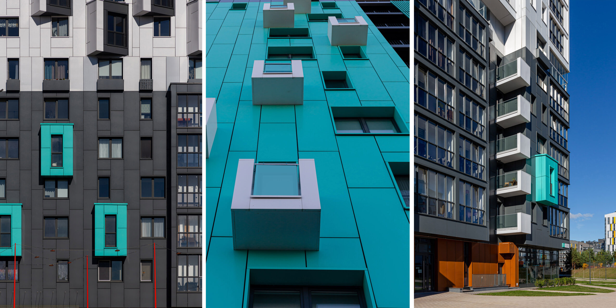
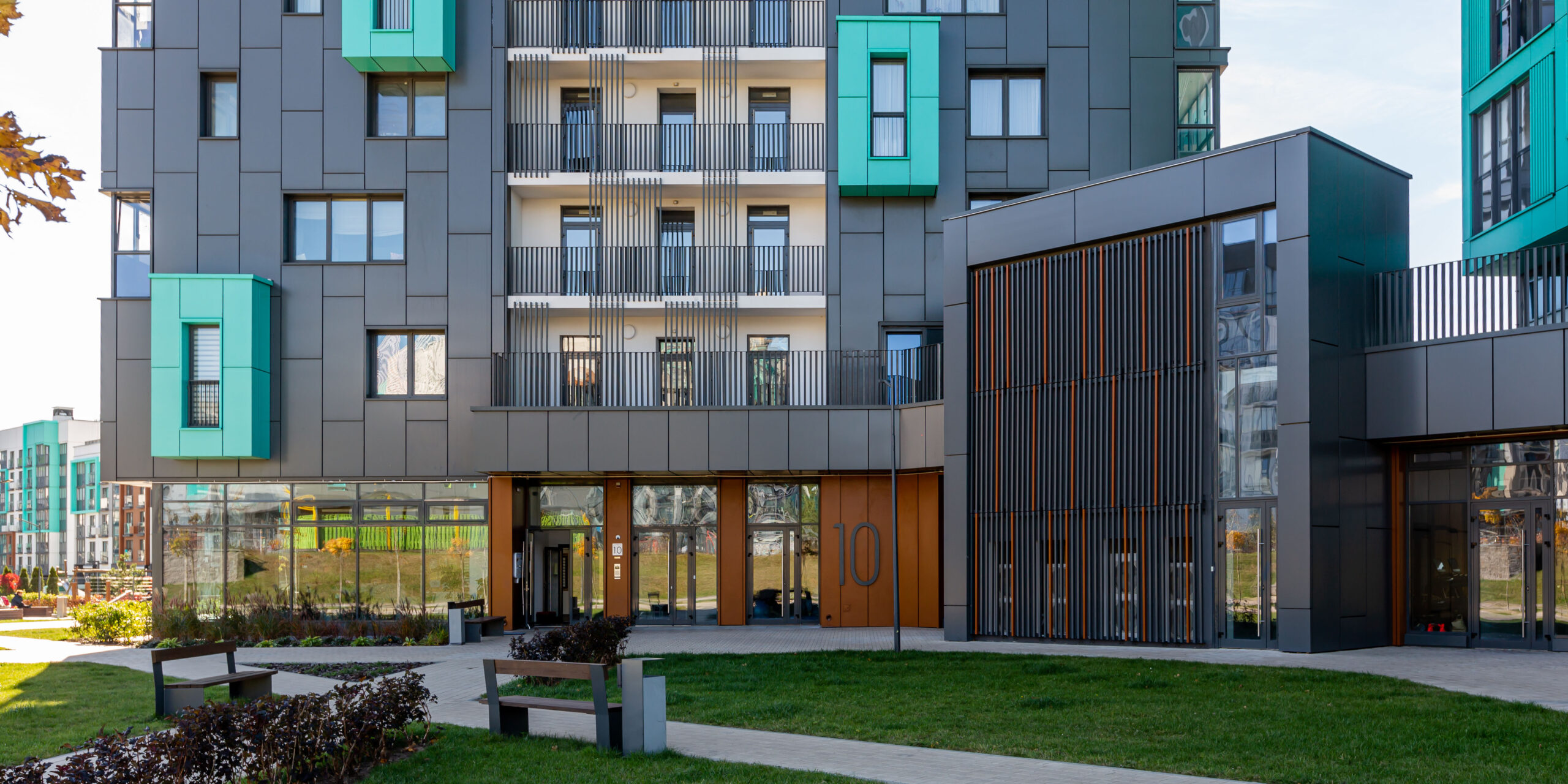
A neutral floor in gray with open glass balconies serves as the separation between the base and the main part and adds light to the project. The bottom of the house stands out with its rich color, imitating corten. To diversify the façade solutions on the one hand, and to connect them on the other, we used different colors in different proportions on each tower.
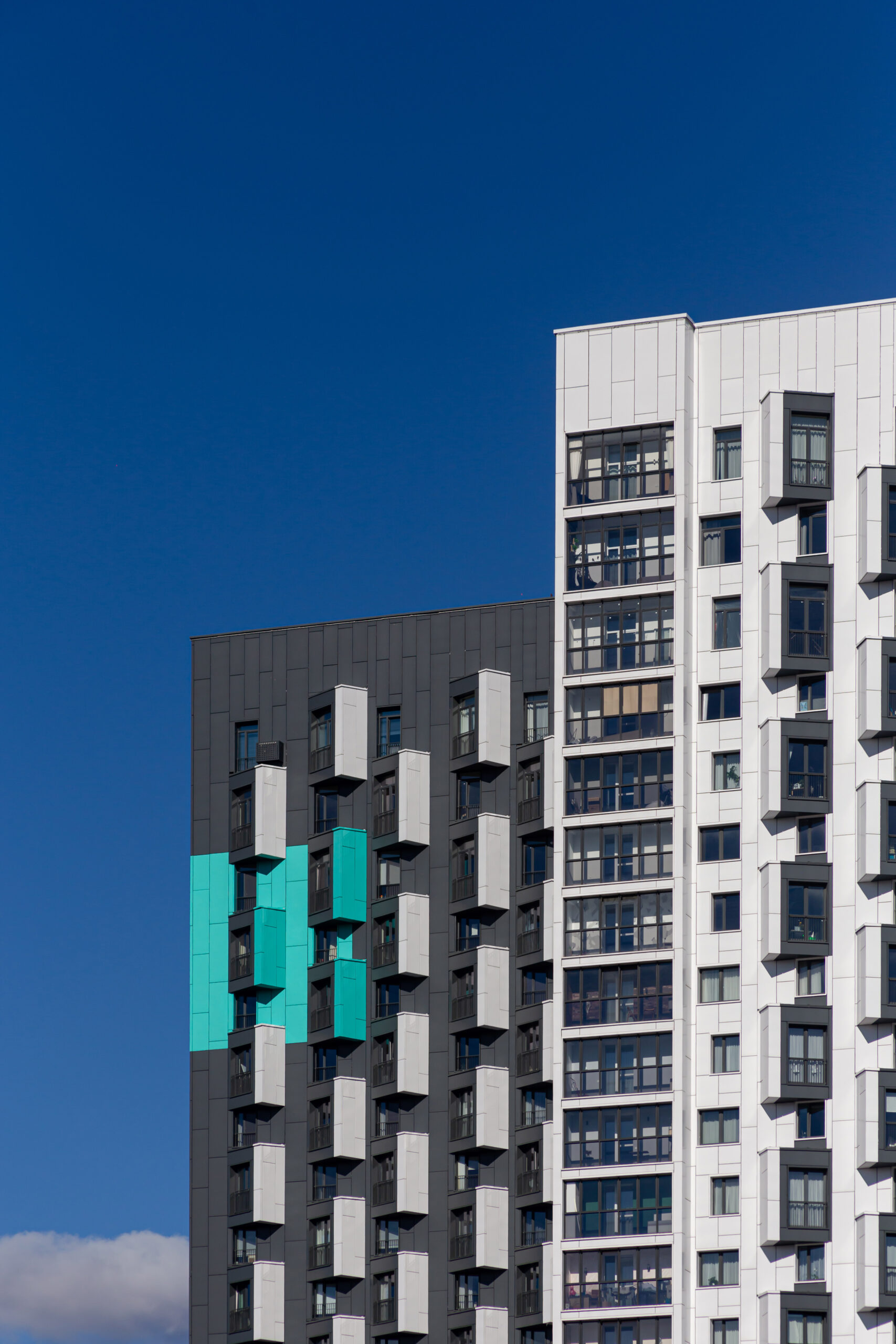
The rectangle painted in turquoise on the anthracite tower serves as a kind of accent landmark for the residents of Novaya Borovaya. And it also resembles a bookmark in a book.
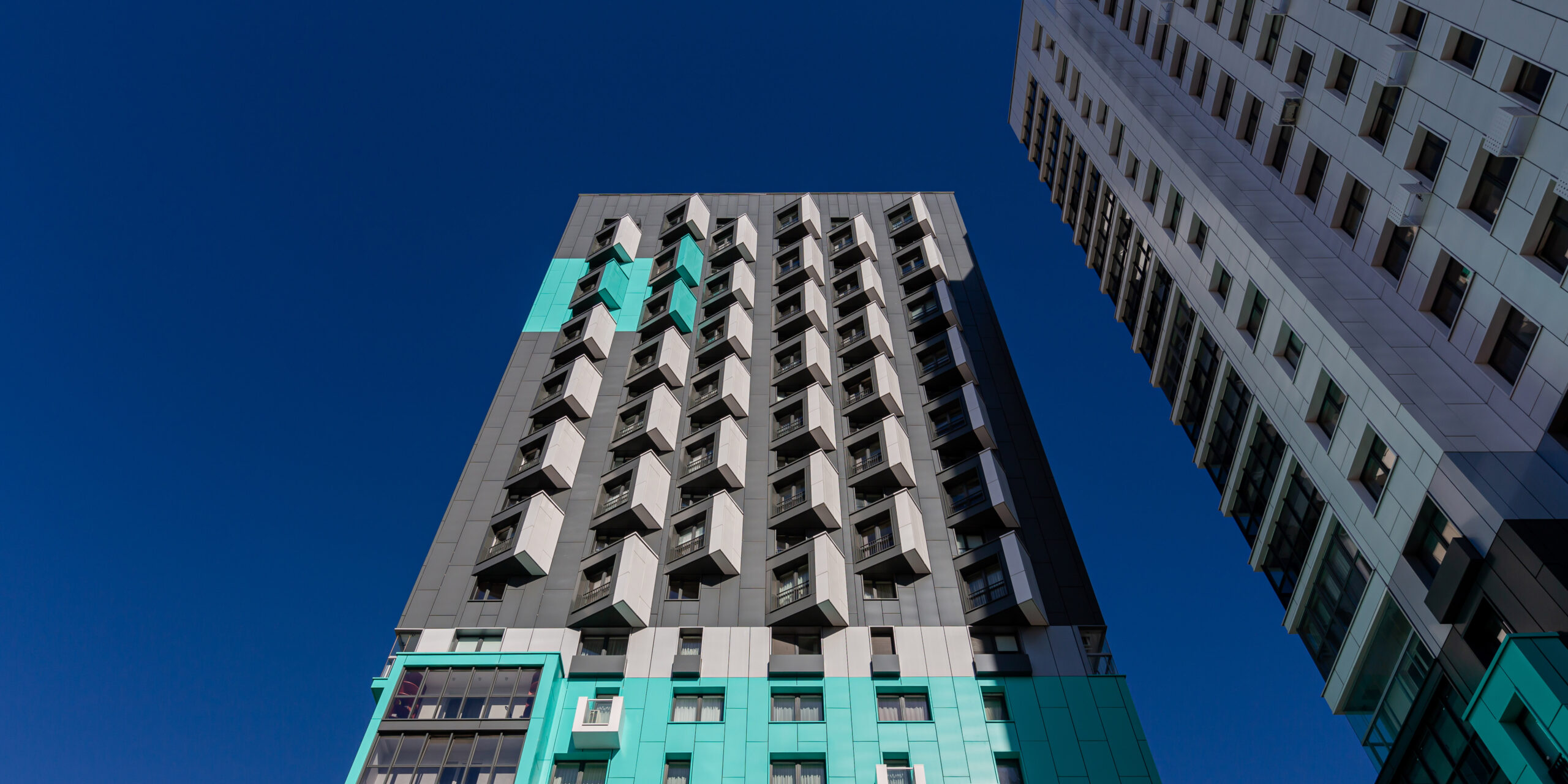
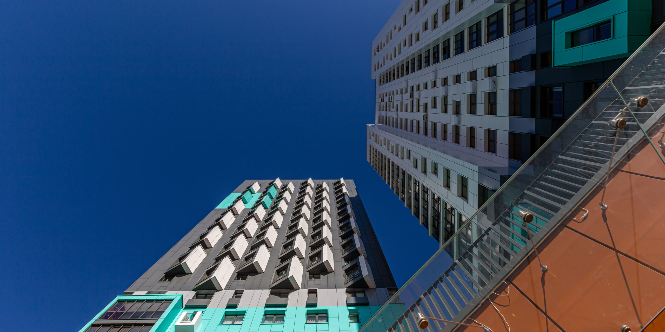
We enhanced the image of the complex with original elements — non-standard triangular oriels that look like pages of books. These are small cozy areas in every apartment where you can relax in a chair and read.
The pages are open to the best views: on the white tower — to the functional courtyard, and on the anthracite tower — towards a small preserved forest. This peculiar ‘grater’ is a distinctive feature of the complex and gives it its recognizable character.
As accents for the lower tier, we used randomly scattered protruding rectangular volumes, French balconies, and overhanging consoles that protrude from the overall volume of the towers like ship bridges.
The boxes for air conditioners are made in the color of the facade to prevent installed air conditioners from spoiling the facade look.
The facades facing the staircase and elevator cells are restrained but are not inferior to the rest. We designed open balconies in the form of lamellar structures, randomly scattered over the floors.
The pattern on the facades is emphasized by windows of different sizes, which converge in a gradient towards the center. This simple technique breaks up the monotony and adds dynamics.
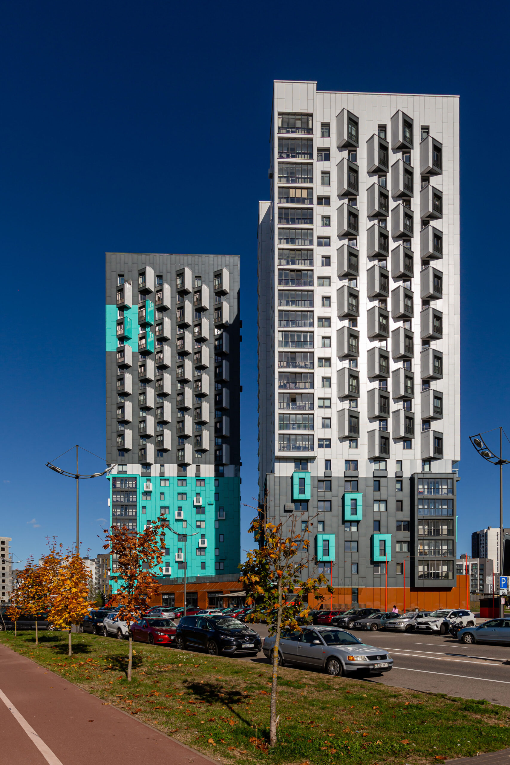
By combining all of these techniques, we were able to create the towers different in character, but to preserve the integrity of the complex.
BOOK Towers look original from any side and harmoniously fit into the Sosnovy Kvartal Quarter.
The building does not have a closed courtyard. Its function is replaced by a stylobate and an open area around it. On the first floor, there are shops and cafes, for which we developed a design code and provided the same places for signs so that advertising did not spoil the appearance of the building.
The apartments on the second floor have small private terraces that open onto the platform. We hid the air conditioning and fire escape ladder behind a grid that formed a whole panel of lamellas.
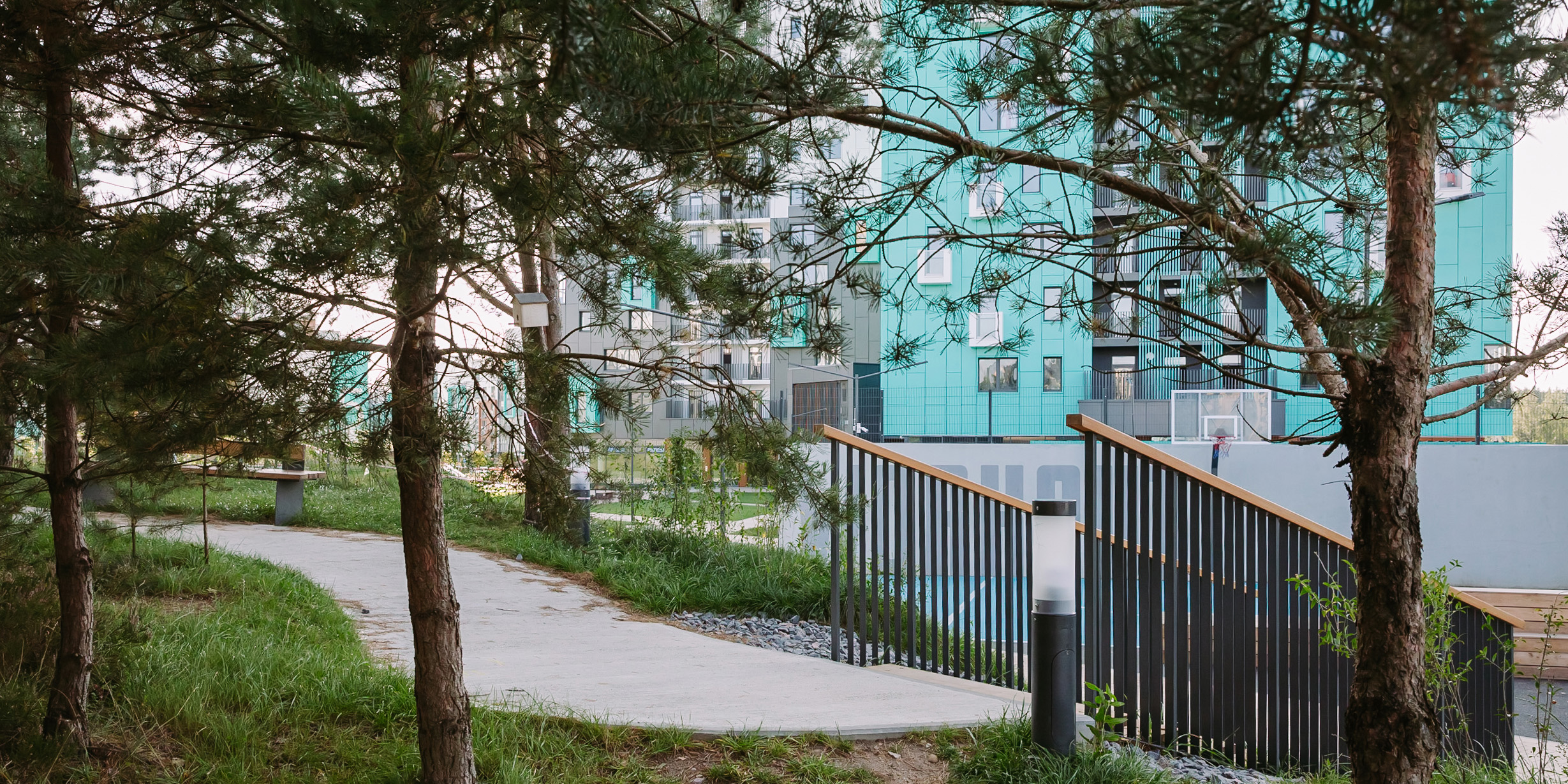
When choosing colors for the facades and landscaping elements, we aimed to fit the urbanized quarter into the natural environment delicately.
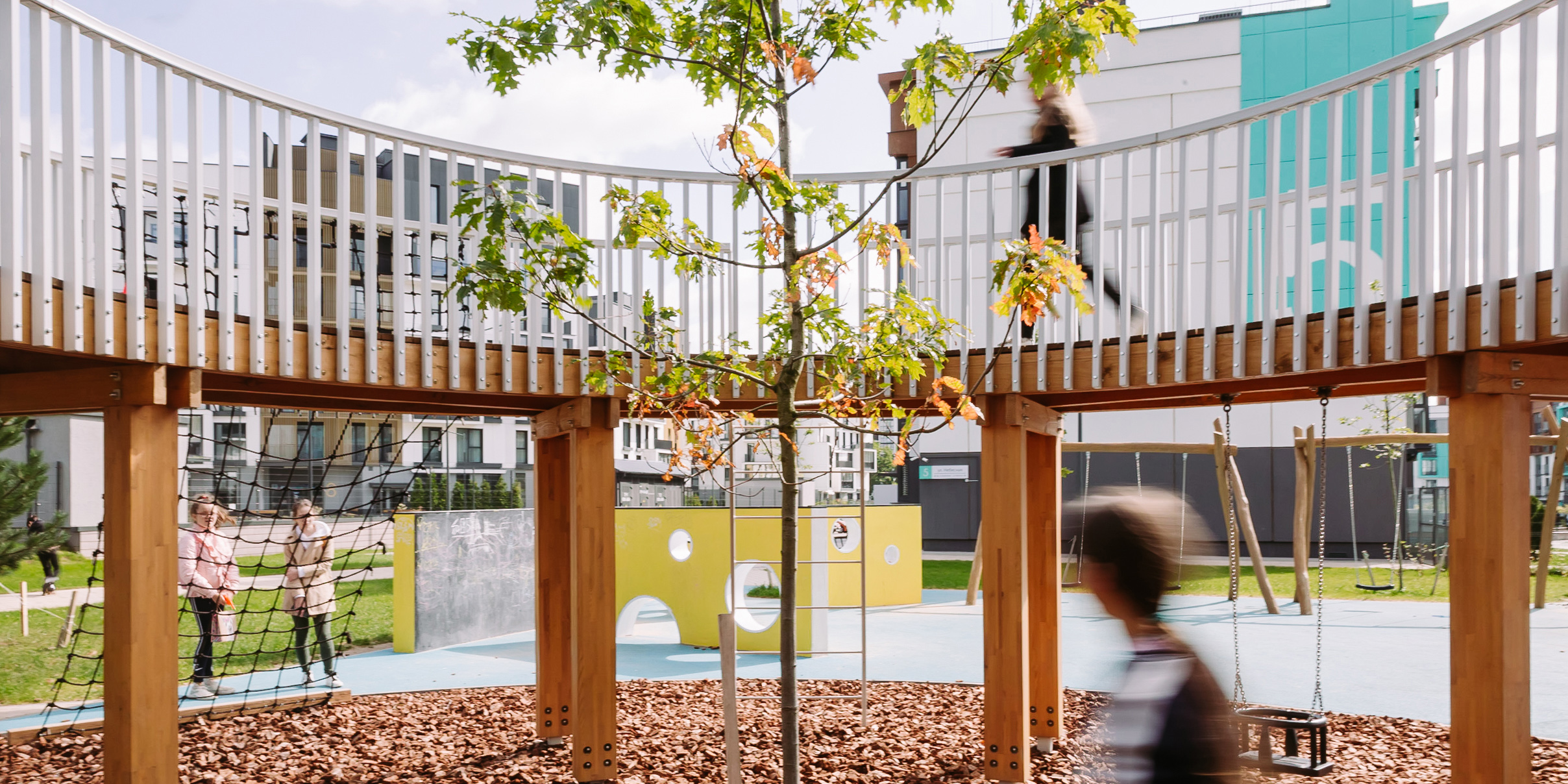
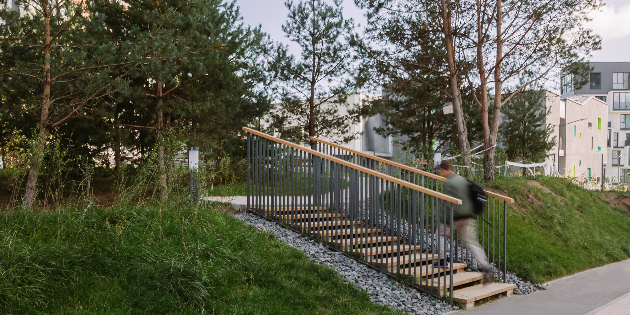
The area around the house is landscaped. It’s conducive to children’s games, sports, and relaxing in a small pine oasis. We filled it with a variety of zones:
— full-fledged children’s playgrounds with custom-made concise equipment in the form of a wooden circle and geo-plastics;
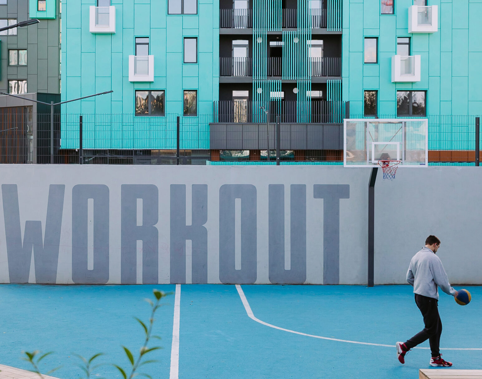
— workout area with exercise equipment and a basketball hoop;
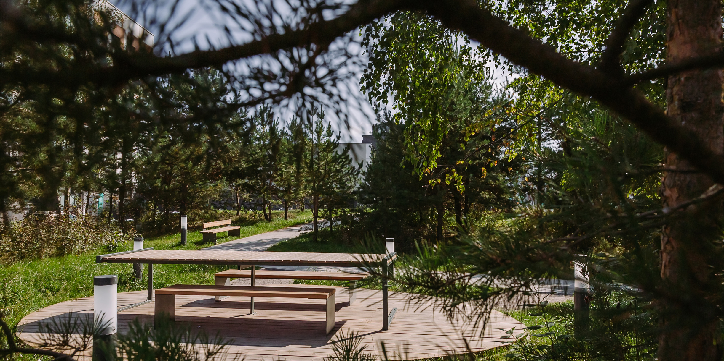
— and a real preserved piece of forest — a favorite place for young mothers.
This project is special for our team as we implemented more than 90% of our ideas.
Read about other projects in this quarter on our website:
SCHOOL New Bor — https://level80.pro/en/projects/school-new-bor/
Kindergarten COSMOS — https://level80.pro/en/projects/kindergarten-cosmos/
Kvartal PARK — https://level80.pro/en/projects/kvartal-park/
SUGAR Houses — https://level80.pro/en/projects/sugar-house/
Kindergarten YELLOW GIRAFFE — https://level80.pro/en/projects/kindergarten-yellow-giraffe/
