CLINIC CENTER

Location:
Belarus, Minsk region
Year:
2017
Work done:
Architecture
Landscape architecture
Status:
Built in 2018
The team:
Katerina Kovaliova
Kirill Skorynin
Dmitry Sergienya
Dzmitry Biarnovik
Veranika Zanouskaya
Photo:
Ilya Polonski
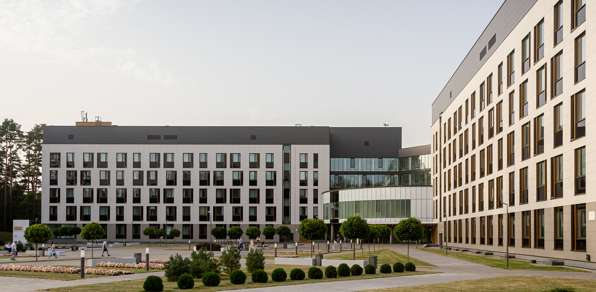
The modern medical center is located near Minsk in the Zhdanovichi district. The clinic territory is situated in a pine forest near the Minsk Sea.
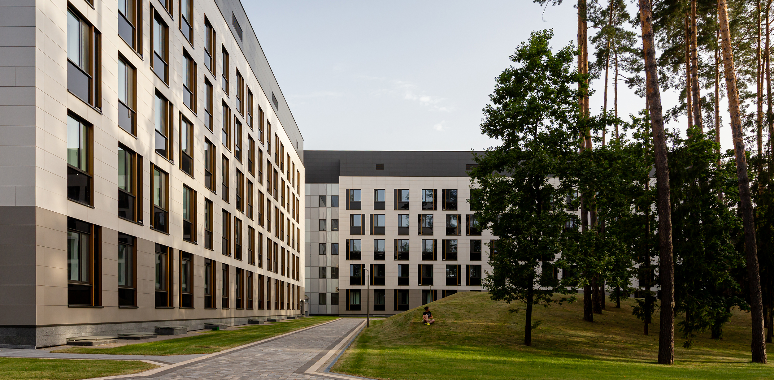
The primary task was to design new facade solutions for the existing building volume that would create a friendly image of the clinical center. We wanted to achieve the effect of a suburban hotel instead of monotonous clinic buildings.
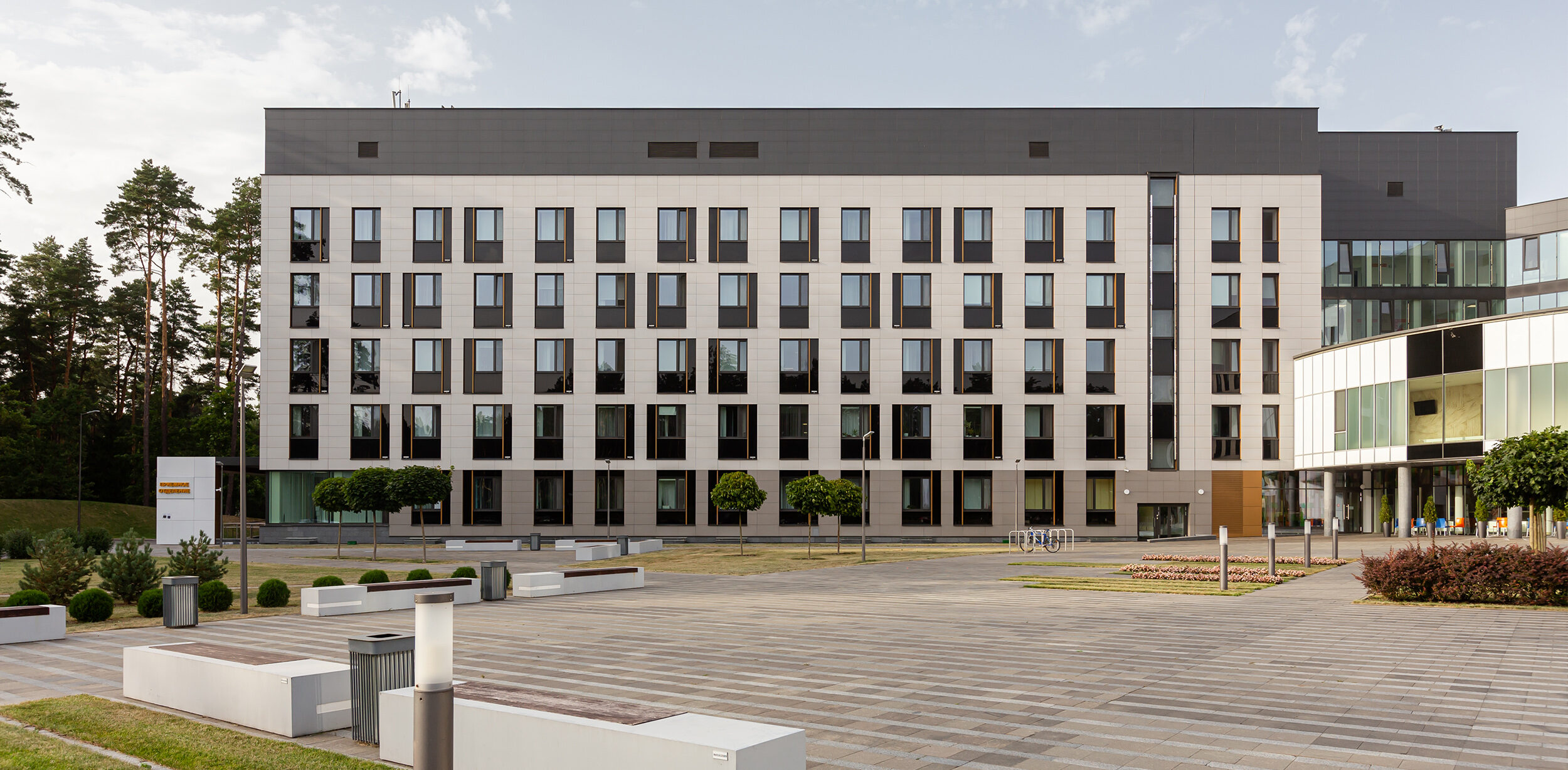
The space-planning solution of the medical center had been designed by another organization and our team got invited to design facades while the construction had already started. It was not an easy task since the volume of the primary building with window and door openings had already been built on the construction site, and we could not change their location.
We analyzed the features of the existing volume and decided that such a symmetrical space-planning solution should be diluted with a modern dynamic facade. And we weren’t mistaken because, at the first presentation of the facades, the customer undoubtedly approved it. As a result, despite numerous meetings with the customer, contractor, and builders, our primary idea of the facade solution didn’t change much.
Working on the center project, we tried to achieve a pleasant and graphic image of the facade. Due to the usage of SCHUCO facade systems, our team managed to create a modern and original image of the building that will be relevant for a long time.
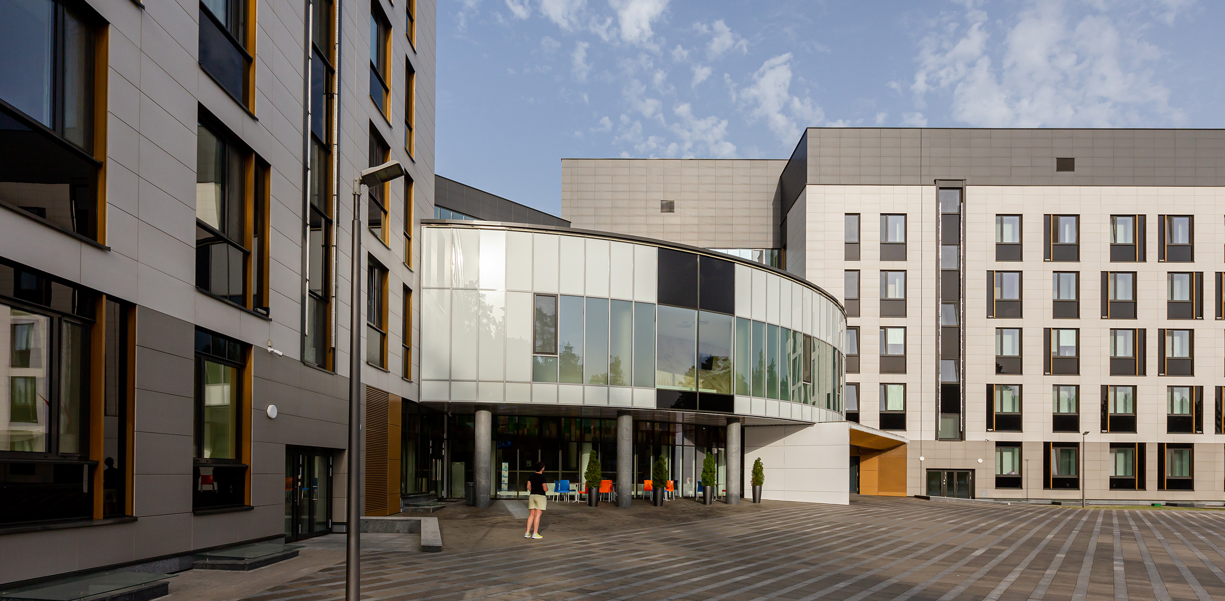
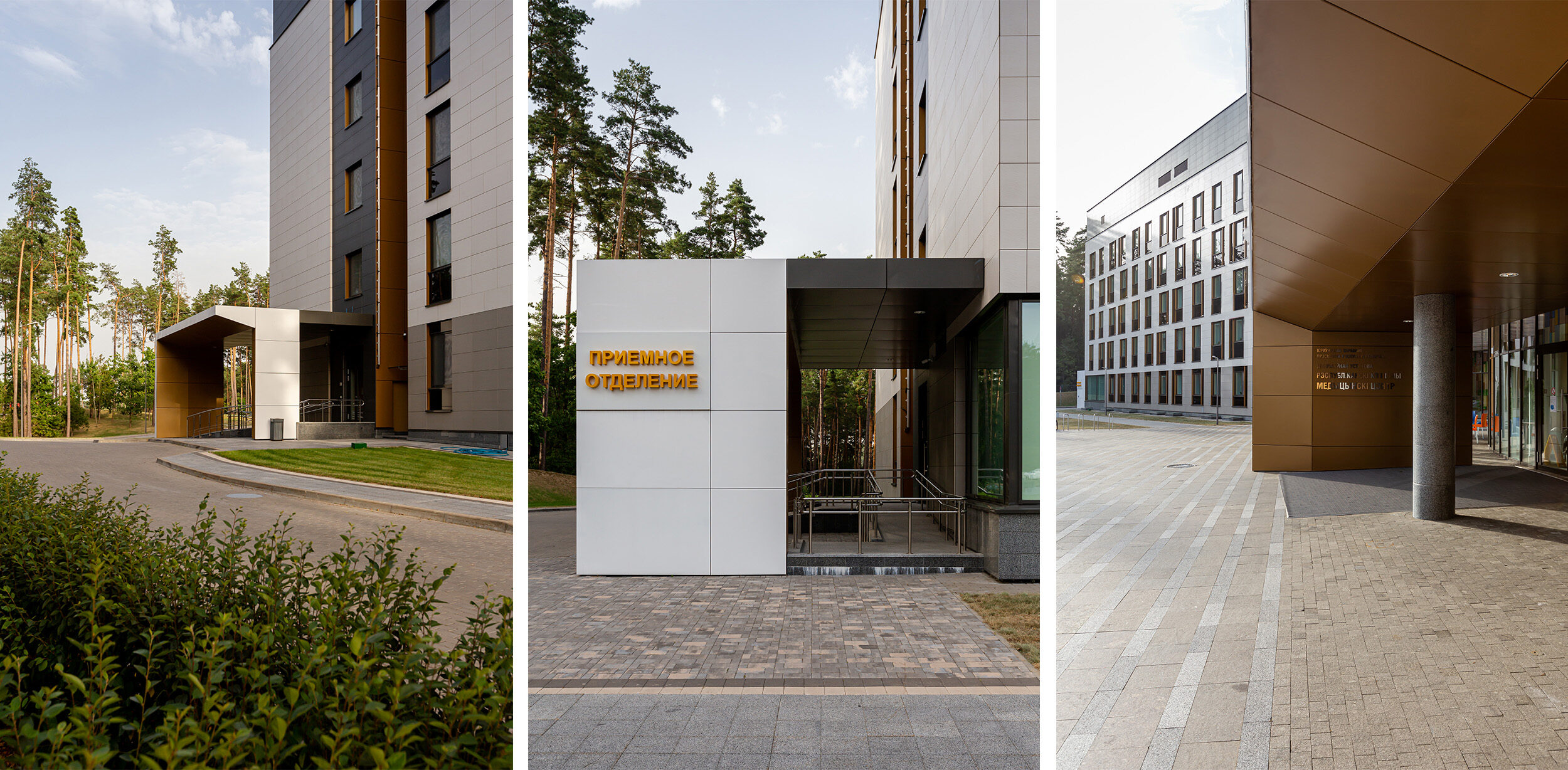
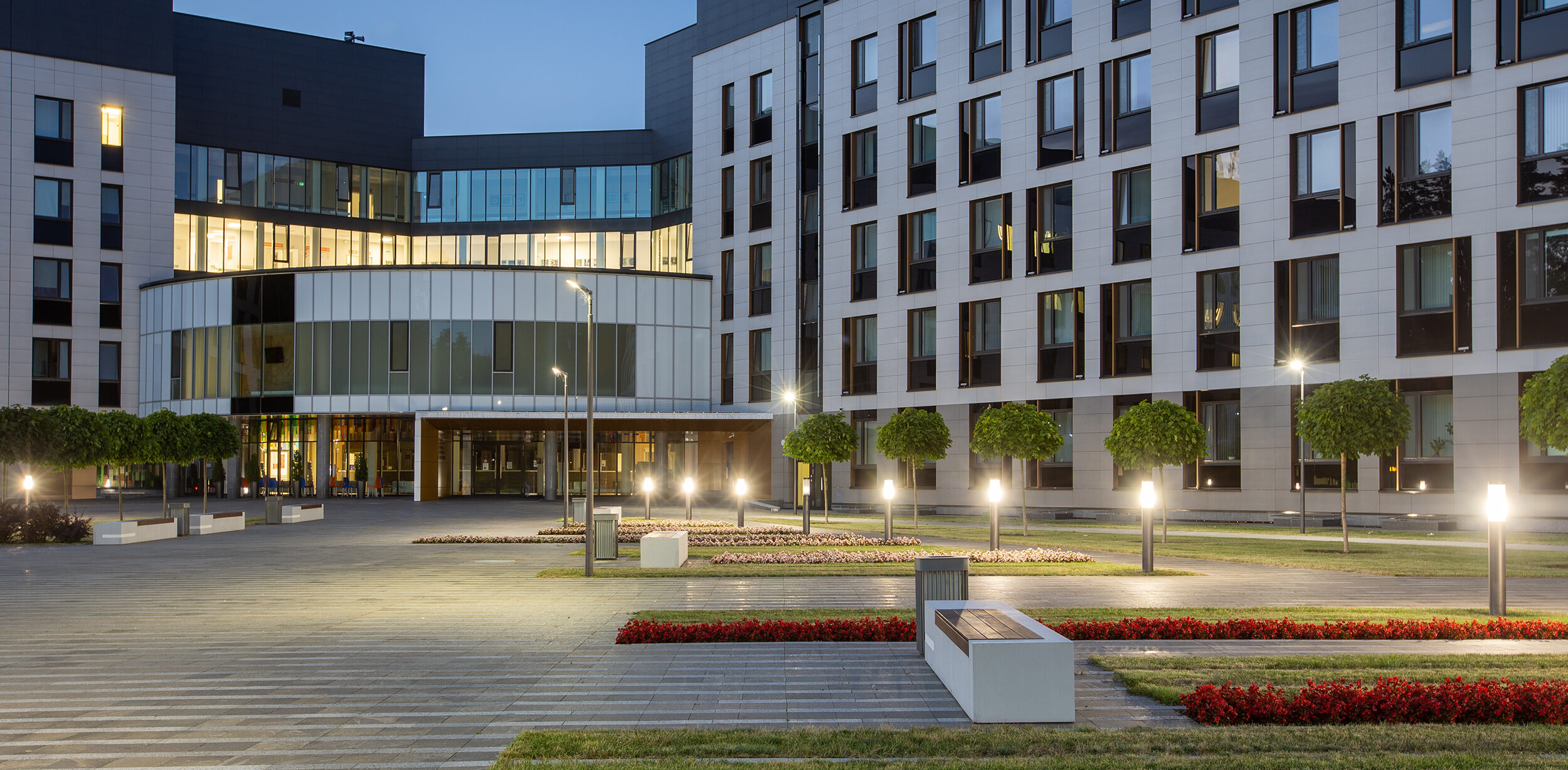
The medical center has a classic four-leaf plan form with the main entrance to the center and additional ones at the ends. To make the building look more asymmetrical, we added a dark enamel-glass insert to the entrance group on the left. And we moved the entrance to the right and accentuated it with an asymmetrical canopy.
Our team decorated the secondary entrance groups at the ends with canopies. We highlighted them with color and big panels.
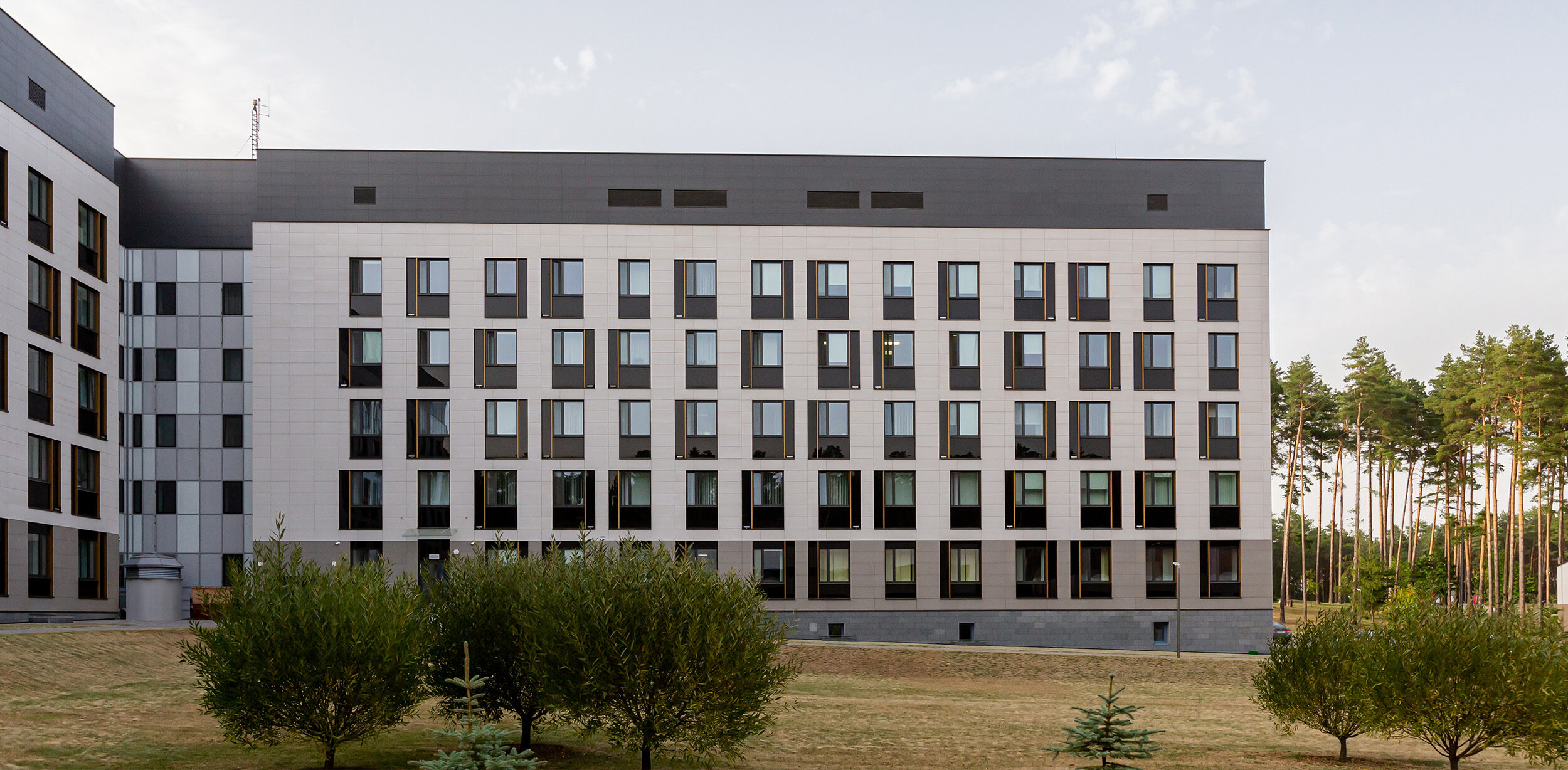
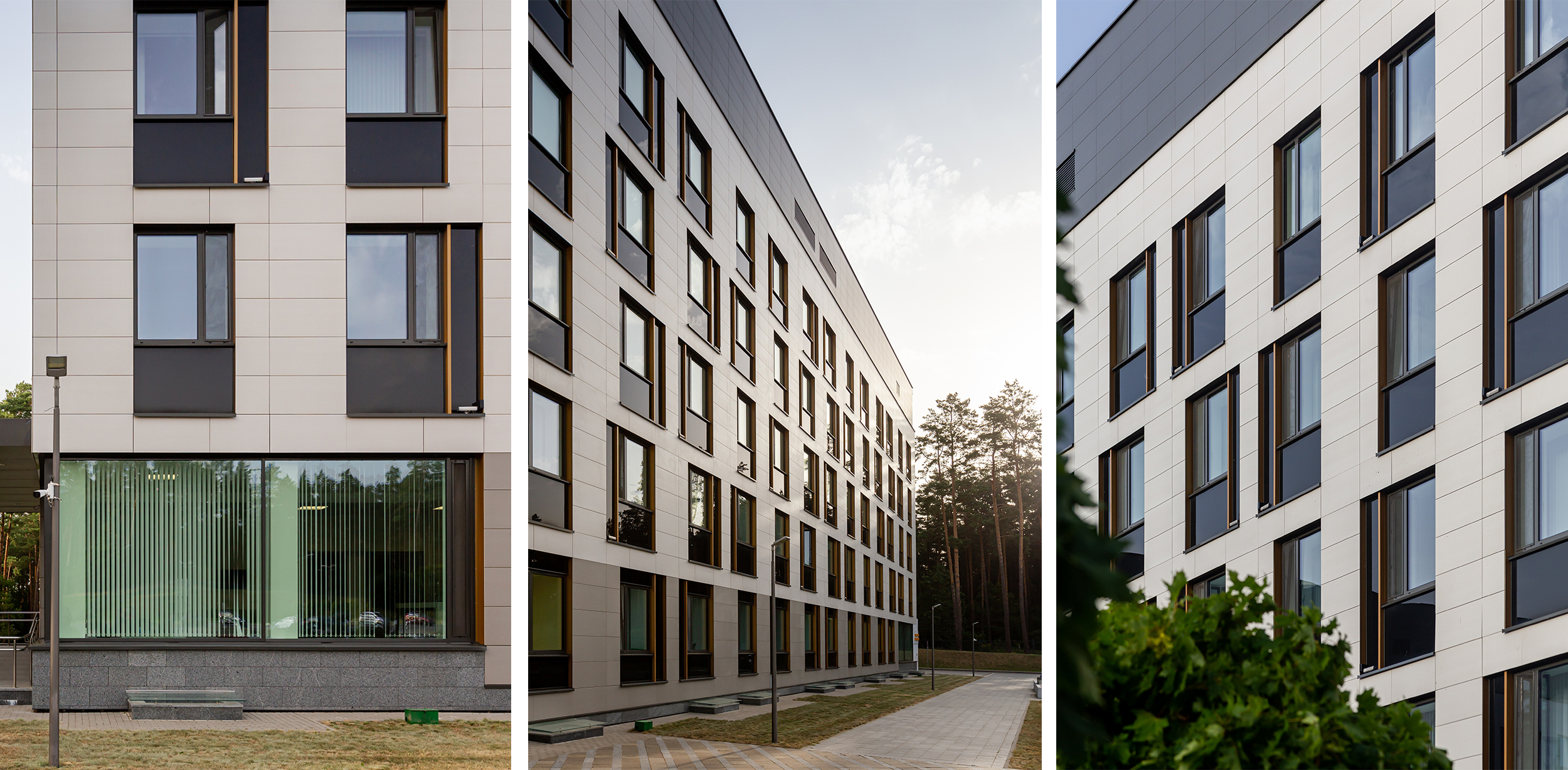
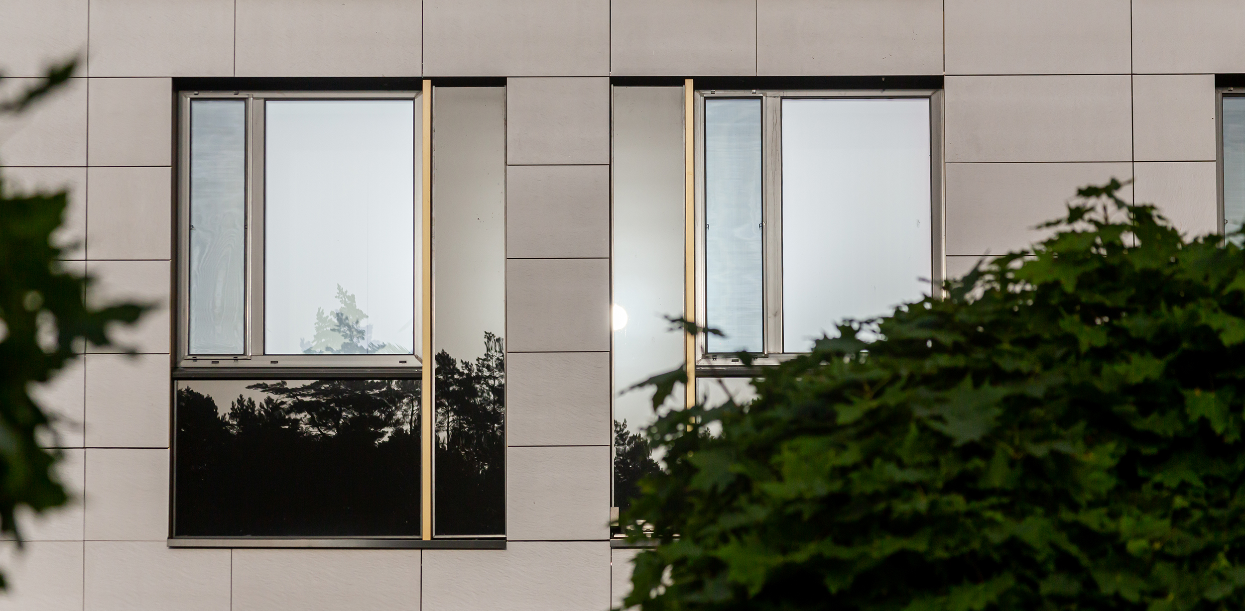
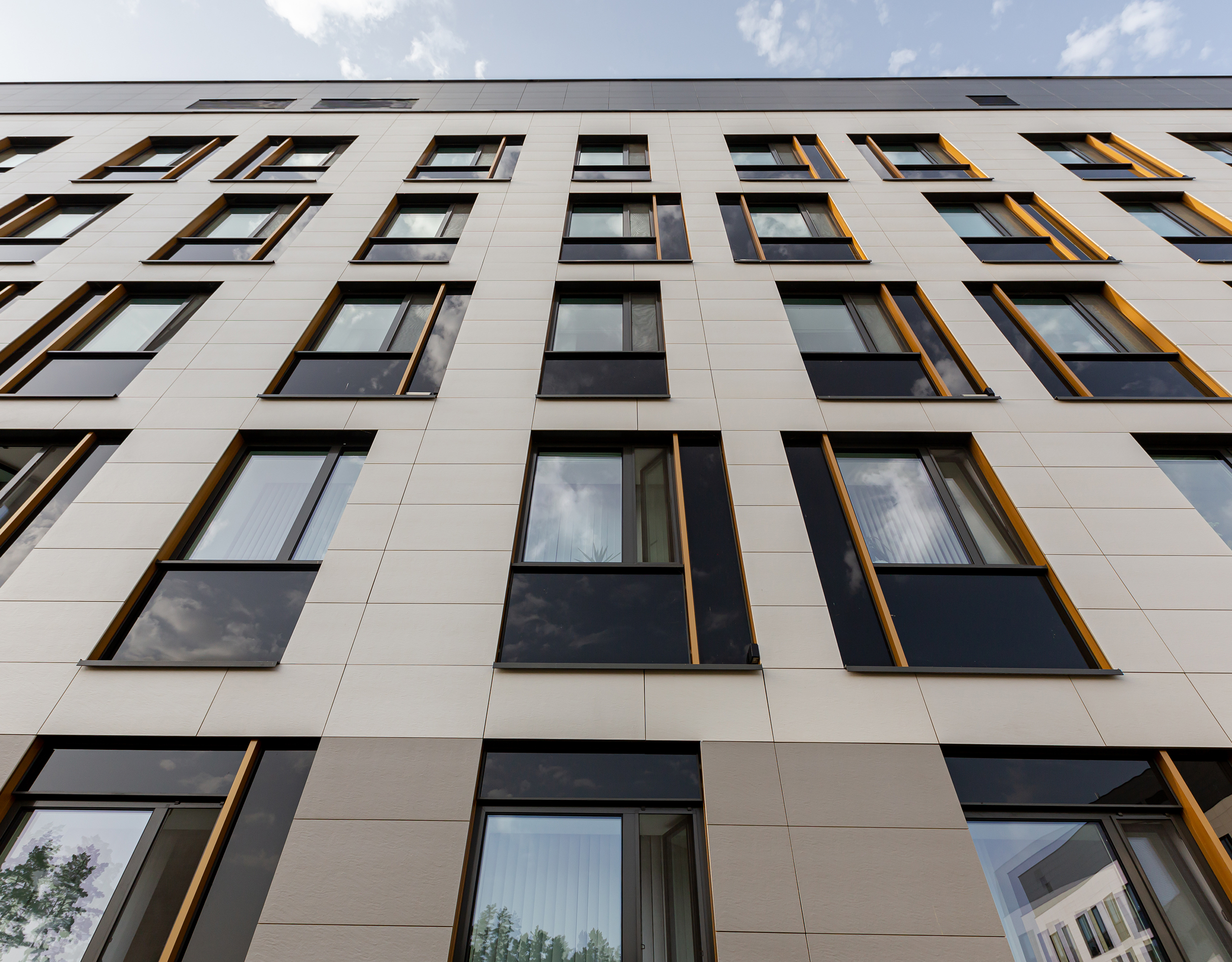
The typical window opening arrangement was diluted by alternating dark enamel inserts on the left and right. Also, the inserts were used to visually expand the window openings to the story height.
The visual expansion of the openings has several standard sizes, which, when alternating on the facade of the building, give it a dynamic rhythm. In contrast to the chaotic window system we used regular floor-to-ceiling glazing.
The second essential point in the design was the cladding materials selection. When choosing them, we relied on the manufactured elements, their technological effectiveness, and their economy. Based on this, we opted for a facade granite tile attached to a flush mount system. Since we wanted to achieve the effect of a hotel, we very carefully selected the color scheme that would fit into the existing development. We initiated the creation of the desired color tile in the production laboratory of the Keramin plant.
Together with the laboratory specialists, we selected the color, texture, and panel format. Due to the chosen tile format, we managed to perfectly lay it out on the facade. All seams are laid evenly to the windows without asymmetry, and exactly five elements are embedded in the window height. Thanks to this technique and the flush panel mount, the facade looks as graphic and fresh as possible.
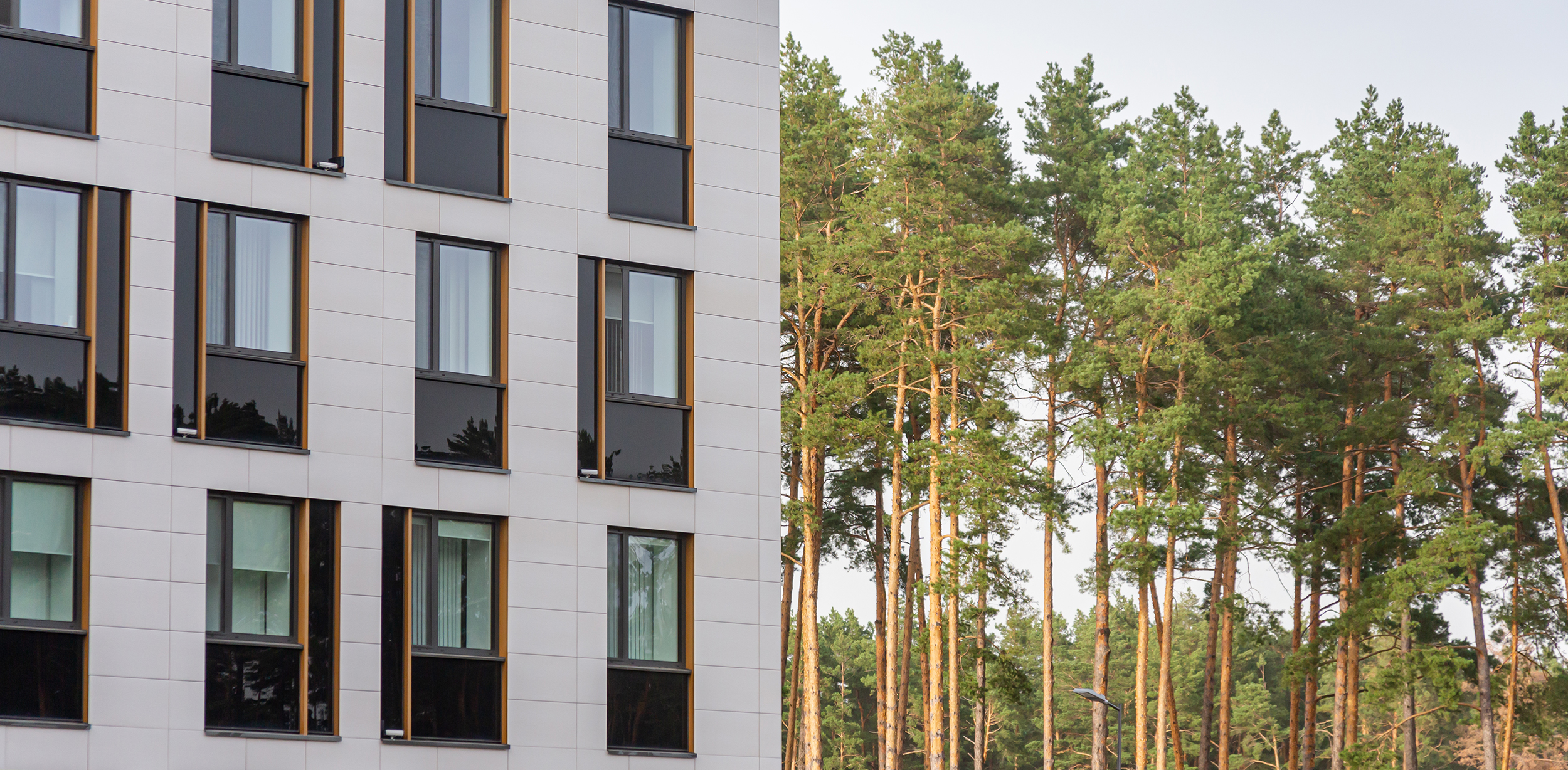
The structural ventilation facade pillars in the window area protrude outward and form side jambs, which we used as visual accents on the facade. We paid great attention to the choice of anodized aluminum in window profiles. It was essential to choose such a color of the metal that would combine it harmoniously with the color of the trunks of the surrounding pines at a certain angle and in certain sunlight.
We decided to choose the shade closest to the color of trunks. So the facade would match the light brown pine forest verticals and fits into the environment well.
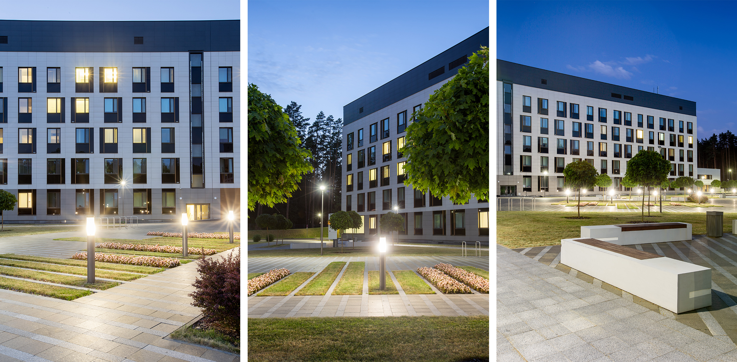
We also designed the landscaping of the medical center entrance group with recreation areas. Our team proposed to lay the paving diagonally with alternating wide and narrow stripes interrupted by greenery spots.
The direction of the green zones creates visual axes that lead us to the main entrance. It coincides with the paving lines that enhance the overall impression and sets the entrance zone pageantry.
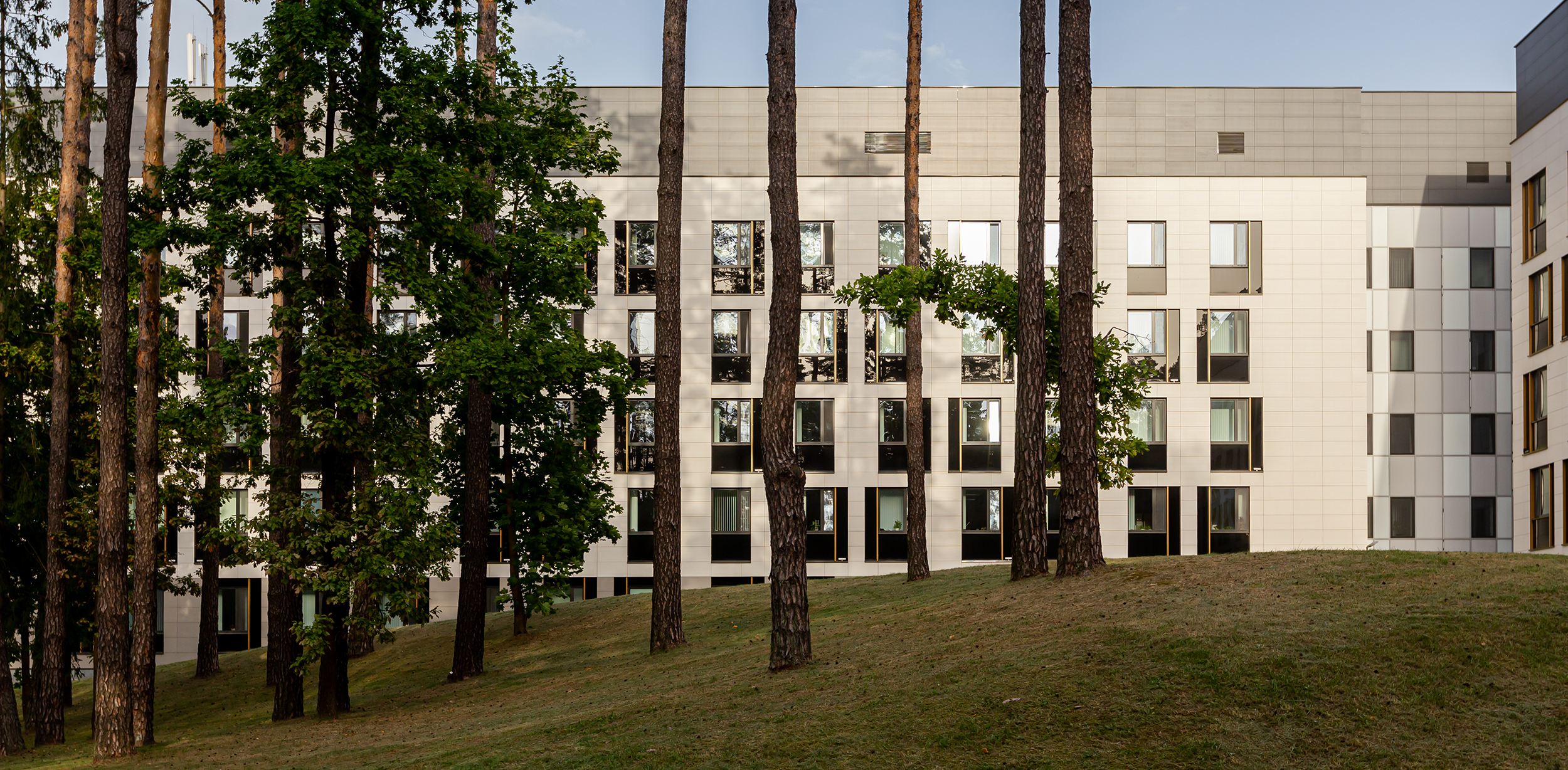
While working on this project, we wanted to create an image of a quiet hotel complex in the forest that would not resemble a hospital.
Solving this challenging task, we managed to give the building an identity, fit it into the natural environment, and make it practical and relevant for a long time.
