Kvartal PARK

Location:
Belarus, Minsk region, Novaya Borovaya
Year:
2017-2018
Work done:
Architecture
Interior design
Landscape architecture
Status:
Built in 2019
The team:
Katerina Kovaliova
Kirill Skorynin
Ilya Polonski
Dmitry Sergienya
Mikhail Naumov
Veranika Zanouskaya
Aliaksei Zanouski
Vlad Chabai
Photo:
Ilya Polonski
Anastasia Sascheka
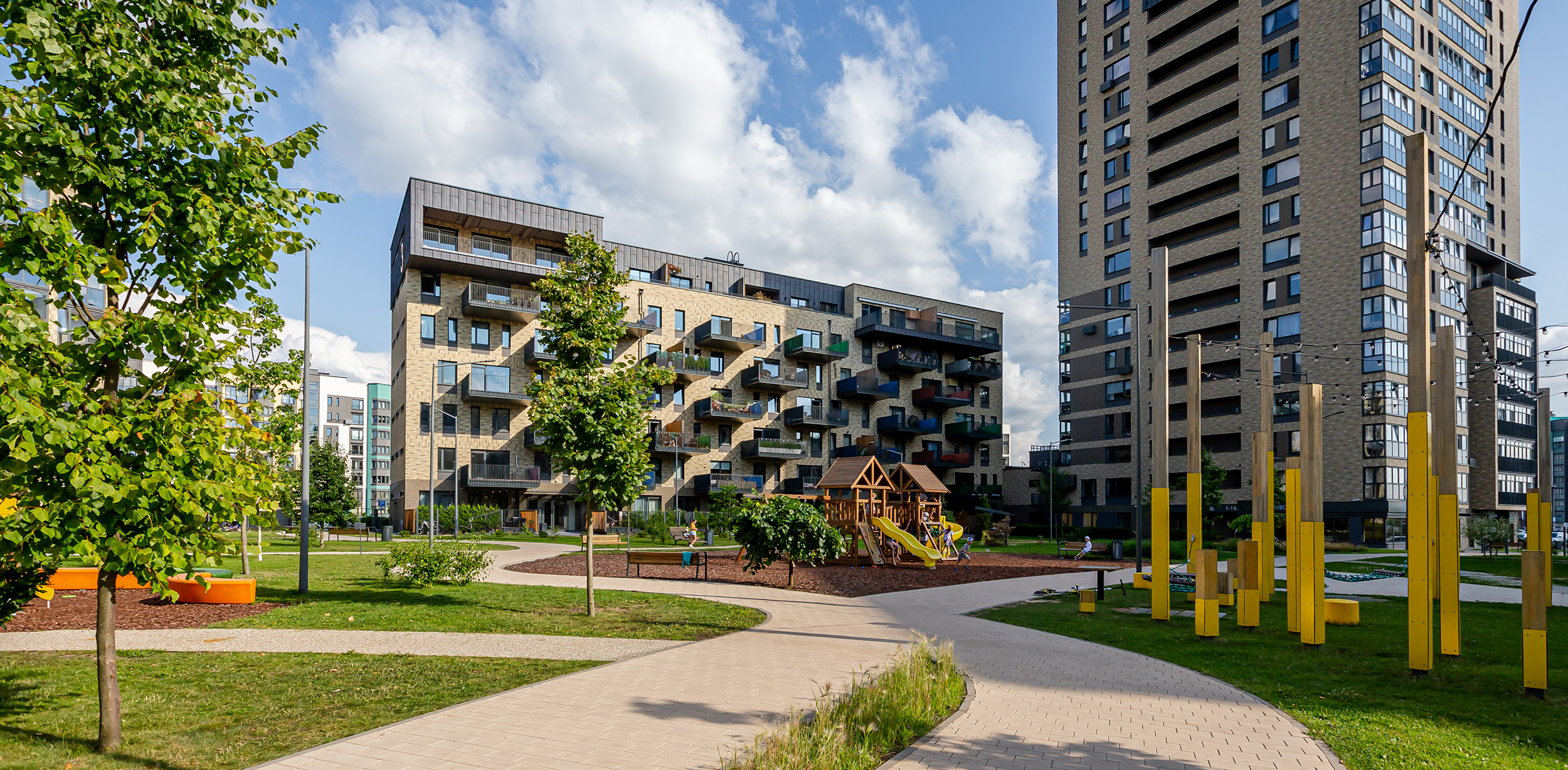
Our team designed Kvartal Park for a modern residential area of Minsk. It is a combination of significant architecture and landscaping. A distinctive feature of the architectural complex is the combination of cast-in-place and panelized types of construction.
This project showed that using standard panels with cast-in-place stories, it is possible to create an original architectural image. There is a courtyard park with a thought-out area and lots of zones for recreation and sports inside the block.
Initially, we planned the complex as a Quarter of Artists with attic apartments-workshops. Later, due to the strict and restrained facade color palette, it was called the English Quarter. As a result, the bright and unusual landscaping of the courtyard into a park originated the name Kvartal Park.
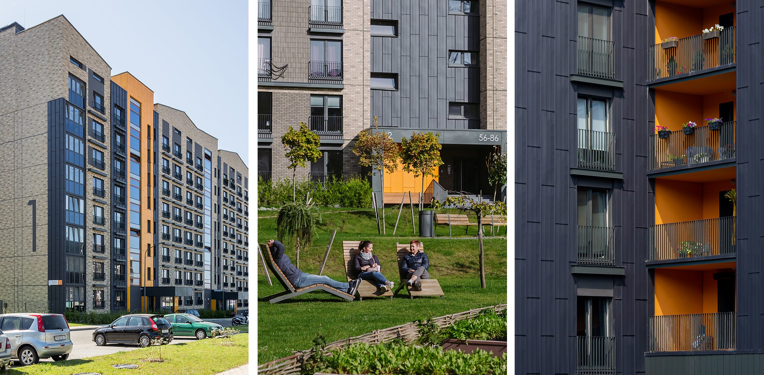
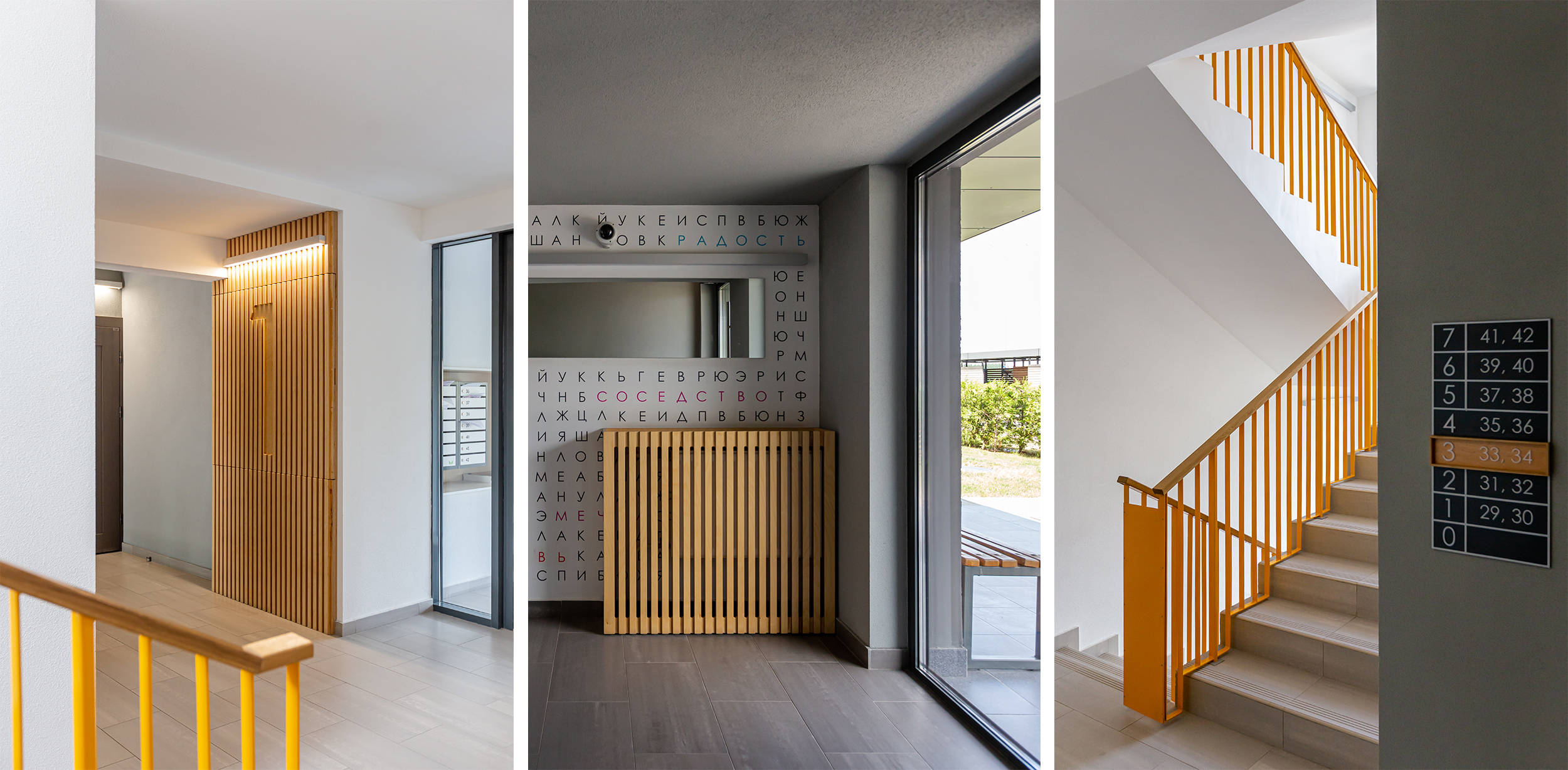
So that the image of the block didn’t not seem so strict, we added an accent color: bright orange inserts on the entrance groups, staircase-elevator nodes, parts of balconies, and house numbers.
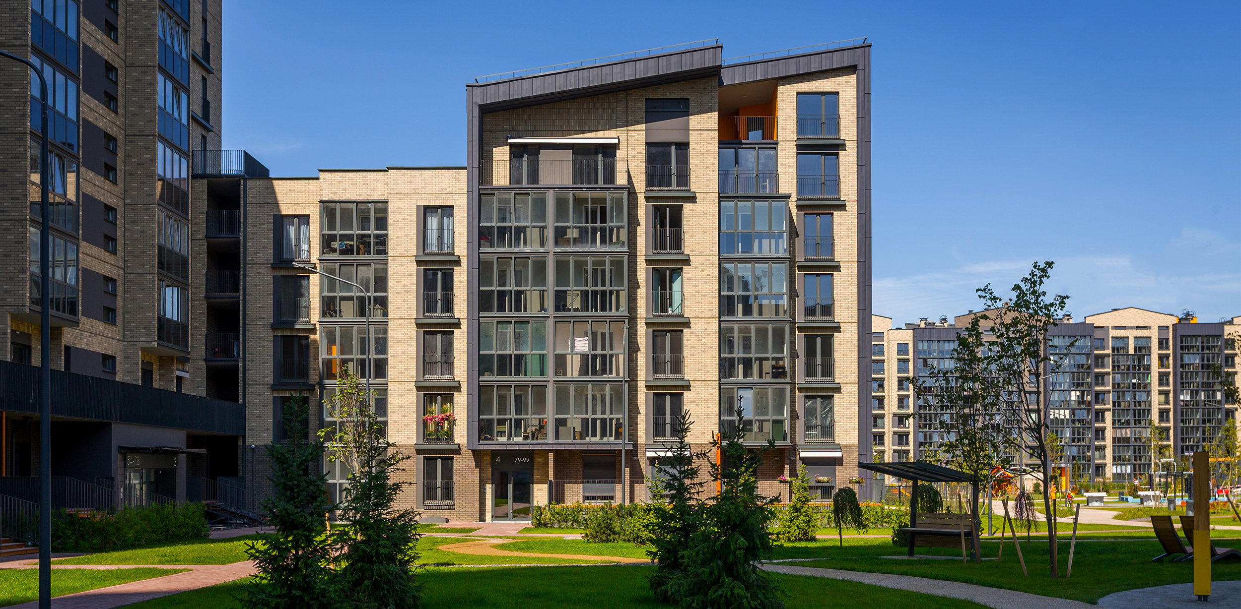
Five of the seven designed houses are implemented based on standard panelized building projects. We modified them beyond recognition using cast-in-place technology for the first and attic stories.
Thanks to this bold design solution, we could take full advantage of two technologies: the cast-in-place of the first and attic stories allowed us to design a memorable architectural image, and the panelized stories in the middle of this so-called constructive sandwich sped up the construction.
Inspired by New York City’s loft districts and northern architecture, we offered brick lining combined with graphite-colored folding panels, making the neighborhood look noble. Attic apartments of the upper stories with a pitched roof can be transformed into the two-level apartments due to the free planning and ceiling height up to five meters.
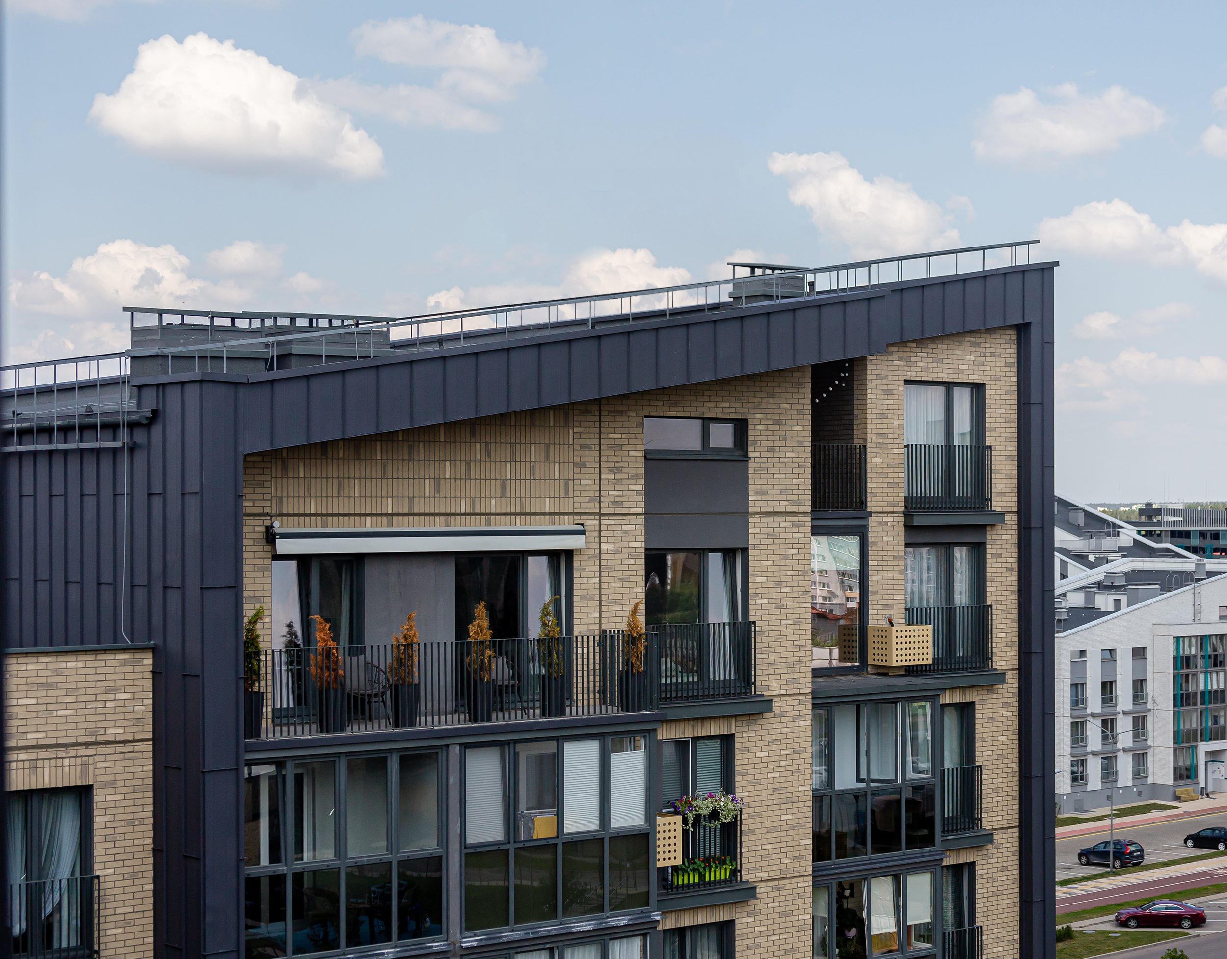
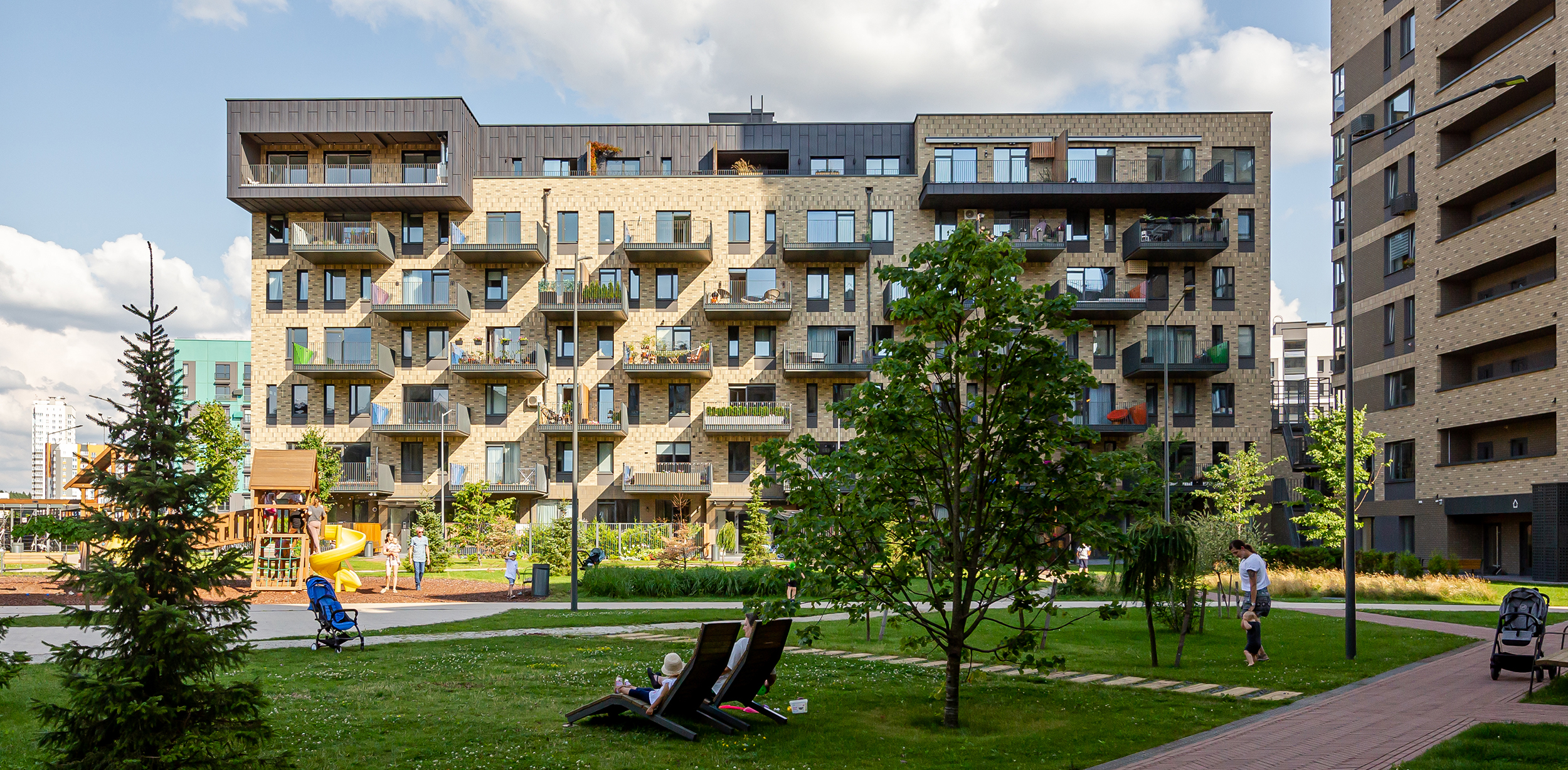
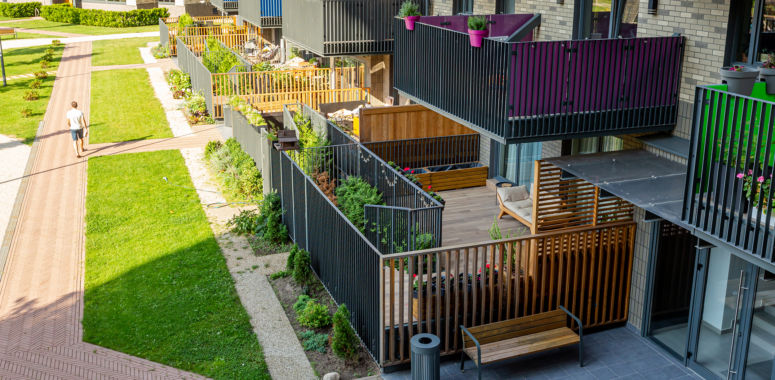
When we designed the Sosnovy and Kedrovy Quarters of Novaya Borovaya, we paid attention that usually unpopular apartments on the first story began to be in great demand after the construction of terraces. Realizing this, we suggested designing a house with terraces on each story. Now the apartments of the whole block of flats are equipped with large, non-glazed balcony terraces, and residents of any story can enjoy the rest on their terrace.
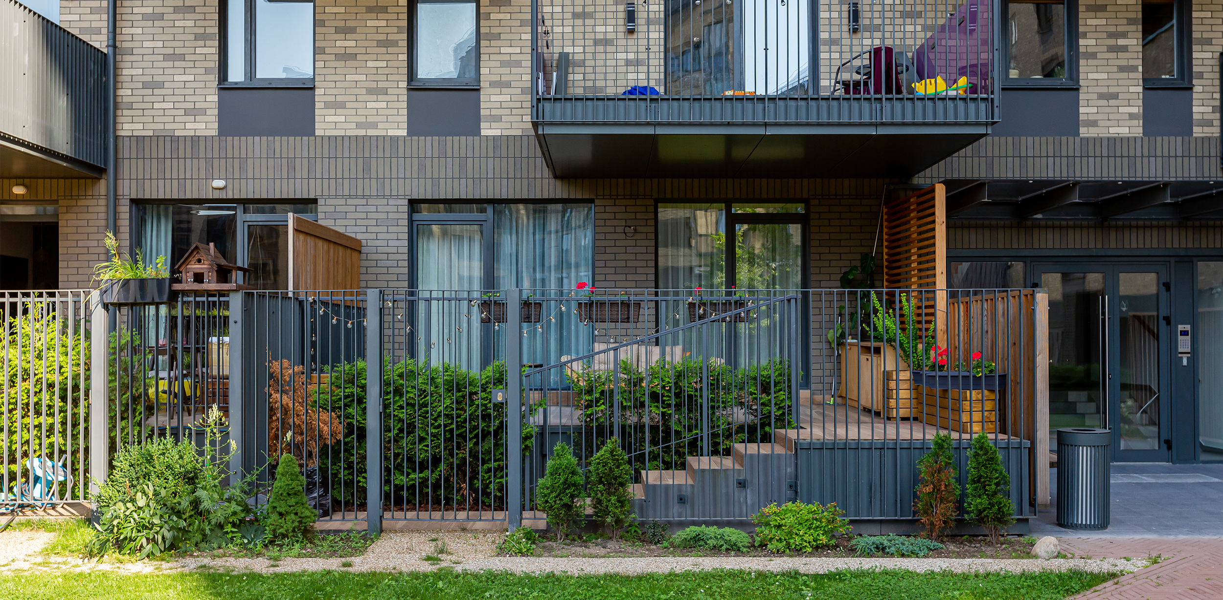
In this block, we proposed a new terrace format for residents of the first story: wooden flooring with an exit from the apartment and descent into a small private courtyard, from where you can get into the common courtyard through the gate in the fence. This solution reveals more opportunities for the owners: they can have plants not only in tubs on the terrace but also plant their front garden. Around the perimeter, one can plant cedars to make the terrace more private.
We made the facade recognizable with the original window arrangement and brick layout. We designed the irregular arrangement of windows to set a certain rhythm for the façade. Whereas on the first floor there is a wide window, on the second floor there’s a window that fits within only a half of the window hole. There is also an option to split the opening into two narrow windows of different sizes.
The graphics of the window arrangement are perceived by a person at a distance, but the second level of detail of the facade ( the layout of the brick ) opens upon close examination. The main direction is horizontal, and we highlighted the stripes between the windows using a vertical brick layout. We closed fire cutoffs with an I-beam for further detail of the facade. To give the building an individual character, we used accent color inserts in the fences of the terraces, which dilute the beige palette of the façade. These elements, combined with large consoles, give the house a recognizable look.
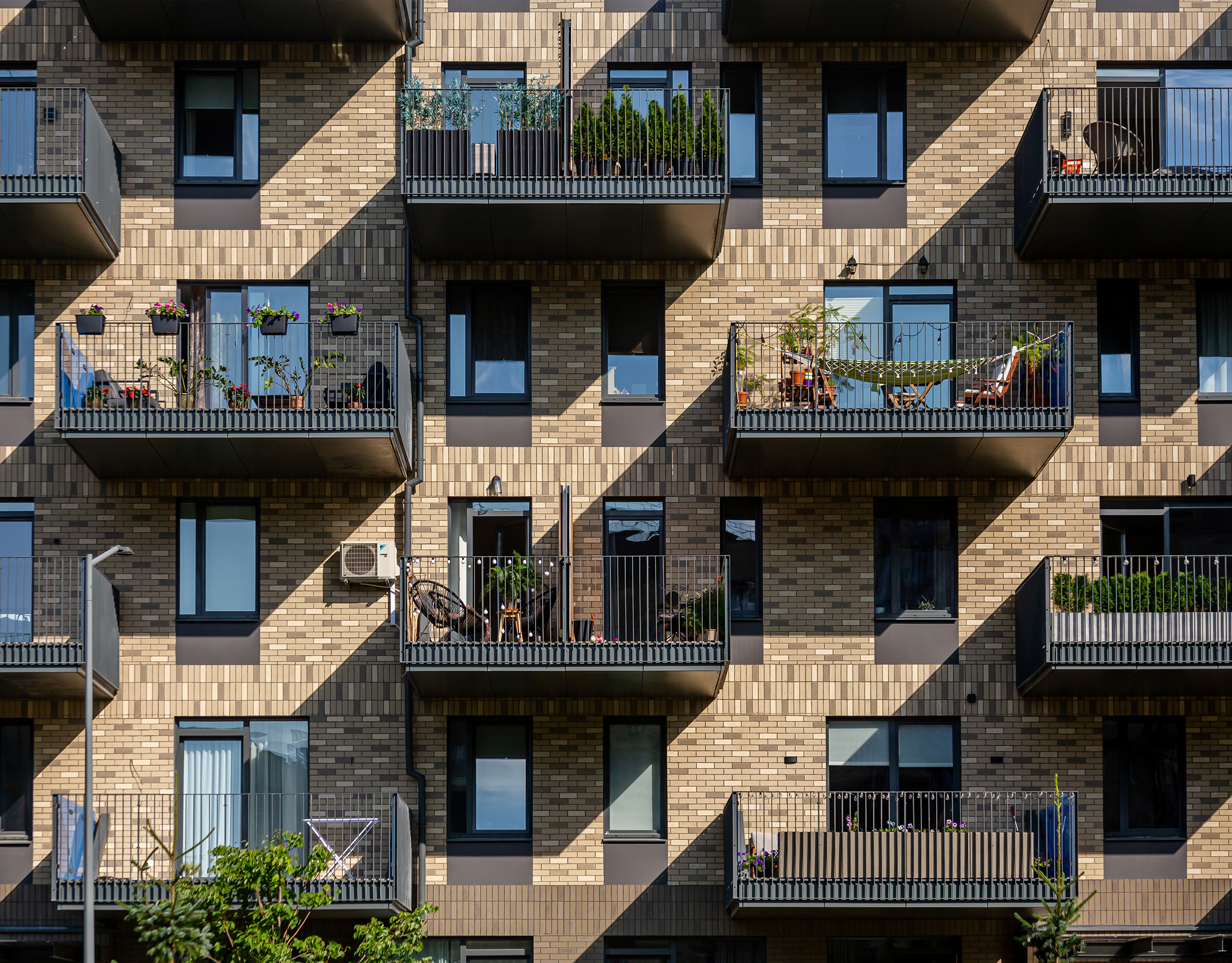
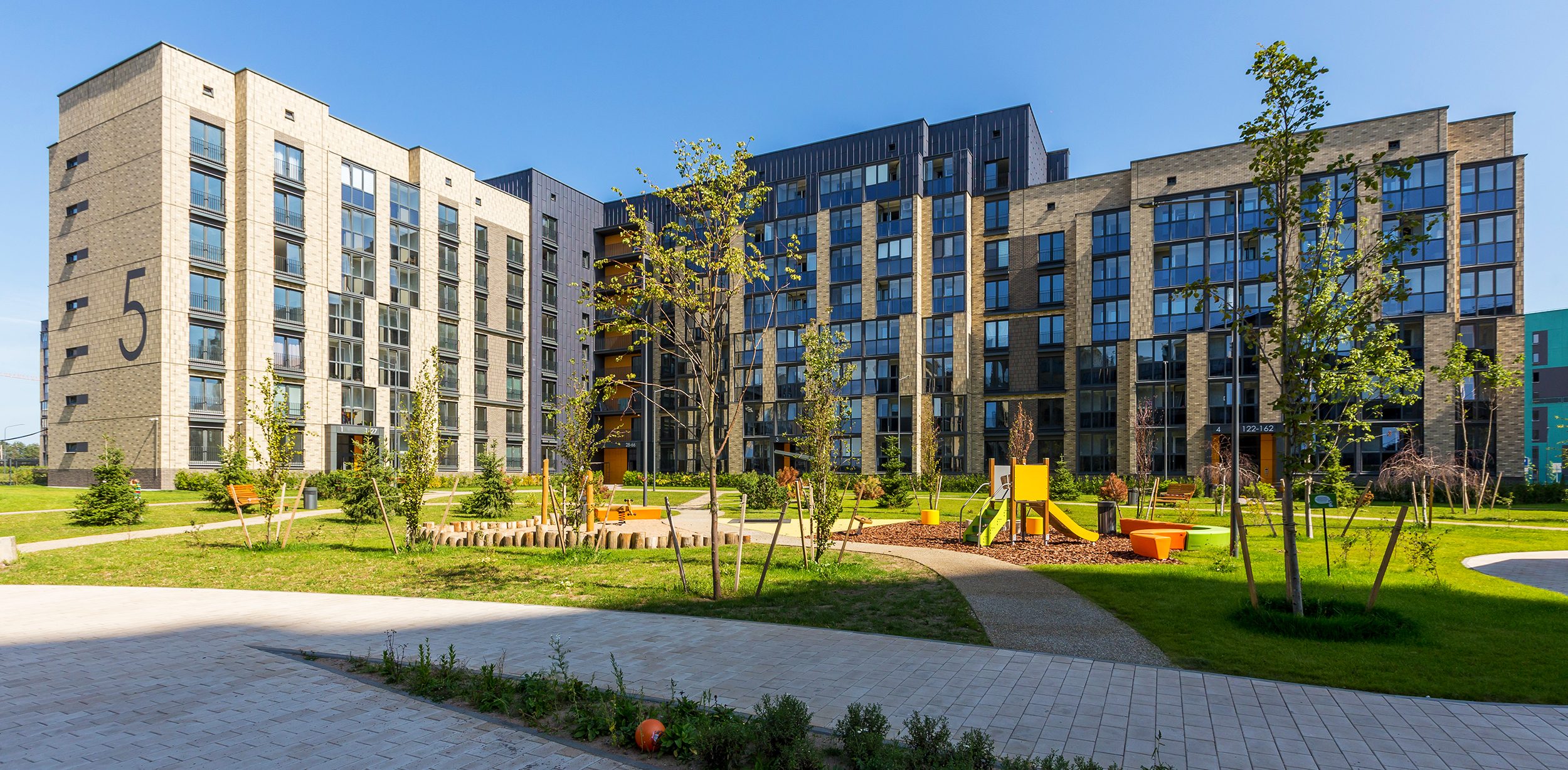
We used hinged plates on loggias and played with different numbers of stories in addition to laying out the brick finish in the houses made fully in panel technology.
Decorative panels, randomly located on glazed loggias, have not only an aesthetic but also a practical function: residents of the house can arrange storage places behind them, without thereby worsening the appearance of the facade.
Another non-standard technique for this object was the use of above-mentioned folding panels in the decoration of the facade. They fit well with bricks and combine with other façades. And for the residents not to feel discomfort in rainy weather, we provided good noise insulation. The aesthetics of this material helped us to finalize the image of the block.
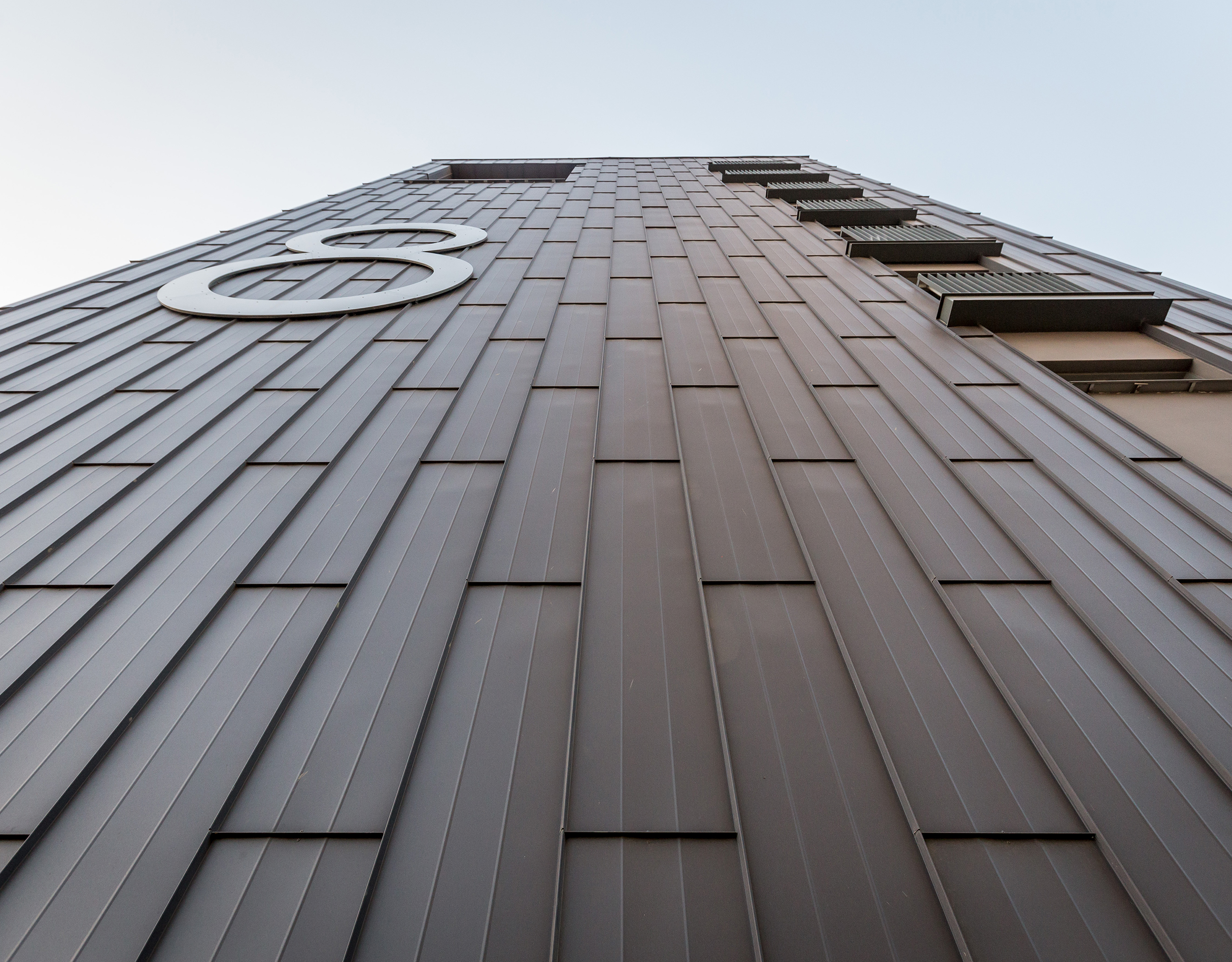
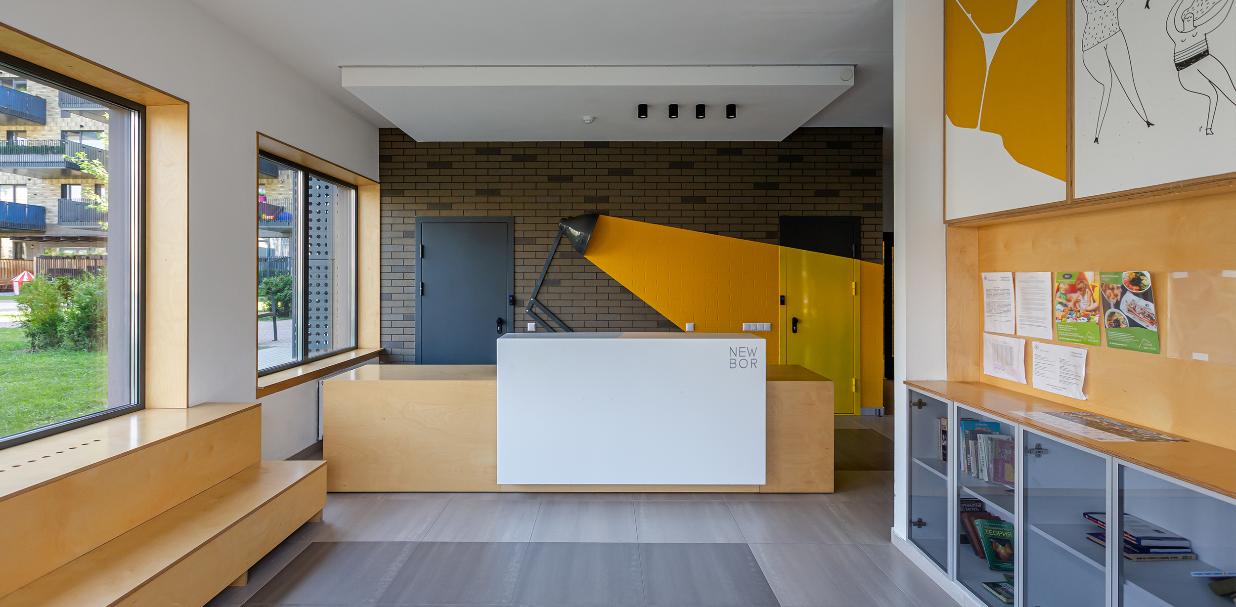
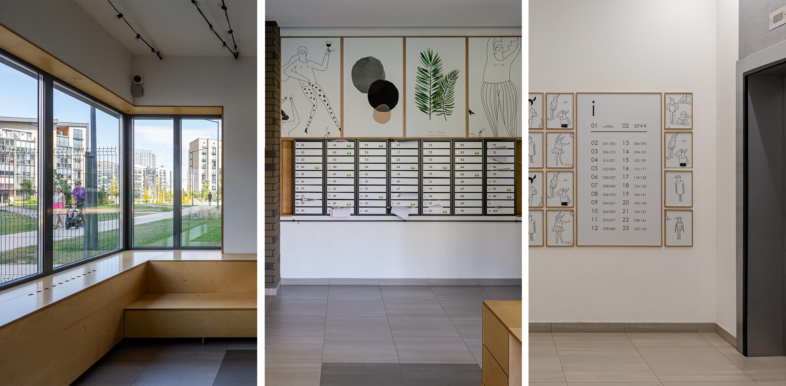
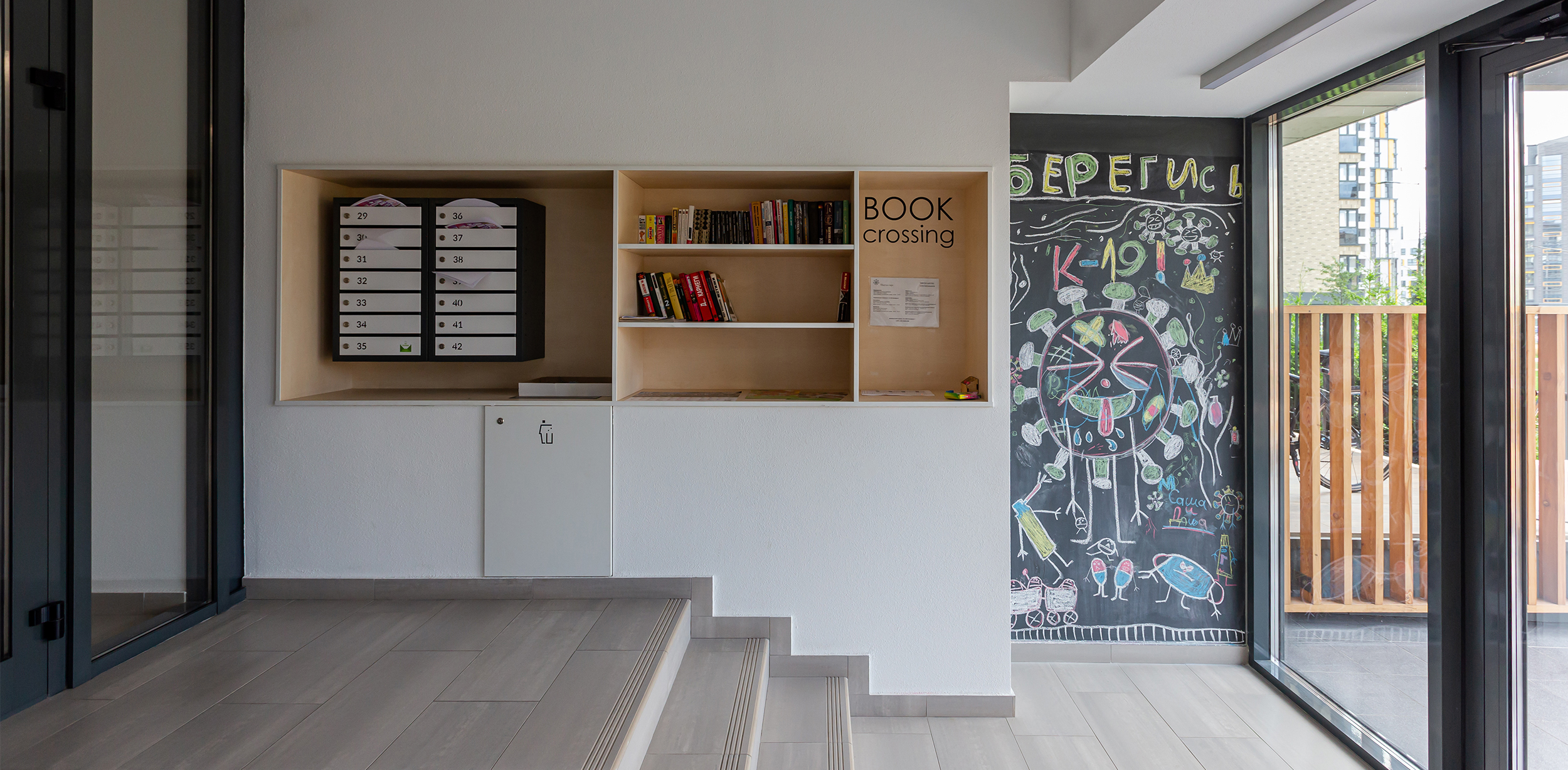
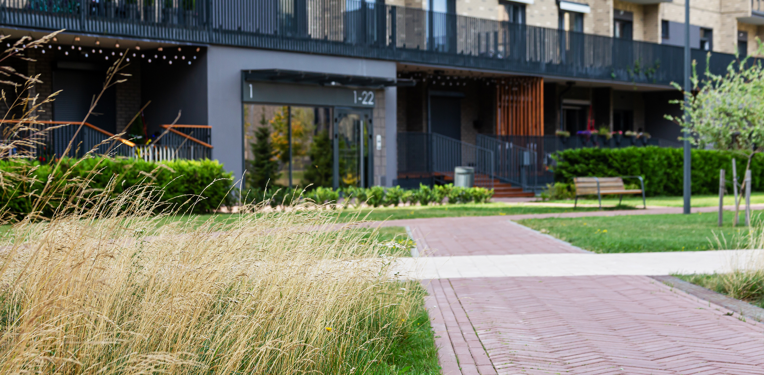
We designed entrance groups as passageways: on the one hand, the residents can go outside, and on the other — into the courtyard. The wide glazing area of the entrance groups allows the Sun to illuminate the halls with natural light, which makes them more comfortable and cozy.
We developed an infographic with the designation of common areas for convenient navigation. We used calm light tones, textured materials and accent bright orange elements.
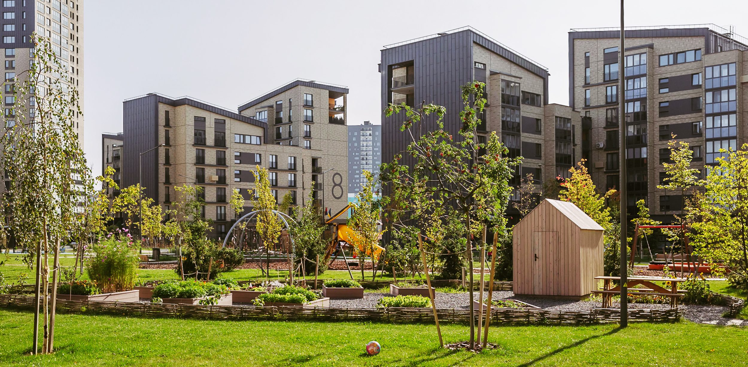
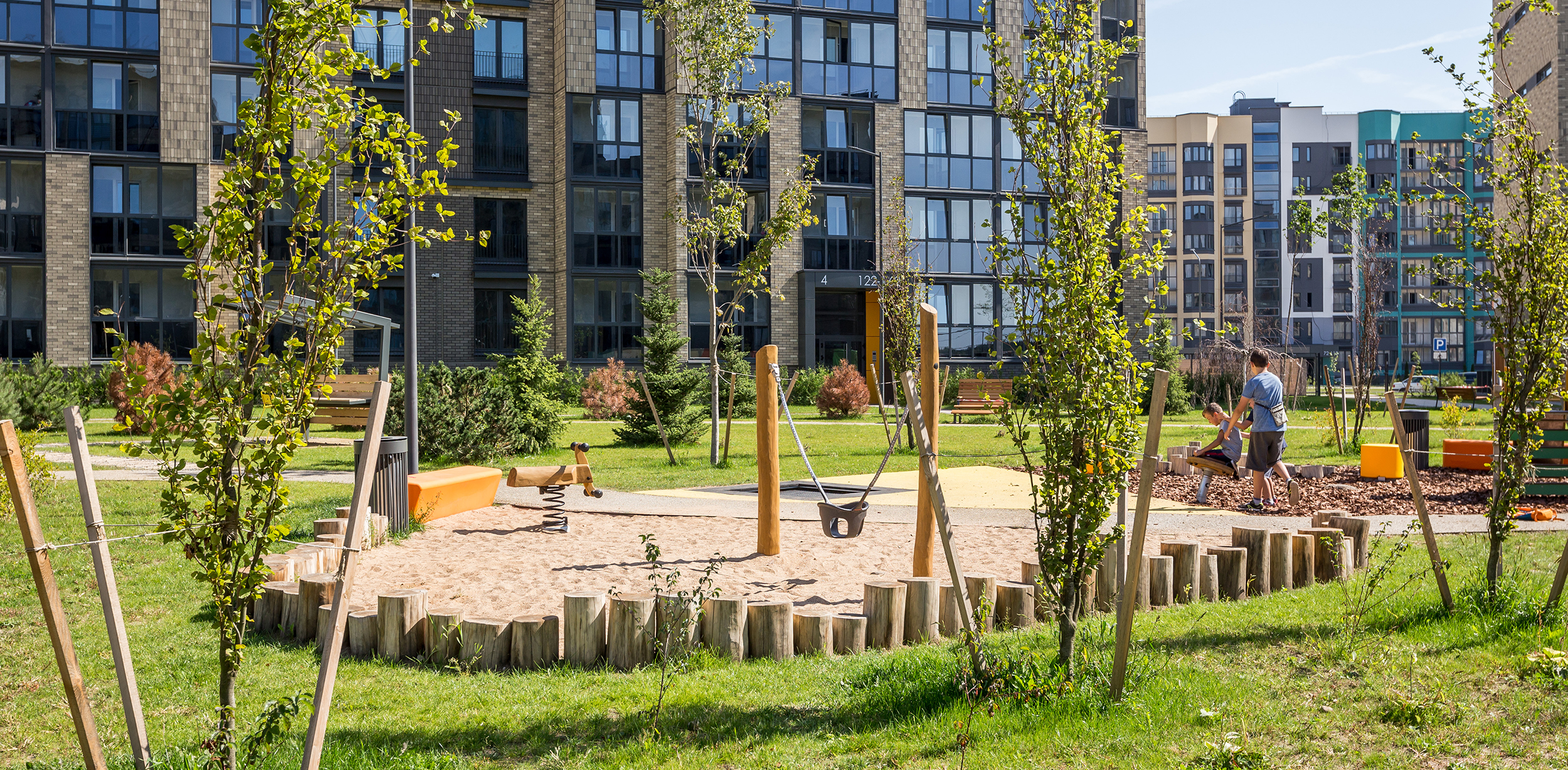
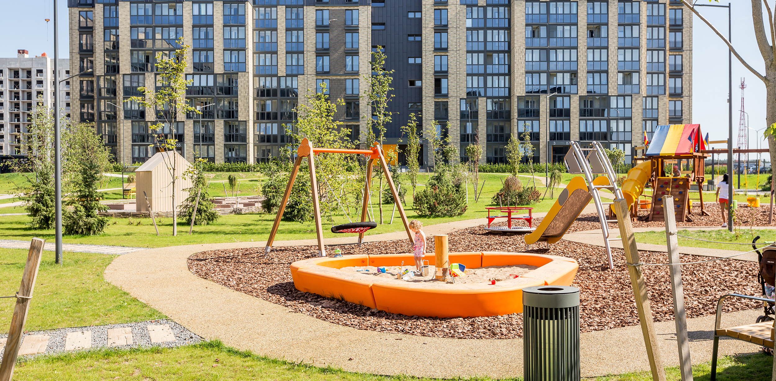
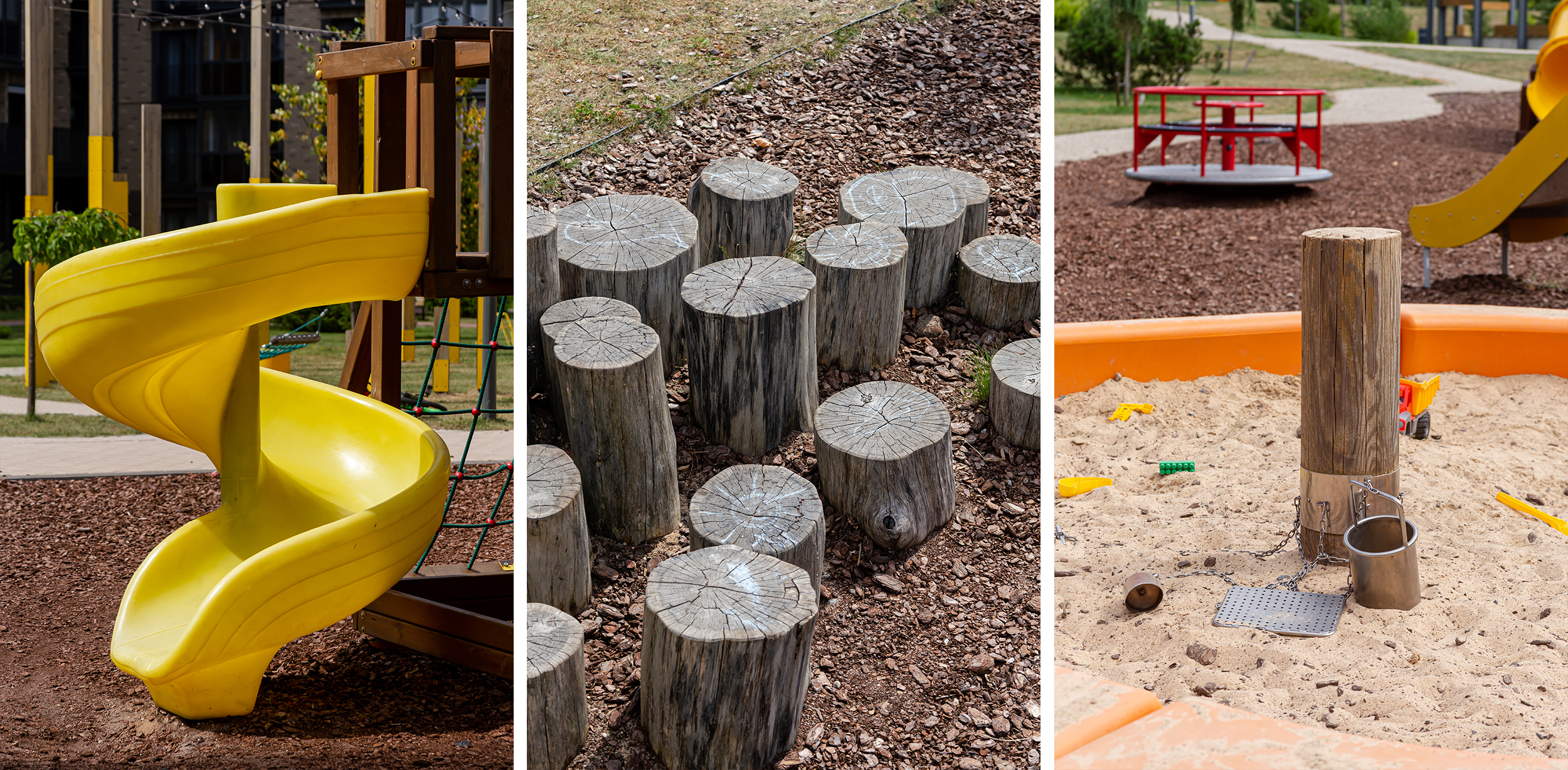
The landscaping of Kvartal Park is full of areas with various functions. There are playgrounds with high-quality equipment that are focused on different age groups.
Thanks to natural colors and eco-coating, they fit well into the environment, and the bright orange elements of the improvement overlap with the accent details of the facade.
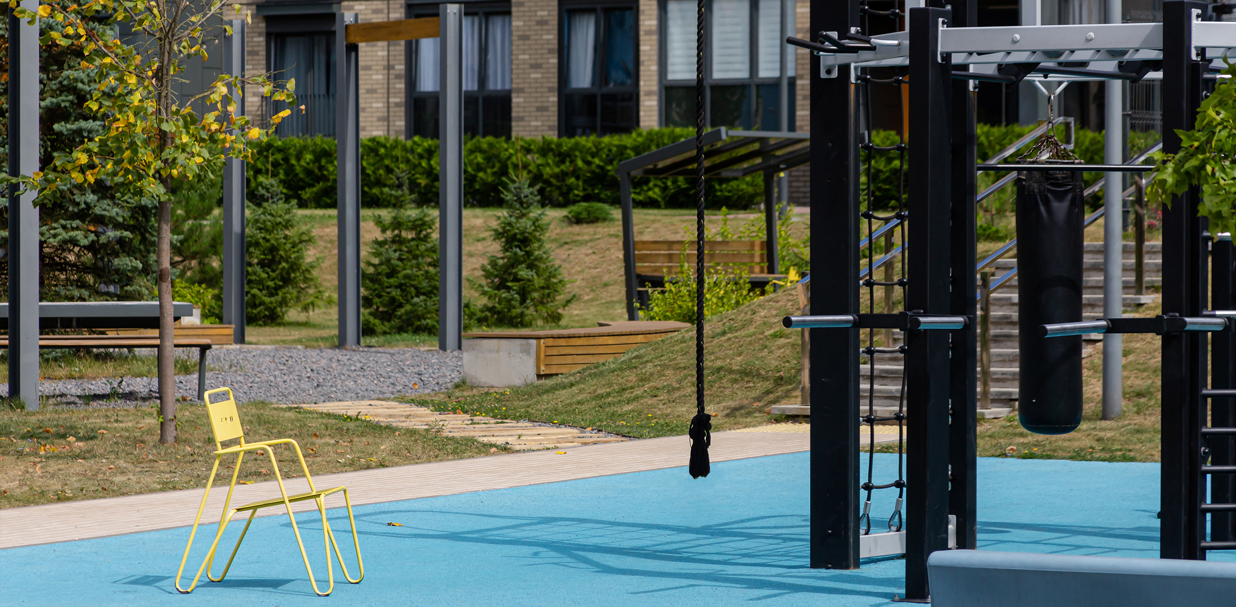
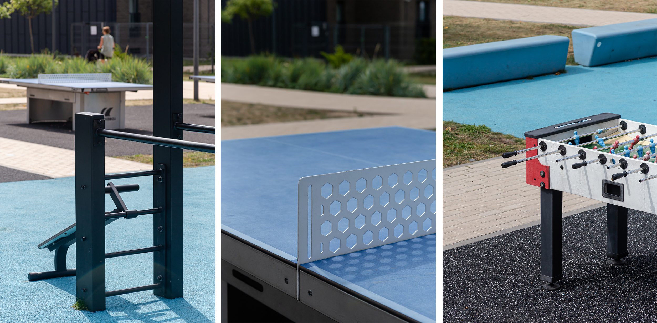
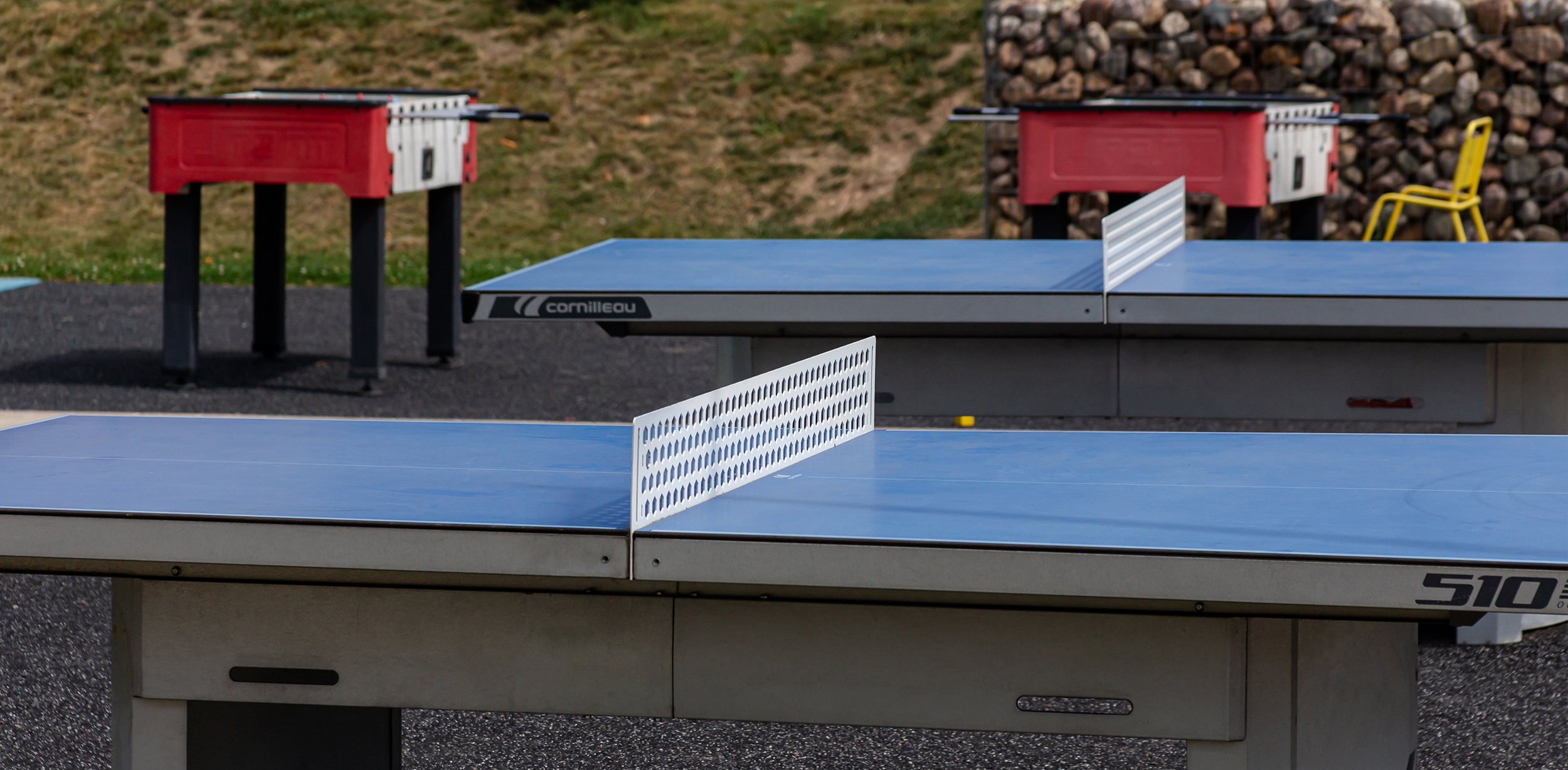
We have provided two types of venues for sports fans: entertainment ones with kicker tables, ping-pong, and health facilities with workout equipment.
Modern concrete ping pong tables will last a long time. We placed them in the center of the courtyard so that the noise from the game did not annoy the residents. We designed the workout venue as a zone with multifunctional equipment in the active recreation area.
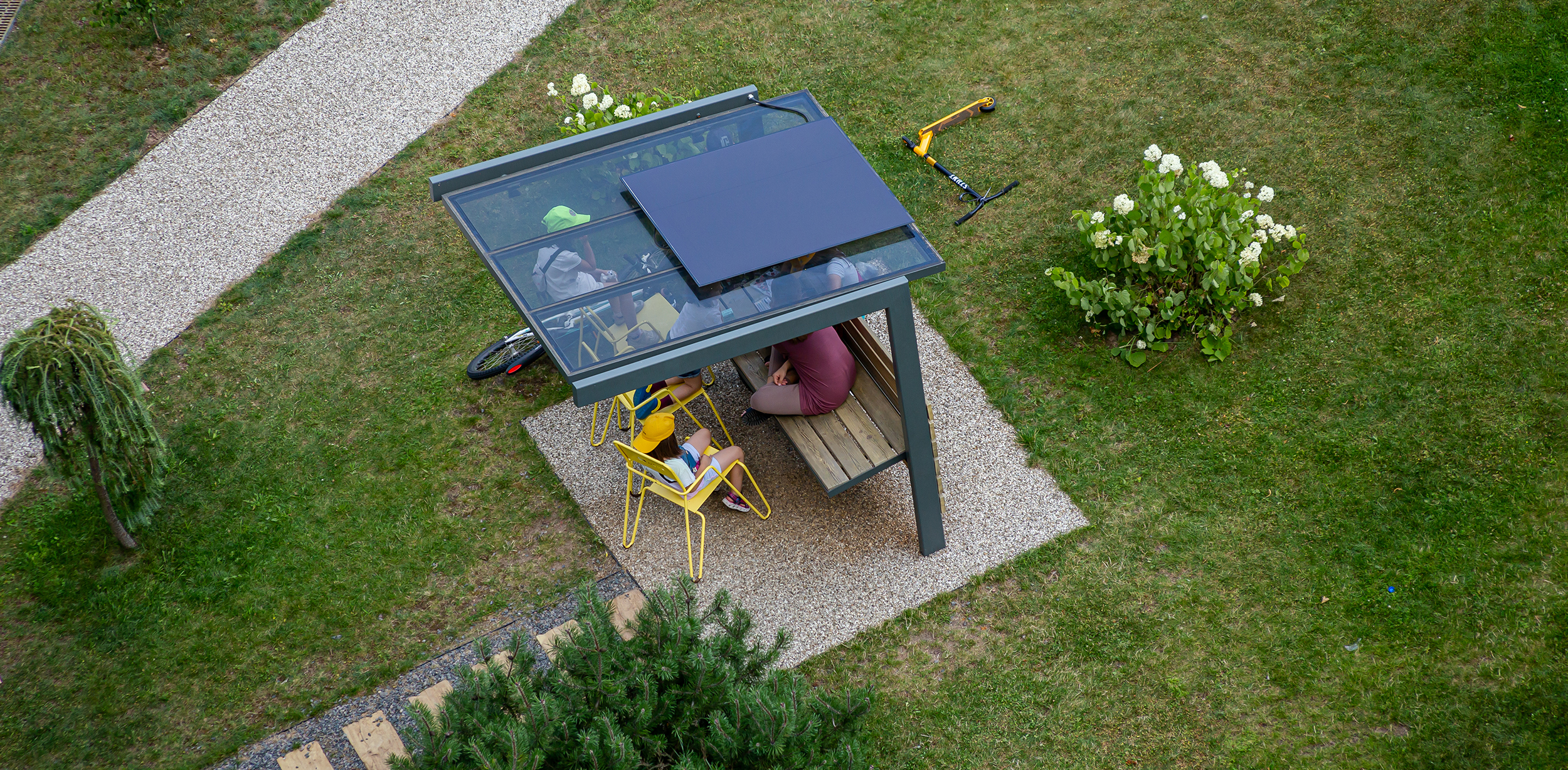
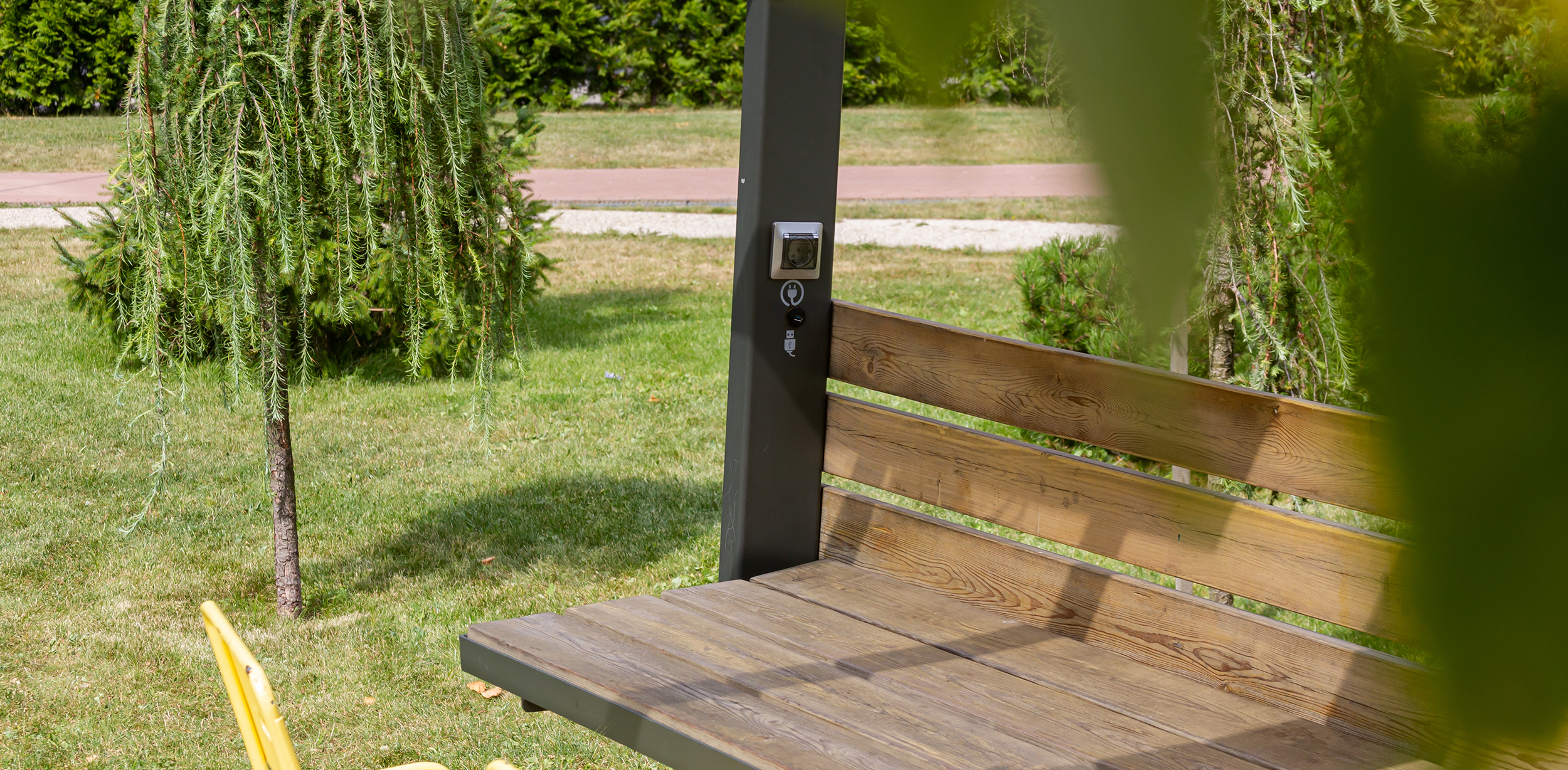
We have developed street offices with desks, a Wi-Fi hotspot, and solar-powered sockets for outdoor enthusiasts.
We equipped the working area with branded portable furniture for sole or collective usage.
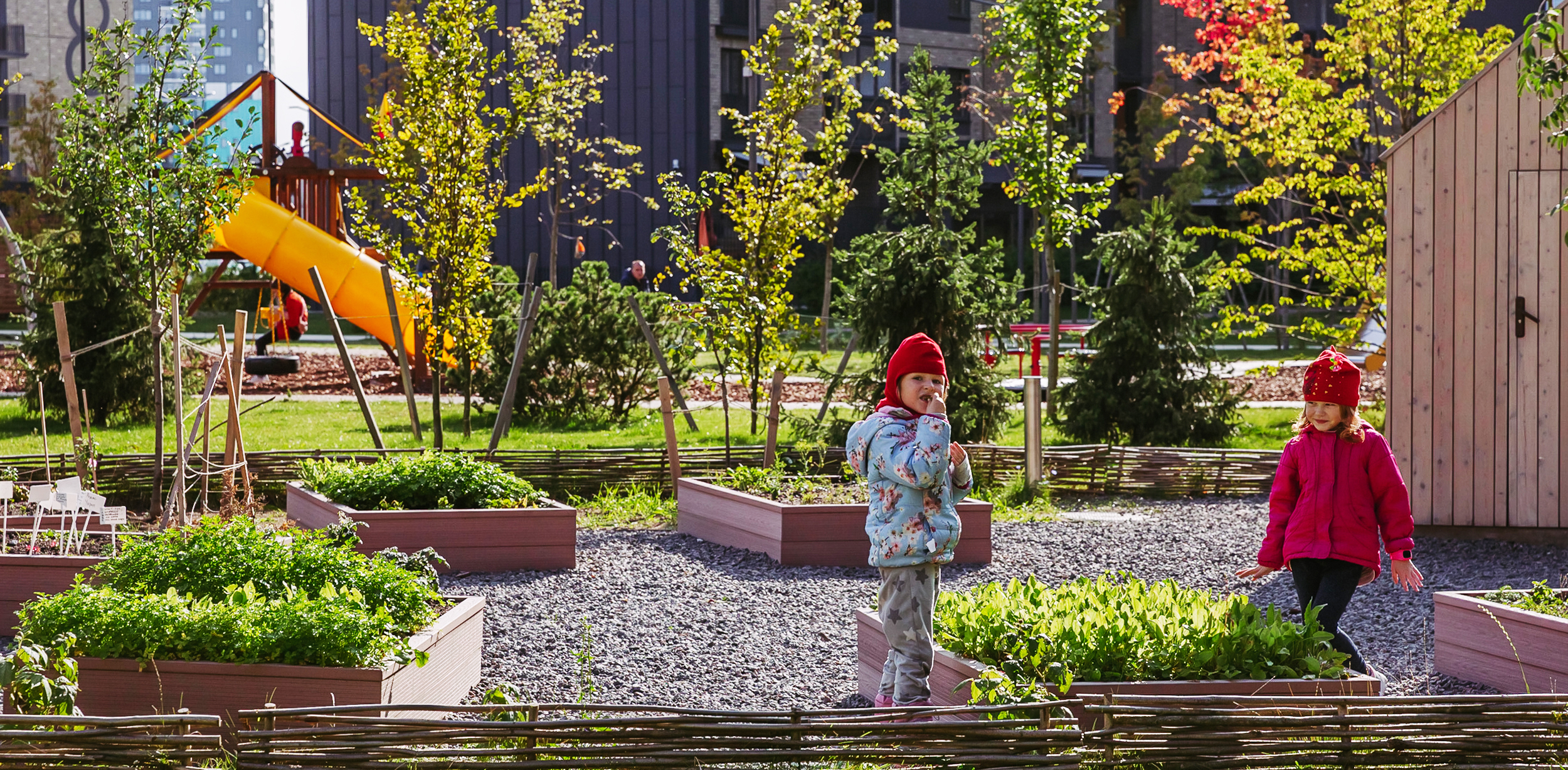
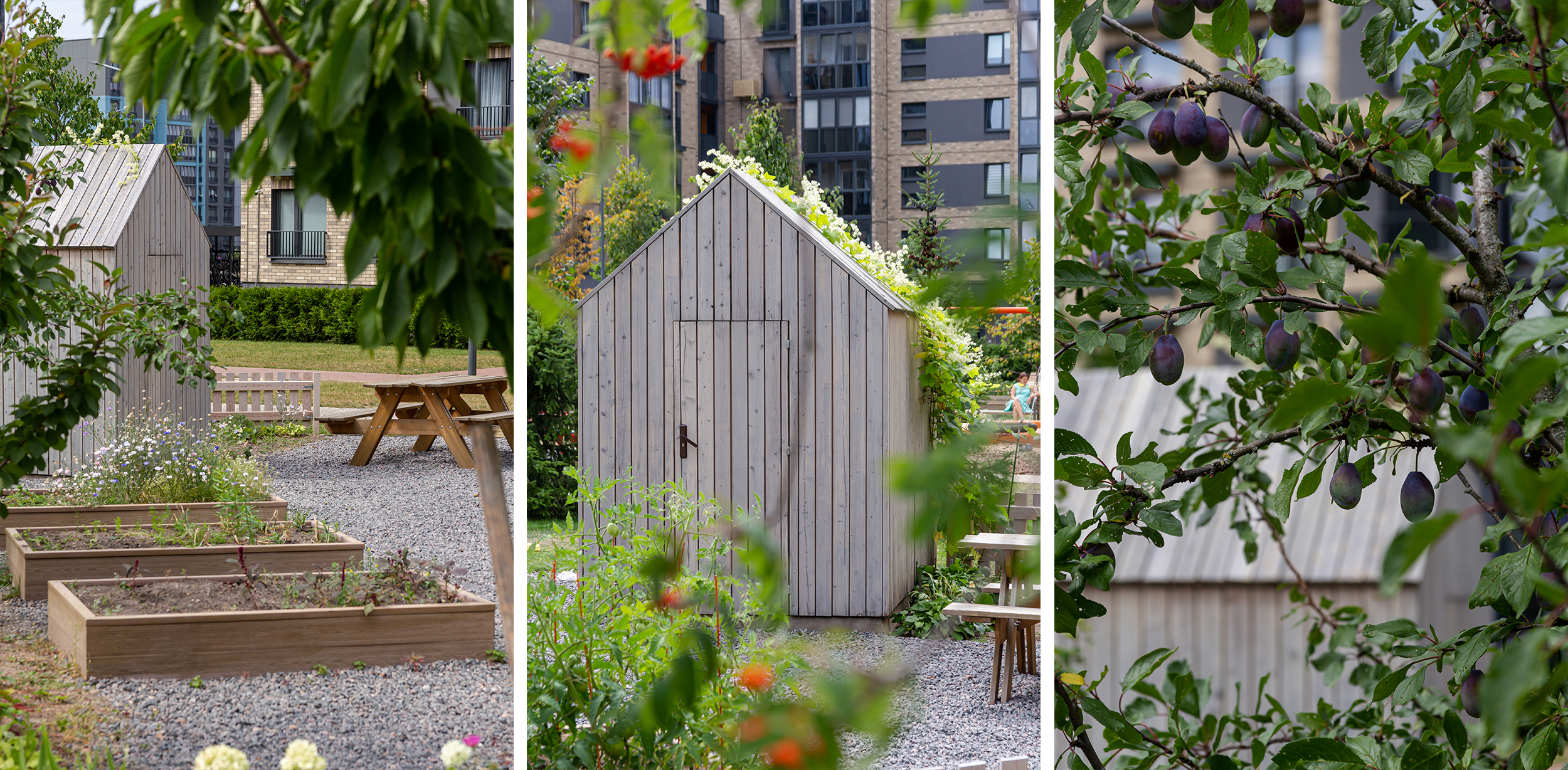
Also, we have provided public gardens for those who like to grow vegetables and fruits. Here one can plant greens on their own or with neighbors, and enjoy both the process and the result of their efforts.
We supplied watering to the beds and provided a small shed for inventory. And, fruit trees are planted along a low fence surrounding the territory.
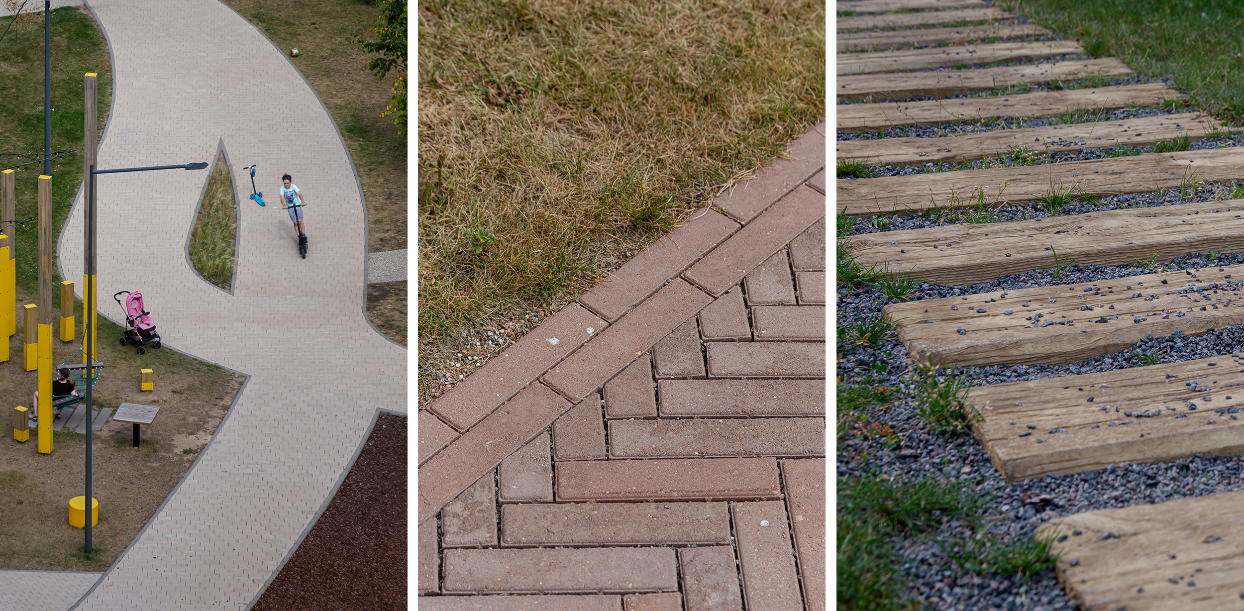
We arranged a bike path for the most active children in the courtyard and carried it as far as possible from the windows so that the game noise would not annoy the residents. For the same purpose, we moved the footpaths away from the facades.
The project used different types of coatings. For example, paths made of clinker tiles with individual pattern, combine landscaping elements with facade solutions. We planted thick greenery in the space between the path and the windows.
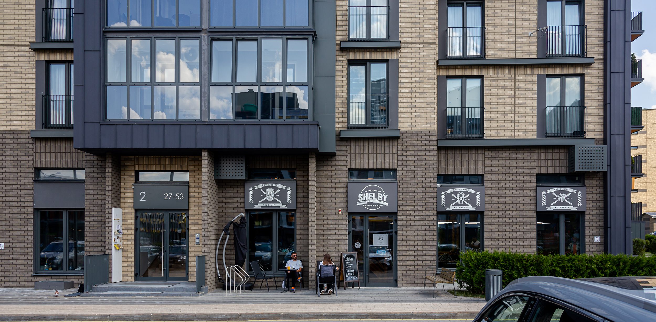
We paid particular attention to the design code of the built-in premises located on the first stories. It was essential to withstand all the signs in a single style to avoid visual noise on the facades.
We inscribed all ads in a rectangle of definite size in black and white graphics — white signs on an anthracite matte background. Such a decision helped to unite all ads stylistically and implement them unobtrusively.
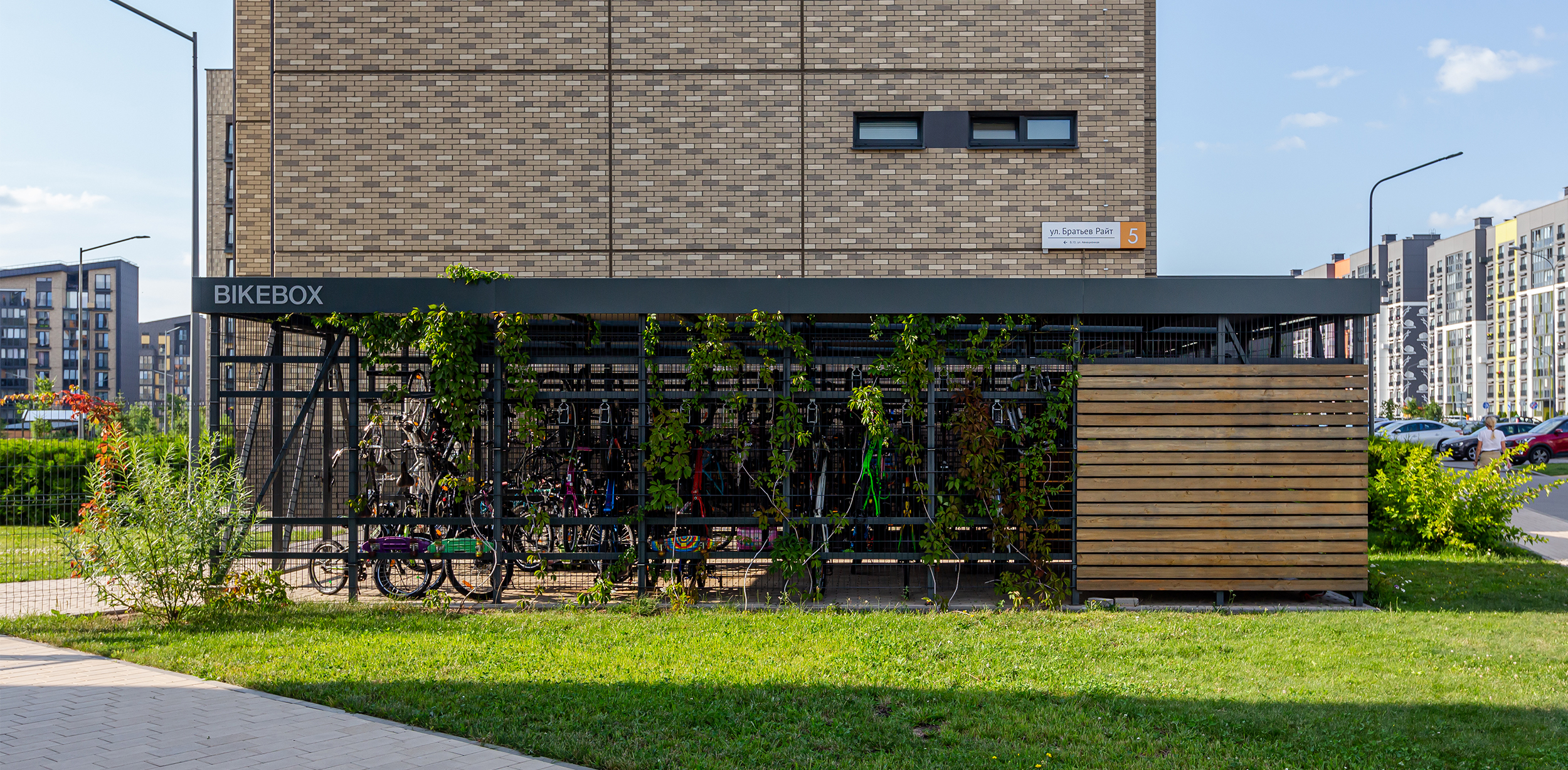
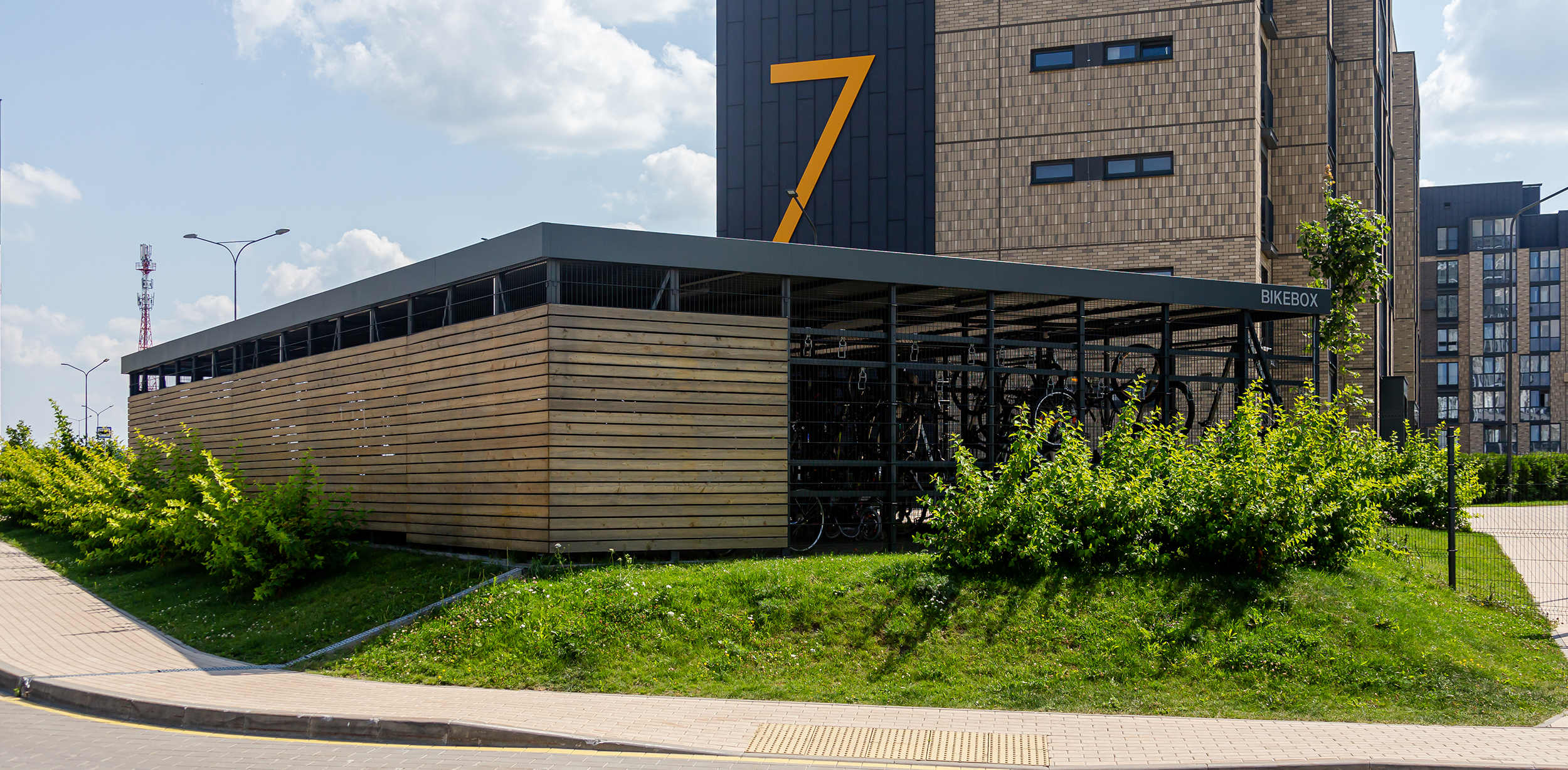
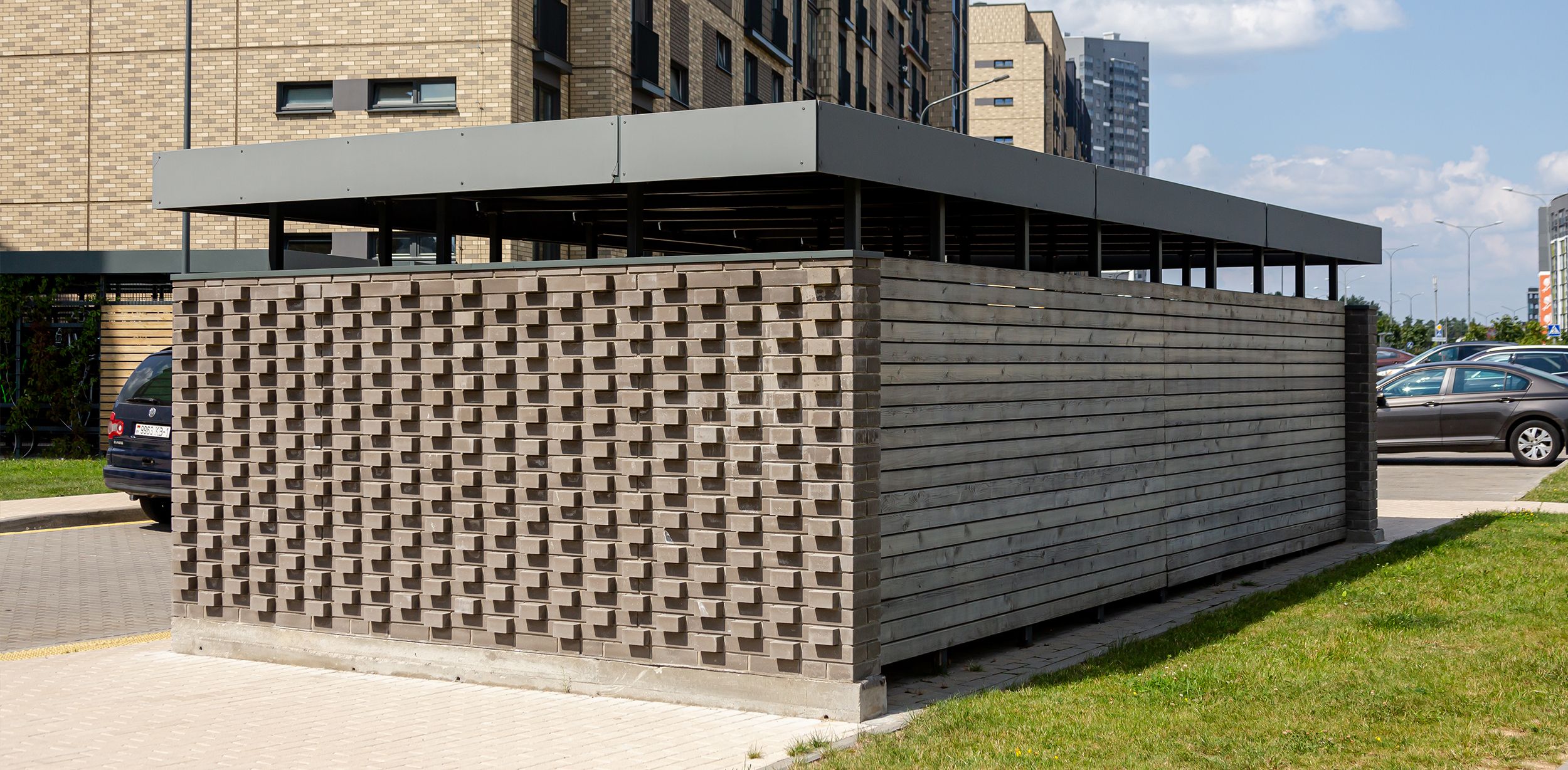
The design of technical buildings is also individual. This applies to bicycle parking, garbage collection sites, and transformer substations. We believe that it is essential to pay attention to the aesthetics of such objects and harmoniously fit them into the concept of the block.
To do this, we used the same materials as on the facade and worked out volumetric masonry in the overhangs of garbage collection sites. We designed the bike boxes in two sizes with the installation of vertical mount holders, which allows you to store a large number of bicycles.
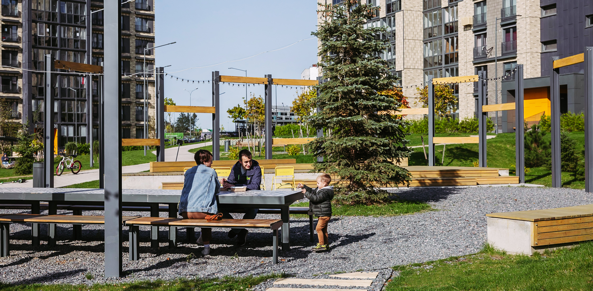
Kvartal Park is a place with remarkable architecture and landscaping, where the main idea is a functional and comfortable environment with a variety of areas for life and recreation. A thoughtful approach to the territory forms communities and a new look at the lifestyle in modern development.
We designed this residential block for those who value the quality of life and the aesthetic environment around them. The architecture of the quarter inspires residents for creativity and forms new values in them.
