PIXEL House I Interior
Location:
Belarus, Minsk
Year:
2008
Status:
Built in 2009
Work done:
Site plan
Architecture
Interior design
landscaping
Construction technology:
Combined monolithic and steel frame
House area:
670m2
The team:
Kirill Skorynin
Eduard Medvedev
Galina Skorynina
Photo:
Nikita Bezrukov
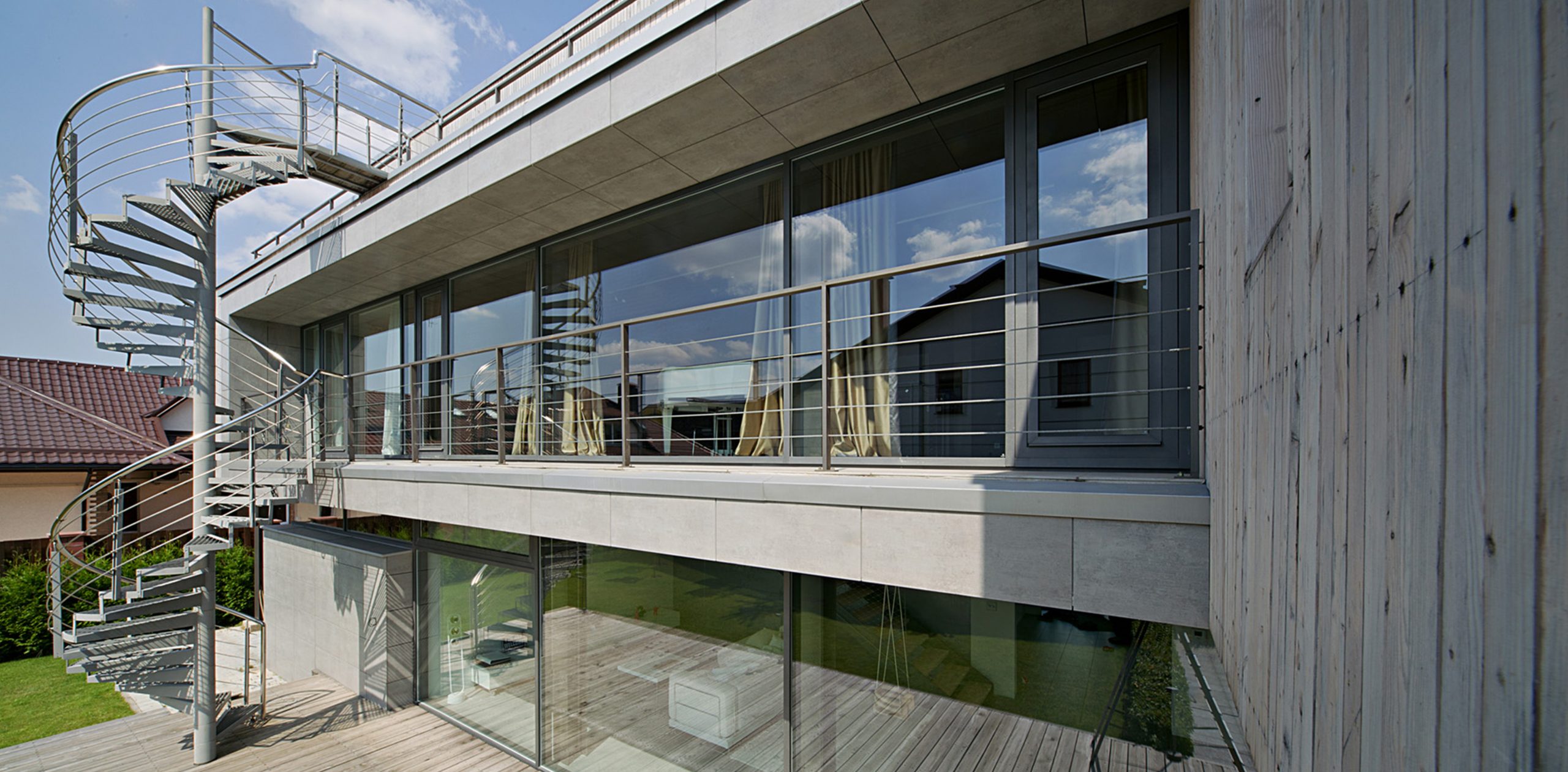
The modernist style of the house combines strict forms, restrained colors, and large glazed surfaces. The natural materials of the exterior are beautifully aging and will look better over the years.
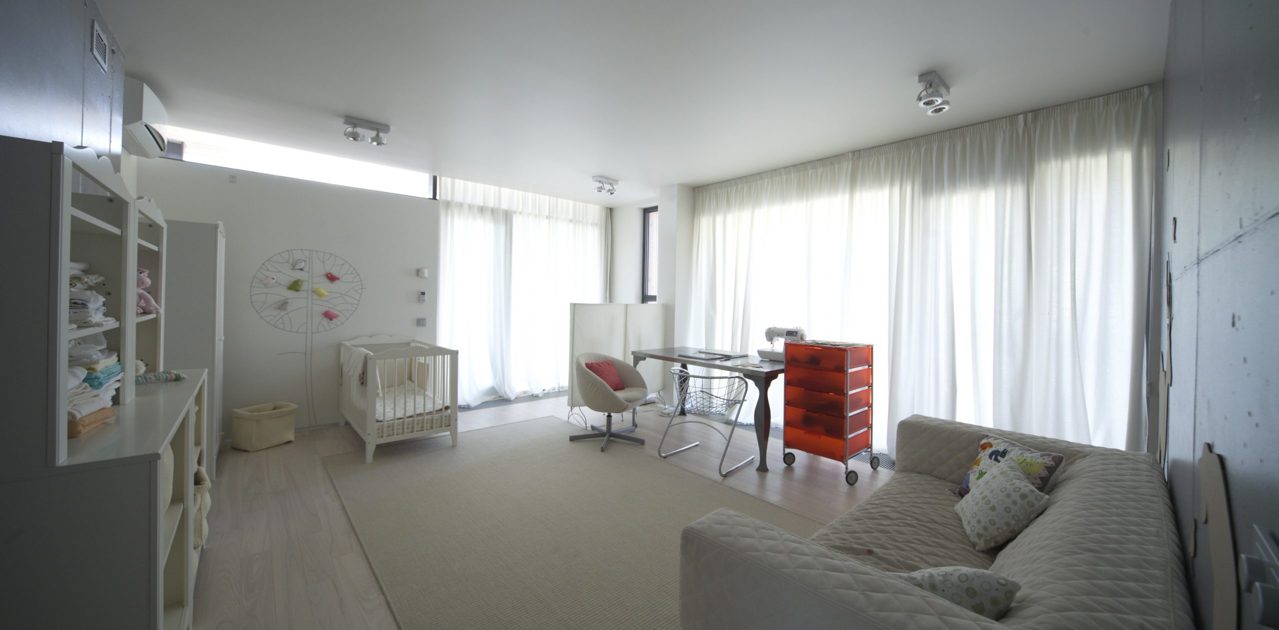
The approach ensures that the house will look à la mode for time to come. The large windows and south-facing orientation of the house let plenty of sunlight inside. The open and laconic interiors make the rooms spacious and comfortable.
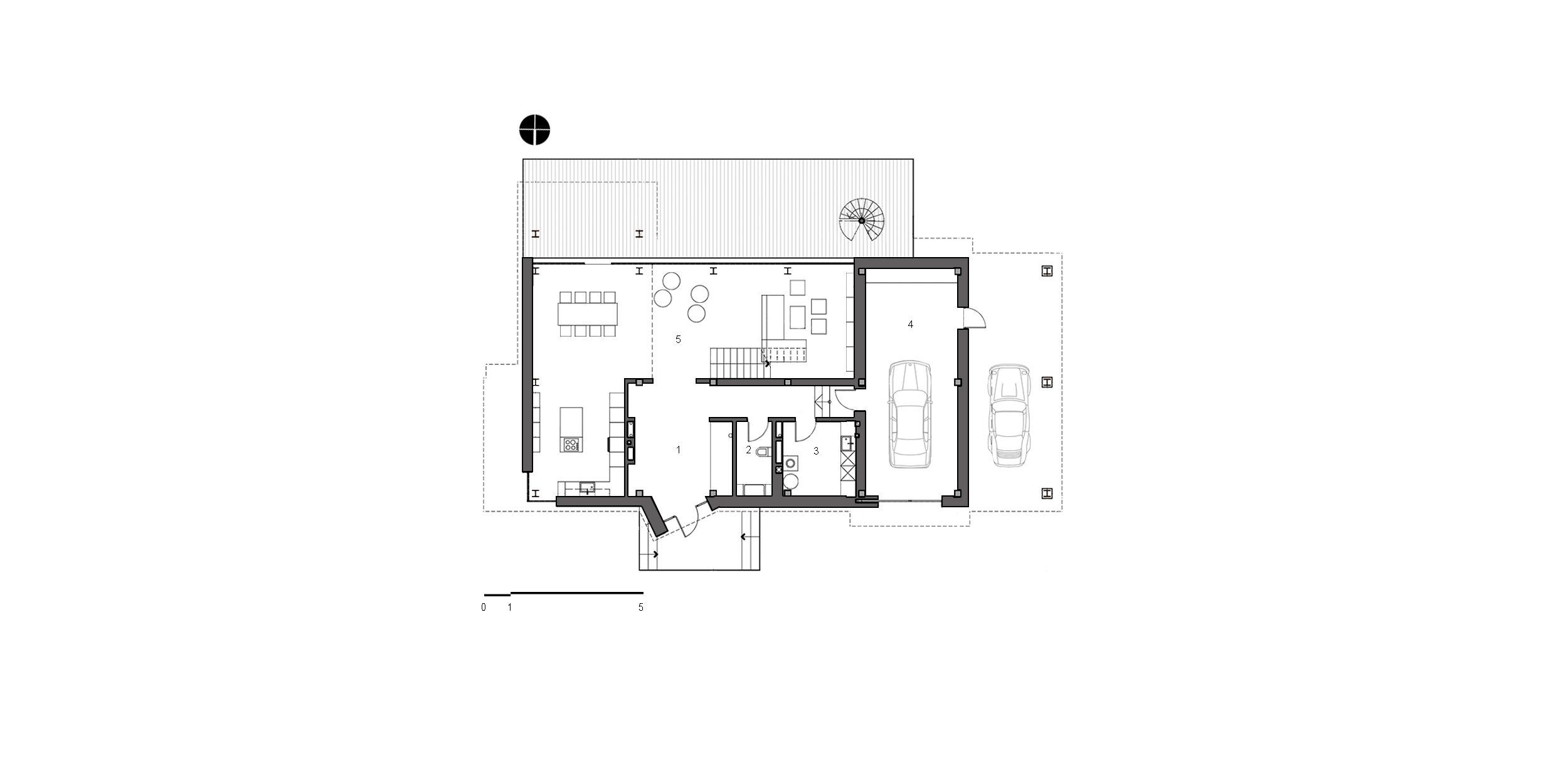
1. Hall
2. WC
3. Boiler room
4. Garage
5. Living room-dining room-kitchen
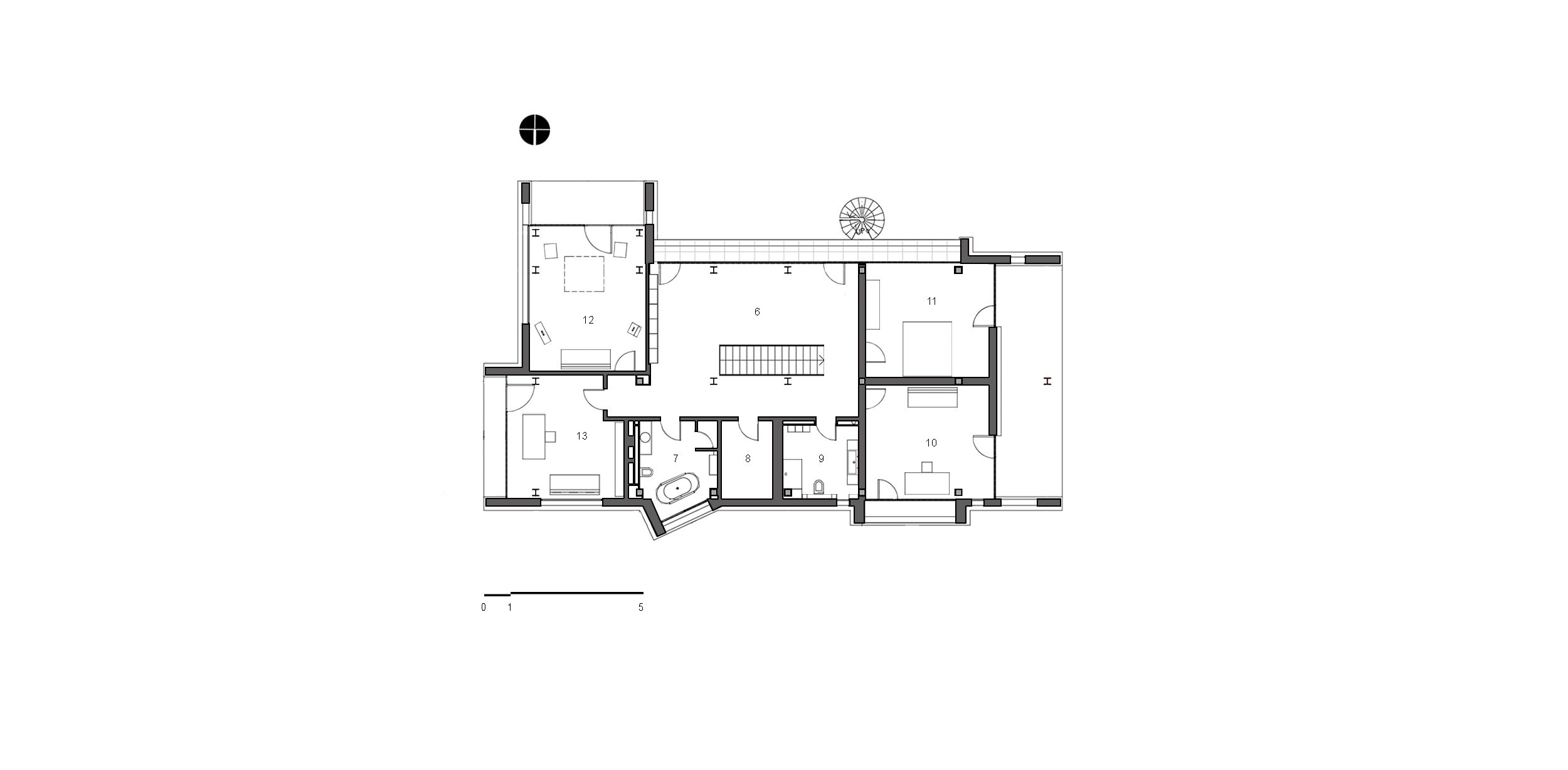
6. Hallway
7. Bathroom
8. Wardrobe
9. Bathroom
10. Bedroom
11. Bedroom
12. Sound studio
13. Bedroom
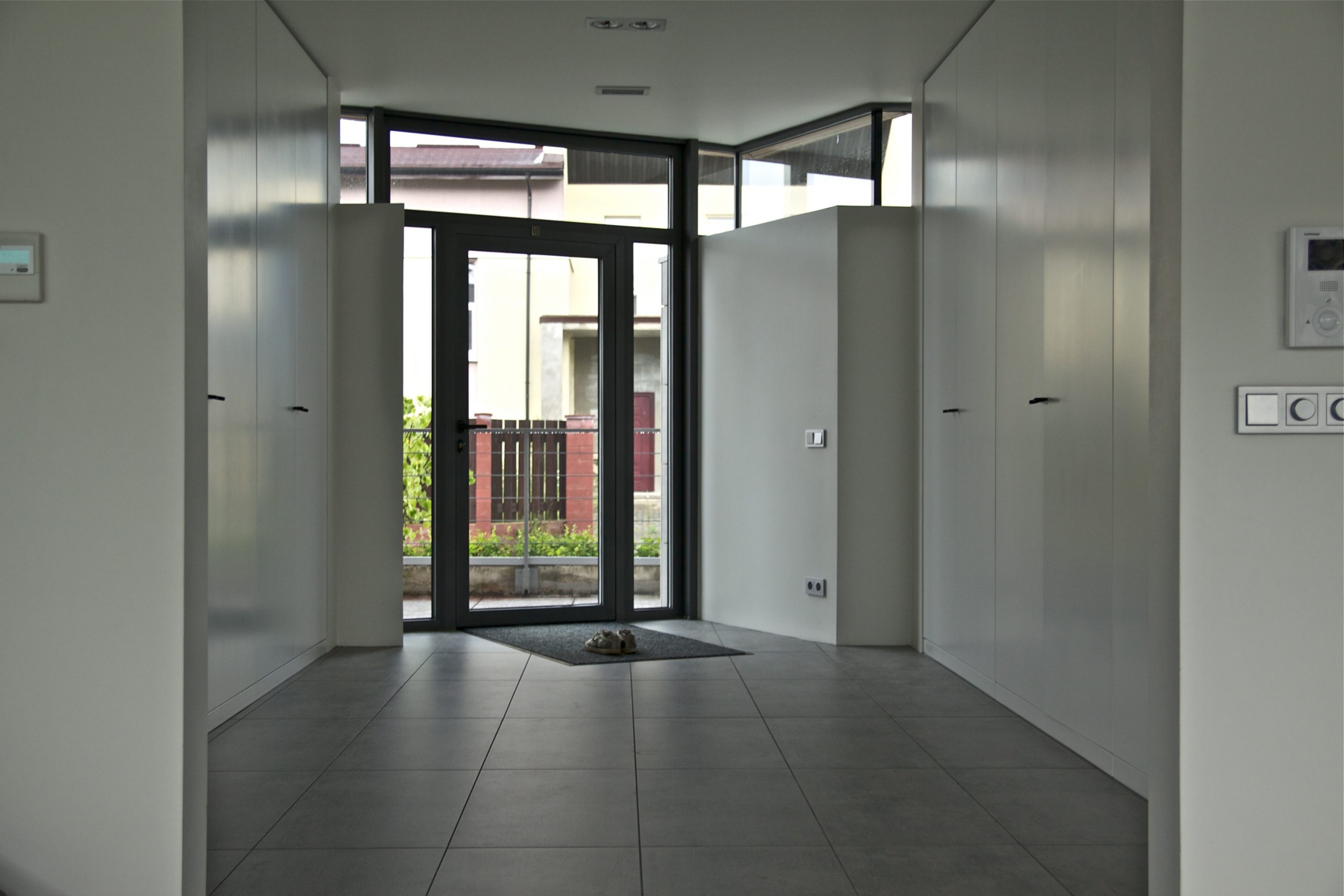
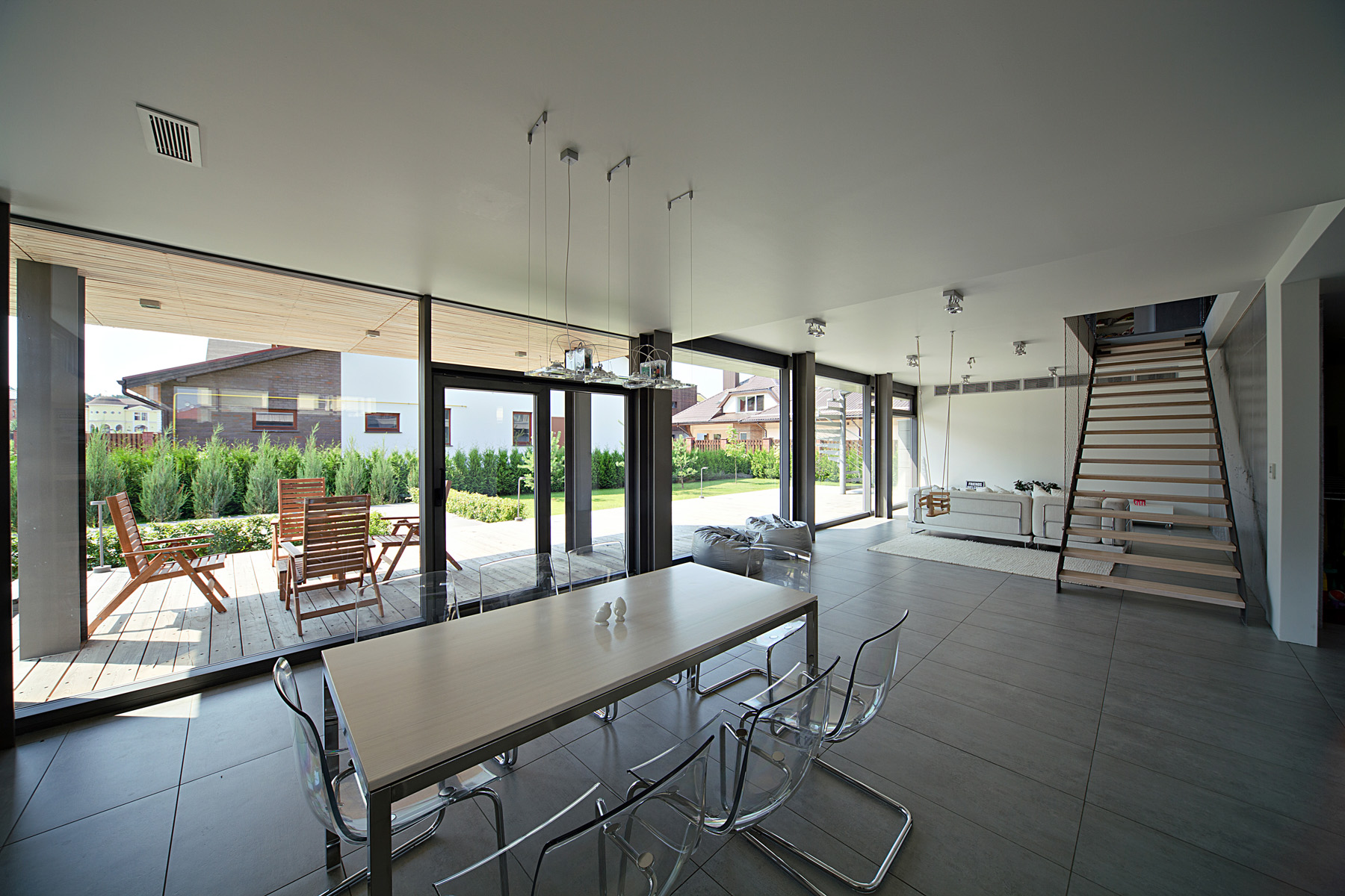
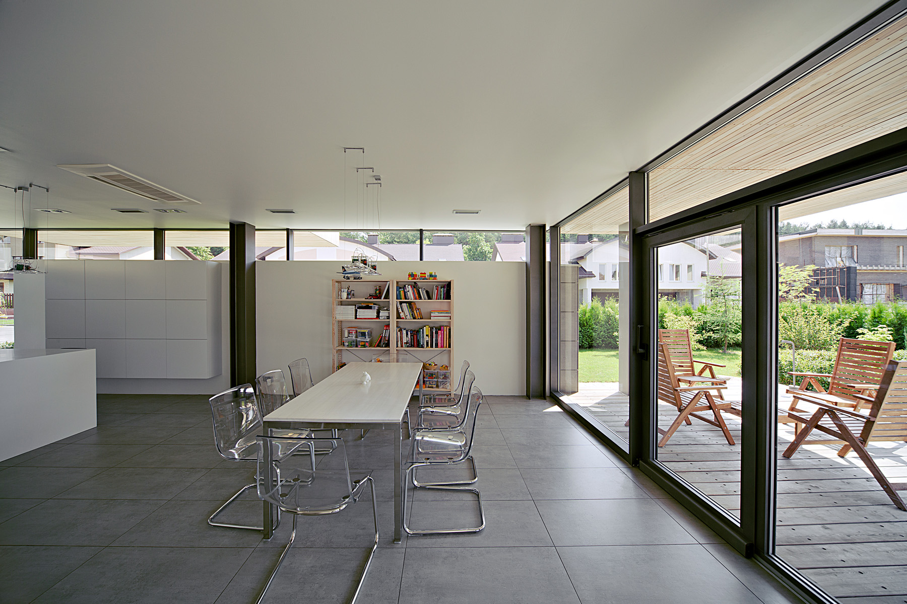
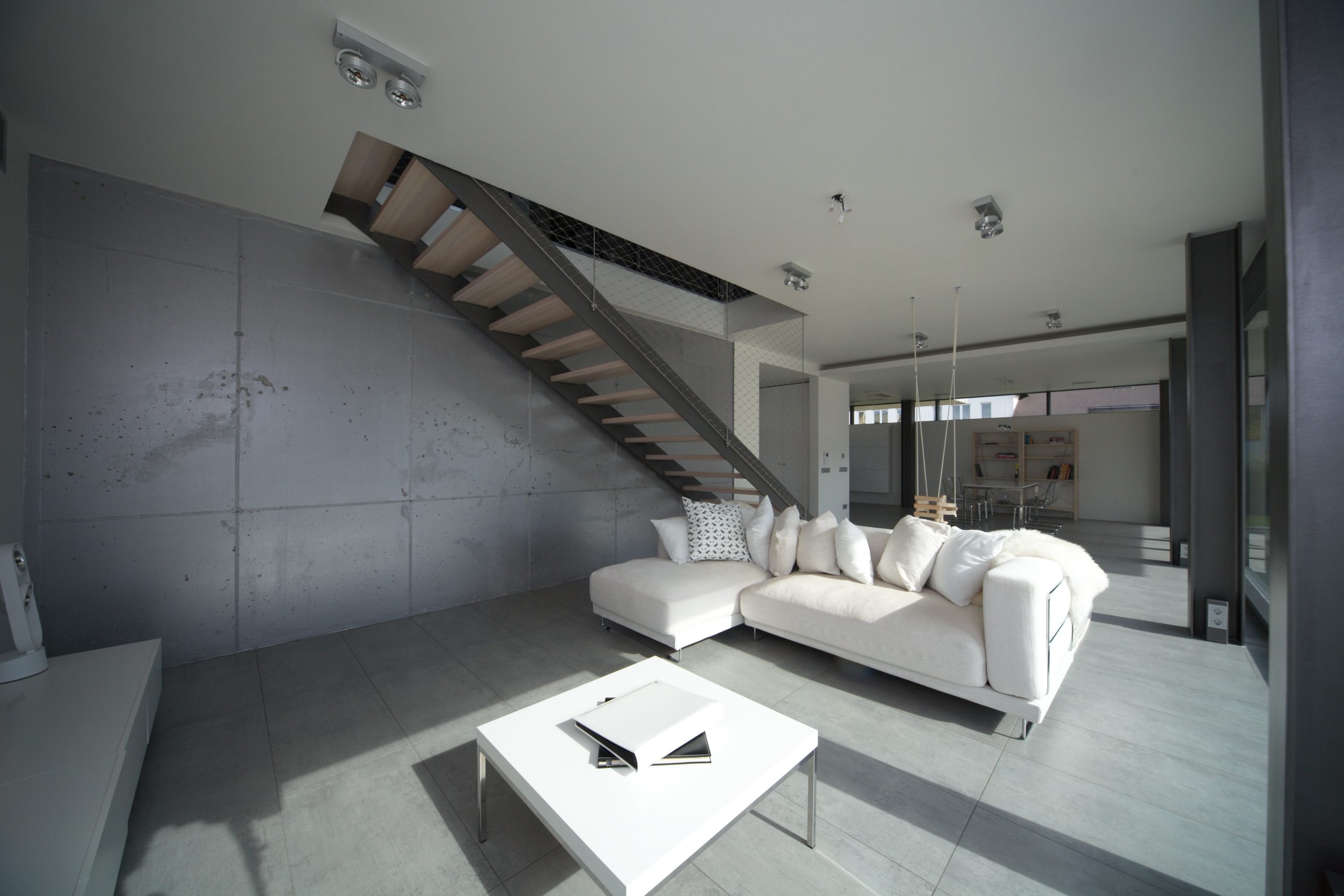
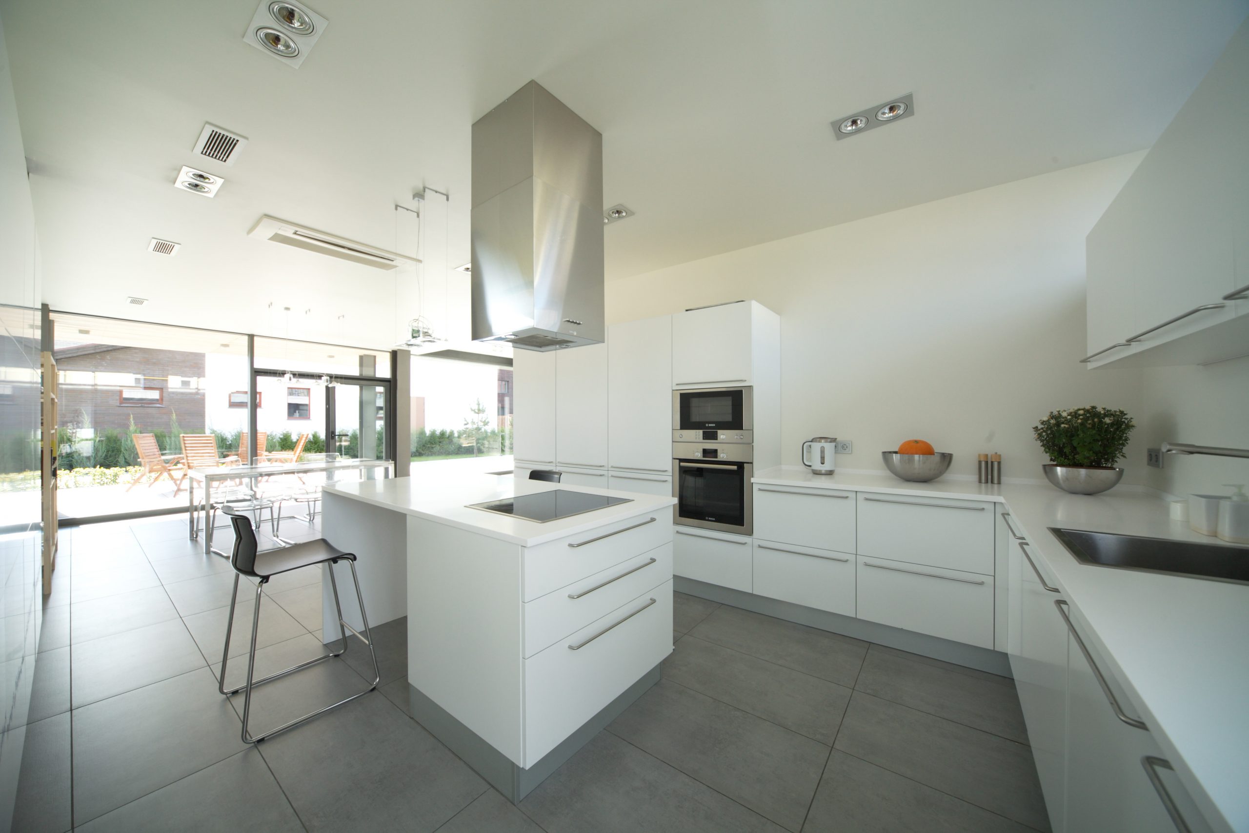
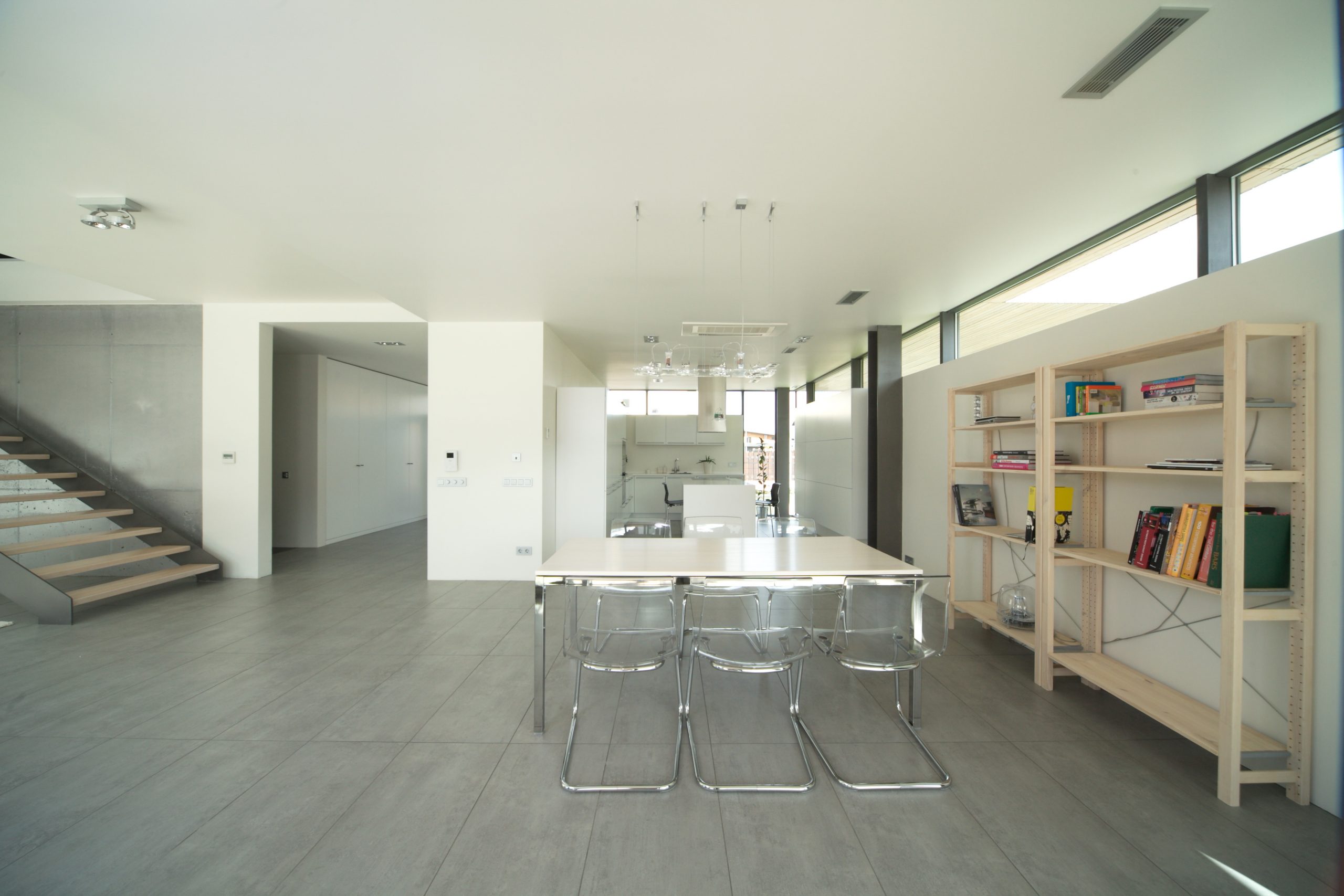
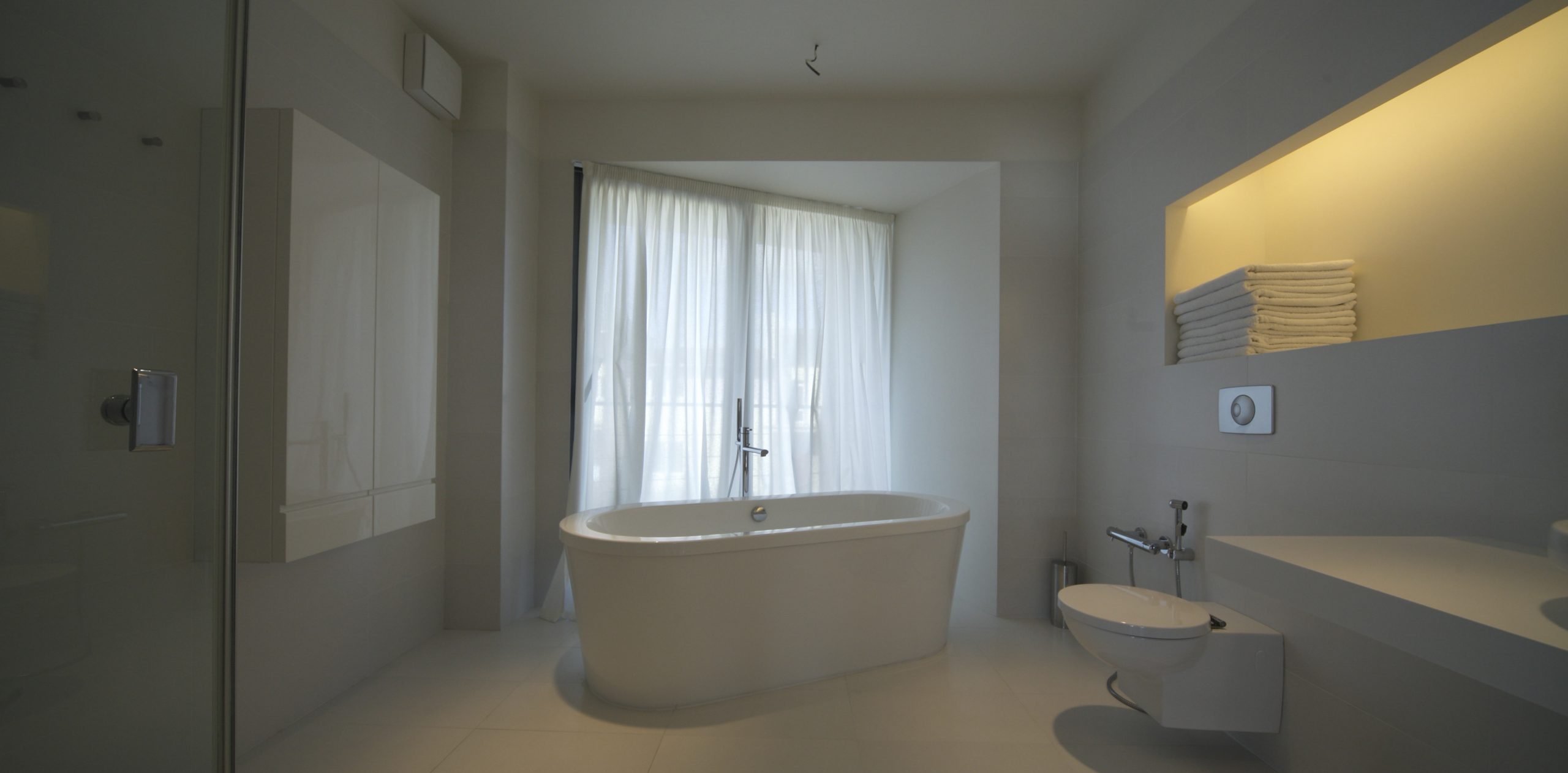
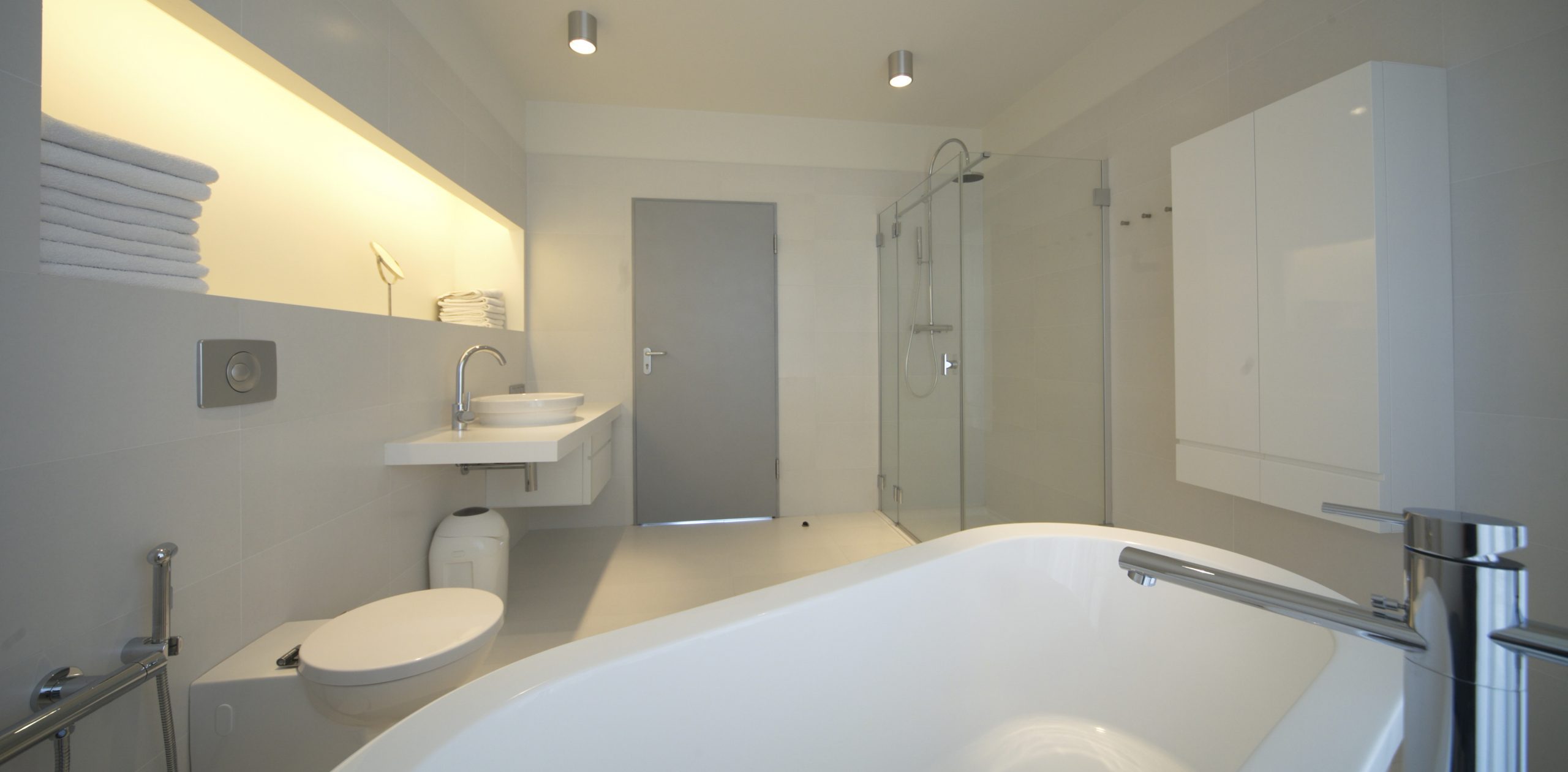
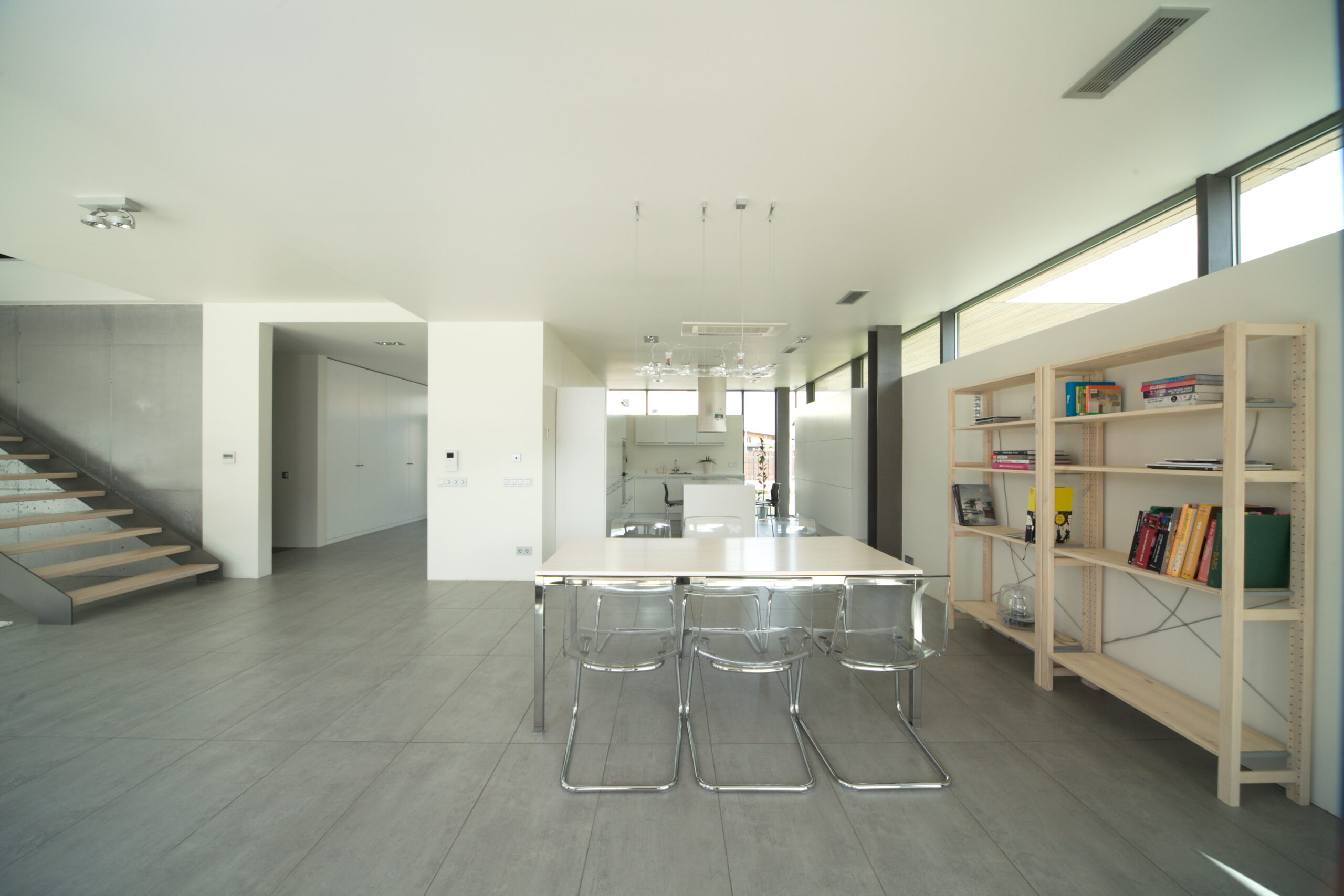
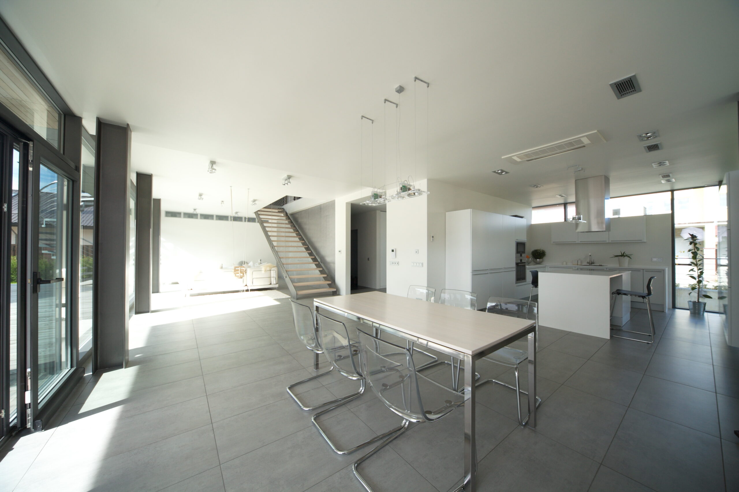
Upon entrance, we find ourselves in a spacious hall with a built-in storage system. We proceed to an ample combined living-dining-kitchen room with access to the terrace and stairs to the second floor. From the hall, we could also get to the bathroom, furnace room, and garage. The modernists’s house inside looks strictly and concise.
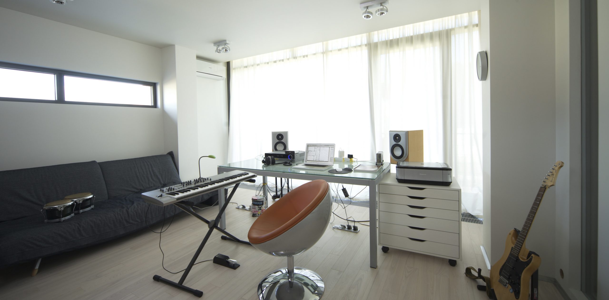
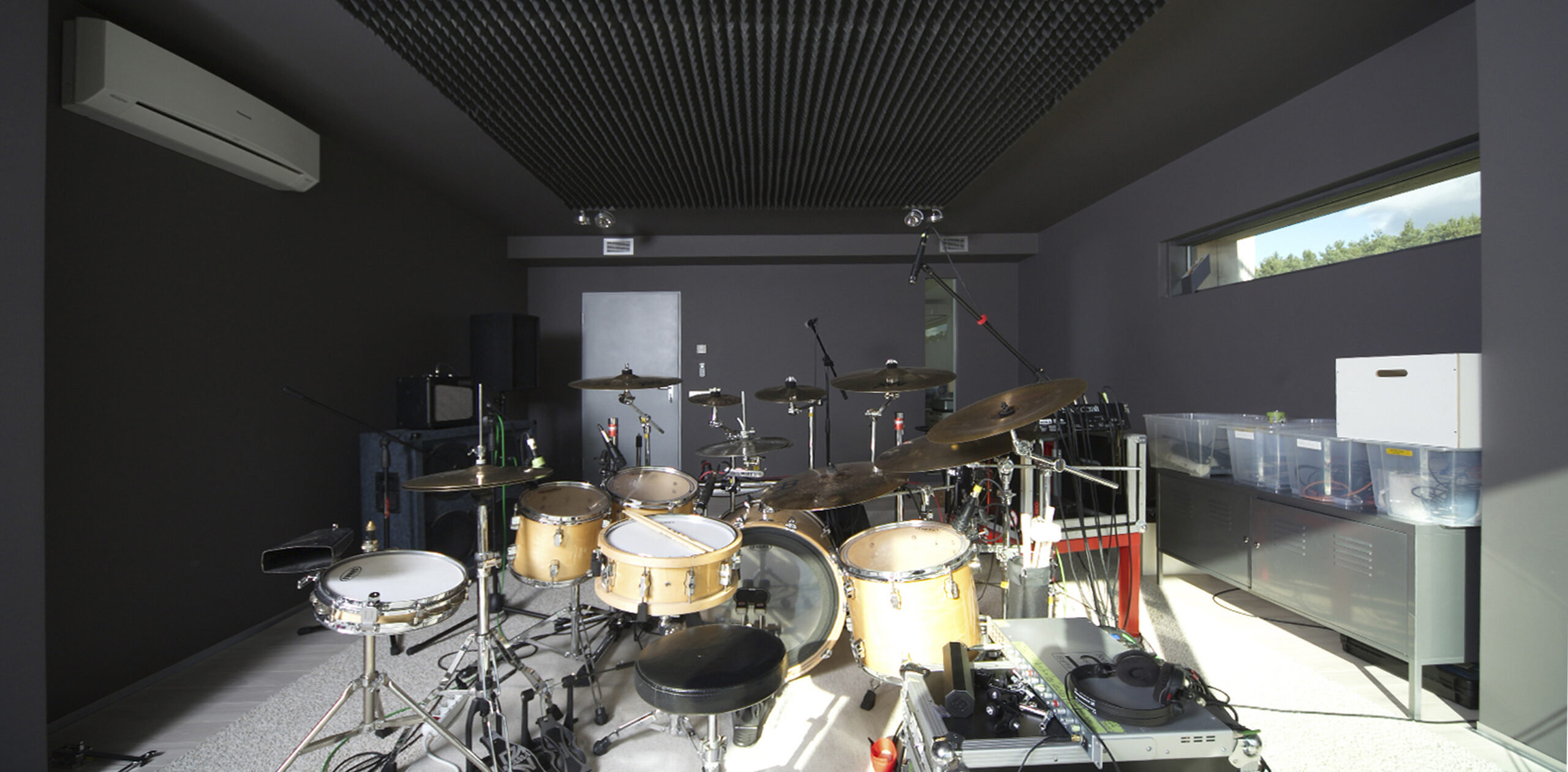
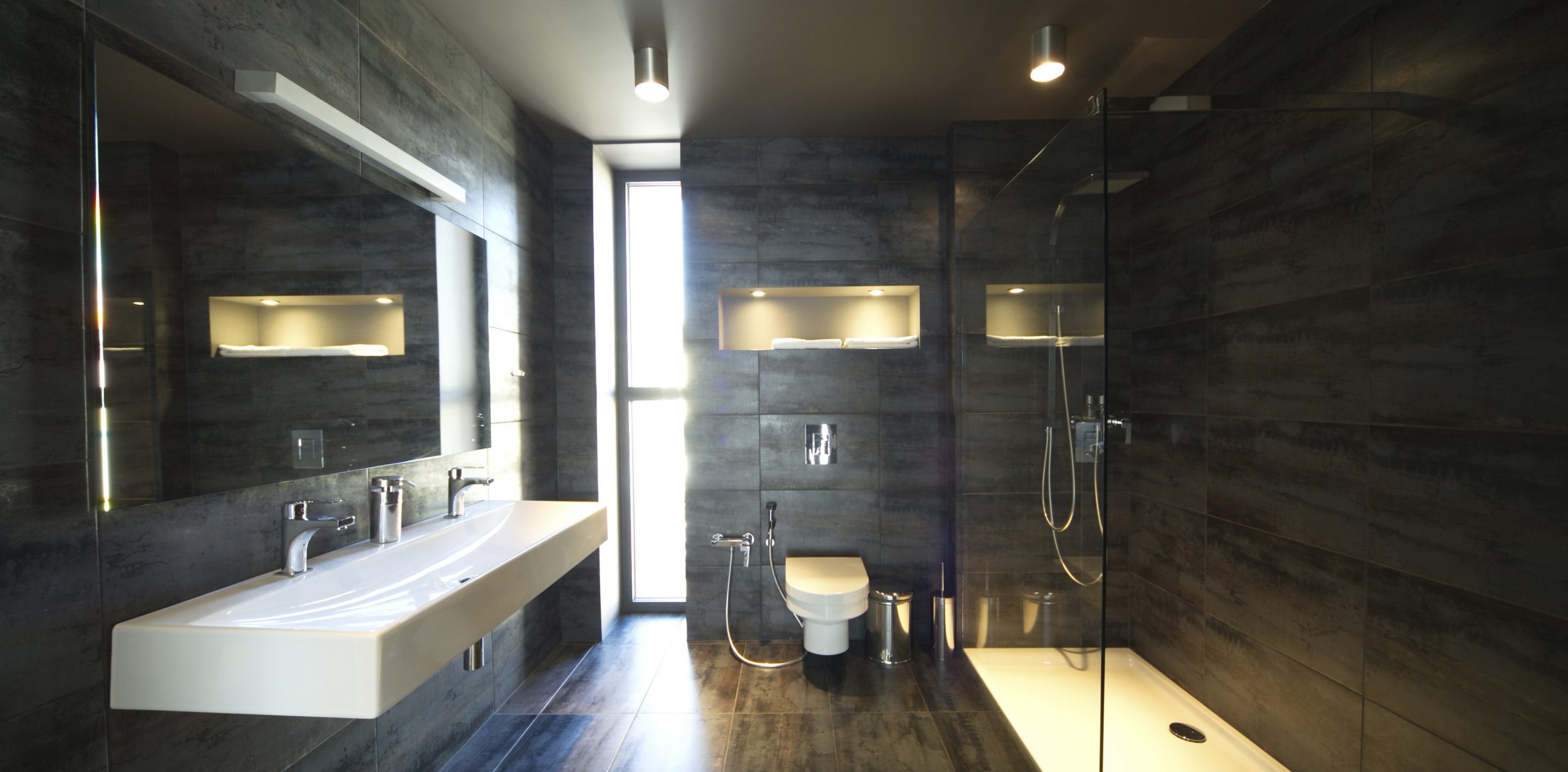
On the flooring and, partially, on the walls of the first floor, we used large gray tiles. They are easy to clean — it allows children to apply their creativity without damaging property. The flooring of the second floor, the steps of the stairs, and the countertop are made of bleached ash. For most of the walls, we preserved the texture and color of the concrete. The walls are also painted in white and anthracite. The ceilings are white throughout, except for the second-floor hall, where it is anthracite along with the walls.
Given the family’s interest in music, we arranged a sound studio on the second floor and gave the room with the most inspiring view and good acoustics to the piano. On the second floor, there are also bedrooms and bathrooms.
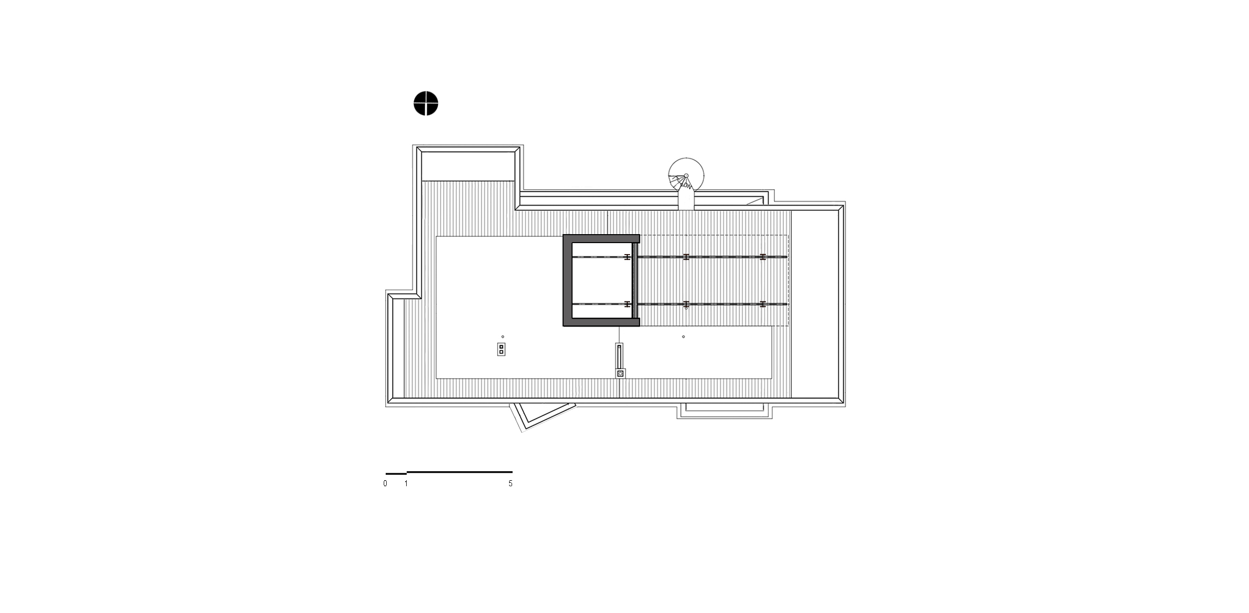
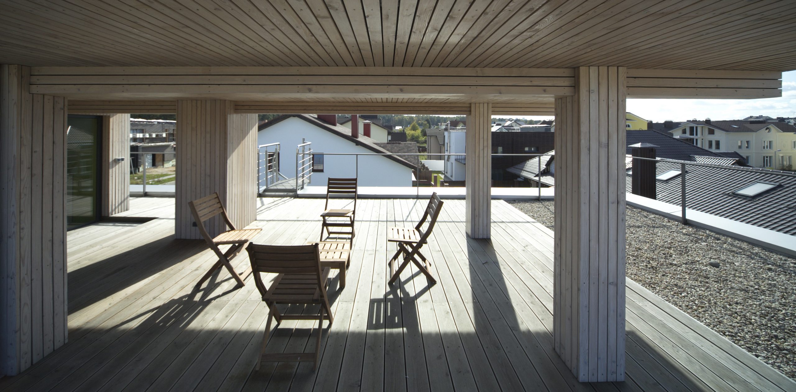
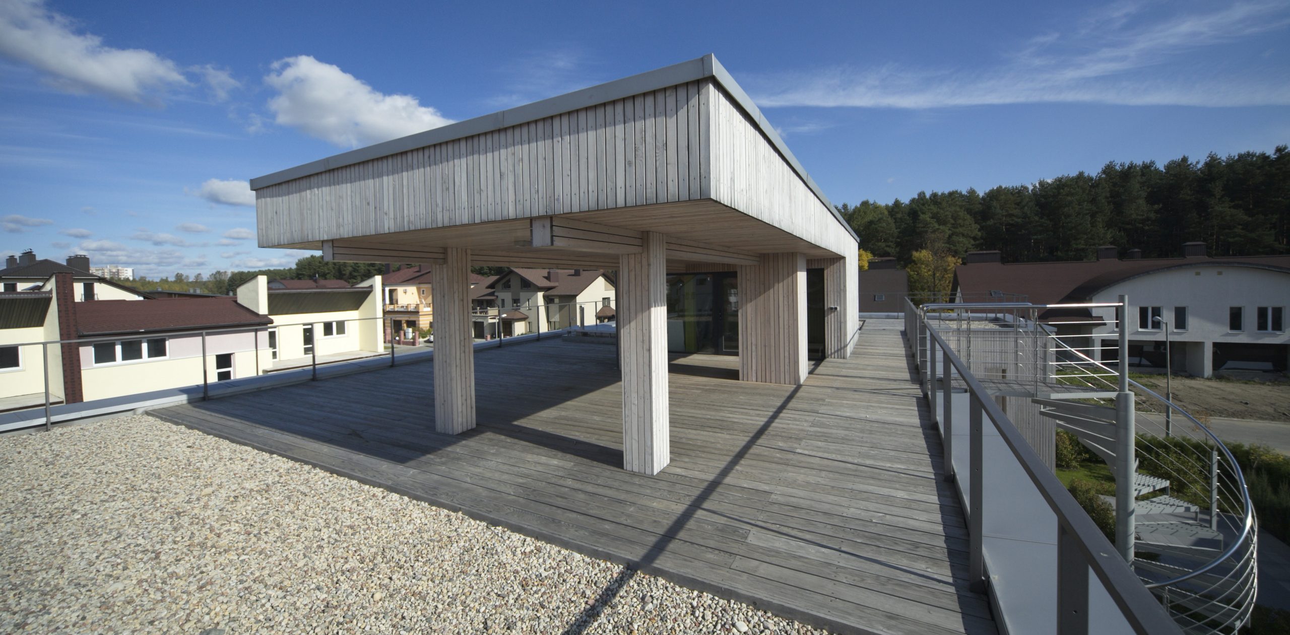
We compensated for the small size of the plot with the exploitable roof, which in good weather turns into a terrace on the third floor, to which a spiral staircase leads.
In general, Pixel House reflects the main principles of our design: large glazed surfaces, a ribbon window around the perimeter, a frame system, and natural materials. It is a bright house that will never go out of style.
More information about this project you can find here: https://level80.pro/en/projects/pixel-house/
